4 common design mistakes that are easy to fix

The design is constantly being sent to the logomachine for analysis: in the social network, in the comment on Habré, on our live broadcast. Very often it can be easily improved by correcting some little thing: colors, sizes, distances. We made of the fact that they sent us a selection that will help you notice the most common problems and easily fix them.
Confideal: Clean Dirty Color

This logo was sent to the Logomachine in VK.
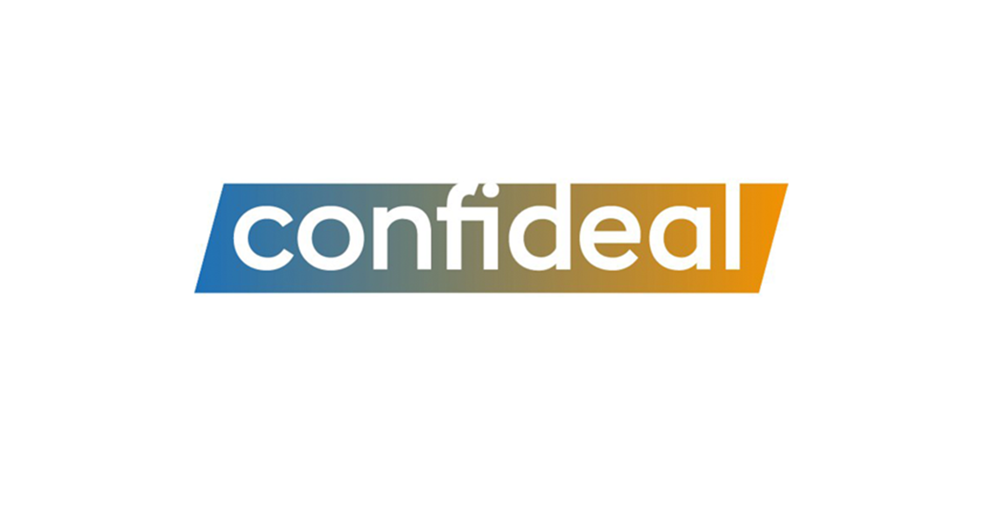
There is a clear problem with the transition of colors - the gradient. Between shades that are at different ends of the color wheel, a “dirty” color always appears. The same mistake was made by Lebedev Studio in its express design for 100,000 rubles: It is

difficult to use such a logo in life - objects with this color look dirty: It

is easy to fix it - you need to add one or several shades between complementary colors to bypass the “dirty” one. For example, like this:
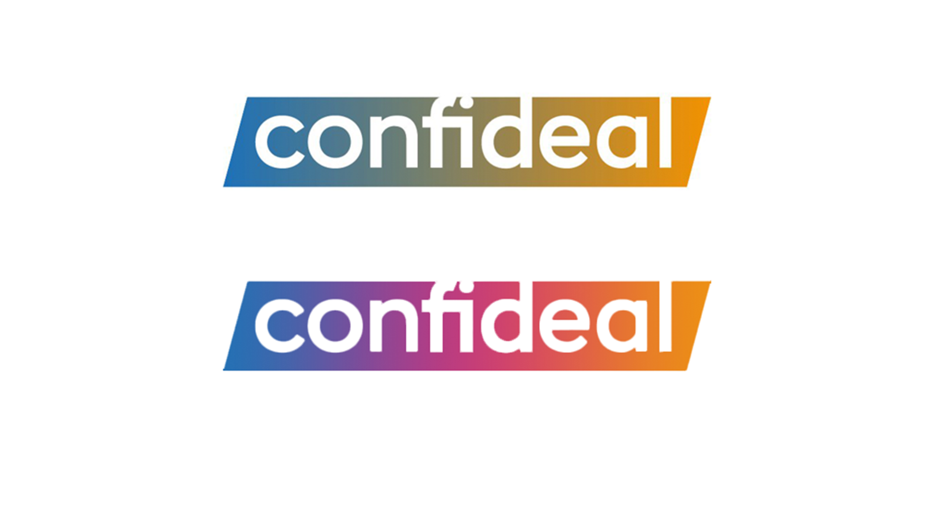
Instead of dirty green, we used a shade of fuchsia - the logo became warmer, brighter, and most importantly, cleaner. You can choose other shades. Such a sign will be more noticeable, and branded business cards and T-shirts will not look dirty.
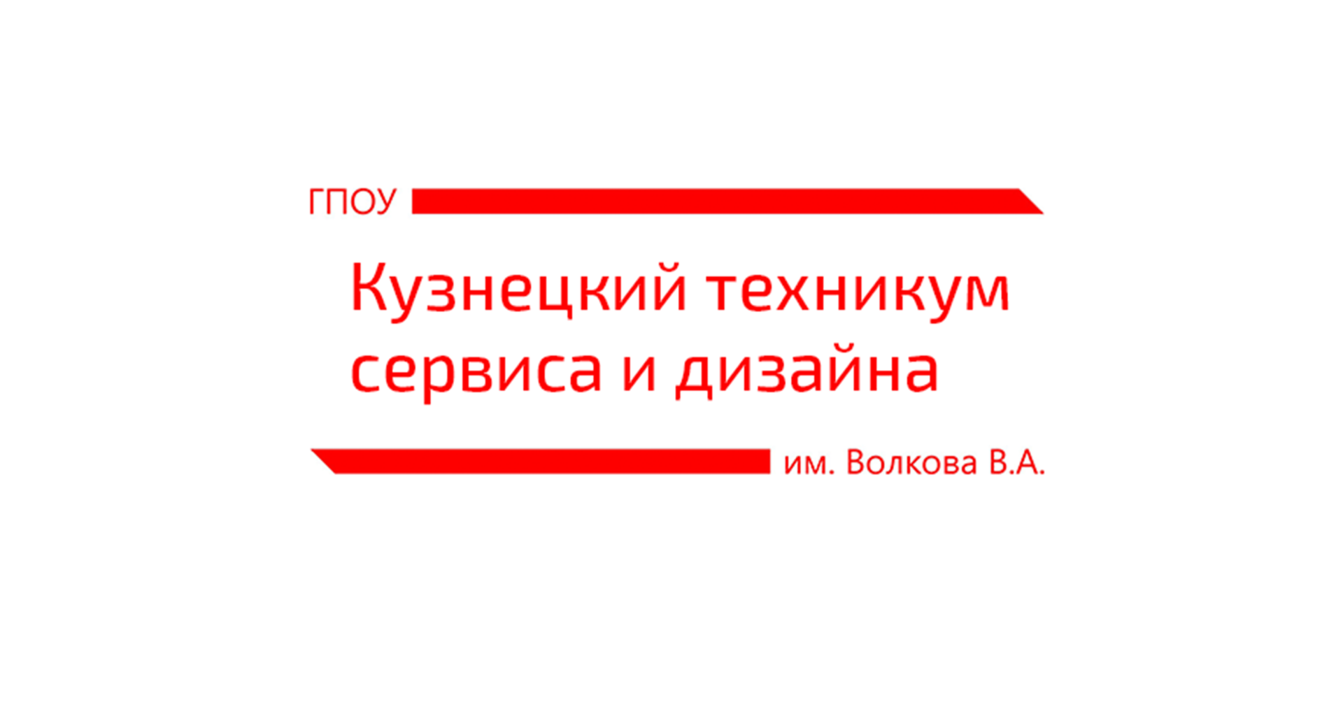
Kuznetsk technical school: improving readability
We were sent this logo:

People rarely look at the logo closely. More often, we see the logo in motion, in a small format or at a distance. To check how the logo will look in combat conditions, we’ll blur it a bit - it’s called the “squint test”.

It became obvious that the text on the red die is very difficult to read. There are three reasons for this.
Firstly, it is capitalized. IT WOULD ALL UNDERSTAND IT TO READ SUCH A TEXT IS DIFFICULT - ON HABRA EVEN A RULE WHICH I NOW VIOLATE IN THE NAME OF VISIBILITY. BUT WHEN THE BUSINESS REACHES THE LOGOS, EVEN VERY LONG TITLES TYPE UP CAPITAL. This can be done, but carefully.
Secondly, the text is made "invert" - white in red. This also reduces readability.
Thirdly, the font is chosen thin, so it’s worth squinting, it immediately dissolves in a red background.
We will not change the composition, we only correct the font in the middle - we remove the uppercase letters, invert and we select a more massive font:
Check:

Even though the letters are smaller, the inscription is better read. Now there is a chance to understand that this is the Kuznetsk technical school without even looking closely.
Aircraft: remove the stroke

In this simple sign that was sent to us, you can notice the favorite trick of beginning designers - to circle everything that is possible. We already cleaned the stroke in one of the previous issues :
The stroke itself is a useful technique, if used to the place. But most often you can just get rid of it - it creates unnecessary noise and complicates the logo. Compare:

Just remove the stroke and look - if the sign has become “easier”, it is better without it:

Raznotorg: improving the composition
Logo of a department store chain:

A common problem in logos and design in general is poor composition. It is difficult to read, there are no accents - it is not clear what is important and what is secondary. The creator of this logo simply “played Tetris”, trying to put all the details into a compact rectangle:

The result was a disproportionately large “P”, a flower emblem that hung in a random place and a handle that is not aligned for anything. Compare how much clearer it would be, for example, such a composition: The

elements are all the same, with the exception of the giant letter P, but the arrangement is simpler and more understandable. Let's apply this scheme:

We changed the location and size of the elements. It turned out not perfect, but better than in the original. When compiling the composition, one should look at the mutual subordination and arrangement of objects, and not just “play tetris”, driving the elements into empty places. Then the accents will be correctly placed, the signs will be better perceived and recognized, and the inscriptions will be easier to read.
As a result
These were four common design mistakes that were easy to fix. Send your design directly in the comments or in our public VK . We analyze errors, and sometimes completely redo the design and show a new style.
And, as always, good luck to you and your projects!