Developing a UI with Flutter
Hi, Habr! We present to your attention the translation of the article " Building Layouts ".
The result of today's lesson will be the following screen
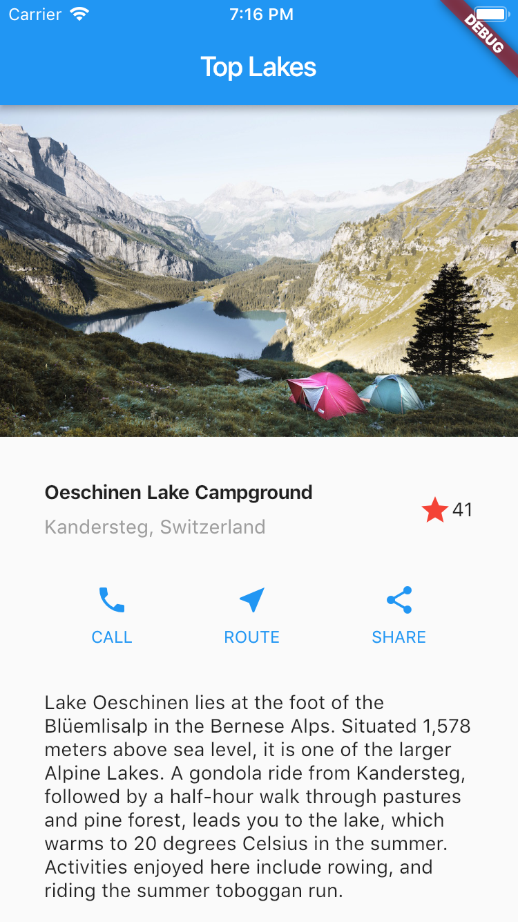
First, create a new project File -> New Flutter Project -> next, next, next ...
Next, you need to create the images directory in the project root and put the file named lake.jpg - you can download the file from here - link
You also need to correct the configuration the pubspec.yaml file (something like gradle for android and cocoa pods in iOS, in it we can add external dependencies). The very text of the file can be downloaded here. The
source code of the project can be downloaded here - it must be placed in the file main.dart
To begin, we divide the layout into simple elements.
First, we define the main large elements. In this example, 4 elements are arranged in the form of a column: a picture, two rows and a test block.
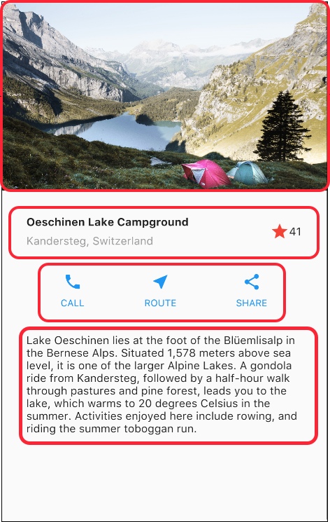
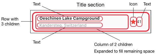
Next, we analyze each row. The first line, which is called the "Title", has 3 children - a column of text, an icon of a star and a number. The first column contains 2 rows. The first column takes up a lot of space, so you should wrap it in an extensible widget.
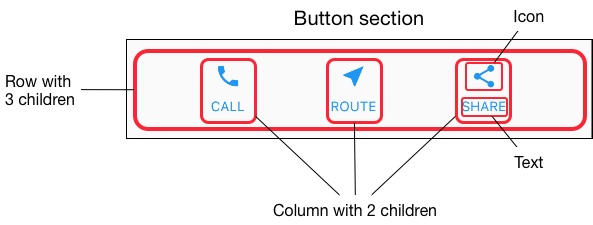
The next row, called the button section, also has 3 children. Each of them contains a picture and text.
Finally we laid out the layout into simple elements. The easiest way is to use a bottom-up approach for display layout. In order to avoid complex structure, break the UI into variables and functions.
First, we need to build the left column of the header section. Inserting a column inside an expandable widget stretches the column to use all the remaining space in the row. Set the crossAxisAlignment property for CrossAxisAlignment.start to align the column to the beginning of the row.
Placing a line of text inside the container allows you to activate indents. The second child element in the column is also text, it is displayed in gray. The last two elements of the star icon are drawn in red and the text with the value “41”. Place the whole line in the container and add indents of 32 pixels on each side. The code to perform these actions is presented below.
The button section consists of 3 columns, which are built according to a similar principle - the icon above the text line. The column in this line is filled evenly and the text and icons are drawn in the main color, which is chosen blue in our project in the build () method.
Since the build code of each row will be almost identical, it will be most efficient to use a nested function, such as buildButtonColumn (), which includes an icon and text and returns a column with this widget.
The build function adds an icon directly to the column. Place the text in the container in order to add indents and separate it from the icon. Construct each row of these columns by calling a function, and passing the icon and text inside the column. Align the column along the main axis using MainAxisAlignment.spaceEvenly, arranging free space before, between and after each column.
We define a description section that is rather long. Place the text in the container and add padding 32 pixels from each edge.
Three of the four columns have already been built, it remains to make only the image column. The image that is used in this project is available online under the Creative Commons license. But it is big and it will load slowly. In step 0, we added an image to our project and updated the configuration file, now we add a link to it in our code.
BoxFit.cover tells the Flutter framework that the image should be as small as possible, but cover the entire rendering area.
In the final step we will collect all the pieces of our code together. The widget is organized in a ListView, not a Column, because the ListView automatically scrolls while scrolling on a small device.
Today we will find out:
- How UI build mechanics work on Flutter
- How to typeset screens horizontally and vertically
- How to roll up the screen using Flutter
The result of today's lesson will be the following screen

Step 0: Configure the project
First, create a new project File -> New Flutter Project -> next, next, next ...
Next, you need to create the images directory in the project root and put the file named lake.jpg - you can download the file from here - link
You also need to correct the configuration the pubspec.yaml file (something like gradle for android and cocoa pods in iOS, in it we can add external dependencies). The very text of the file can be downloaded here. The
source code of the project can be downloaded here - it must be placed in the file main.dart
Step 1: Screen Diagram
To begin, we divide the layout into simple elements.
- Define rows and columns
- Determine whether the layout of the grid?
- Are there any overlapping elements
- Need tabs for user interface?
- Pay attention to areas that need alignment or padding.
First, we define the main large elements. In this example, 4 elements are arranged in the form of a column: a picture, two rows and a test block.

Next, we analyze each row. The first line, which is called the "Title", has 3 children - a column of text, an icon of a star and a number. The first column contains 2 rows. The first column takes up a lot of space, so you should wrap it in an extensible widget.

The next row, called the button section, also has 3 children. Each of them contains a picture and text.

Finally we laid out the layout into simple elements. The easiest way is to use a bottom-up approach for display layout. In order to avoid complex structure, break the UI into variables and functions.
Step 2: Build a header series
First, we need to build the left column of the header section. Inserting a column inside an expandable widget stretches the column to use all the remaining space in the row. Set the crossAxisAlignment property for CrossAxisAlignment.start to align the column to the beginning of the row.
Placing a line of text inside the container allows you to activate indents. The second child element in the column is also text, it is displayed in gray. The last two elements of the star icon are drawn in red and the text with the value “41”. Place the whole line in the container and add indents of 32 pixels on each side. The code to perform these actions is presented below.
class MyApp extends StatelessWidget {
  @override
  Widget build(BuildContext context) {
    Widget titleSection = Container(
      padding: const EdgeInsets.all(32.0),
      child: Row(
        children: [
          Expanded(
            child: Column(
              crossAxisAlignment: CrossAxisAlignment.start,
              children: [
                Container(
                  padding: const EdgeInsets.only(bottom: 8.0),
                  child: Text(
                    'Oeschinen Lake Campground',
                    style: TextStyle(
                      fontWeight: FontWeight.bold,
                    ),
                  ),
                ),
                Text(
                  'Kandersteg, Switzerland',
                  style: TextStyle(
                    color: Colors.grey[500],
                  ),
                ),
              ],
            ),
          ),
          Icon(
            Icons.star,
            color: Colors.red[500],
          ),
          Text('41'),
        ],
      ),
    );
  //...
}
Step 3: Build a row of buttons
The button section consists of 3 columns, which are built according to a similar principle - the icon above the text line. The column in this line is filled evenly and the text and icons are drawn in the main color, which is chosen blue in our project in the build () method.
class MyApp extends StatelessWidget {
  @override
  Widget build(BuildContext context) {
    //...
    return MaterialApp(
      title: 'Flutter Demo',
      theme: ThemeData(
        primarySwatch: Colors.blue,
      ),
    //...
}
Since the build code of each row will be almost identical, it will be most efficient to use a nested function, such as buildButtonColumn (), which includes an icon and text and returns a column with this widget.
class MyApp extends StatelessWidget {
  @override
  Widget build(BuildContext context) {
    //...
    Column buildButtonColumn(IconData icon, String label) {
      Color color = Theme.of(context).primaryColor;
      return Column(
        mainAxisSize: MainAxisSize.min,
        mainAxisAlignment: MainAxisAlignment.center,
        children: [
          Icon(icon, color: color),
          Container(
            margin: const EdgeInsets.only(top: 8.0),
            child: Text(
              label,
              style: TextStyle(
                fontSize: 12.0,
                fontWeight: FontWeight.w400,
                color: color,
              ),
            ),
          ),
        ],
      );
    }
  //...
}
The build function adds an icon directly to the column. Place the text in the container in order to add indents and separate it from the icon. Construct each row of these columns by calling a function, and passing the icon and text inside the column. Align the column along the main axis using MainAxisAlignment.spaceEvenly, arranging free space before, between and after each column.
class MyApp extends StatelessWidget {
  @override
  Widget build(BuildContext context) {
    //...
    Widget buttonSection = Container(
      child: Row(
        mainAxisAlignment: MainAxisAlignment.spaceEvenly,
        children: [
          buildButtonColumn(Icons.call, 'CALL'),
          buildButtonColumn(Icons.near_me, 'ROUTE'),
          buildButtonColumn(Icons.share, 'SHARE'),
        ],
      ),
    );
  //...
}
Step 4: Build the description section
We define a description section that is rather long. Place the text in the container and add padding 32 pixels from each edge.
class MyApp extends StatelessWidget {
  @override
  Widget build(BuildContext context) {
    //...
    Widget textSection = Container(
      padding: const EdgeInsets.all(32.0),
      child: Text(
        '''
Lake Oeschinen lies at the foot of the Blüemlisalp in the Bernese Alps. Situated 1,578 meters above sea level, it is one of the larger Alpine Lakes. A gondola ride from Kandersteg, followed by a half-hour walk through pastures and pine forest, leads you to the lake, which warms to 20 degrees Celsius in the summer. Activities enjoyed here include rowing, and riding the summer toboggan run.
        ''',
        softWrap: true,
      ),
    );
  //...
}
Step 5: Build a section with an image
Three of the four columns have already been built, it remains to make only the image column. The image that is used in this project is available online under the Creative Commons license. But it is big and it will load slowly. In step 0, we added an image to our project and updated the configuration file, now we add a link to it in our code.
return MaterialApp(
//...
body: ListView(
  children: [
    Image.asset(
      'images/lake.jpg',
      height: 240.0,
      fit: BoxFit.cover,
    ),
    // ...
  ],
),
//...
);
BoxFit.cover tells the Flutter framework that the image should be as small as possible, but cover the entire rendering area.
Step 6: Combine It All Together
In the final step we will collect all the pieces of our code together. The widget is organized in a ListView, not a Column, because the ListView automatically scrolls while scrolling on a small device.
//...
return MaterialApp(
      title: 'Flutter Demo',
      theme: ThemeData(
        primarySwatch: Colors.blue,
      ),
      home: Scaffold(
        appBar: AppBar(
          title: Text('Top Lakes'),
        ),
        body: ListView(
          children: [
            Image.asset(
              'images/lake.jpg',
              width: 600.0,
              height: 240.0,
              fit: BoxFit.cover,
            ),
            titleSection,
            buttonSection,
            textSection,
          ],
        ),
      ),
    );
//...