Make a simple and convenient site relevance map - DONE
Everyone who worked with seo-promotion has heard the statements more than once: “The site needs a semantic core (CJ)”, “There is no semantic core - there is no progress”, “CX is the basis of the site”, etc. etc. Soon they began to say that AE is, of course, good, but we also need a “relevance map” (it’s also a linking map, a key entry map). But with the definition of this concept, there is some confusion. Even detailed guides on mapping relevance from leading agencies do not add clarity. It is difficult to understand how, with what they show in the examples, you can work systemically.
In the article, we will share our vision of this tool and development experience.
What does the relevance map say on the Internet?
Little has been written about this tool, one of the most complete definitions can be found on the website of the Texterra agency:
“The relevance map is a .excel file created by our promotion department specialists before starting promotion work. The relevance map is, in fact, the semantic core, stretched over the site structure. In addition, the relevance map contains information about:
Relink, i.e. internal links from the donor page to the acceptor page (links that already exist and which will only be put in the course of work in the future are reflected)
Relevance of elements such as H1, Title, Description. ” (Tekterra)
Here's what they look like:

Why do we need a relevance card?
In the same source we read:
“Our seo-optimizers and copywriters constantly refer to this document when working. Thanks to it, there is no confusion or accidental errors, no sections appear relevant to one or another key, which should be present on completely different pages. For example, there is no relevant page yet, but it is already displayed in the plan, and we know that on another page it is impossible to “pump up” text relevance for keys that are “booked” by another, not yet existing page. ” (Texterra)
Everything that is said is true, but we look at the example of the map in the screenshot and do not understand at all how to work with this tool systematically:
In general, there are more questions than answers. The article is probably out of date, or a simplified version is used as an example.
Our version of the relevance map.
First, we will determine what we need in this document:
1. Joint editing. Must be able to edit multiple employees.
2. Filtering. The map contains a lot of different data, which means without filtering and sorting anywhere.
3. Visibility of the overall structure of the site. This means that in the map it is clear which request refers to which section and subsection of the site.
4. Full information on semantics. Frequencies, pages on a site, meta tags, location according to sections of a site - it’s convenient to see all this in one place.
The first requirement is easily resolved using Google SpreadSheet. The magic tool for co-editing, does almost everything the same as Excel, but also online.
Matching the rest of the items is more difficult. To do this, you have to turn to the theory of relational databases :)
Working with filtering
In order to conveniently work with filtering (we repeat, without this it makes no sense to use tables! Write in a notebook - you won’t feel the difference) you need to have a table in normalized form, in this case “1 normal form. ”
“A table is in the first normal form (1NF) if and only if none of its rows contains more than one value in any of its fields and none of its key fields is empty.”
Simply put, a table should not have compound fields and empty important fields. In any row of the table, you should understand what the data reflected in it refers to.
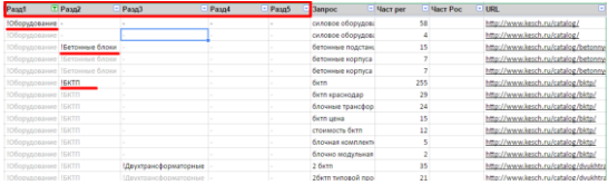
This is easy and looks something like this:

In this case, we can use standard filtering and sorting. Each row individually contains all the necessary data for its identification. In the highlighted line, it is clear that the query “bktp” refers to the “BKTP” group, which, in turn, refers to the “Equipment” section. The request has a frequency of 255.
Visibility of the overall structure of the site.
For this, we built a pivot table based on the source data. Below is a small piece of it.

At the agency, we constantly work with the card, so we quickly realized that this option is not an option. And here's why:
You need to store a lot of different data in one document, but they all refer to two different entities. For example, the frequency refers to each request separately, but the page url refers to a group of requests. And so that everything is correct in the table, it is necessary for all requests related to one page to specify the same url. For the copywriter and the project manager, a map in the context of the site pages is important, and for the SEO optimizer, keywords are more important. In short, a mismatch.

It turns out such a hell.
Torn between the presentation of the data “one line - one request” or “one line - one page”, we found a solution that was simply amazing in our opinion. By combining two levels of abstraction in one table using scripts, we made our relevance map two-faced, so to speak. There are two options for presenting the map, I will describe each of them in detail, so that it is clear how this is done and why.
The first view is “One row - one query” . If we work at the query level, then our map looks like this:
This is the “One line, one request” view. All information is indicated for each specific request. We can sort filter them, do whatever we want.
There are a number of chips that make it insanely convenient:
In general, we filter everything along and across. We add new query characteristics, such as frequency, title, description, and in general everything you need to know in the context of the request.
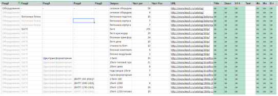
The “One line - one page”
view I repeat that the previous view is great for working with queries, but as soon as we need to add the data related to the page, there is a nuisance. And then the idea of “One line - one page” comes to the rescue. We write a small script, select the “Group” item in the Google tables menu.
The script iterates over the rows in our table and groups all the data for each url. It turns out the following form:
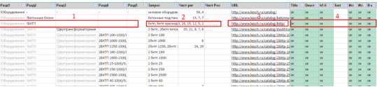
In this form, the data is indicated for each URL, that is, for each page.
Here:
Partition data (number 1) - grouped
Query data (number 2) - combined in a single field, separated by a comma
URL page address (number 3) - grouped Page
data (number 4) - grouped
Here's what you need from a map view pages:
Thus, in one file, all participants in the process see what has been done and planned.
If we needed to return to the “One line - one query” view, but we click “Ungroup” and return to the previous view:
What did we get as a result?
We have a multi-level relevance map that:
How do you work with semantics? Everyone has their own methods - let's share.
In the article, we will share our vision of this tool and development experience.
What does the relevance map say on the Internet?
Little has been written about this tool, one of the most complete definitions can be found on the website of the Texterra agency:
“The relevance map is a .excel file created by our promotion department specialists before starting promotion work. The relevance map is, in fact, the semantic core, stretched over the site structure. In addition, the relevance map contains information about:
Relink, i.e. internal links from the donor page to the acceptor page (links that already exist and which will only be put in the course of work in the future are reflected)
Relevance of elements such as H1, Title, Description. ” (Tekterra)
Here's what they look like:
Why do we need a relevance card?
In the same source we read:
“Our seo-optimizers and copywriters constantly refer to this document when working. Thanks to it, there is no confusion or accidental errors, no sections appear relevant to one or another key, which should be present on completely different pages. For example, there is no relevant page yet, but it is already displayed in the plan, and we know that on another page it is impossible to “pump up” text relevance for keys that are “booked” by another, not yet existing page. ” (Texterra)
Everything that is said is true, but we look at the example of the map in the screenshot and do not understand at all how to work with this tool systematically:
- How to use multiple employees? If it is Excel, then for synchronization of changes it is necessary to enter a separate position of “Synchronizer”.
- How to sort and filter? The structure of the document itself does not involve filtering, but this is very important when working with an array of data.
- How to understand what semantics belong to which section of the site?
- How to highlight priority pages for work?
In general, there are more questions than answers. The article is probably out of date, or a simplified version is used as an example.
Our version of the relevance map.
First, we will determine what we need in this document:
1. Joint editing. Must be able to edit multiple employees.
2. Filtering. The map contains a lot of different data, which means without filtering and sorting anywhere.
3. Visibility of the overall structure of the site. This means that in the map it is clear which request refers to which section and subsection of the site.
4. Full information on semantics. Frequencies, pages on a site, meta tags, location according to sections of a site - it’s convenient to see all this in one place.
The first requirement is easily resolved using Google SpreadSheet. The magic tool for co-editing, does almost everything the same as Excel, but also online.
Matching the rest of the items is more difficult. To do this, you have to turn to the theory of relational databases :)
Working with filtering
In order to conveniently work with filtering (we repeat, without this it makes no sense to use tables! Write in a notebook - you won’t feel the difference) you need to have a table in normalized form, in this case “1 normal form. ”
“A table is in the first normal form (1NF) if and only if none of its rows contains more than one value in any of its fields and none of its key fields is empty.”
Simply put, a table should not have compound fields and empty important fields. In any row of the table, you should understand what the data reflected in it refers to.
This is easy and looks something like this:
In this case, we can use standard filtering and sorting. Each row individually contains all the necessary data for its identification. In the highlighted line, it is clear that the query “bktp” refers to the “BKTP” group, which, in turn, refers to the “Equipment” section. The request has a frequency of 255.
Visibility of the overall structure of the site.
For this, we built a pivot table based on the source data. Below is a small piece of it.
At the agency, we constantly work with the card, so we quickly realized that this option is not an option. And here's why:
You need to store a lot of different data in one document, but they all refer to two different entities. For example, the frequency refers to each request separately, but the page url refers to a group of requests. And so that everything is correct in the table, it is necessary for all requests related to one page to specify the same url. For the copywriter and the project manager, a map in the context of the site pages is important, and for the SEO optimizer, keywords are more important. In short, a mismatch.
It turns out such a hell.
Torn between the presentation of the data “one line - one request” or “one line - one page”, we found a solution that was simply amazing in our opinion. By combining two levels of abstraction in one table using scripts, we made our relevance map two-faced, so to speak. There are two options for presenting the map, I will describe each of them in detail, so that it is clear how this is done and why.
The first view is “One row - one query” . If we work at the query level, then our map looks like this:
This is the “One line, one request” view. All information is indicated for each specific request. We can sort filter them, do whatever we want.
There are a number of chips that make it insanely convenient:
- Up to 5 levels of sections / subsections are displayed (if required, more can be done);
- the screenshot below shows that in the first line the section name is visually highlighted, and subsequent similar names are darkened. Such selections are made automatically using banal conditional formatting and greatly simplify the perception of the site structure;
- You can filter so that requests from only one section or any subsection are displayed;
- It is possible to sort requests by frequency;
- We can easily copy the list of requests of interest and we don’t have to drag a bunch of disparate, unrelated lines. It is convenient, for example, to collect additional statistics in other services;
- You can see which page the query relates to. You can filter out queries related to only one page or to a group of pages.
In general, we filter everything along and across. We add new query characteristics, such as frequency, title, description, and in general everything you need to know in the context of the request.
The “One line - one page”
view I repeat that the previous view is great for working with queries, but as soon as we need to add the data related to the page, there is a nuisance. And then the idea of “One line - one page” comes to the rescue. We write a small script, select the “Group” item in the Google tables menu.
The script iterates over the rows in our table and groups all the data for each url. It turns out the following form:
In this form, the data is indicated for each URL, that is, for each page.
Here:
Partition data (number 1) - grouped
Query data (number 2) - combined in a single field, separated by a comma
URL page address (number 3) - grouped Page
data (number 4) - grouped
Here's what you need from a map view pages:
- You can copy pages in a list (for example, to check pages in the uniqueness check service);
- Note the fact that any work related to the page has been completed. Here you can add anything you like: “Check for uniqueness”, “Check for optimized text”, “Check for indexing pages”, etc. Do you check the texts according to the Zipf Law or pass through the Glavred service? Add a new field and record the fact of execution;
- The copywriter sees the required pages on which the content has not yet been written.

Thus, in one file, all participants in the process see what has been done and planned.
If we needed to return to the “One line - one query” view, but we click “Ungroup” and return to the previous view:
What did we get as a result?
We have a multi-level relevance map that:
- It is stored “in the cloud” and does not require additional synchronization;
- Allows you to conveniently work together;
- Allows you to visually see the entire structure of the site;
- Allows you to store information in the context of requests and at the same time work in the context of pages;
- Using scripts, you can change the presentation of data depending on the needs of each project participant;
- Using scripts, specify the data related to the page only once, and for each request of this page the data is duplicated automatically;
- Simplifies dialogue with a copywriter. In fact, the map is a ready-made statement of work for each page of the site;
- gives all participants in the process a vision of the overall picture of the project.
How do you work with semantics? Everyone has their own methods - let's share.