Centenary Holivar: creativity versus usability
- Transfer
"I am an artist, I see it so!"
“The Internet suffers from a lack of reasonable standardization.”
Connect to holivaru. And who are you for?
Recently, a controversial essay was published on Medium. Why do all websites look the same ? (aka "On the visual fatigue of the web"). Essay "haipanulo". As I write this, it received over 55,000 views, 27,000 views, 11,300 claps, and 60 comments. I was obviously nervous.
So - thanks for the feedback. Nice to start a lively debate. But it is difficult for me to address every comment individually. The feedback I received is varied, and the comments on Medium and Twitter are rather contradictory. Without going into details, most of the discussion comes down to the well-known “creativity versus usability” argument.
My essay is certainly full of controversial points. I criticize a particular pattern driven web trend that leaves very little chance for innovative and complex development approaches. I do not criticize usability at all. That would be absurd and a complete misinterpretation of my text.
The whole discussion of “creativity versus usability” has been going on for over 100 years. As I wrote earlier, it is deeply connected with technological developments and industrial revolutions. History has shown that we need both creativity and usability to make real progress in the world of design and technology. And in order to have a balanced relationship between creativity and usability, it seems to us that we have to discuss this topic again and again. In my essay, I wanted to balance my creativity.
In addition, I would like to touch on a few specific arguments from the discussion. I wrote the following section in response to the first comments. It still exists, and I think this is a good addition to the original essay. The answer is a bit difficult to find, so I will republish it here.
1) Templates should work for design.
Templates are part of the current web. A single polemical essay will not change that.
Patterns make sense. They allow you to quickly publish content and combine technical reliability with optimized workflows. They are very effective.
But I got the impression that now designers are striving to limit their creativity in order for the design to work on the template. And I firmly believe that it should be the other way around. Instead of asking how they meet the requirements of the template, developers and designers should ask themselves how they can create templates that meet the design requirements. This is one of the reasons why I believe that designers should be able to write code on their own. If you want to push the boundaries, you need to understand the limitations.
2) Form - Content
Let me quote myself:
One of the fundamental principles of design is the deep and meaningful connection between form and content; the form must reflect and shape the content.
In other words, you need specific design solutions for a specific design problem. A unified approach that is suitable for everything rarely gives satisfactory results. The hospital information system is clearly not the right place for experimental typography. And I would not ask David Carson to create books for primary schools.
But design is more than hospital typography and school books. There are many applications, especially in the field of culture, music and art, where visual design can do more than just provide readability. This is true for typography - and this is also true for the web.
3) Webpage as a paperback book
If we draw an analogy between the web and the world of books, we are in the paperback era of web pages.
A paperback is a small, inexpensive book for quick consumption. They stick to glue, use poor quality paper, have a poor quality image and often mediocre typography. But they work well for the mass market. They are very effective.
There is nothing wrong with the paperback. In many ways, they make sense, and there is even a series of really well-designed “soft covers.” But the claim that they should only be in paperback is completely stupid. There is a space, a market and a need for novels with good binding, travel photographic magazines, extravagant exhibition catalogs, abundant cooking books and so on.
No one requires all books to be paperbacked. But I got the impression that many people regard web pages as “soft cover” as cheap, pragmatic information machines. This position ignores the fact that the Internet is a huge cultural space and that even the most minimal and practical website is an artifact.
There are many different books, from pragmatic paperbacks to experimental art books. I would like to see this cultural and visual diversity on the Internet.
The text of the controversial article:
Why all sites look the same
(https://medium.com/s/story/on-the-visual-weariness-of-the-web-8af1c969ce73) TheInternet suffers from a lack of imagination, so I asked my students to redesign it.
Today's Internet is monotonous. Everything looks the same: the same fonts, not to mention the layouts, interchangeable pages and the lack of expressive visual language. Even microtypography is a mess.
Web design today seems to be subject to technical and ideological limitations, not creativity and ideas. Each page consists of containers in containers in containers; sometimes text, sometimes images. Nothing really done, it was just suggested by default.
Ironically, modern web technologies have tremendous possibilities for design. We have the opportunity to implement almost all conceivable ideas and layouts. We can create radical, amazing and evocative sites. We can combine experimental typography with generative images and interactive experiences.
And yet, even web sites for designers are based on containers in containers in containers.

The most popular portals for online ads - Dribbble and Behance - are so fundamentally boring that they are mostly interchangeable.
Why did this happen?
There are several reasons. Technology frameworks such as content management systems (CMS) and blogging platforms such as WordPress are based on templates. The web pages of these frameworks are not created individually, but are generated on the fly, combining various types of media, such as images, titles, main text and video. Templates are not designed designs. Rather, these are rules for combining related data types. In addition to the template, these platforms usually do not allow to affect the appearance of the page. What you see is what you have poured into the template.
In other words, patterns are agnostic. And that's the problem.
One of the fundamental principles of design is the deep and meaningful connection between form and content; the form must reflect and shape the content. Their separation violates this principle and creates shared content containers. In a design sense, patterns are meaningless; the form adds nothing to the content.
One of the fundamental principles of design is a deep and meaningful connection between form and content.
There are many other reasons for the lack of creativity in web design. Most of these reasons are economic and pragmatic. For example, creating individual pages takes a lot of time. Given the speed of news and new articles, large websites simply do not have the resources to develop a page from scratch. In addition, web design still depends on technical knowledge: HTML, JavaScript and CSS remain complex tools for designers. There is no web design equivalent to a direct and helpful workflow for desktop publishing applications.
I assume that creative and intellectual laziness of designers is also to blame. In the era of mobile-first, a common, framework-based development, no one probably worries about the visual and contextual integrity of a web page.
How can we solve this problem? What can an expressive and advanced website look like today?
Sometimes, if you want to create a future, you need to rediscover the past.
Retro Web Design
I developed my first website about 23 years ago in a research and development group at the University of the Arts in Bremen, Germany. At the time, the creation of web pages was a novelty. The internet was young. Pages fired my imagination.
In the mid-nineties, we struggled with the limitations of HTML. We could only use web safe fonts such as Arial, Times or Verdana. We had to use tabular layout, monospace fonts or GIF if we wanted to do something interesting. At first, HTML was completely content oriented, and we had to work against technology to create the page design.
At the same time, experimental typography exploded. From Jan Chchichold Die Neue Typographie in the twenties to computer models from April Greiman in the eighties, the designers challenged the status quo and tried to find a visual language that represented the ideas and revolutions of their epochs. By the mid-1990s, an unusual combination of technological and cultural advances made it possible to create a very radical generation of graphic design. You could see this in the work of Irma Boom, David Carson, Paula Sher, Neville Brody and many others.
However, compared to the visual explosion of the graphic design world, early webpages were still quite lame. ( Web Design Museum shows this very well.)
We wanted to do graphic design in the browser, but no one knew how - or what errors might happen. There was no idea how the web page should look like. There were no standards. There was no CMS (almost), no CSS, no JS, no video, no animation.
Now is a good time, more than ever, to challenge the visual monotony of the Internet.
Look at 2018, we can do everything in the browser. From massive layouts to micro-typography, animation and video. And what do we do with these incredible possibilities? Containers in containers in containers. Gigabytes of visually similar mobile pages contaminated with javascript. Common templates that follow the same visual rules. If my junior could see the state of web design in 23 years, he would be very disappointed.
The problem of web design is not the limitation of technology, but the limitation of our imagination. We have become too obedient to visual fit, economic viability and perceived expectations.
However, every crisis creates an opportunity. Now is a good time, more than ever, to challenge the visual monotony of the Internet. Alas, I am too old and too bourgeois to come up with a radical, experimental and modern approach to web design. But I can ask my students to do this.
In 2017, I conducted a web design course on interface design in Potsdam, Germany. Each team was asked to develop a redesign for an existing website. The task was very clear: to present the browser as a blank canvas and create expressive, imaginative visual impressions. Use the technological potential of modern web technologies as a tool for your creativity. Do not limit yourself to usability, readability and flexibility. Have your position. DisregardErwartungskonformität (approx. Translator “compliance with user expectations”).
I was very pleased with the result of the master class. (You can see all the results on this page .) Here are four projects that represent different approaches to solving a problem.
1. ZKM Frederick Haas and Jonas Kepfer
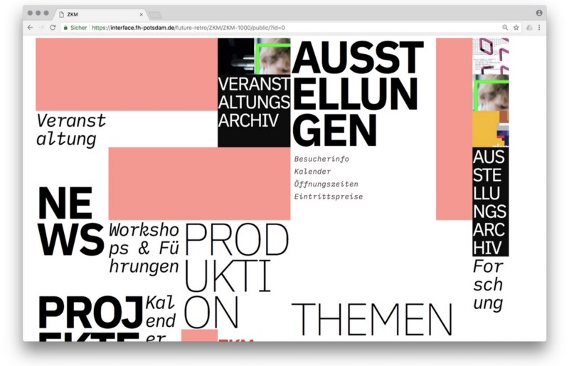
Frederick and Jonas chose the Zentrum für Kunst und Medien (ZKM) website as a starting point for their experiments and research. A very suitable choice, as ZKM is one of the most famous exhibition venues for media art in Germany, but the ZKM website is pretty standard. It is functional, but it lacks avant-garde approval, which is represented by artwork at exhibitions.
The goal of Frederick and Jonas was to develop the concept, visual language and technical setting of the ZKM website, which represent the progressive approach of the museum. Their concept is based on a generative design: every time a page loads, a new markup is created.
Browse through the ZKM redesign .
2. Streem Daria Tees, Bela Kurek and Lukas Vogel

Streem is a street magazine about street art and culture. This is a platform for future artists, and a platform for social issues. Streem includes illustration, painting, photography, design, writing and journalism. Daria, Bela and Lucas combined these various influences and based their projects on a conceptual urban structure. For their prototype, they created four different quarters, each of which is a section of the magazine. Their approach combines strong illustrative styles with spatial typography to create a legible city.
Browse the Streem redesign .
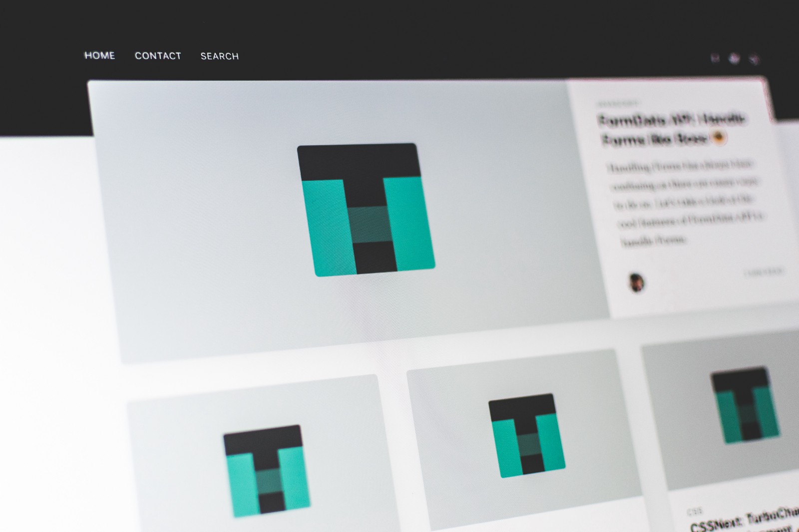
3. Medium Amelie Kirchmayer and Fabiana Schultz
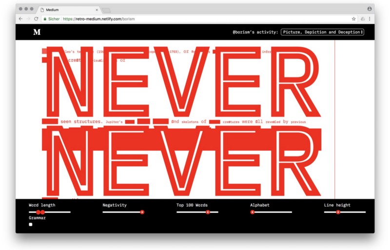
Amelie and Fabian followed a rather structural approach. Instead of finding an adequate form for a specific story, their goal was to disassemble a web page and break it down into semantic, syntactic and statistical properties. Their idea was to demonstrate the fluidity and inherent ductility of HTML. They have deconstructed publications and created an environment that allows readers to break long blocks of text in an experimental typographic space.
Browse through the Medium redesign .
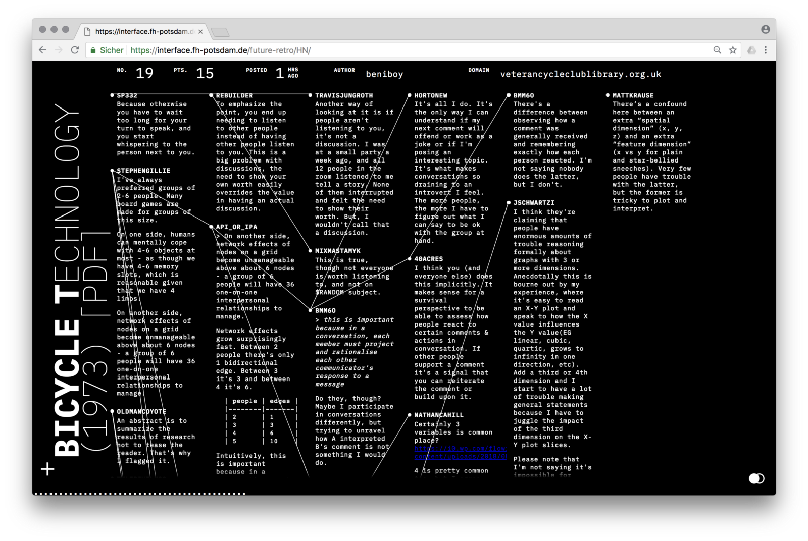
4. Hacker News by Fabian Dinklage and Florian Zia
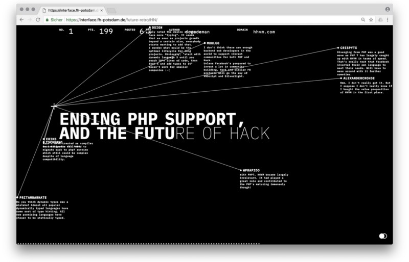
Fabian and Florian turned Hacker News into interactive visualization. A social networking site is a news aggregator focused on computer science and information technology. His design is bare bones, but he has complex functionality for polls and discussions. Fabian and Florian took the existing structure and turned it into a typographical space of time lines and networks. The visual presentation is based on the sequence and links of news and comments. They also linked their design with API Hacker News, so you can use it to read the site.
Browse the Hacker News redesign .
***
David Carson once said: “Do not confuse communication with clarity.”(don't confuse communication with legibility). We need to apply this advice to the current state of web design. Clarity, usability, responsiveness and, in particular, accessibility are important qualities of a modern Web. But they should not define and limit their visual repertoire. If you equate stereotypes with usability, you do not understand either visual design or human-centered design.
For example, I would like to see a more radical, productive, evocative, thoughtful, adequate, content-specific and intelligent web design. I would like to re-open the Internet as a space for experimentation. I would like to be surprised more often. I do not know what the Internet will look like in 23 years, but I hope that it will not look like today.
The translation was made with the support of the EDISON Software company, which is professionally engaged in web development and recently redesigned its website .
PS
I will give useful comments habrachiteli to last publication of controversial articleApparently I do not understand anything in design. I looked at the "redesigns" - and there is some kind of, sorry for the expressions, garbage. The design of WEB-sites is usually designed so that people interact with it daily. This is not an avant-garde picture that can be sold at an exorbitant price only for the fact that it is painted with the tail of an ass that was sitting in a cart that the artist himself
was carrying - vlreshet
The Internet suffers from a lack of reasonable standardization.
I, as a user, want to enter the site and not wade through the flow of designer’s “creativity”.
- eugene_bb
Che-t is not a redesign, but some kind of game. There were websites that did something under the motto "I am an artist, I see it that way."
As noted above vlreshet above, sites are created for the interaction of people, and not for the realization of the designer's fantasies. The site is a tool that should be convenient to use first of all, and the designer's imagination should be far from the first place (and in such a manifestation as in your “redesigns” it cannot even be given the last place).
The Internet suffers from a lack of imagination.
On the contrary, he suffers from an excess of fantasy. Already, some designers' fantasies translate into megabytes of fonts and images uploaded to the site.
For a splash of fantasy, these are promo sites that publish on awwwards with bundles: fantasy to the fullest, in places cool, very rarely useful, but in general its mass is pointless.
In the usual web for people of this fantasy is not the place
- Ashot
Why did they make Upyachka from Medium? Designers such designers ...
- berezuev
Why do all the books look the same? Oh yeah, they also need to read!
Why do all cars look the same? Oh yeah, they must ride!
In websites, the main thing is information. For its effective submission it is simply necessary to follow certain rules of ergonomics. These rules narrow the flight of designers' imagination and rightly so. Sites are similar to each other, but this is why the user quickly finds the navigation elements he needs and more or less conveniently perceives the content.
And the examples of the article rather show how NOT to make websites, because the visitor will not go beyond the main page. Well, find a banal link to contacts on any of these brilliant creations.
- Pran
Commentators - read the article more carefully. Designers are not so bad solved the task. Please note that the statement of the problem says: “Hammer on users, they still don't understand a damn thing” :).
Therefore, criticizing designs, arguing that the user is uncomfortable is nonsense. The statement of the problem clearly states that it is necessary to score the convenience of the user.
- newm
Only registered users can participate in the survey. Sign in , please.