Projecting Google Material Design onto a desktop system ... (Part Two)

Summary of the first part : contract client, redesign of their own CRM-ki, Google Material style, familiar habitat, audience - experienced IT specialists. Who is not inspired by the first part and the others too - I invite you to Cat.
By the way, if you use Figma , I recommend paying attention to our ready-made design systems . They help freelancers complete more orders per month, programmers are allowed to create beautiful applications on their own, and team leads “sprint” sprints faster using ready-made design systems for team work.
And if you have a serious project, our team is ready to deploy a design system within the organization based on our best practices and tailor it to specific tasks using Figma. Web / desktop, and any mobile. We are also familiar with React / React Native. Write to T: @kamushken
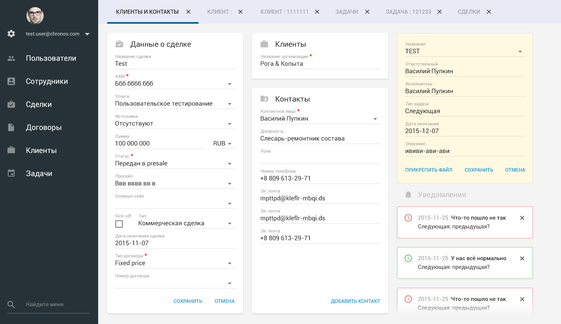
In general, as you recall, I rolled out to the client just such a picture as a completed task and began to wait for an answer.
First of all, I would like to thank the skeptics from the first chapter . I have been postponing the description of this project for two months. Now I have an additional motivation to continue: I have to not only argue my decisions, but also dispel your doubts.
The attentive reader certainly noticed some errors in the screenshot above. And that's great! Do not forget that this screen is only the result of a test task. This screen is not a whole system. This layout does not solve the user's problems or offers some kind of optimal scenario. This is just a “test”, which is served on the table to a potential client for verification. It is based on restoring one randomly selected screen of the old system. As a rule, at this stage it sometimes happens that the UI designer sets the value of some elements / blocks / sections based on their own guesses, and not the tasks of the client. This is acceptable and not critical. Further, as a rule, the designer, fueled by faith or hope, expects feedback from the client.
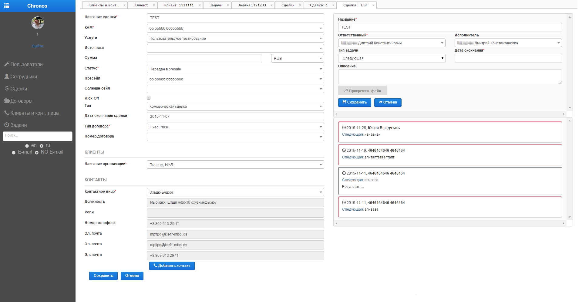
Let's now look at the original screenshot (the appearance of the system at that time). This section was chosen by me from 5 proposed as a test task:
What immediately struck me then: default bootstrap, an abundance of input forms, plug-and-play. By the way, later it turned out that the “Notifications” block was generally interpreted incorrectly on my test task. For the client in the system, these are actually the tasks associated with this task! Oops, I did design them in a completely different way ... Actually, at the stage of the test execution, this my misunderstanding did not bother anyone. Adequate client understands that this is not yet the stage of “proposing solutions”. This is only a “pre” stage of a possible future joint work called “show the approach”. Therefore, those who asked earlier why the “notifications” are hanging down below, I’ll calm ... There will be no notifications at all.
So, I will order observations:
The default bootstrap. This is what the client wants to get away from, because default cannot provide adjustments for personal needs. This is what the client usually says, “Now it’s implemented like this, we understand that it’s crooked, but I want it a little differently.”
The abundance of input forms. For those who, in the first chapter, considered that it was “very piled up”, I’ll say that the worst is yet to come. Yes, this is the specificity of the Chronos system: there are a lot of parameters that accompany each transaction. There is nothing to throw out. The task is not one of visually pleasing, because you can not resort to scrolling.
Vkladochnost.This is a system requirement. Since Performance Lab employees often have to conduct many transactions and clients at the same time, all of them should be available in a minimum number of clicks. Any tab can be closed, clicking on any section in the menu on the left generated a new one.
So, having cooperated with the analyst of the company, who, as it turned out, also preferred Android, we started. The analyst knew perfectly the requirements of users, their behavioral scenarios and their problems. It was a pleasure to interact with him. The interface designer should show tremendous curiosity and attention to users and the process moves more efficiently when the analyst already has a set of all the data about their behavior.
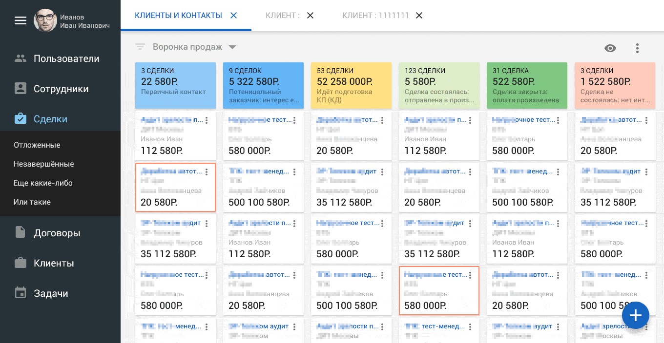
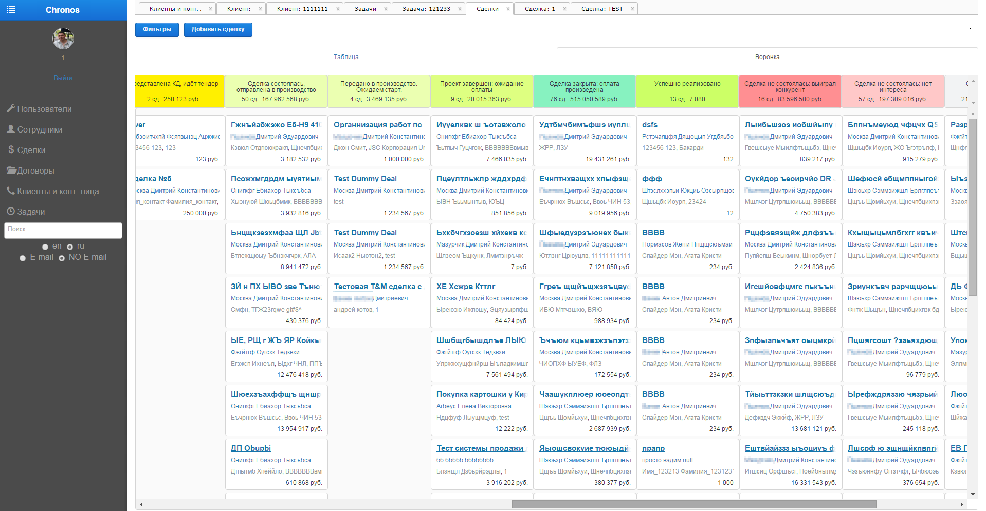
Deals
The “Transactions” section is a standard approach in the form of a sales funnel . For the company, there are about 10 stages of customer management. From “cold”, then to “getting warmer” and ultimately the most “heat” is a successful sale. The purpose of this section in CRM “Chronos” is to give an understanding of the number of transactions in each specific stage, present their cash volume, show the employees involved and, if necessary, highlight expired ones.
I started working according to all current trends: an abundance of indentation, fullness of air and no cramped space for elements:
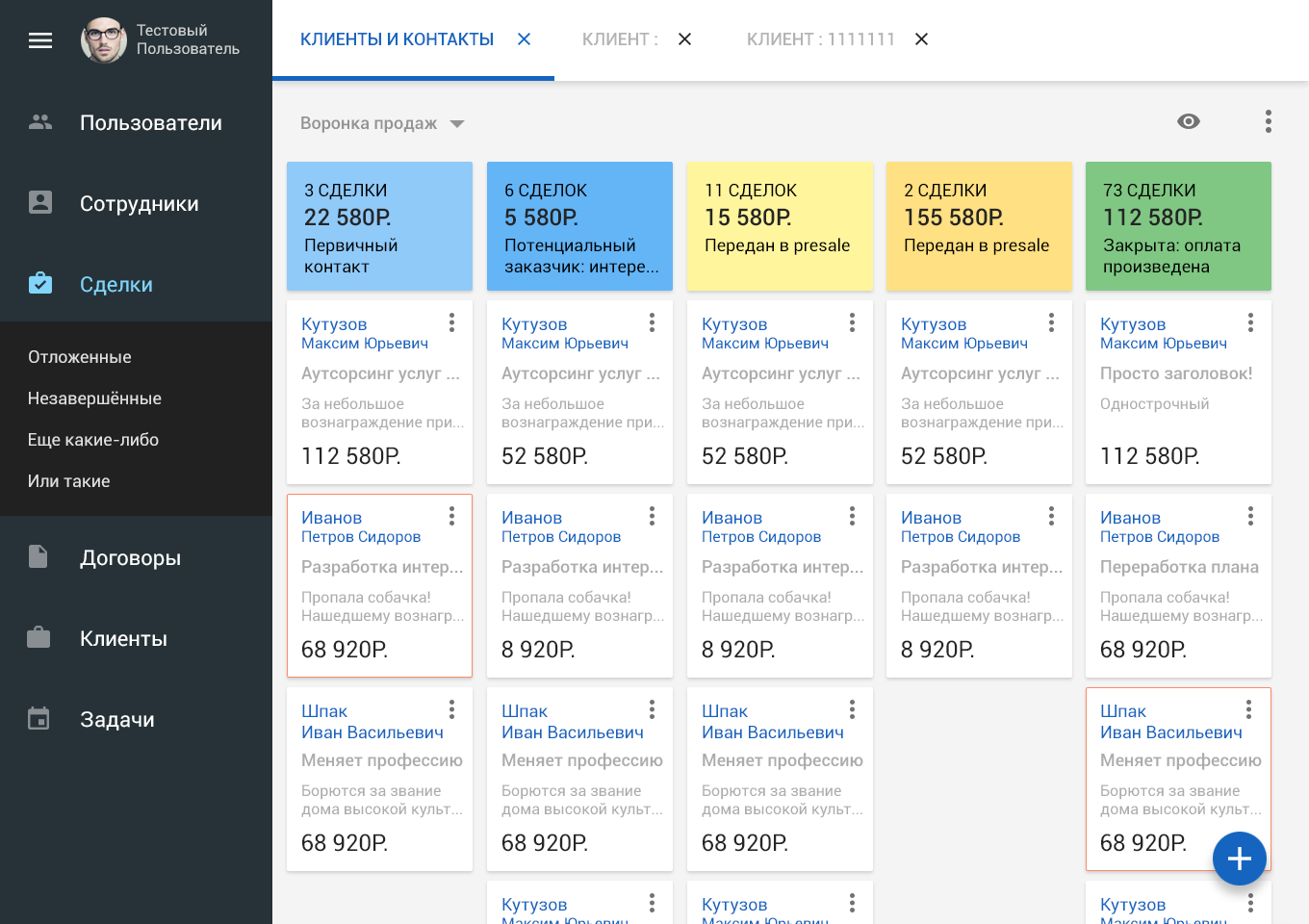
Along the way, I proposed a new color scheme for all stages of sales, based on the colors offered by Google Material rules (here’s a convenient resource for choosing colors according to these rules):
It

was

(from “cold” to selling, at the very end, unpleasant - red if the deal fell through, gray - if frozen)
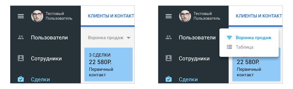
To display information on all deals in a tabular form, the following mode of view switching (by click) was offered:
Each transaction was presented in the form cards:
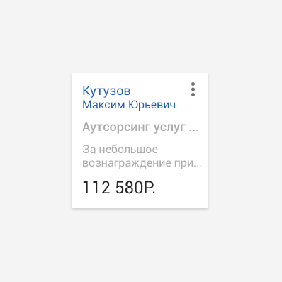
The sequence for submitting information for each transaction was as follows: first you need to focus on the amount of the transaction, the second most important person is responsible for it, and only then does the name and description of the transaction matter. Behind the vertical ellipsis icon you can hide any additional functionality (save, export, share, but you never need much more).
By clicking on the “eye” icon, we call up a popup with display parameters: you can display only certain stages of transactions, or display transactions only from certain people (customers, KAMs, presales):

Of course, we cannot but mention the renounced and dangling lonely floating button (because we follow Google’s guides, if you haven’t forgotten) in the lower right corner. It will come in handy for creating a new deal ...
First problems
According to the good old tradition, the client “forgot” some important information at the start. Namely ... “By the way, with us, 80% of system users run around the office with laptops! And all of them with a resolution of 1366x768. And let's “gash” all the layouts into this screen size. ” Lolstooo ?! When the resolution of 1300 was running, the world knew neither material design, nor solid indentation, nor the concept of “airiness” in the interfaces.
The task was set to put 6 stages of transactions into this permission at all costs. Yes, press all the elements so that for each stage 4 cards are visible. Well well! It turns out that firstly: I have to cut the layout in height to a realistic laptop height of 768, and secondly: introduce the fourth row of cards ... Farewell to “fullness of airiness”. But these are the requirements for the functionality of the system. The analyst knows what he is saying, and I have to act in the restrictions that have appeared.
First decisions
I was reassured that if a version for mobile devices is planned, then there will be an individual approach to it. It is said - done: The
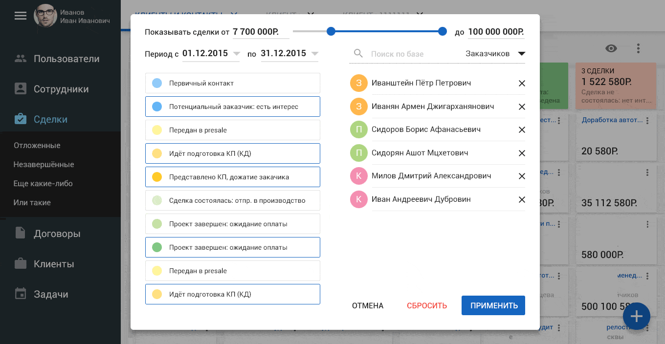
good news was that the left menu can be minimized, then a wider picture appears:
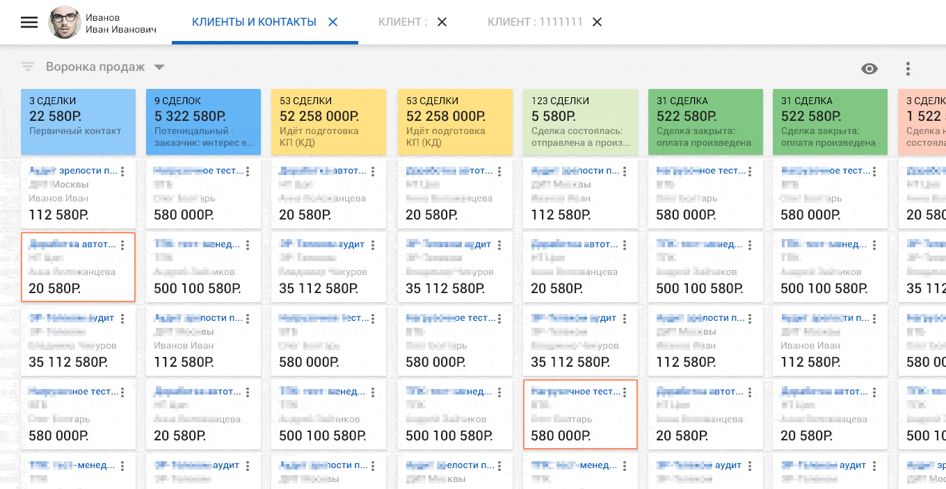
The display parameters section also had to be squeezed and supplemented. Because “Suddenly” it turned out that there would be scenarios when you want to filter and display transactions for a certain period and are in a certain monetary range:
(for a visual example, people were also filtered: two customers, two presales, two KAMs)
Probably it will not be superfluous to show how it all began ... Of course this screenshot is made by the client with a width of 1920 pixels of the screen, so it is able to display more information:
BIn the next issue, I talked about the tabular view and interaction with forms inside the CRM “Chronos” ...