A few thoughts on comparing statistics
- Tutorial
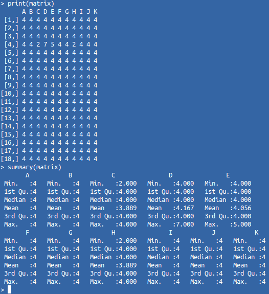
Comparing a certain entity with known objects is one of the most obvious classification methods. The more the object resembles the representatives of a set known to us, the higher the probability that it belongs to this set. For comparison, we need specific metrics (numbers suitable for mathematical processing). But as you know, to visually analyze such matrices is not very convenient.
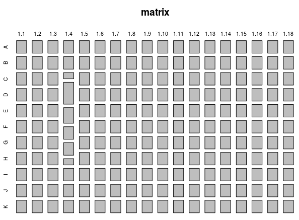
For convenient perception, it is necessary to display this data in graphical form. The first thing you can try is a “mosaic”. The size of its blocks will reflect the value of the corresponding metric of the object. Since our matrix consists of identical objects, a “strange” object should stand out from the general background. However, the difference in its metrics is not so strong, therefore, the size of the "strange" blocks will not radically stand out. This can best be understood from the following example (the matrix and its display in the form of a “mosaic”):
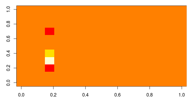
It is well known that a person can very quickly find an object that differs in color against a uniform background. Therefore, if we display this matrix on the heat map, then similar elements form a single background, and different elements will contrast well with a homogeneous majority.
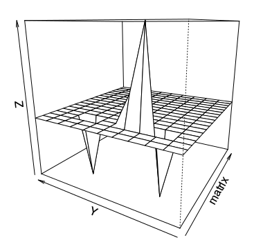
Naturally, a person very well recognizes not only colors, but also the shape of objects. If you display the matrix in the form of a three-dimensional perspective, then any deviations from the total mass of typical objects will be quite clearly visible.
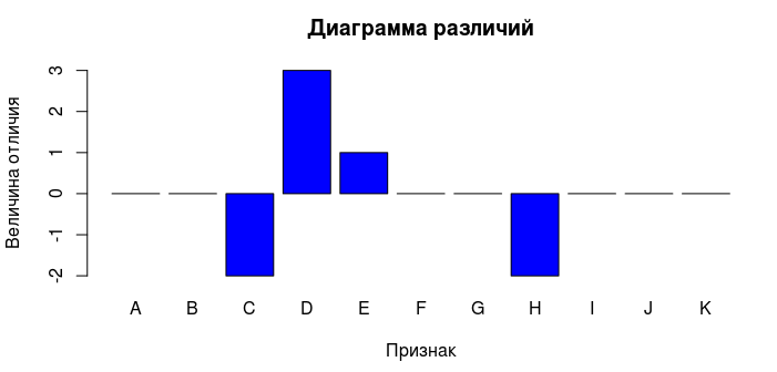
Knowing the signs of different objects, you can form a subset that consists only of "strange" objects. Next, you can display a diagram of the difference between an object from a subset and a typical set object.
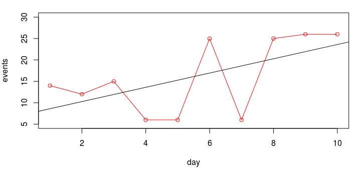
Of course, it would be logical to study in more detail the behavior of the indicators of interest. As you know, a linear correlation coefficient does not always help to find the dependence of variables, however, we can build a graph for the desired period of time. Visually assessing the correlation will be much easier. But we will not just build a graph, but try to perform an elementary linear regression analysis. Consider a small example. There is a hypothesis that an increase in one indicator leads to an increase in the value of a variable dependent on it. Let's try to display this in graphical form:
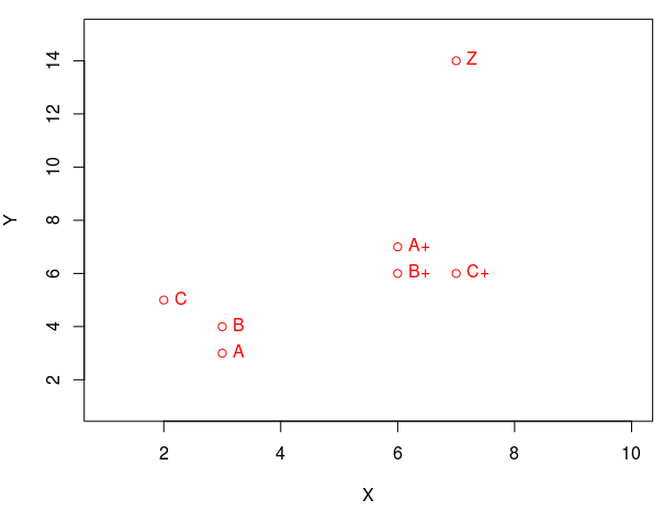
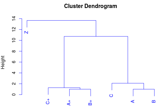
There are situations when we can find similarities by points in space. If you display two signs in the form of coordinates (by abscissa and ordinate), you will notice that some points are collected in groups (form clusters). We see that the points (A, B, C) are gathered in one group, and the points (A +, B +, C +) in another group. And I’ll add a point Z, which should not fall into any of the clusters. This is such a "lone wolf." Hierarchical cluster analysis will help us more clearly display the similarities. Compare the display of points on the graph and on the dendrogram:
This is a fairly universal approach, which is often used in visual assessment of relatively small amounts of data. Many mathematical systems already contain the implementation of the previously mentioned methods, for example, in the well-known programming language R, the solution of such problems may look like this:
For convenient perception, it is necessary to display this data in graphical form. The first thing you can try is a “mosaic”. The size of its blocks will reflect the value of the corresponding metric of the object. Since our matrix consists of identical objects, a “strange” object should stand out from the general background. However, the difference in its metrics is not so strong, therefore, the size of the "strange" blocks will not radically stand out. This can best be understood from the following example (the matrix and its display in the form of a “mosaic”):
It is well known that a person can very quickly find an object that differs in color against a uniform background. Therefore, if we display this matrix on the heat map, then similar elements form a single background, and different elements will contrast well with a homogeneous majority.
Naturally, a person very well recognizes not only colors, but also the shape of objects. If you display the matrix in the form of a three-dimensional perspective, then any deviations from the total mass of typical objects will be quite clearly visible.
Knowing the signs of different objects, you can form a subset that consists only of "strange" objects. Next, you can display a diagram of the difference between an object from a subset and a typical set object.
Of course, it would be logical to study in more detail the behavior of the indicators of interest. As you know, a linear correlation coefficient does not always help to find the dependence of variables, however, we can build a graph for the desired period of time. Visually assessing the correlation will be much easier. But we will not just build a graph, but try to perform an elementary linear regression analysis. Consider a small example. There is a hypothesis that an increase in one indicator leads to an increase in the value of a variable dependent on it. Let's try to display this in graphical form:
There are situations when we can find similarities by points in space. If you display two signs in the form of coordinates (by abscissa and ordinate), you will notice that some points are collected in groups (form clusters). We see that the points (A, B, C) are gathered in one group, and the points (A +, B +, C +) in another group. And I’ll add a point Z, which should not fall into any of the clusters. This is such a "lone wolf." Hierarchical cluster analysis will help us more clearly display the similarities. Compare the display of points on the graph and on the dendrogram:
This is a fairly universal approach, which is often used in visual assessment of relatively small amounts of data. Many mathematical systems already contain the implementation of the previously mentioned methods, for example, in the well-known programming language R, the solution of such problems may look like this:
# Получение данных из файла
matrix <- as.matrix(read.csv(path), ncol=11, byrow = TRUE)
print(matrix)
summary(matrix)
# Визуальная оценка данных
mosaicplot(matrix)
image(matrix)
persp(matrix, phi = 15, theta = 300)
# Формируем подмножество по заданным условиям
dataset <- subset(matrix, matrix[,"A"] == 4 & matrix[,"C"] < 4 & matrix[,"D"] > 4)
print(dataset)
# Находим и отображаем разницу двух векторов
a <- as.vector(dataset[1,], mode='numeric')
b <- as.vector(matrix[1,], mode='numeric')
diff <- a - b
barplot(diff, names.arg = colnames(matrix), xlab = "Признак", ylab = "Величина отличия",
col = "blue", main = "Диаграмма различий", border = "black")
# Пытаемся найти корреляцию
day <- c(1:10)
events <- c(14, 12, 15, 6, 6, 25, 6, 25, 26, 26)
cor.test(day, events)
plot(day, events, type = "o", ylim=c(5, 30), col = "red")
abline(lm(events ~ day))
# Простой пример кластерного анализа
matrix <- matrix(c(3, 3, 2, 6, 6, 7, 7, 3, 4, 5, 7, 6, 6, 14),  nrow=7,  ncol=2)
dimnames(matrix) <- list(c("A", "B", "C", "A+", "B+", "C+", "Z"), c("X", "Y"))
plot(matrix, col = "red", ylim=c(1, 15), xlim=c(1, 10))
text(matrix, row.names(matrix), cex=1, pos=4, col="red")
plot(hclust(dist(matrix, method = "euclidean"), method="ward"), col = "blue")