100 ideas for A / B testing. Part one
A / B testing is one of the most effective ways to increase conversion on a site. If you're a beginner, coming up with an idea for an experiment isn't easy. But we decided to help and made a list of 100 ideas. Proceed to study, friends.

I want to warn right away that proper A / B testing is a very complex process. The whole difficulty is not to start the experiment. This is the simplest. The whole difficulty lies in the formulation of the hypothesis, in the search for ideas for testing.
If you follow the rules that experts advocate, to find a potentially successful idea for A / B testing, you will have to use web analytics, analyze user behavior, communicate with the target audience, and conduct surveys. And these rules are absolutely logical. They must be observed. But if you have a small company, a small team, there are no necessary specialists, it is very difficult to do all of the above.
For this case, a list of 100 ideas was compiled. 51 ideas in the first part of the article. 49 - in the second. Study, adopt and test the most relevant ideas on your site.
Call to action (CTA-button / Call-to-Action button) - an element that is present on almost any site. It is one of the most important in the sales funnel: they click on it to go from one stage to another. Therefore, the call to action button is one of the most popular objects for A / B testing. In addition, testing this element often gives the most significant results.
1. Change the text of the call to action. Instead of “Order Now”, try “Buy Now”, instead of “Register” - “Become a Project Participant”, and instead of “Download” - “Get Free”. At the same time, note that the button text must correspond to the result that the user will receive after clicking.
Related article - Increasing Conversion by Changing the Text of a CTA Button
2. Change the placement of the CTA button. Place it next to the customer benefit block or next to customer reviews. If now the button is located at the bottom of the page, place it on the first screen (the screen that is visible immediately when you get to the site), because many users do not scroll down the page and never see this button. You can analyze this if you use the scrolling map in Yandex.Metrica.
3. Add navigation tips that direct the user's gaze to the call to action. It can be just arrows pointing at the CTA-button, or arrows with explanatory text.
4. Place several CTA buttons throughout the page instead of one . This is especially true in the case of long landing pages. The presence of several buttons, in theory, should be more effective.
5. Use a simple text link instead of a button. As practice shows, in some cases it works more efficiently. Why? I personally do not understand. But real cases confirm this fact. If you decide to run such an experiment, make sure that the link is visible to visitors and encourages them to click on it.
6. Add an icon to the text of the CTA button. A good icon can attract additional attention from the visitor. In addition, it can carry a certain semantic load. For example, it’s quite logical to add a letter icon to the “Send Email” button.
7. Apply a hover effect to the CTA button to make it more attractive and interactive.
8. Change the color of the CTA-button so that it stands out from other objects and attracts the attention of visitors . Your site should have a visual hierarchy, i.e. the most important elements should be most visible. And what could be more important than the call to action button ?!
Related article - Which color has the best effect on conversion rate
9. Increase the call to action button. Perhaps increasing / decreasing the size of the button will distinguish it from other elements of the site and increase clickability. It is worth noting that there were cases when increasing the size of the button negatively affected the conversion rate.
10. Change the colors of the text on the CTA button.Very often on the sites you can see buttons where the text is almost impossible to read. As a result, users do not understand what will happen if you click on it. If this is your situation, feel free to test.
11. Add a time limit or some bonus to the CTA button. For example, “Buy now with a 20% discount” or add a note to the “Register for an event” button - “there are only 20 seats left”. Everyone knows that having a restriction encourages users to take action.
12. Add explanatory text to the CTA-button (text about what the user will receive / see if he clicks on the button). This idea is relevant if the button text itself cannot convey the essence of further action.
13. If one of the CTA buttons on your site is “Buy Now”, then try adding another “Try it for Free” call to action. The fact is that a very small percentage of users are ready to make a purchase immediately, at the first contact, without having tried a product / service. That is why the addition of an alternative option can help increase the number of your users, some of which will later become paid customers.
14. Experiment with various forms of buttons: square, rectangular and others, which fit into the overall concept of the site.
On any site there is a huge amount of text content - headings, subheadings, product descriptions, listing customer benefits, product features, reviews and more. Using these elements, you convey to the client the most important information that affects subsequent decisions. That is why text elements can and should be tested.
Testing Ideas
15. Test the text of headings and subheadings. Use exactly the words that are familiar to your potential customers - speak their language. A typical example is if in Yandex Wordstat or Google Adwords potential customers most often search for a product using certain words, then these words should be used in their texts. Also try different heading styles - somewhere strict business style works better, and somewhere it is preferable to use creative and playful options.
16. Test the length of the headers: short versus long headers. If your site is full of long texts, users can simply ignore them. And, therefore, you do not convey the meaning of your unique offer for them. In this case, short texts may be more effective.
17. Compare the performance of the page with only the title and the page with the title + subtitle. The title and subtitle are among the first elements that visitors pay attention to. And in this case, the subtitle plays the role of an additional source of important information about your product. So why not take this opportunity?
18. Break down long descriptions of goods and services into lists with short and clear paragraphs . Bulleted and numbered lists are much better perceived than listings in a single paragraph.
19. Test texts with a positive / negative connotation, interrogative / affirmative, passive / active.For example, the active headline "Create a page for your business" is much more effective than the passive "Business is developing faster on the Internet." Or the text “Chances of survival in the first month after surgery - 90%” is subconsciously perceived much better than “Mortality after surgery is 10% in the first month."
20. Change the color and font of the text to make it more readable for visitors. This is especially true for online media and other projects where text content plays an important part. The success of such an experiment can be tracked by the average duration of the session on the site.
21. Experiment with product / service descriptions.For products that potential customers already understand, long descriptions are not needed. And for complex technological products, the opposite is true - the user needs to explain why he needs to buy this particular product. Joseph Shugerman, one of the most famous copywriters, said: “The more unusual the product you sell, the more text you need to link it with the needs of potential customers, and the more attention should be paid to creating suitable conditions for making a purchase and explaining new ones, unfamiliar product qualities. " And another quote: "The higher the price, the more text you need to justify it or create a need for such an expensive product."
22. Test various customer reviews.For example, if you have some super-positive reviews about you on the landing page, then a potential customer might think that they are fake. So try different options. The real reviews, the better. Moreover, the text of the reviews should correspond to the language spoken by the potential client. In this case, he will feel a subconscious predisposition to your company and the proposed product.
23. Add “magic” words to headings, subheadings, or other text elements that increase conversion. For example: free, new, fast, easy, terrific, rush and so on.
Related Article - Making an Attractive Headline
24. Add a text block to the landing page with answers to the most common and exciting questions of potential customers. The answers to these questions will help dispel doubt in the mind of the buyer and will affect the number of transitions to the next stage of the sales funnel.
Visual content (images, video, audio) is another way of providing information to potential customers. Some people perceive text materials better, while others, the so-called visuals, process visual information much easier. Therefore, A / B experiments with video, audio and photographs take place. Moreover, no less tests are conducted with them than with CTA buttons and text elements.
25. Test which is more effective: image of satisfied customer / image of product / image of customer with product. In one case, it will be more efficient to place a photo of a smiling customer, in another - an image where your product is used.
Related article - How to increase site conversion using images: 6 ways
26. Experiment with photos of people. For example, in one case you can use a photo of a man, in another - women. In the first version, there can be one person in the photo, in the second - several. Also try using photos of people of different ages. For example, if the target audience of your product is young people, then it is logical that the photograph should be a person of the same age.
27. Test two types of images with people: in the first version, the person looks directly at the client, and in the second, his gaze is directed to the call to action button, video clip or a detailed description of the product. As practice shows, if a person’s gaze is directed to some place in the image, then the visitor also subconsciously looks there. This is also confirmed by experiments using the Eye-tracking system.
28. Replace the usual image with a slider that allows you to see the goods from all sides. Very scrupulous customers love little things that sometimes can not be conveyed in one image. As the practice of foreign online stores shows, such experiments can affect the increase in conversion and sales.
29. Provide an opportunity to enlarge images. This applies to online stores, where sometimes it is impossible to see the goods close. This idea of the experiment overlaps with the previous one. Their main goal is to give more information to a potential client. More good information - more likely to complete the target action.
30. If you use an image found on the Internet - try replacing it with a real high-quality photo that either shows your product or reflects the essence of your business . Sometimes the websites do not use the best quality photographs, as a result of which the conversion suffers.
31. Replace the static photo with a slider and vice versa.Now many people think that a slider is not the best option for a landing page. Firstly, it does not give the user control over the page. Secondly, the user can see only one slide and skip some important information. If you have clearly decided to use the slider, make sure that it is easy for a potential client to turn over the slides.
32. Experiment with image sizes . For example, many online stores sin too small images of their products. As a result, it is difficult for potential customers to make decisions due to the lack of high-quality visual information.
33. Add a video about your product / service to the landing page instead of text descriptions. A well-made video can tell about you much better than the lyrics. At the same time, remember: it is desirable that it lasts no more than 90 seconds. Visitors do not like long videos. The shorter and more concise the better.
34. Activate the automatic launch of the video instead of the manual one and see how it will affect the conversion , the bounce rate and the average length of time spent on your site.
35. Test videos with various participants (male / female), voices, scenarios, duration. The choice of option largely depends on the product. Selling serious technological equipment, it’s better to show a serious uncle in glasses, an expert, so to speak, on video. Selling cosmetics, all sorts of female things - it’s logical to use a beautiful woman in the video.
36. Experiment with different types of videos: animated versus ordinary. For B2B products, when you sell to serious companies, it is advisable to use ordinary videos, where the essence of the product is shown in a business style. If you work in the B2C market, then the animation clip can be more effective and viral.
37. Add videos with reviews of your customers. Most sites use text reviews, so a video review is a great way to stand out from other sites, as well as convey compelling information from a real person.
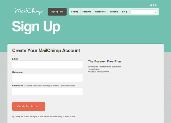
Making a payment, subscribing to news, registering on the site - all these actions are carried out by filling out forms. Form is a key element of the site. And it is precisely when filling out forms that a large number of potential customers “fall off”. And this means that you need to work on them, trying to increase the number of people who begin to fill out the form and finish the job.
By the way, before A / B testing, I advise you to analyze how users fill them. To do this, you can use the free Analytics Forms service, which is available in Yandex Metric. Thanks to this information, you will understand at what stage potential customers have questions and difficulties.
38. If your form has many fields to fill out, shorten it. Remove unnecessary fields and test how conversion will increase. For example, if you only need his name and phone to communicate with a client, then you should not ask him for a link to the site, his home address, or his mother’s maiden name.
39. If you have a long form and nothing can be removed, then try to break it into several stages. Let the user only need to write the last name and first name at the first stage, contact details at the next stage, and only then enter the payment card data. Successful cases are direct evidence that this idea for A / B testing can bring a positive result.
40. Add a description to each field.Perhaps visitors do not fill out the form completely, as they simply do not understand what exactly needs to be written there and how to do it correctly.
41. Offer potential customers a bonus if they fill out the form until the end (special offer, discount, opportunity to participate in the draw). Today, all people are very lazy. And you need to be very convincing to get them to perform this or that action. Therefore, a bonus is a great incentive. Every second site offers a unique e-book when signing up or a discount coupon. This is by no means done for nothing.
42. If your goal is to collect the e-mail addresses of users, then experiment with the addition of a small note that you will by no means send spam to the specified email address.In some cases, this helps increase the visitor’s conversion to the subscriber.
43. Test the size of both the form itself and each field in it. If your form is too small and unattractive, then in the test version, increase it and see how this will affect the conversion. Large fields are perceived more "friendly."
44. Try using auto-complete fields. For example, you can automatically track a person’s geographic location, time zone, national currency, etc. Therefore, do not ask him to fill out all this information. Make this process automatic and you'll see how much better usability will be.
45. If your landing page provides only one form, then place two - at the beginning and at the end of the page.Here the situation is the same as with the STA buttons. Someone will want to fill out a form at the top of the page. And someone will look through the page to the end and want to fill it in there. Therefore, give potential customers the opportunity to do this.
46. Add security icons to the product payment form right next to the “Confirm” button. As practice shows, for many, the presence of such elements is very important. This increases the trust in you from potential customers.
47. If you have a large online store and visitors use the search form, then place it in a prominent place so that they do not have to search for it. You can also experiment with the color and size of this shape.
48. As a rule, in each search form, a sentence or word is initially entered.And this can also be an object for testing. For example, you can enter there initially the most popular product of your online store. Or vice versa, write in the product that you want to sell faster. Then the first thing the visitor sees is the name of this product and subconsciously you can already influence further actions.
49. If the form is placed on the page where the visitor first interacts with the site, then a great idea for A / B testing is to replace the form with a call to action button. If the form to fill out is the first thing the user sees on the site, then this may scare him away. It might be more efficient to place a CTA button that will open this form as a new window or redirect it to another page.
50. Place a fixed subscription form in the sidebar. This idea for testing is perfect for online publications, blogs and other projects whose main goal is to collect a subscriber base. No one knows when exactly the visitor wants to leave his address. Give him the opportunity to do this at any time.
51. Experiment with the placement of the form: top, left, right, middle, bottom. For example, if you place a form at the top of the page next to the title, subtitle and photo of the product, this can be completely ineffective. Why? The problem is that at this stage, people are not ready to enter their personal data. But the placement of the form after the reviews and the list of benefits for the client is a more rational option, which will increase the conversion rate.
So 51 ideas are in front of you. Think about which one is best for your site, which one is the easiest to implement and run an experiment. And test it. Do not brake. Every missed day is probably a lost profit.
PS If you have experience using other ideas for A / B testing, tell us about it in the comments. I am sure that it will be useful to everyone. And you have a plus for karma and a lot of likes for a useful comment.
The second part in a week!
Do you like the article? Do a good deed - share it with your friends and colleagues!
I want to warn right away that proper A / B testing is a very complex process. The whole difficulty is not to start the experiment. This is the simplest. The whole difficulty lies in the formulation of the hypothesis, in the search for ideas for testing.
If you follow the rules that experts advocate, to find a potentially successful idea for A / B testing, you will have to use web analytics, analyze user behavior, communicate with the target audience, and conduct surveys. And these rules are absolutely logical. They must be observed. But if you have a small company, a small team, there are no necessary specialists, it is very difficult to do all of the above.
For this case, a list of 100 ideas was compiled. 51 ideas in the first part of the article. 49 - in the second. Study, adopt and test the most relevant ideas on your site.
A / B Call to Action Testing
Call to action (CTA-button / Call-to-Action button) - an element that is present on almost any site. It is one of the most important in the sales funnel: they click on it to go from one stage to another. Therefore, the call to action button is one of the most popular objects for A / B testing. In addition, testing this element often gives the most significant results.
Ideas for A / B Testing
1. Change the text of the call to action. Instead of “Order Now”, try “Buy Now”, instead of “Register” - “Become a Project Participant”, and instead of “Download” - “Get Free”. At the same time, note that the button text must correspond to the result that the user will receive after clicking.
Related article - Increasing Conversion by Changing the Text of a CTA Button
2. Change the placement of the CTA button. Place it next to the customer benefit block or next to customer reviews. If now the button is located at the bottom of the page, place it on the first screen (the screen that is visible immediately when you get to the site), because many users do not scroll down the page and never see this button. You can analyze this if you use the scrolling map in Yandex.Metrica.
3. Add navigation tips that direct the user's gaze to the call to action. It can be just arrows pointing at the CTA-button, or arrows with explanatory text.
4. Place several CTA buttons throughout the page instead of one . This is especially true in the case of long landing pages. The presence of several buttons, in theory, should be more effective.
5. Use a simple text link instead of a button. As practice shows, in some cases it works more efficiently. Why? I personally do not understand. But real cases confirm this fact. If you decide to run such an experiment, make sure that the link is visible to visitors and encourages them to click on it.
6. Add an icon to the text of the CTA button. A good icon can attract additional attention from the visitor. In addition, it can carry a certain semantic load. For example, it’s quite logical to add a letter icon to the “Send Email” button.
7. Apply a hover effect to the CTA button to make it more attractive and interactive.
8. Change the color of the CTA-button so that it stands out from other objects and attracts the attention of visitors . Your site should have a visual hierarchy, i.e. the most important elements should be most visible. And what could be more important than the call to action button ?!
Related article - Which color has the best effect on conversion rate
9. Increase the call to action button. Perhaps increasing / decreasing the size of the button will distinguish it from other elements of the site and increase clickability. It is worth noting that there were cases when increasing the size of the button negatively affected the conversion rate.
10. Change the colors of the text on the CTA button.Very often on the sites you can see buttons where the text is almost impossible to read. As a result, users do not understand what will happen if you click on it. If this is your situation, feel free to test.
11. Add a time limit or some bonus to the CTA button. For example, “Buy now with a 20% discount” or add a note to the “Register for an event” button - “there are only 20 seats left”. Everyone knows that having a restriction encourages users to take action.
12. Add explanatory text to the CTA-button (text about what the user will receive / see if he clicks on the button). This idea is relevant if the button text itself cannot convey the essence of further action.
13. If one of the CTA buttons on your site is “Buy Now”, then try adding another “Try it for Free” call to action. The fact is that a very small percentage of users are ready to make a purchase immediately, at the first contact, without having tried a product / service. That is why the addition of an alternative option can help increase the number of your users, some of which will later become paid customers.
14. Experiment with various forms of buttons: square, rectangular and others, which fit into the overall concept of the site.
A / B text element testing
On any site there is a huge amount of text content - headings, subheadings, product descriptions, listing customer benefits, product features, reviews and more. Using these elements, you convey to the client the most important information that affects subsequent decisions. That is why text elements can and should be tested.
Testing Ideas
15. Test the text of headings and subheadings. Use exactly the words that are familiar to your potential customers - speak their language. A typical example is if in Yandex Wordstat or Google Adwords potential customers most often search for a product using certain words, then these words should be used in their texts. Also try different heading styles - somewhere strict business style works better, and somewhere it is preferable to use creative and playful options.
16. Test the length of the headers: short versus long headers. If your site is full of long texts, users can simply ignore them. And, therefore, you do not convey the meaning of your unique offer for them. In this case, short texts may be more effective.
17. Compare the performance of the page with only the title and the page with the title + subtitle. The title and subtitle are among the first elements that visitors pay attention to. And in this case, the subtitle plays the role of an additional source of important information about your product. So why not take this opportunity?
18. Break down long descriptions of goods and services into lists with short and clear paragraphs . Bulleted and numbered lists are much better perceived than listings in a single paragraph.
19. Test texts with a positive / negative connotation, interrogative / affirmative, passive / active.For example, the active headline "Create a page for your business" is much more effective than the passive "Business is developing faster on the Internet." Or the text “Chances of survival in the first month after surgery - 90%” is subconsciously perceived much better than “Mortality after surgery is 10% in the first month."
20. Change the color and font of the text to make it more readable for visitors. This is especially true for online media and other projects where text content plays an important part. The success of such an experiment can be tracked by the average duration of the session on the site.
21. Experiment with product / service descriptions.For products that potential customers already understand, long descriptions are not needed. And for complex technological products, the opposite is true - the user needs to explain why he needs to buy this particular product. Joseph Shugerman, one of the most famous copywriters, said: “The more unusual the product you sell, the more text you need to link it with the needs of potential customers, and the more attention should be paid to creating suitable conditions for making a purchase and explaining new ones, unfamiliar product qualities. " And another quote: "The higher the price, the more text you need to justify it or create a need for such an expensive product."
22. Test various customer reviews.For example, if you have some super-positive reviews about you on the landing page, then a potential customer might think that they are fake. So try different options. The real reviews, the better. Moreover, the text of the reviews should correspond to the language spoken by the potential client. In this case, he will feel a subconscious predisposition to your company and the proposed product.
23. Add “magic” words to headings, subheadings, or other text elements that increase conversion. For example: free, new, fast, easy, terrific, rush and so on.
Related Article - Making an Attractive Headline
24. Add a text block to the landing page with answers to the most common and exciting questions of potential customers. The answers to these questions will help dispel doubt in the mind of the buyer and will affect the number of transitions to the next stage of the sales funnel.
A / B visual content testing
Visual content (images, video, audio) is another way of providing information to potential customers. Some people perceive text materials better, while others, the so-called visuals, process visual information much easier. Therefore, A / B experiments with video, audio and photographs take place. Moreover, no less tests are conducted with them than with CTA buttons and text elements.
Ideas for A / B Testing
25. Test which is more effective: image of satisfied customer / image of product / image of customer with product. In one case, it will be more efficient to place a photo of a smiling customer, in another - an image where your product is used.
Related article - How to increase site conversion using images: 6 ways
26. Experiment with photos of people. For example, in one case you can use a photo of a man, in another - women. In the first version, there can be one person in the photo, in the second - several. Also try using photos of people of different ages. For example, if the target audience of your product is young people, then it is logical that the photograph should be a person of the same age.
27. Test two types of images with people: in the first version, the person looks directly at the client, and in the second, his gaze is directed to the call to action button, video clip or a detailed description of the product. As practice shows, if a person’s gaze is directed to some place in the image, then the visitor also subconsciously looks there. This is also confirmed by experiments using the Eye-tracking system.
28. Replace the usual image with a slider that allows you to see the goods from all sides. Very scrupulous customers love little things that sometimes can not be conveyed in one image. As the practice of foreign online stores shows, such experiments can affect the increase in conversion and sales.
29. Provide an opportunity to enlarge images. This applies to online stores, where sometimes it is impossible to see the goods close. This idea of the experiment overlaps with the previous one. Their main goal is to give more information to a potential client. More good information - more likely to complete the target action.
30. If you use an image found on the Internet - try replacing it with a real high-quality photo that either shows your product or reflects the essence of your business . Sometimes the websites do not use the best quality photographs, as a result of which the conversion suffers.
31. Replace the static photo with a slider and vice versa.Now many people think that a slider is not the best option for a landing page. Firstly, it does not give the user control over the page. Secondly, the user can see only one slide and skip some important information. If you have clearly decided to use the slider, make sure that it is easy for a potential client to turn over the slides.
32. Experiment with image sizes . For example, many online stores sin too small images of their products. As a result, it is difficult for potential customers to make decisions due to the lack of high-quality visual information.
33. Add a video about your product / service to the landing page instead of text descriptions. A well-made video can tell about you much better than the lyrics. At the same time, remember: it is desirable that it lasts no more than 90 seconds. Visitors do not like long videos. The shorter and more concise the better.
34. Activate the automatic launch of the video instead of the manual one and see how it will affect the conversion , the bounce rate and the average length of time spent on your site.
35. Test videos with various participants (male / female), voices, scenarios, duration. The choice of option largely depends on the product. Selling serious technological equipment, it’s better to show a serious uncle in glasses, an expert, so to speak, on video. Selling cosmetics, all sorts of female things - it’s logical to use a beautiful woman in the video.
36. Experiment with different types of videos: animated versus ordinary. For B2B products, when you sell to serious companies, it is advisable to use ordinary videos, where the essence of the product is shown in a business style. If you work in the B2C market, then the animation clip can be more effective and viral.
37. Add videos with reviews of your customers. Most sites use text reviews, so a video review is a great way to stand out from other sites, as well as convey compelling information from a real person.
A / B form testing
Making a payment, subscribing to news, registering on the site - all these actions are carried out by filling out forms. Form is a key element of the site. And it is precisely when filling out forms that a large number of potential customers “fall off”. And this means that you need to work on them, trying to increase the number of people who begin to fill out the form and finish the job.
By the way, before A / B testing, I advise you to analyze how users fill them. To do this, you can use the free Analytics Forms service, which is available in Yandex Metric. Thanks to this information, you will understand at what stage potential customers have questions and difficulties.
Ideas for A / B testing:
38. If your form has many fields to fill out, shorten it. Remove unnecessary fields and test how conversion will increase. For example, if you only need his name and phone to communicate with a client, then you should not ask him for a link to the site, his home address, or his mother’s maiden name.
39. If you have a long form and nothing can be removed, then try to break it into several stages. Let the user only need to write the last name and first name at the first stage, contact details at the next stage, and only then enter the payment card data. Successful cases are direct evidence that this idea for A / B testing can bring a positive result.
40. Add a description to each field.Perhaps visitors do not fill out the form completely, as they simply do not understand what exactly needs to be written there and how to do it correctly.
41. Offer potential customers a bonus if they fill out the form until the end (special offer, discount, opportunity to participate in the draw). Today, all people are very lazy. And you need to be very convincing to get them to perform this or that action. Therefore, a bonus is a great incentive. Every second site offers a unique e-book when signing up or a discount coupon. This is by no means done for nothing.
42. If your goal is to collect the e-mail addresses of users, then experiment with the addition of a small note that you will by no means send spam to the specified email address.In some cases, this helps increase the visitor’s conversion to the subscriber.
43. Test the size of both the form itself and each field in it. If your form is too small and unattractive, then in the test version, increase it and see how this will affect the conversion. Large fields are perceived more "friendly."
44. Try using auto-complete fields. For example, you can automatically track a person’s geographic location, time zone, national currency, etc. Therefore, do not ask him to fill out all this information. Make this process automatic and you'll see how much better usability will be.
45. If your landing page provides only one form, then place two - at the beginning and at the end of the page.Here the situation is the same as with the STA buttons. Someone will want to fill out a form at the top of the page. And someone will look through the page to the end and want to fill it in there. Therefore, give potential customers the opportunity to do this.
46. Add security icons to the product payment form right next to the “Confirm” button. As practice shows, for many, the presence of such elements is very important. This increases the trust in you from potential customers.
47. If you have a large online store and visitors use the search form, then place it in a prominent place so that they do not have to search for it. You can also experiment with the color and size of this shape.
48. As a rule, in each search form, a sentence or word is initially entered.And this can also be an object for testing. For example, you can enter there initially the most popular product of your online store. Or vice versa, write in the product that you want to sell faster. Then the first thing the visitor sees is the name of this product and subconsciously you can already influence further actions.
49. If the form is placed on the page where the visitor first interacts with the site, then a great idea for A / B testing is to replace the form with a call to action button. If the form to fill out is the first thing the user sees on the site, then this may scare him away. It might be more efficient to place a CTA button that will open this form as a new window or redirect it to another page.
50. Place a fixed subscription form in the sidebar. This idea for testing is perfect for online publications, blogs and other projects whose main goal is to collect a subscriber base. No one knows when exactly the visitor wants to leave his address. Give him the opportunity to do this at any time.
51. Experiment with the placement of the form: top, left, right, middle, bottom. For example, if you place a form at the top of the page next to the title, subtitle and photo of the product, this can be completely ineffective. Why? The problem is that at this stage, people are not ready to enter their personal data. But the placement of the form after the reviews and the list of benefits for the client is a more rational option, which will increase the conversion rate.
So 51 ideas are in front of you. Think about which one is best for your site, which one is the easiest to implement and run an experiment. And test it. Do not brake. Every missed day is probably a lost profit.
PS If you have experience using other ideas for A / B testing, tell us about it in the comments. I am sure that it will be useful to everyone. And you have a plus for karma and a lot of likes for a useful comment.
The second part in a week!
Do you like the article? Do a good deed - share it with your friends and colleagues!