5 behavioral hypotheses. Exploring widget settings
For two months, we conducted a study on the effect of various changes in the appearance of the widget on the conversion of calls from sites. Read more about the result of the experiment in the article.
In our opinion, marketing is certainly an important component of the business. But even more important is the broad analytics and transparency of the system. This is the key to the development and increase of product and company efficiency. Therefore, we conducted a new study and are ready to share the results!

Hearing the phrase: “Online feedback widgets give you an increase in conversion by 100,500%!”, You probably wondered how this happens? In general, how realistic is it to increase conversions with this callback?
An experiment on living people It
was not so easy to analyze the reaction of site visitors to certain widget settings: there are a large number of external factors. The purity of the experiment could be affected, for example, by conducting promotions and changing advertising campaigns during data collection. We tried to level this factor by the number of customers and sites participating in the study.
Based on a base of 200 thousand visits, we began to collect indicators. For the purity of the experiment, sites with a different theme and appearance were selected. Having cleared the database of outlayers and choosing several interesting hypotheses, we began to measure behavioral reactions to a particular change in the appearance of the Cashmyvisit widget and deduced certain trends.
This sacred knowledge will help you better understand the preferences of customers, and therefore increase the conversion of your site. Enjoy reading!
1) The hypothesis about the color scheme of the widget :
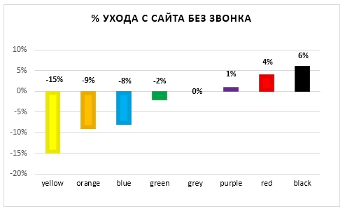
Clients of our service use a palette of 8 colors. Having highlighted the average conversion value, we realized that, for example, the yellow widget shows indicators higher by 28%. While black color brought values lower by 17%. Red color did not cause any significant changes for the entire study period.
The graph shows that the color scheme definitely affects the clickability of the widget button.

When using violet, red and black colors, the percentage of visitors who left the site without making a call was high. Yellow, orange, blue and green, on the contrary, had low indicators, which means they brought a higher percentage of successful connections after opening the widget window.
2) The hypothesis of the influence of the logo:
The presence of a logo in the widget’s window has a good effect on the recognition of the company, but the conversion rates for sites using this feature and doing without it did not differ significantly.
Some entrepreneurial companies use the image of an advertising banner with a promotion or bonus for site visitors, thereby increasing customer interest and conversion rates. Therefore, we advise our customers to use this setting.
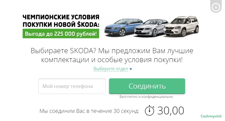
* Image taken from the website of the official dealer of Skoda, "Griffin-Auto".
3) The hypothesis about the influence of the text in the widget :
We divided the existing types of text into 4 types:
1) Standart is the text originally set by the system: “Didn't find what you were looking for? Have a question? We will call you back in 27 seconds and help you! ”
2) Sale - these are texts that include a variety of promotions and discounts. For example, “An offer with a benefit of up to 38% is interesting? Call now! ”,“ A limited number of AVEO and CRUZE on the most favorable terms! ”.
3) Subject - these are texts with specifics: “Let's talk about used cars?”, “Do you need help in choosing ventilation?”.
4) Other - this is any direct appeal to the site visitor. For example, “Still thinking?”, “Thank you, they will contact you soon.”
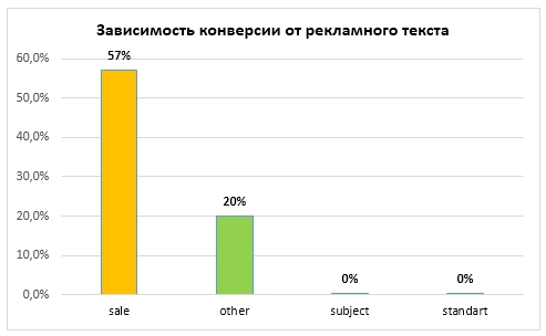
The hypothesis that marketing offers with various bonuses and discounts are the most effective was confirmed after a couple of weeks of research. Relative to the average indicator, that is, the conversion of sites with the text “Standart”, the indicators of sites with direct access to the client have a conversion 20% higher. And sites using texts such as "Sale", the conversion rate is 57% higher!
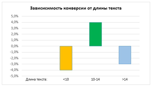
We found that too few or too many words in the text of the widget adversely affect conversion rates from sites. An ideal long can be called 10-13 words in circulation. Sites that use the optimal number of words in the widget text have a conversion rate of 4% above average.
4) The hypothesis about the location of the button:
We took 3 parameters as a basis: a button in the corner of the screen, a button on ¾ of the screen (just above the middle), and a button on ½ of the screen and above.
The results showed that the button in the corner of the screen had the least impact on conversion from sites, and the location of the button on ½ of the screen gave conversion 11% lower than the average. The button на of the screen showed the best result, the conversion from sites was an order of magnitude higher, from 7% to 29%!
5) Hypothesis about the type of button:
In our system there are two types of buttons for the widget:
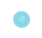
• A pulsating matte button with the image of a handset, when clicked, the client will see the widget window.
Visitors to the site can set the location of this button themselves, and for the next 7 days the system will display it in the selected space.
• Bright button, with a moving field for entering a phone number. If necessary, site visitors can minimize the field that appears. In this view, there is no way to call the widget window by clicking on the button.
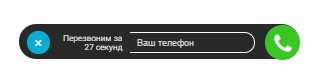
Sites that installed a button with a leaving field had a conversion 10% below average. It was preferable to install a pulsating button, the conversion from sites was consistently high.
Advertising PS
We can conclude how important it is to interest the client in good marketing text, the location of the button, and even the color of the widget. Using a feedback widget instead of a static image of a company number you will achieve great results!

After registering, you can find out how various settings affect your performance. Try and be sure to find something that suits you! :)
Team Cashmyvisit .
In our opinion, marketing is certainly an important component of the business. But even more important is the broad analytics and transparency of the system. This is the key to the development and increase of product and company efficiency. Therefore, we conducted a new study and are ready to share the results!
Hearing the phrase: “Online feedback widgets give you an increase in conversion by 100,500%!”, You probably wondered how this happens? In general, how realistic is it to increase conversions with this callback?
An experiment on living people It
was not so easy to analyze the reaction of site visitors to certain widget settings: there are a large number of external factors. The purity of the experiment could be affected, for example, by conducting promotions and changing advertising campaigns during data collection. We tried to level this factor by the number of customers and sites participating in the study.
Based on a base of 200 thousand visits, we began to collect indicators. For the purity of the experiment, sites with a different theme and appearance were selected. Having cleared the database of outlayers and choosing several interesting hypotheses, we began to measure behavioral reactions to a particular change in the appearance of the Cashmyvisit widget and deduced certain trends.
This sacred knowledge will help you better understand the preferences of customers, and therefore increase the conversion of your site. Enjoy reading!
1) The hypothesis about the color scheme of the widget :
Clients of our service use a palette of 8 colors. Having highlighted the average conversion value, we realized that, for example, the yellow widget shows indicators higher by 28%. While black color brought values lower by 17%. Red color did not cause any significant changes for the entire study period.
The graph shows that the color scheme definitely affects the clickability of the widget button.
When using violet, red and black colors, the percentage of visitors who left the site without making a call was high. Yellow, orange, blue and green, on the contrary, had low indicators, which means they brought a higher percentage of successful connections after opening the widget window.
2) The hypothesis of the influence of the logo:
The presence of a logo in the widget’s window has a good effect on the recognition of the company, but the conversion rates for sites using this feature and doing without it did not differ significantly.
Some entrepreneurial companies use the image of an advertising banner with a promotion or bonus for site visitors, thereby increasing customer interest and conversion rates. Therefore, we advise our customers to use this setting.
* Image taken from the website of the official dealer of Skoda, "Griffin-Auto".
3) The hypothesis about the influence of the text in the widget :
We divided the existing types of text into 4 types:
1) Standart is the text originally set by the system: “Didn't find what you were looking for? Have a question? We will call you back in 27 seconds and help you! ”
2) Sale - these are texts that include a variety of promotions and discounts. For example, “An offer with a benefit of up to 38% is interesting? Call now! ”,“ A limited number of AVEO and CRUZE on the most favorable terms! ”.
3) Subject - these are texts with specifics: “Let's talk about used cars?”, “Do you need help in choosing ventilation?”.
4) Other - this is any direct appeal to the site visitor. For example, “Still thinking?”, “Thank you, they will contact you soon.”
The hypothesis that marketing offers with various bonuses and discounts are the most effective was confirmed after a couple of weeks of research. Relative to the average indicator, that is, the conversion of sites with the text “Standart”, the indicators of sites with direct access to the client have a conversion 20% higher. And sites using texts such as "Sale", the conversion rate is 57% higher!
We found that too few or too many words in the text of the widget adversely affect conversion rates from sites. An ideal long can be called 10-13 words in circulation. Sites that use the optimal number of words in the widget text have a conversion rate of 4% above average.
4) The hypothesis about the location of the button:
We took 3 parameters as a basis: a button in the corner of the screen, a button on ¾ of the screen (just above the middle), and a button on ½ of the screen and above.
The results showed that the button in the corner of the screen had the least impact on conversion from sites, and the location of the button on ½ of the screen gave conversion 11% lower than the average. The button на of the screen showed the best result, the conversion from sites was an order of magnitude higher, from 7% to 29%!
5) Hypothesis about the type of button:
In our system there are two types of buttons for the widget:
• A pulsating matte button with the image of a handset, when clicked, the client will see the widget window.
Visitors to the site can set the location of this button themselves, and for the next 7 days the system will display it in the selected space.
• Bright button, with a moving field for entering a phone number. If necessary, site visitors can minimize the field that appears. In this view, there is no way to call the widget window by clicking on the button.
Sites that installed a button with a leaving field had a conversion 10% below average. It was preferable to install a pulsating button, the conversion from sites was consistently high.
Advertising PS
We can conclude how important it is to interest the client in good marketing text, the location of the button, and even the color of the widget. Using a feedback widget instead of a static image of a company number you will achieve great results!
After registering, you can find out how various settings affect your performance. Try and be sure to find something that suits you! :)
Team Cashmyvisit .