Logo design or how to survive during the holivar
If someone with pain in his soul recalls the times when he had to get together with the team and spend hours discussing one seemingly simple thing, then we are with you! However, there was something good in the process. Let's try to remember what.
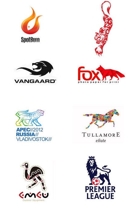
From the very beginning, we decided to analyze the logos of competitors, and we have a lot of them. The result of which was the decision - the logo does not have to be a direct reflection of the essence of the service: speed, cash profit, customer focus, sales growth, all possible “up” badges have become a kind of cliche. Most competitors took these indicators as a basis and we immediately dismissed everything possible: handsets, banknotes, satisfied customers, missiles and mechanisms.
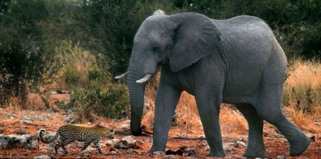
Our well-known competitor CallBackHunter, the immensely respected pioneer in the callback market, has chosen the leopard logo. Leopard is a predator and hunter, CBH is a predatory callback widget, a hunter for customers. An interesting message. I immediately remembered: “WWF”, “Peugeot”, “Winston” and “United Russia” and many others:
This prompted us to try to find our reflection in the animal world.
You can go along the path of Christopher Columbus and find something beautiful along the way, but it is better not to hope for luck and think over the idea in advance. We realized: the more meaningful the idea and the more logical the logical series, the more likely it is that the logo will become successful.
The simple truth: “The logo is the face of the company, how it will be perceived by customers, partners and investors, and not a reflection of someone’s hobby,” has become our stumbling block. The idea to stand out with the help of the logo gave rise to deep discussions and tough debates, each team member understood something different to mean “stand out”.
When characters collide, tea, patience and suggested options always end quickly. After a week of holivars, we realized: brainstorming on the topic in which format we would like to see the logo is a bad idea ...
And suddenly the idea is Elephant! Why exactly the elephant? It's simple, elephants are cool, everyone loves elephants. They are big, wise, reliable, associated with stability and strength, loyal to their relatives. For us, all these concepts matter. In addition, elephants never rush, but at the same time they always reach the desired point, do not run and do not hunt for anyone and live longer.
To come up with a logo concept and draw it are two different things. We decided not to spend more time on disputes, which, it must be said, are not cheap for a beginner project, and turned to professionals.
At Spark, we saw many reviews of the Logomachine . Their approach to work seemed interesting to us, and within a couple of hours we began to discuss the details.
From correspondence with Logomashina:
Logomashina- Why the elephant, how is it related to the target audience?
Cashmyvisit - The elephant does not need to prove anything in the animal world, it is a priori cooler. Elephants just do their job and do it well. There is no connection with the audience, because the logo does not always have to be turned outside, it can reflect the ideology of the project team.
L - What symbols do not use in the sign, in addition to the dollar, banknotes, etc.?
C - We are inclined to minimalism, no pretentiousness and catchiness is needed. Do not use phone and rocket icons.
L - Are there any wishes for fonts and color?
C - No whorls. While we decided that orange would suit us, the color of creativity, warmth. And elephants love warmth.
This simple questionnaire turned out to be quite enough and Logomashina started to work.
I think you are wondering: “What about the money?”.
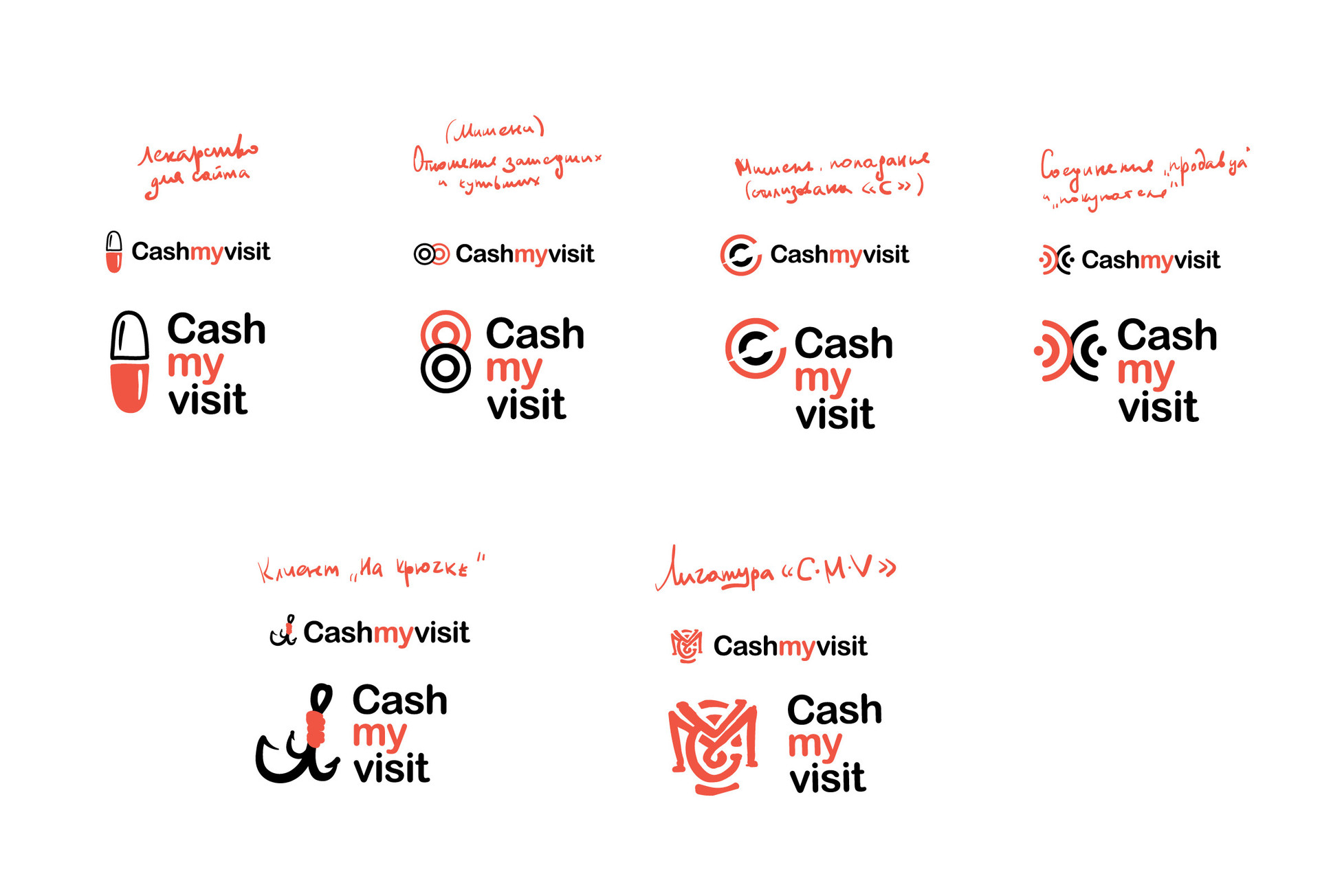
"Logomashina" cost us inexpensively, it’s no secret to anyone, the cost of projects - everything is on the site. We were provided with the long-awaited elephant and several other ideas to choose from:
As a result, fruitful cooperation: we got what we wanted - our elephant, and Logomashina got our widget.
Advertising ps:
Although the logo and an important attribute of any modern company, this is only an external component. Quality service is much more important, and you will have customer loyalty and numerous sales.
We have both. See for yourself ;)
# 1 Stage: The jungle is your name:
From the very beginning, we decided to analyze the logos of competitors, and we have a lot of them. The result of which was the decision - the logo does not have to be a direct reflection of the essence of the service: speed, cash profit, customer focus, sales growth, all possible “up” badges have become a kind of cliche. Most competitors took these indicators as a basis and we immediately dismissed everything possible: handsets, banknotes, satisfied customers, missiles and mechanisms.
Our well-known competitor CallBackHunter, the immensely respected pioneer in the callback market, has chosen the leopard logo. Leopard is a predator and hunter, CBH is a predatory callback widget, a hunter for customers. An interesting message. I immediately remembered: “WWF”, “Peugeot”, “Winston” and “United Russia” and many others:
This prompted us to try to find our reflection in the animal world.
# 2 Stage: One head is good, but five is not very good.
You can go along the path of Christopher Columbus and find something beautiful along the way, but it is better not to hope for luck and think over the idea in advance. We realized: the more meaningful the idea and the more logical the logical series, the more likely it is that the logo will become successful.
The simple truth: “The logo is the face of the company, how it will be perceived by customers, partners and investors, and not a reflection of someone’s hobby,” has become our stumbling block. The idea to stand out with the help of the logo gave rise to deep discussions and tough debates, each team member understood something different to mean “stand out”.
When characters collide, tea, patience and suggested options always end quickly. After a week of holivars, we realized: brainstorming on the topic in which format we would like to see the logo is a bad idea ...
And suddenly the idea is Elephant! Why exactly the elephant? It's simple, elephants are cool, everyone loves elephants. They are big, wise, reliable, associated with stability and strength, loyal to their relatives. For us, all these concepts matter. In addition, elephants never rush, but at the same time they always reach the desired point, do not run and do not hunt for anyone and live longer.
To come up with a logo concept and draw it are two different things. We decided not to spend more time on disputes, which, it must be said, are not cheap for a beginner project, and turned to professionals.
At Spark, we saw many reviews of the Logomachine . Their approach to work seemed interesting to us, and within a couple of hours we began to discuss the details.
From correspondence with Logomashina:
Logomashina- Why the elephant, how is it related to the target audience?
Cashmyvisit - The elephant does not need to prove anything in the animal world, it is a priori cooler. Elephants just do their job and do it well. There is no connection with the audience, because the logo does not always have to be turned outside, it can reflect the ideology of the project team.
L - What symbols do not use in the sign, in addition to the dollar, banknotes, etc.?
C - We are inclined to minimalism, no pretentiousness and catchiness is needed. Do not use phone and rocket icons.
L - Are there any wishes for fonts and color?
C - No whorls. While we decided that orange would suit us, the color of creativity, warmth. And elephants love warmth.
This simple questionnaire turned out to be quite enough and Logomashina started to work.
# 3 Stage: Money is nothing, image is everything.
I think you are wondering: “What about the money?”.
"Logomashina" cost us inexpensively, it’s no secret to anyone, the cost of projects - everything is on the site. We were provided with the long-awaited elephant and several other ideas to choose from:
As a result, fruitful cooperation: we got what we wanted - our elephant, and Logomashina got our widget.
Advertising ps:
Although the logo and an important attribute of any modern company, this is only an external component. Quality service is much more important, and you will have customer loyalty and numerous sales.
We have both. See for yourself ;)