Dark web form patterns or what the most conversion form would be

Almost every web resource is designed to collect information, the purpose may be the collection of applications, signatures, registration as well as the collection of personal data of customers. In any branch of events, we need to go through the stage of filling out web forms. We thought about what should be the form, which has the maximum effective conversions from the beginning of filling up to its final dispatch. I will note in advance that the publication was written for informational purposes in order to show how forms with dark patterns are developed, which “successfully” are used by major campaigns and in no case call upon the actions described in the publication.
Notice that I will refer to the terms used in this publication.
Dark patterns - a user interface with increased benefits, but not for the user, but for the owner of the resource. The interface and functionality is hidden for the user, by the method of irrationality of the menu, inopportuneness, inconsistency of reality or vagueness of the wording and activated at the right moment advantageous to the owner. Under the wording, you can understand an automatic subscription to an email newsletter, the connection of additional paid services and an agreement in points of use of which data, logically, should not be there.
Label - Name of the input field indicating the type and logic of the form and the information that should be entered into the form. As a rule, it is located on the top or on the side of the form, but it can also be inside, which in turn is a very bad solution for large amounts of filled information.
Placeholder - tips for entering into the form the necessary and specific information, usually located in the field itself and disappears at the beginning of interaction with it.
Checkbox - a switch button with 2 values, yes or no (on / off).
I used to write an article on Medium on the usability of modern web forms - “how to increase the conversion of a form to usability”. Now I will not touch on the many aspects that affect the user experience described earlier, but will only touch on those principles and prims that I will use in this example.
It is worth noting that this type of reception is not correct and improves the user experience, but exactly the opposite, leads to its deterioration and annoys users, but in this case we want to collect more applications and user information, exaggerating we pursue the greedy goal of gain for the owner in in the framework of a theoretical article, I do not in any way urge to resort to these techniques. It is interesting that dark patterns use the same techniques as usability, and are based on the same principles, only they have a completely different purpose.
Task
3 standard input fields + additional form in it (we will not touch on additional forms as this is a separate topic the size of which is a couple of tones).
Telephone number, customer name, email and a separate form with a brief.
purpose
Make it as easy as possible to complete the form and lead to the final dispatch by any means.
Foreword
We don’t like to fill in large amounts of text, and especially it causes resentment and perhaps convulsive jolts when looking at a large number of forms that you don’t really want to fill out. Based on these judgments, we can conclude, having already a small number of input fields, we need to reduce them as much as possible and make the escape routes as unacceptable and painful as possible using dark patterns.
Decision

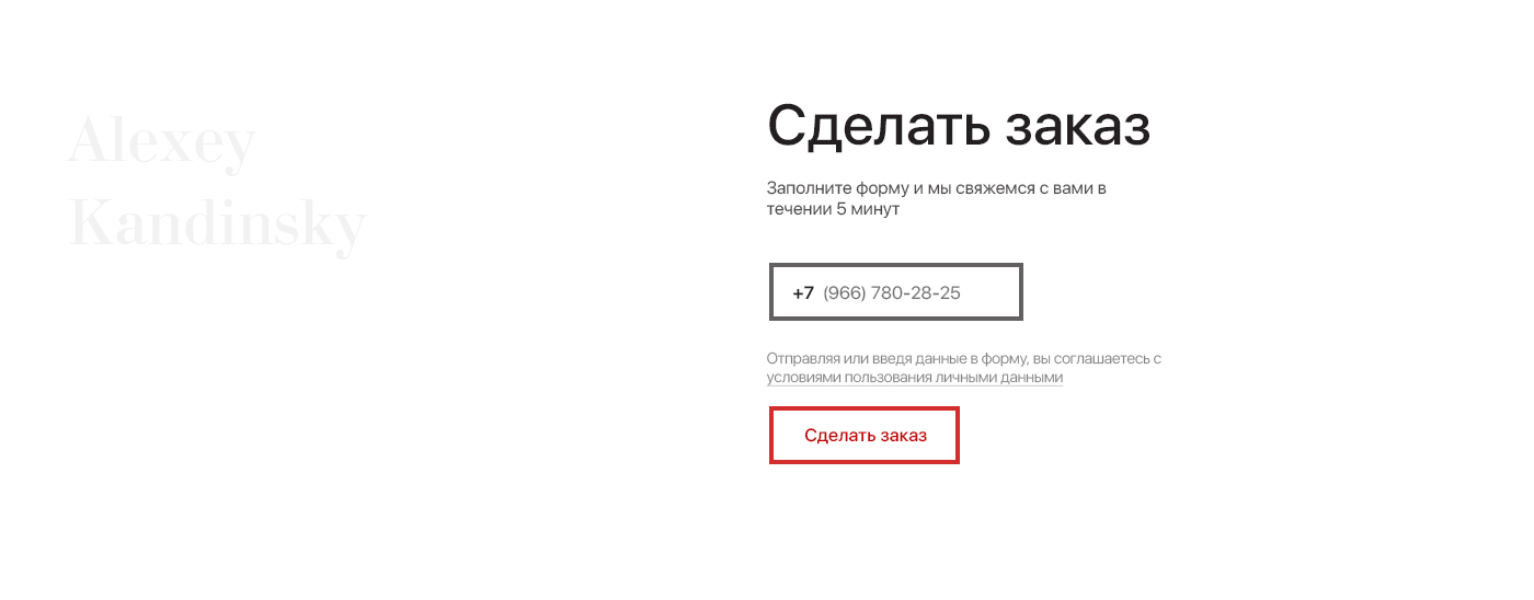
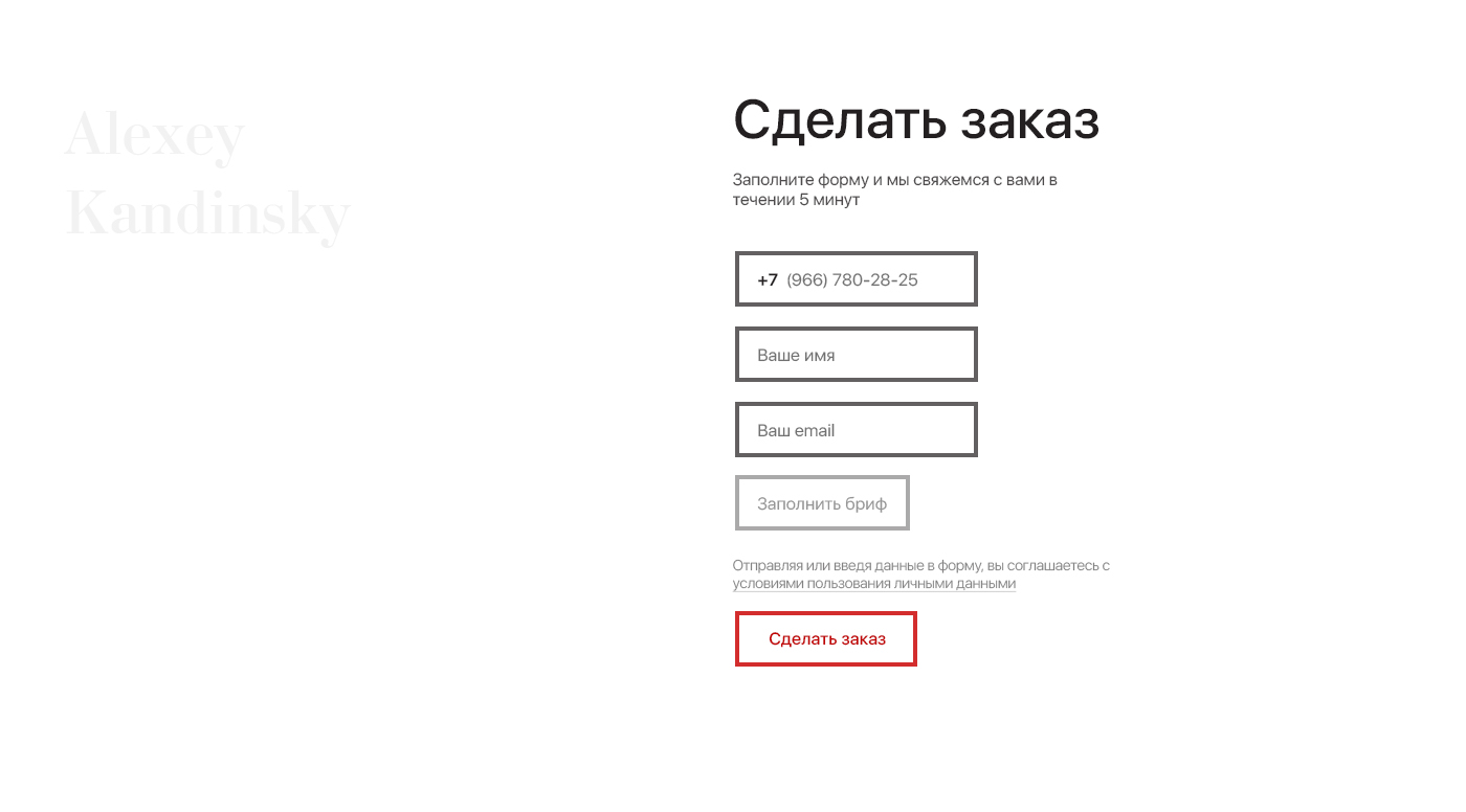
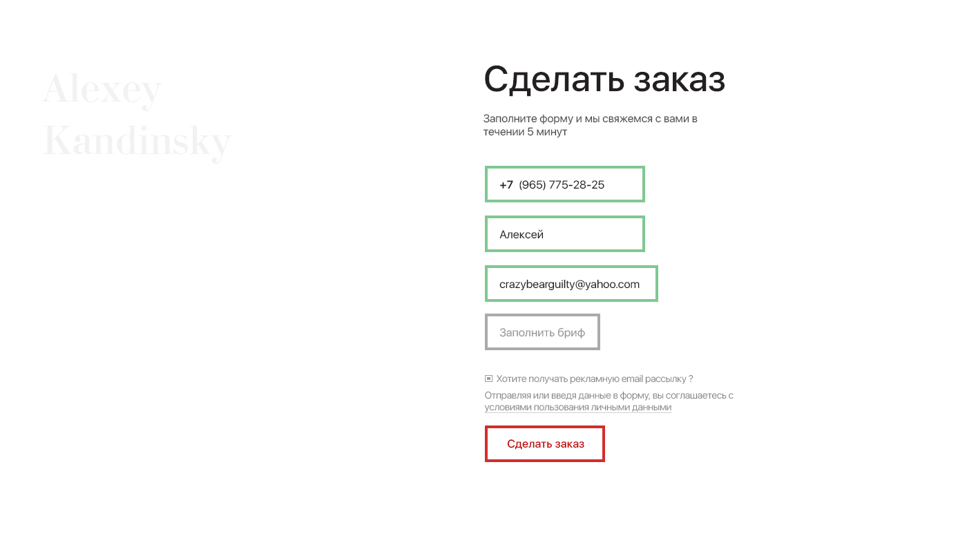
It was decided to leave only one field - the phone number, and after completing its entry, show the remaining 3 items. Optional fields - Email and a separate form for filling out a specific brief by the customer. Also, the second mandatory field of the client name. Thus, after filling the phone number, we make the withdrawal path by filling out the form to the end as incorrect and painful as possible. Exaggerating it sounds like “Well, I filled the number, there is not much left”, also, if the client is determined and will not regret his time to fill out the brief, he will also introduce a separate form with the brief's filling. Due to the fact that it is not obligatory and painful to enter a kilo of information, we have made the input field of the brief unnecessary and discolored (we don’t like to fill in large volumes of texts, especially if they imply constructive inference and narration), thus under the guise of introducing little information, we get several times more of it. We showed the freedom of choice, and the choice of branches of events, but in fact it does not exist, since the brief is filled in any case, the only question is how soon.
A series of such not very tricky frauds gives us the effective involvement of users in the process of filling out the form, Yandex and many other successful services use this technique.
Yandex, in its Yandex Money service, when ordering a physical plastic card before we start filling out the form, we are not told that we need to pay one-year service immediately when ordering (almost all large banks have a service cost, it looks like a negative balance in the account after receiving a physical plastic card, but Yandex went on), so after filling in all the data from the simplest form - your name? before the series and passport number, before the final confirmation of the card order, we see that for registration you need to pay for the service and issue, otherwise if for this reason it is decided to postpone the order, all of the above will have to be carried out again, thereby cutting off ways to move away from .

Yandex - offering to enter light information first, after more specific and complex, in fact draws into the funnel, getting out of which is more difficult with each new field filled in, under the pretext of our brain as a waste of time or just lazy to fill out these forms again. Especially if a person made physical manipulations, so that the passport fell into the hands of the owner (even if you go to the next room for a purse with documents) and the subsequent introduction of information, this all very strongly pushes to perform the action of paying for the service exactly at the present moment.
Distribution of attention and the ratio of Label
Studying usability recommendations, the number of points and elements that need to be paid attention to, we understand that the most satisfactory option is to place the Label at the top of the input field, thus we draw a vector of sight along one vertical line, not sprayed on the sides of the screen.
This recommendation showed itself well with large and medium volumes of filled in information, because it allows the user not to forget which field was entered or is active at the moment and in case of incorrect input to understand what it was for the field and what it was intended for. In turn, this technique increases the amount of information read and, with a small number of forms, can play a weighty bad role if we use in conjunction with a placeholder.
Since we have only 3 fields to fill in, it was decided to use only the Placeholder as a Label, for the same reason, without fear that the user will forget the Label of the filled field and the data will be specific.
Autocomplete and Templates
Of course, auto-completion plays a very important role in the formation of user experience, increases the convenience and speed of solving problems. But what if it doesn’t exist, or there is no data to fill in on a resource, in which case using a template would be a good idea, it’s important not to use an input template for fields where this is not dictated by clear logic and accuracy of the entered data. In this case, a static +7 is used and further along the template, excluding the possibility of an error, it remains to enter (___) ___-__-__. If the user enters information without paying attention to the existing template, that is, of the form - 89676552889, this situation is corrected by introducing js scripts to correct such cases.
Also, by the bottom field, we could place a subscription field for an advertising newsletter with the default checkbox activated, so thanks to the carelessness of the visitor, we received a +1 item on the email list, which is essentially a dark pattern.

Form submission and attention
Drawing attention to the call to action is important when creating forms, in our case, after the title explaining the purpose of the information block on a resource, we position attention on the conversion element, that is, the “place an order” button, by animating microinteraction and highlighting due to the color gamut . In essence, diverting attention from the most important position for action
Phrases
Regarding the texts affecting the behavior, without taking the authority to tell how and what text affect the behavior in expanded form, I will say more briefly and concisely that the text of the form - Order, arrange, call, are not satisfactory in this case (application form ). But specifically in our case, a good solution to this issue is the phrase “Make an order”, as well the inscription on this place could be - Get a consultation. Basically, this issue is associated with the expectations that follow the action, as obliging to perform some kind of difficult action, or quite the opposite, only help in solving the problem and not the obligation to do something.
Life story
In my student days working in a construction campaign, at one and all posts, I had to do web form analytics on a subsidiary’s website. It turned out that 70% of users started filling out a form and left the site without completing even two fields.
Trick
Based on this situation, we arranged the number field first, designating it as the most important of the fields and at a glance the only field to fill in, for the following reason - Any user who started filling out the form will enter the number fields, which for us is the most important factor of all the remaining fields , will be ready to fill in the remaining ones, if the user does not fill in the fields and does not send the form, using ajax, we consider the time to start filling and in the case of not sending the form, within 20 minutes, these forms are automatic Skis are sent to the CRM owner. The same scheme applies when trying to end a session on a site or close a tab (one of three scenarios).
This acceptance is in free light a dark pattern and does not bring customers loyalty in you as a company. This kind of dark pattern violates the rights to use personal data. In order to avert the obvious violation, the inscription “By sending or starting data entry you agree to the terms of using personal data” is located in front of the send button, the inconvenient features of the contract are hidden in small print when you open the full agreement to use personal data.
Conclusion
From this publication, I wanted to reason and convey the idea of what form the most intrusive and useful for the site or application owner could be, with the maximum theoretical conversion. We and our team do not use these methods, the subject of discussion was a non-existent project, I do not urge to resort to such methods, the article is intended for informational purposes and only in the form of theoretical data, excluding the possibility of its use in practice. Virtually any tricks with the dark pattern technique can be overridden by the usability and refinement of your product from the point of view of usability to improve the quality of user experience.
