How to monitor all layers of infrastructure
Once I calculated that 1 minute of hh.ru downtime on weekdays affects about 30,000 users. We constantly solve the problem of reducing the number of incidents and their duration. We can reduce the number of problems with the right infrastructure, application architecture - this is a separate issue, we will not take it into account for now. Let's talk better about how to quickly understand what is happening in our infrastructure. Here monitoring helps us.
In this article, using hh.ru as an example, I will tell and show how to cover all layers of infrastructure with monitoring:
- client-side metrics
- frontend metrics (nginx logs)
- network (what can be obtained from TCP)
- application (logs)
- database metrics (postgresql in our case)
- operating system (cpu usage may also come in handy)
We formulate the problem
I formulated for myself the tasks that monitoring should solve:
- find out what is broken
- quickly find out where it broke
- see what is fixed
- capacity planning: do we have enough resources for growth
- optimization planning: choose where to optimize so that there is an effect
- control of optimizations: if after release of optimization no effect is visible in produсtion, then the release needs to be rolled back and the code thrown out (or reformulated task)
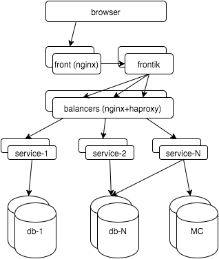
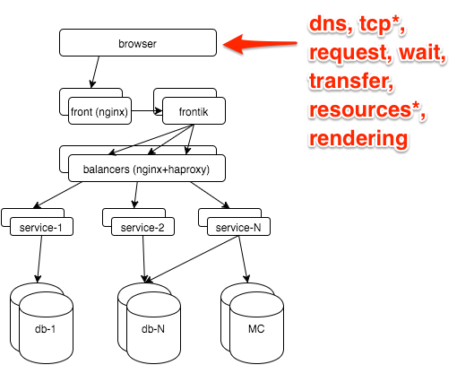
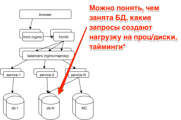
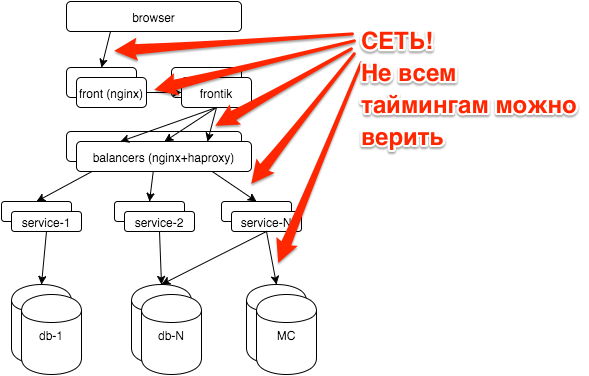
First, a few words about the hh.ru architecture: all the logic is distributed between several dozen services in java / python, pages for users are “assembled” by our frontik collector service, the main database is postgresql, and nginx + haproxy is used on frontends and internal balancers.
Now let's start monitoring all layers. As a result, I want to:
- see how the system works from a user perspective
- see what happens in each subsystem
- know what resources are going to
- look at all this in time: as it was a minute ago, yesterday, last Monday
That is, we will talk about graphs. About alerts, workflow, KPI, you can see my slides with RootConf 2015 (I also found a “ screen ”).
Client-side metrics
The most reliable information about how the user sees the site is in the browser. It can be obtained through the Navigation timing API , our js snippet shoots metrics to the GET server with a request with parameters, then nginx takes it:
location = /stat {
    return 204;
    access_log /var/log/nginx/clientstat.access.log;
}
then we just parse the resulting log and get the following graph:
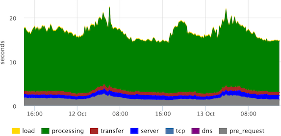
These are the stacked 95th percentiles of the times of the main stages of page rendering. “Processing” can be defined differently, in this case the user sees the page much earlier, but our frontend developers decided that they need to see this.
We see that the channels are normal (according to the "transfer" stage), there are no emissions from the "server", "tcp" stages.
What to remove from the frontend
The main monitoring we have built on the metrics that we remove from the frontends. On this layer we want to find out:
- Are there any errors? How many?
- Fast or slow? One user or all?
- How many requests? As usual / failure / bots?
- Does the channel reach the customers?
All this is in the nginx log, you just need to slightly expand its default format:
- $ request_time - time from receiving the first byte of the request to writing the last byte of the response to the socket (we can assume that we take into account the transmission of the response over the network)
- $ upstream_response_time - how much the backend was thinking
- Optional: $ upstream_addr, $ upstream_status, $ upstream_cache_status
A histogram is well suited for visualizing the entire flow of requests.
We determined in advance what a fast request (up to 500ms), average (500ms-1s), slow (1s +) is.
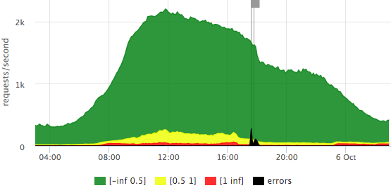
We draw requests per second on the Y axis, the response time is reflected in color, we also added errors (HTTP-5xx).
Here is an example of our “traffic light” based on $ request_time:
We see that we have a little more than 2krps at the peak, most requests are fast (the exact legend is in the tooltip), that day there were 2 outliers that affected 10-15% of requests.
Let's see how the chart is different if we take $ upstream_response_time as a basis:

It can be seen that fewer requests reach backends (part is sent from the nginx cache), there are almost no “slow” requests, that is, in the previous graph, red is basically the contribution of transmission over the network to the user, rather than waiting for a backend response.
On any of the graphs, one can take a closer look at the scale of the number of errors: It is
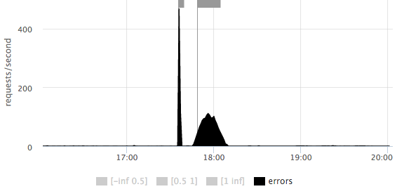
immediately clear that there were 2 outliers: the first short ~ 500rps, the second longer ~ 100rps.
Errors sometimes need to be sorted by url:
In this case, errors are not on any one url, but are distributed across all the main pages.
On the main dashboard, we also have a schedule with HTTP-4xx errors, we look separately at the number of HTTP-429 (we give this status if the limit on the number of requests from one IP is exceeded).
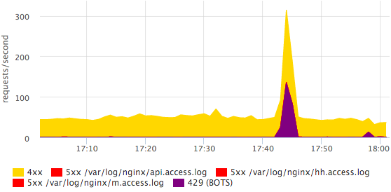
Here you can see that some bot was coming. More detailed information on bots is easier to see in the log with your eyes, in monitoring we just need the fact that something has changed. All errors can be divided into specific statuses, this is done quite simply and quickly.
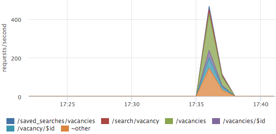
Sometimes it’s useful to look at the traffic structure, which URLs generate how much traffic.
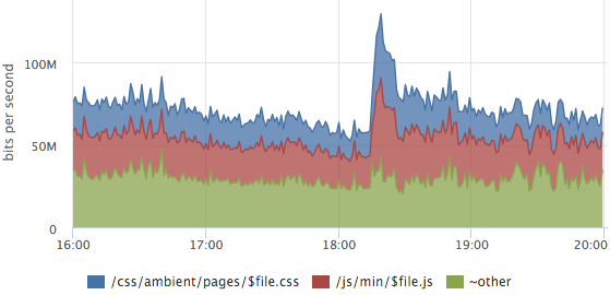
In this graph, the layout of the traffic of static content, the outlier is the release of a new release, css and js caches were disabled for users.
About the breakdown of metrics by url it is worth mentioning separately:
- manual rules for parsing basic urls become obsolete
- you can try to somehow normalize urls:
throw request arguments, id and other parameters in the url
/ vacancy / 123 itself? arg = value -> / vacancy / $ id - after all normalizations, dynamic top urls work well (by rps or by the sum of $ upstream_response_time), you only detail the most significant queries, for the rest, the total metrics are considered
- you can also make a separate top for errors, but with a cut-off from the bottom so that there is no debris
Logs are parsed on each server, on the graphs we usually look at the final picture, but you can see the breakdown of servers too. For example, it is convenient for balancing assessment:
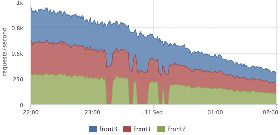
Here you can clearly see how front2 was withdrawn from the cluster, at that time 2 neighboring servers processed the requests. The total number of requests did not sink, that is, the users were not affected by these works.
Similar graphs based on metrics from the nginx log allow you to clearly see how our site works, but they do not show the cause of the problems.
Picker layer
Instant monitoring of any program gives an answer to the question: where is the control now (computing, waiting for data from other subsystems, working with disk, memory)? If we consider this task in time, we need to understand what stages (actions) took time.
In our collector service, all significant stages of each request are logged, for example:
2015-10-14 15:12:00,904 INFO: timings for xhh.pages.vacancy.Page: prepare=0.83 session=4.99 page=123.84 xsl=36.63 postprocess=13.21 finish=0.23 flush=0.49 total=180.21 code=200In the process of processing the vacancy page (handler = ”xhh.pages.vacancy.Page”) we spent:
- ~ 5ms per user session processing
- ~ 124ms waiting for all service requests for page data
- ~ 37ms per template
- ~ 13ms for localization
From this log, we take the 95th percentile for each stage of each handler (as we parse the logs I will describe in a more illustrative example below), we get graphs for all pages, for example, for the vacancy page:
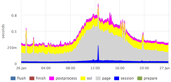
Here you can clearly see the emissions within specific stages.
Percentiles have a number of drawbacks (for example, it is difficult to combine data from several measurements: servers / files / etc.), but in this case the picture is much more visual than the histogram.
If we need, for example, to obtain a more or less accurate ratio of any stages, then we can look at the sum of the times. By summing response times by processor, you can evaluate how to occupy our entire cluster.
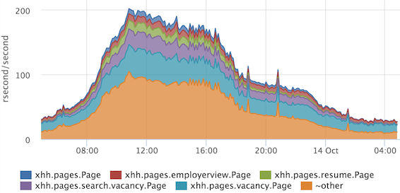
On the Y axis, we have the so-called “resource” seconds spent per second. It is very convenient that the ratio immediately takes into account the frequency of requests, and if we have one very heavy handler rarely called, then it will not get into the top. If we do not take into account the parallelization of processing of some stages, then we can assume that at the peak we spend 200 processor cores on all requests.
We also applied this technique to the problem of profiling standardization.
The collector logs which template how many were rendered for each request:
2015-10-14 15:12:00,865 INFO: applied XSL ambient/pages/vacancy/view.xsl in 22.50msThe monitoring service agent that we use is able to parse logs, for this we need to write something like this config:
plugin: logparser
config:
  file: /var/log/hh-xhh.log
  regex: '(?P\d{4}-\d{2}-\d{2} \d{2}:\d{2}:\d{2}),\d+ [^:]+: applied XSL (?P\S+) in (?P\d+\.\d+)ms'
  time_field: datetime
  time_field_format: 2006-01-02 15:04:05
  metrics:
    - type: rate
      name: xhh.xsl.calls.rate
      labels:
        xsl_file: =xsl_file
    - type: rate
      name: xhh.xsl.cpu_time.rate
      value: ms2sec:xsl_time
      labels:
        xsl_file: =xsl_file
    - type: percentiles
      name: xhh.xsl.time.percentiles
      value: ms2sec:xsl_time
      args: [50, 75, 95, 99]
      labels:
        xsl_file: =xsl_file
From the obtained metrics we draw a graph:

If suddenly during release we increase the time for applying one template (or all at once), then we will see it. We can also choose what exactly makes sense to optimize ...
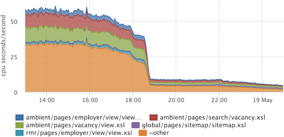
... and verify that the optimization has brought results. In this example, the common piece was optimized, which is included in all other templates.
What happens on the pickers, we now understand quite well, move on.
Internal balancer
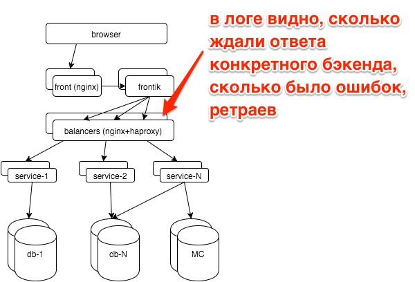
In the event of a breakdown, we usually have a question: did a particular service break down (if so, which one) or all at once (for example, with problems with the databases, other storages, the network). Each service is behind balancers with nginx, logs for each service are written in a separate access log.
A simple schedule of top-5 services by the number of errors greatly simplified our lives:
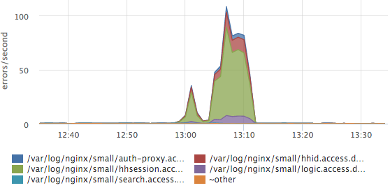
Here you can see that the session service log accounted for the most errors. If we have a new service / log, it will be parsed automatically and new data will be immediately taken into account in this top. We also have response time histograms for all services, but most often we look at this graph.
Services
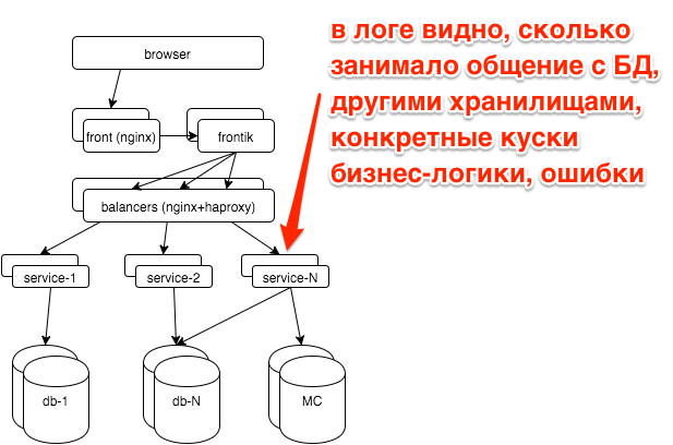
In the service logs, we also have the request processing stages:
2015-10-21 10:47:10.532 [Grizzly-worker(14)] INFO r.hh.health.monitoring.TimingsLogger: response: 200; context: GET /hh-session/full; total time 10 ms; jersey#beforeHandle=+0; HHid#BeforeClient=+0; HHid#Client=+6; DB#getHhSession=+3; pbMappers=+0; makeHeaderSession=+1; currentSessionInBothBodyAndHeader=+0; jersey#afterHandle=+0;We visualize:
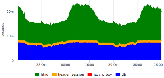
It can be seen that the database is responsible for constant time, and the hhid service slows down a little during peak traffic.
Database
All the main databases we work on postgresql. We outsource database administration in postgresql-consulting, but it’s also important for us to understand what is happening with the database, since it is not advisable to pull DBA for all problems.
The most important question that worried us: is everything good now with the database? Based on pg_stat_statements, we draw a graph of the average query execution time:
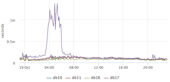
It is clear from it whether something unusual is happening in the database now or not (unfortunately, nothing can be done from the available data). Next, we want to find out what the database is currently occupied with, while we are primarily interested in what requests the CPU and disks load:

These are the top-2 requests for CPU usage (we remove top50 + other). Here you can clearly see the release of a specific request to the hh_tests database. If necessary, it can be fully copied and reviewed.
Postgresql also has statistics about how many requests are waiting for disk operations. For example, we want to find out what caused this outlier on / dev / sdc1:
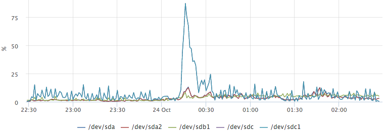
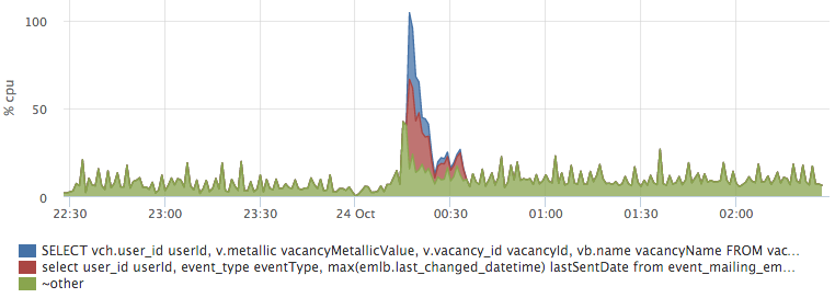
By plotting the top io queries, we easily get the answer to our question:
Network
The network is a rather unstable environment. Often, when we do not understand what is happening, we can attribute the brakes of services to network problems. For instance:
- hhsession was waiting for a response from hhid 150ms
- hhid service believes that it answered this request in 5ms (we have all requests have the identifier $ request_id, we can recognize specific requests from the logs)
- there is only a network between them
You have no ping results for yesterday between these hosts. How to exclude a network?
TCP RTT
TCP Round-Trip Time - the time from sending a packet to receiving an ACK. The monitoring agent on each server removes rtt for all current connections. For ip from our network, we aggregate the times separately, we get roughly the following metrics:
{
	"name": "netstat.connections.inbound.rtt",
	"plugin": "netstat",
	"source_hostname": "db17",
	"listen_ip": "0.0.0.0",
	"listen_port": "6503",
	"remote_ip: "192.168.1.48",
	"percentile": "95",
}
Based on such metrics, you can retroactively see how the network worked between any two hosts on the network.
But the TCP RTT values do not even closely match the ICMP RTT (what ping shows). The fact is that the TCP protocol is quite complex, it uses many different optimizations (SACK, etc.), this picture is well illustrated by the picture from this presentation :
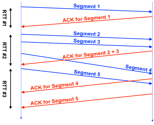
Each TCP connection has one RTT counter, it can be seen that RTT # 1 is more or less honest, in the second in the case during the measurement, we sent 3 segments, in the third - sent 1 segment, received several ACKs.
In practice, TCP RTT is fairly stable between selected hosts.
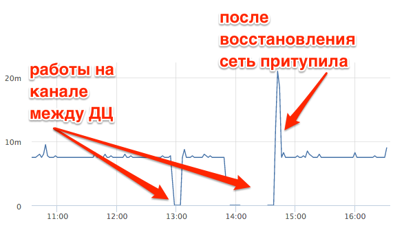
This is TCP RTT between the master database and the replica in another data center. You can clearly see how the connection lost during work on the channel, how the network slowed down after recovery. In this case, TCP RTT ~ 7ms at ping ~ 0.8ms.
OS metrics
We, like everyone else, look at the use of CPU, memory, disks, IO disk utilization, traffic on network interfaces, packet rate, and swap usage. Separately, it is necessary to mention swap i / o - a very useful metric that allows you to understand whether swap was actually used or if it simply contains unused pages.
But these metrics are not enough if you want to retroactively understand what was happening on the server. For example, look at the CPU graph on the DB master server:

What was that?
To answer such questions, we have metrics for all running processes:
- CPU per process + user
- Memory per process + user
- Disk I / O per process + user
- Swap per process + user
- Swap I / O per process + user
- FD usage per process + user
In about this interface, we can “play” with real-time metrics:
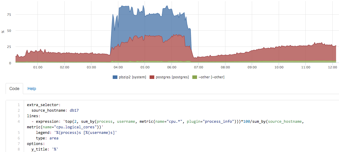
in this case, a backup was launched on the server, pg_dump itself almost did not use percent, but the contribution of pbzip2 is clearly visible.
Summarize
Monitoring can be understood as many different tools. For example, you can use an external service to check the availability of the main page once a minute, so you can find out about the main crashes. This was not enough for us, we wanted to learn to see the full picture of the quality of the site. With the current solution, we see all significant deviations from the usual picture.
The second part of the task is to reduce the duration of incidents. Here, “carpet” coverage helped us a lot by monitoring all the components. Separately, I had to get confused with the simple visualization of a large number of metrics, but after we made good dashboards, life was greatly simplified.
- The
article was written based on my report at Highload ++ 2015, slides are available here .
I can not help but mention the monitoring serviceokmeter.io , which we have been using for more than a year.