White on black. Unload eyes
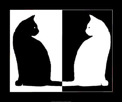 Everyone heard the expression "written in black and white." It came to us from the paper world and, as it were, claims that it is this combination of colors for text and background that gives the best contrast and readability. I propose to refute this assumption and more often use the opposite color scheme. In this article I will not convince the expediency of the color scheme “white on black” (and some statements may be controversial). The purpose of this article is to provide an overview of tools that allow you to quickly and conveniently invert bright colors in commonly used applications in order to reduce eye strain. And also I propose to invert the mentioned expression and in the era of LCD displays say “
 White background and black text by inertia have been preserved in many applications to simulate the visual perception of ink on white paper. Maybe the efficiency is “black and white” and true with respect to paper (by the way, where did black and white come from on paper? 1 ), but when it comes to monitors, there is no more paper and reflected light. Most monitors are light sources and a white background can be tiring for the eyes, because white is the maximum light output that a pixel emits (given a monitor brightness). Accordingly, the total light emission to the eyes is greatest with a white background. As an alternative, many are more pleasant and less tiring the opposite scheme - white text on a black background *, which in total emits less light. I must admit that it is not so simple with radiation, since human vision has a rather complex mechanism and the perception of light is influenced by many factors such as display brightness, type of display, distance, external lightening, visual adaptation , chromatic adaptation , as well as individual psychophysiological characteristics. Therefore, the comparison of these two types of color schemes is still a rather controversial issue for both vision experts and graphic designers, and depends heavily on the conditions of their use.
I want to note that all the following contrast switching techniques are less tiring for the eyes when reading / writing text for a long time. And it does not depend on the cool design or personal preferences in colors (see experiment ). In other situations, this is not so important.
* And also, when I mention “white on black” I do not mean absolutely white and absolutely black (and I will not go into the nuances of “blackness” ). Quite the contrary - I do not recommend using these extremes. With too much contrast, the scattering of light in the eyes is felt more strongly and the white letters begin to “creep” against a black background. This effect is well illustrated by the optical illusion of irradiation . It is better to choose grayscale (e.g. light gray to dark gray). The main thing is comfortable contrast. Probably, it would be more correct to call this scheme “ light on dark ”, but somehow it doesn’t sound very good.
And so, a list of popular applications in which it is easy to stay and where a black background will help reduce eye strain:
- Browser
- Document Browsers
- Text editor
- Development environment
- miscellanea
- Vision hygiene
- Experiment
Browser
before and after
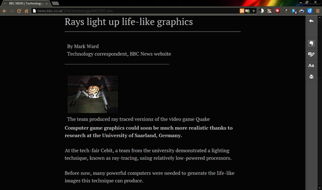
Chrome (Chromium)
Clearly
If you want to comfortably read the article without unnecessary visual garbage, then for this the guys from Evernote created the excellent Clearly extension. Besides the fact that it removes everything except the main text, it also makes it possible to choose colors. If you do not like the standard dark scheme, then you can create your own.
Hotkeys
Для удобства авто разширения предоставил возможность переключения при помощи горячих клавиш. Лично мне сочетание из трёх клавиш (Ctrl+Alt+?) кажется неудобным. Хром позволяет отдельно настроить горячие клавиши для вызова конкретного расширения: Tools > Extensions, внизу есть Configure Commands (у меня Alt+R).
High Contrast
A simpler solution. It is sometimes more convenient for them to use than Clearly (for example, on forums). It is possible to quickly create an exception or set a default scheme.
Hotkeys
Для себя настроил следующим образом — горячие клавиши Alt+H, расширение включено (Enabled) постоянно, режим Normal установил по умолчанию, а для нужных сайтов включаю Inverted Color. Так я косвенным образом веду список сайтов, на которых инверсия включается автоматически и не нужно вручную переключать туда-сюда режимы.
Существенный минус расширения в том, что цвет изображений также изменяется.
К сожалению, сочетание клавиш (Shift+F11) нельзя поменять в настройках. Но если очень хочется, то можно копнуть исходники. У меня расширение находиться в:
%LocalAppData%\Chromium\UserData\Default\Extensions\djcfdncoelnlbldjfhinnjlhdjlikmph\0.4_0\
или просто в поиске найти highcontrast.js, довольно уникальное имя для файла. Далее делаем следующие изменения в файлах:
highcontrast.js, строка 12, evt.keyCode == 122 меняем на нужный, и заодно если не нравится Shift, то evt.shiftKey меняем на evt.altKey или evt.ctrlKey.
А также для внешности — в popup.js, строка 100 и в manifest.json, строка 8.
Существенный минус расширения в том, что цвет изображений также изменяется.
К сожалению, сочетание клавиш (Shift+F11) нельзя поменять в настройках. Но если очень хочется, то можно копнуть исходники. У меня расширение находиться в:
%LocalAppData%\Chromium\UserData\Default\Extensions\djcfdncoelnlbldjfhinnjlhdjlikmph\0.4_0\
или просто в поиске найти highcontrast.js, довольно уникальное имя для файла. Далее делаем следующие изменения в файлах:
highcontrast.js, строка 12, evt.keyCode == 122 меняем на нужный, и заодно если не нравится Shift, то evt.shiftKey меняем на evt.altKey или evt.ctrlKey.
А также для внешности — в popup.js, строка 100 и в manifest.json, строка 8.
Stylish
Allows you to use any style on the visited page. Many are available at userstyles.org . The downside is that their authors do not always update the style on time with changes on the site. Useful dark styles: Wikipedia , Google Search , Habrahabr , StackOverflow , YouTube , Facebook .
suggest (or create your own) dark styles for popular sites, add to
Theme list.
In order for the browser interface elements not to contrast with the dark coloring of the page content, it is better to choose some dark theme. I have James White .
What I don't like about Chrome is the flickering of a white background when rendering a page. As far as I understand, this happens at the engine level , and at the user level you can’t change it, even if you change the colors in the OS. I think that in this place you need to throw a stone in the garden of Chrome developers. Why do they determine the color of the canvas themselves, and do not take it from the system settings of the OS? The same goes for Skype and a number of other “serious” applications.
Firefox
Clearly
See description above .
Blank Your Monitor
Looks like High Contrast .
Hotkeys
Присутствует то же неудобство сочетания из трёх клавиш. Можно исправить с помощью Customizable Shortcuts: Options > Shortcuts > Action: Other — bymer-key.
Stylish
See description above .
Skins for the fox. I have FT DeepDark .
Opera
With the Opera is not so thick. All that was found was the Contrast Changer extension . Or a simpler option in the form of a bookmarklet .
As an alternative to Clearly, you can use the Instapaper online service and their bookmarklet.
Also, Stylish Extension has recently appeared .
We select a dark theme . For example, Opera Simple Dark .
Stylish alternative
На userstyles.org каждый стиль можно сохранить в виде userscript. Складываем все скрипты в одну директорию, переименовываем так, чтобы имена файлов заканчивались на “.user.js” и указываем путь в настройках:
Tools > Preferences > Advanced > Content > JavaScript Options > User JavaScript folder. К сожалению, не все стили отображаются также как в Stylish.
Tools > Preferences > Advanced > Content > JavaScript Options > User JavaScript folder. К сожалению, не все стили отображаются также как в Stylish.
Internet explorer
With the choice of extensions for this browser, everything is sad, I did not find anything in the way. But it seems that the colors can be changed as follows - Internet Options> Appearance: Colors , but before that it should be noted Accessibillity> Formatting: Ignore colors specified on webpages . I do not know how well it works, I have not personally tried it.
Document Browser
Adobe Reader
Allows you to invert the color of a document, but only if not a scan / image:
Edit> Preferences (Ctrl + K)> Accessibility> Documents Color Options: Replace Document Colors, Use High Contrast Colors . It is more convenient to read in full screen ( Ctrl + L ) so that bright interface elements do not interfere (or change the color of these elements in the OS).
Hotkeys
Adobe Reader запоминает последнюю позицию меню в настройках. Если позиция осталась на Accessibility и её не менять, то можно инвертировать цвет сочетанием клавиш Ctrl+K | Tab | Space | Enter. Можно автоматизировать при помощи макросов.
WinDjView
Fast DjVu browser with annotation capabilities (Windows only). Allows you to invert the color of the entire document, including the scan / image:
File> Settings (Ctrl +,)> Display: Invert Colors . It is more convenient to read in full screen ( Ctrl + L ).
Hotkeys
WinDjView также запоминает последнюю позицию меню в настройках. Если её не менять, то можно инвертировать цвет сочетанием клавиш Ctrl+, | Space | Enter. Можно автоматизировать при помощи макросов.
Text editor
Microsoft Word 2010
before and after
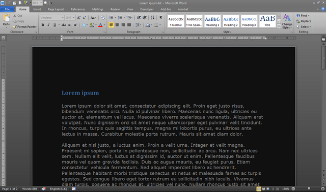
To change the color of the interface: File> Options> General> User Interface options> Color Scheme: Black . To change the color of the paper (background), you need to change the colors in the OS.
For older versions of the office I can’t help.
Google docs
before and after
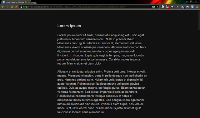
Inverting colors in Google Docs does an excellent job of <a href= found chrome.google.com/webstore/detail/high-contrast/djcfdncoelnlbldjfhinnjlhdjlikmph> High Contrast and BlankYourMonitor . High Contrast slows down a bit in large documents. There is another option, this is the minimalist style of Write Room , which also removes the toolbar (appears when you hover over it). Sublime text
after
Convenient, fast and rich text editor with syntax highlighting, but without text formatting. By default it comes with a dark outline and with good readability of the font. I use it instead of a notebook.Development environment
Visual Studio
Coloring changes in the settings ( Tools> Options> Environment> Fonts and Colors ), but it can be a lengthy procedure, since it is difficult to choose the right colors the first time.
There are more convenient solutions for the latest versions (2005/2008/2010/2012). The Visual Studio Theme Generator online applicationgenerates a configuration file ( .vssettings ) with the selected colors. And also formed a whole community of stylus designers at Studio Styles , where there is a choice among many ready-made styles.
In any case, before changing the colors, it is better to backup the current settings ( Tools> Import and Export Settings ), you can export exclusively color parameters.
Unfortunately, not all colors change from the studio settings and in order to change the background color in the windows of Solution Explorer, Output, etc., it is necessary to change the color in the OS.
Visual studio 2010
before and after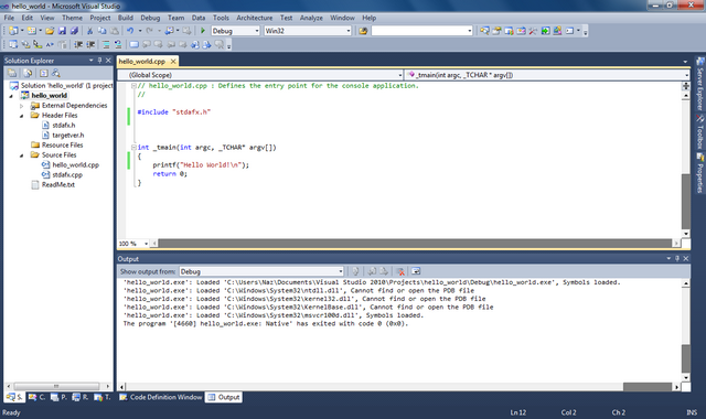

In order not to change the studio settings each time, the Visual Studio Theme Editor extension was added specifically to change the color scheme (it adds an additional Theme menu). This post is about usage, although everything is pretty intuitive there. I am using the Expression theme from here . Visual Studio 2012
In this version, the developers finally included the ability to change the theme in the standard settings, among which there is Dark Theme . For this studio, there is also a separate extension for Visual Studio 2012 Color Theme Editor . What for? I do not know. Personally, VS2012 has not yet seen.
Eclipse
Color capabilities similar to Visual Studio. Can installEclipse Color Theme Plugin and use those ( .xml ) for this plugin. Or use configuration files ( .epf ). A wide selection of themes at Eclipse Color Themes . Make backup settings before changes.
Matlab
All colors change with OS colors (at least in Win7). If separate from the OS, then there is an instruction for Dark theme for Matlab 2007 . The same settings are suitable for 2010 (I suppose for other versions as well).
miscellanea
Windows 7
before and after
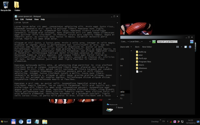
For those who do not want to thoroughly change the colors of all windows, I suggest changing at least the color of the taskbar so that it does not contrast with a dark browser or editor ( Control Panel> Appearance and Personalization> Personalization> Window Color ). The rest of the colors are in the Advanced appearance settings . Searching for the keywords “dark theme” or “black theme” will find many sites with themes. Many high-quality (not only for Windows) are on deviantART .
The first thing that suited me was Dark Soft (I used only styles, I did not use binary files (explorer.exe)).
Linux, MacOS, Windows 8, Windows XP
How to work with the styles of these OSs is not familiar. Add in the comments, we will replenish the list.
Mobile
Share your mobile colors. As far as I use an old telephone, I won’t offer anything here. I
can only offer Opera Mobile users a not-so-convenient solution - he knows how, like his older brother, to impose arbitrary styles .
Another “white on black” bonus for mobile devices is that such a combination consumes less energy (because it emits less light). How much less? I do not know. I suspect that with long reading it is very noticeable. It would be interesting to see the statistics.
VLC Player
before and after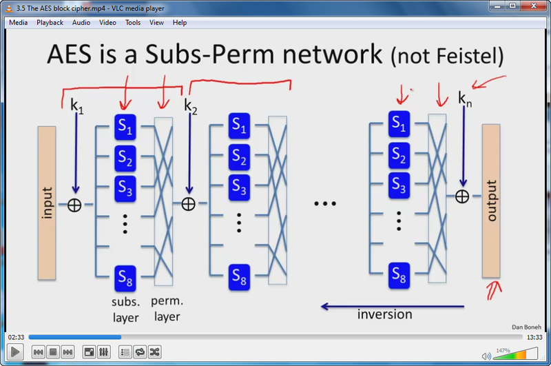
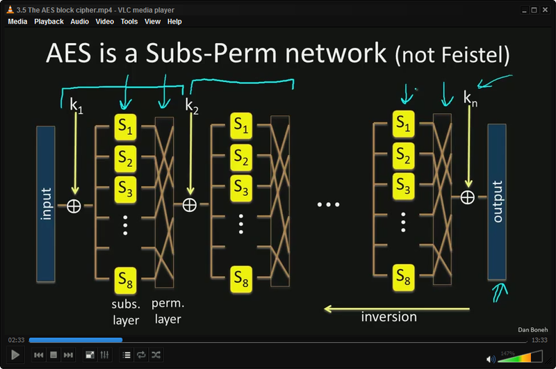
What does the video have to do with it? And nothing to do :) in fact, for those who watch video tutorials and lengthy tutorials, where mostly symbolic and / or graphic information is present on a white background, it is convenient to do the color inversion. I do this for almost all Coursera courses .
Tools> Effects and Filter (Ctrl + E)> Video Effects> Colors> Negate colors . Unfortunately, there are no hotkeys for effects, and this is very inconvenient. But you can automate using macros .
Total commander
before and after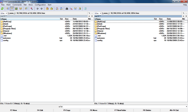

The color changes in Configuration> Options> Color . For a completely dark version, you need to change the colors in the OS. Here are my color options, replace in wincmd.ini :wincmd.ini
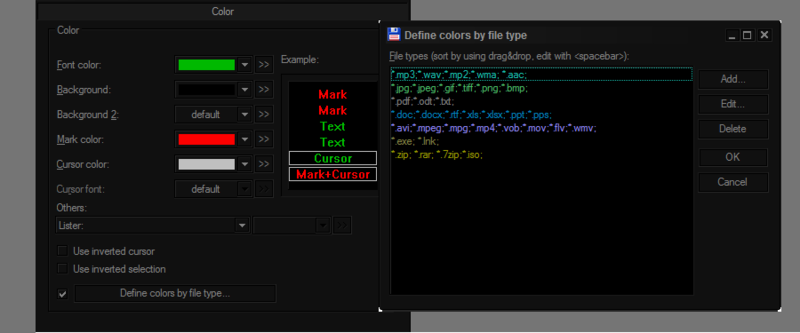
[Colors]
InverseCursor=0
InverseSelection=0
BackColor=0
BackColor2=-1
ForeColor=47360
MarkColor=253
CursorColor=12632256
CursorText=-1
ColorFilter1=*.mp3;*.wav;*.mp2;*.wma; *.aac;
ColorFilter1Color=11452183
ColorFilter2=*.jpg;*.jpeg;*.gif;*.tiff;*.png;*.bmp;
ColorFilter2Color=6667080
ColorFilter3=*.pdf;*.odt;*.txt;
ColorFilter3Color=8421504
ColorFilter4=*.doc;*.docx;*.rtf;*.xls;*.xlsx;*.ppt;*.pps;
ColorFilter4Color=12615680
ColorFilter5=*.avi;*.mpeg;*.mpg;*.mp4;*.vob;*.mov;*.flv;*.wmv;
ColorFilter5Color=16745613
ColorFilter6=*.exe; *.lnk;
ColorFilter6Color=4227200
ColorFilter7=*.zip; *.rar; *.7zip;*.iso;
ColorFilter7Color=39835
Gmail
There are several dark topics in the presence, they are indicated by a black triangle on the icon. Unfortunately, the background of the open letter remains white. I thought to fix it with style, but did not find a suitable one. Can any of you write this style? Or at least update Gmail Dark Message Pane ?
Not sure howpopular MediaMonkey is , but someone should come in handy - VitreousDark .
Vision hygiene
Contrast
As mentioned above, do not use too much contrast (max. White on max. Black). Contrast ≠ readability. Light gray on dark gray is more comfortable. What exactly is the gradation of gray - select individually.
Contrast plays a role not only in the image on the display, but also with the outside world. That is, take into account the lighting in the room and try to avoid too much contrast between the lighting and the brightness of the display / colors. This is especially true for night owls. If you work in the dark, switch to dark color schemes - your eyes will get tired much less. The contrast between a dark and a bright theme in a dark room can differ by 20 times or more!
Distance
Do not forget about the law of inverse squares . If you are accustomed to leaning towards the monitor, then while reading, increase the font ( Ctrl + ) and deviate at least 15cm more back. This will significantly reduce the amount of light emitted to the eyes. Of course, the monitor has too much area to consider it a point source of light and apply this law to it. But as a simple experiment shows , with not too bright ambient lighting, leaning back from a distance of 55cm to 75cm, the illumination from the monitor decreases by 1.5 times (and even more in the dark). Recommended distance from the monitor is 50-70cm.
Breaks
Regular breaks from working behind the monitor are more useful for vision than all of the above taken together. But how can you remember to take regular breaks?
I exclusively liked the Workrave app.. It is set for different periods of time and pauses of different lengths (for example, 3 short every 15 minutes, 1 long every hour). Able to block the system for a certain time without the possibility of cancellation, which is very motivating to get out of the workplace :) It has many small amenities in the settings. For example, a few seconds before the lock, a warning pops up and if you are already very busy and are not up to a pause, then you just continue to work - the application will notice the activity (keyboard, mouse) and cancel the lock. It also independently determines when you take a break yourself and resets your timer.
Exercises
I suspect that most readers are familiar with the symptoms of computer vision syndrome, such as accommodation spasm (pseudomyopia, false myopia) or dry eyes . The network has enough information on how to prevent these disorders through various exercises and exercises for the eyes. The main thing is to do them regularly, at least several times a day. I want to separately note 2 types .
Human vision is designed so that the normal state of the eyes (when the eye muscles are relaxed) is accommodation in the distance. Since under normal conditions the monitor is located relatively close to the eyes, the ciliary muscle is constantly tense to keep the lens convex for focusing at close range. This leads to fatigue and spasms of the ciliary muscle (pseudomyopia), and over time to permanent visual impairment. Alternate looking into the distance and closer compensates for this tension, which is why you need to tear yourself away from the monitor (which Workrave is good at) and periodically exercise at the window for several minutes.
The second type is face-palming .
face palming
Yes, that’s it. So every time you react to the epicail, you have the opportunity to stretch your eyes. This method is also known as palming . Around this word to this day a lot of speculation and ambiguous personalities. Therefore, I’ll immediately make a reservation that I recommend this exercise not as a method to improve vision, but as a method of relaxing the eyes. Darkness allows photoreceptors to “relax” , and the warmth of warm hands dilates the vessels of the eyes and stimulates blood circulation. It also moisturizes the eyes, because when working at the monitor, a person for some reason blinks several times less. Well, given that the brain spends most of its energy on processing visual information, this is also a way to relax a little bit of gyrus.Experiment
In order to verify for myself some of the statements made in this article, I conducted a simple experiment in which I measured the amount of light emitted to the eyes under different conditions. I measured the illumination with the Minolta CL-200A . The photosensor kept eye level turned toward the display. As a light scheme I took Google Docs ( screen ) as an example , as a dark one - Sublime ( screen ).
Clarification . I tried to simulate everyday situations - bright lighting with fluorescent lamps (office), softer lighting with a metal halide lamp (home) and without lighting(at night). Daylight was ruled out because the result is highly dependent on many factors (e.g. weather) and has a large variation in measurements.
Distance . For a long distance, he took the length of his arm 75 cm. The closest one is a slope of ~ 20 cm forward closer to the monitor.
Display brightness . In conditions without lightening, I took measurements twice - with a maximum display brightness and, accordingly, a minimum.
Measurement results . I brought all the data into one table . For comparison, I used the relationship between illuminances in different conditions. As can be seen from the table, with “average” illumination, leaning back, the illumination decreases by 1.5 times. And in the dark, if you use a dark scheme, then the illumination is reduced by 25 times.
Disclaimer!The results of the experiment do not claim to be universal conclusions, since the experiment was done “on the knee”. But I dare to suggest that similar results will be observed in many everyday situations.
That's all. I hope the material presented here is useful to someone and helps to relieve my eyes a little.
¹ In the past, most paper was made from wood or plants that contain cellulose and / or lignin . It is these substances that give the paper a yellowish color, which over time has learned to bleach. Lignin is also the source of the vanilla flavor of old books. And ink (the word itself alludes to color) has already turned black for better contrast. In ancient times, soot was the main raw material for ink, then ink from oak nuts was popular for a long time .