Information architecture on the Internet, part 3

The summary of the book "Information Architecture on the Internet" (authors P. Morvil and L. Rosenfeld) continues.
The first part
The second part
Today on the agenda we have navigation.
Efficient navigation is provided by a number of components:
structure, organization, designation, browsing and search systems.
Types of navigation systems
Navigation systems consist of several basic elements, or subsystems.
First, there are global, local, and contextual navigation systems embedded in the web pages themselves. These built-in navigation systems usually cover the contents of the site and are embedded in it. They provide context and flexibility, giving users the opportunity to understand where they are and where they can go.
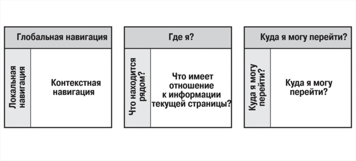
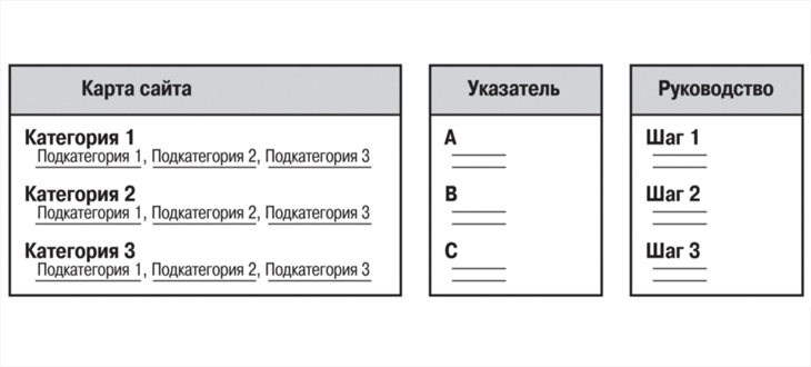
In addition, there are auxiliary navigation systems, such as site maps, indexes, and guides that are outside the pages of the content media.
You should always adhere to several practical rules to ensure the availability of contextual information on your site. For example, users should always know which site they are on, even if they have bypassed the front door - the main page, using the search results or a link to a subordinate page. A fairly obvious way to achieve this is to extend the name of the organization, its logo and graphic style to all pages of the site.
If you already have a ready-made site, we recommend checking it out on several users with the convenience of navigation test.
Here are its main stages:
- Skip the home page and go straight to the middle of the site.
- Selecting an arbitrary page, try to determine your location on the site. Which main section are you in? Where is the parent page?
- Can you determine where to get from this page?
- Are descriptive links enough for you to understand where they lead?
- Is there a noticeable difference between the links so that you can choose the most preferred one?
Built-in navigation systems
Most major web sites have all three main embedded navigation systems: global, local, and contextual. Each of the systems solves specific problems and creates its own difficulties. To develop a successful site, it is important to understand the nature of these systems and their interaction, providing context and flexibility.
Global navigation systems
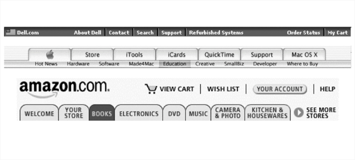
Must be present on every page of the site. Often implemented as a navigation bar at the top of the page. Such global navigation systems allow direct access to the main sections and functions regardless of which part of the hierarchical tree the user is currently in.
Local Navigation Systems
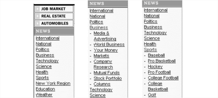
On many web sites, one or more local navigation systems complement the global navigation system, giving users the opportunity to explore a nearby area.
Some tightly managed sites combine global and local navigation into a single consistent system. For example, on a news site, the global navigation panel expands, providing local navigation capabilities for each news category. A reader who chooses the Business category will see other means of local navigation than the reader who chooses the Sport category, but both groups of options will be presented within the same navigation environment.
Contextual navigation
Some links do not fit well into the structured categories of global and local navigation. They require the creation of contextual navigation links specific to a particular page, document, or object. On the e-commerce site, such links (for example, “See also”) may refer to related products or services. On training sites, they may indicate similar articles or related topics.
Thus, contextual navigation supports associative learning. Users learn by exploring the connections that you make between context elements. They can learn about useful products with which they were not previously familiar, or be interested in a topic about which they previously did not know anything. Contextual navigation allows you to create some kind of connective tissue, which is why both users and organization benefit.
Such an approach can create difficulties if these contextual links are important for content creation, since research shows that users often tend to browse pages so quickly that they miss these not very eye-catching links. Therefore, it is sometimes desirable to set aside a separate part of the page for contextual links, or to select them visually.
The main thing when creating such links is a sense of proportion. When used economically, contextual links can complement existing navigation systems, creating another degree of freedom. In excess, they can clutter the pages and confuse visitors.
Site Map
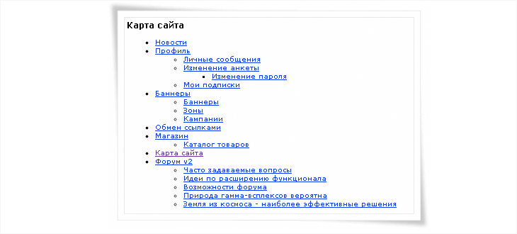
At the dawn of the World Wide Web, the terms “sitemap” (site map) and “table of contents” (table of contents) were used interchangeably. Of course, the "table of contents" seemed to be a more successful metaphor, but the "site map" sounds more attractive and less associated with hierarchy, thanks to which this phrase has become the de facto standard.
A typical sitemap provides a general overview of site content and facilitates the ability to directly access selected areas of this content. The site map may contain graphic or text links that provide the user with direct access to the site pages.
Site maps are most natural for sites that have a hierarchical organization. When deciding to create a site map, you should also consider its size. If the site is small and there are only two or three levels of hierarchy, it may be better to do without a map.
Rules that the card must comply with:
- Reinforce the information hierarchy so that the user can become better acquainted with how the content is organized.
- Facilitate quick direct access to site content for those users who know what they need.
- Do not overload the user with redundant information. It is necessary to help the user, and not to frighten him.
Site index
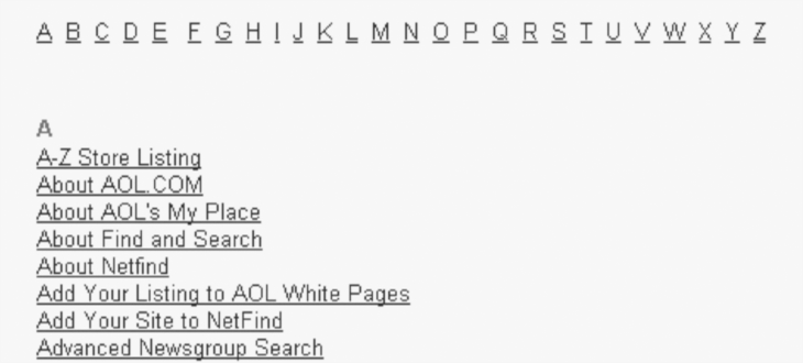
The pointer is effective if the user already knows the name of the item to be searched. Quickly reviewing the alphabetical list, the user gets to the right place: he does not need to know exactly where this element is in the hierarchy.
On large and complex sites, both a sitemap and a pointer are often needed. On small ones, one pointer is enough.
When creating a pointer, there are serious difficulties in choosing the level of detail:
- Does the index of the web page?
- Does the index include separate paragraphs or concepts presented on web pages?
- Does the page group index include?
- What terms will users search for?
In many cases, it is necessary to affirmatively answer all the listed questions and be guided by the answers to these questions when designing. And to find these answers, you need to know the audience of your users and understand their needs.
Manuals
Guides can be presented in different ways, including in the form of excursions, textbooks and mini-portals aimed at specific audiences, topics or tasks. In each of these cases, the guides complement existing navigation tools and improve the understanding of the content of the site.
Guides are often useful tools to familiarize new users with the content and functionality of a website.
When developing guidelines, you should follow these rules:
- The guide should be short.
- The user should be able to exit the manual at any time.
- Navigation links (previous page, initial, next) on each page should be placed in the same place so that users can easily navigate through the manual.
- The manual should be designed in the form of answers to questions.
- Screenshots should be clear, clear and optimal, with enhanced details of the main functions.
- If the manual has enough pages, it may need its own table of contents.
Remember that the guide is intended to familiarize new users with the site and for marketing the site. Many users will never turn to it, and only a few will look into it again. You will certainly have great ideas about how to create a wonderful, dynamic, interactive guide, but you need to understand that it will not play a central role in the daily use of the web site.
Search
The search engine is the central part of auxiliary navigation.
Search is a favorite tool of users, as if they themselves sit at the controls and can indicate their own keywords in search of the necessary information. The search also provides extreme concreteness.
The search or, in a broader sense, the extraction of information is a vast and complex area, and here the topics of the search will be touched only superficially.
Does your site need a search engine?
Before deciding to create a search system, it is advisable to answer the following questions.
- Is the site content large enough?
How much content deserves a search engine? It is difficult to answer this question. Maybe five pages, fifty, five hundred - there is no standard border. It is more important whether users come to the site to search for information on it. - Will creating a search engine divert some of the resources from developing navigation systems?
Many developers view search engines as a solution to the problems that users have when trying to find the necessary information on the site, so on sites with a poorly designed navigation system and other architectural weaknesses, the search engine becomes a quick patch. Sensing this trap, it is better to suspend the implementation of the search system and first solve the problems of the navigation system. - Will users of your site bother searching?
Sometimes it is clear in advance that site users will prefer navigation rather than search. For example, users of a greeting card site are likely to choose to view thumbnail images of cards, rather than search.
Signs that allow you to determine when the site needs a search engine.
- When there is too much information and the available navigation tools are not enough;
- The search mechanism is needed because users believe that it should be.
Users do not always have the desire to wander through the mazes of the site: their time is limited, and the threshold of information perception is lower than it seems. It is interesting that sometimes users refuse to view for erroneous reasons, namely, they are searching, not knowing exactly what to look for, and when navigating through pages would be more useful. But most importantly, users expect this small “search” window to be next to them, wherever they go. This is an established tradition, and it is difficult to fight it.
When a user performs a search in a certain zone, this means that as a result of interaction with the site, he has already identified himself as interested in this specific information. Ideally, search zones on a site should correspond to its specific needs, which will increase the efficiency of information retrieval.
Fourth part
