10 fatal usability mistakes of online stores and something else
“ Do not be afraid of the first mistake, avoid the second, ” folk wisdom teaches us. And the other bluntly indicates who is learning from his mistakes, and who is learning from strangers. Nevertheless, developing an online store is quite easy to make a mistake. Audience features, nuances in the organization of the site and page forms can sometimes only be comprehended by the only correct trial and error method.

According to a study conducted by MasterCard and UsabilityLab, the main points of usability control of the purchase process in the online store were identified. Experts assigned them various degrees of criticality: low, medium, high. Of course, when designing an interface, absolutely all aspects and details must be taken into account - there are no trifles in ensuring the convenience of the buyer. However, there are errors that all developers of online stores need to remember and which cannot be left as they are. We bring to your attention the 10 most gross usability errors of online stores that respondents and experts encountered when they started testing during the study. Note that at the moment, some of these errors on sites have been fixed - online stores still are constantly working to improve usability.
There are two main scenarios for using a basket by an online store buyer.
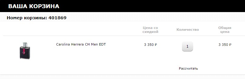
The interface and usability of the shopping cart should be consistent with these scenarios. Gross error - do not indicate in the basket information about the product, its characteristics, image and a link to a detailed description. The user should not determine the correctness of the choice based on the price of the goods alone. A non-clickable image is also not the best solution - when you click on it, either detailed information about the product, or an enlarged photo of the product or a slider with a photo in several angles should be opened.
Let's look at an example. There are no links to the full description of the goods in the catalog in the RIVGOSH shopping basket on the page, so it becomes difficult to check whether the right product is selected. The product photo is also not a link. During the study, this led to the fact that half of the respondents mistakenly ordered the wrong goods that were collected.
You can get a large portion of user annoyance if you do not indicate the available quantity of the product both on the product page itself and in the shopping cart. If information about the availability of goods (or rather, about its lack of availability) is provided too late at the end of the order process, this can significantly reduce customer loyalty to the store. Unfortunately, such an obvious and very annoying mistake is found on the sites of large online stores.
For example, on the M.Video store website, one respondent tried to order a product that was not in the store. Information that the product is not available was provided only at the end of the order process.
On the RivGosh store website, the user learns that the product is not in his city, only after authorization when choosing a delivery method.
Indicate information about the availability of goods in the online store or offline point in a timely manner: for example, in the product card or when adding to the basket. By doing this, you give the buyer the opportunity to make a decision on replacing the product or rejecting the purchase in order to avoid wasting time on placing an unenforceable order.
During the purchase, technical failures are not ruled out: the user accidentally closed the page, the connection was broken, etc. ... In case of a technical problem, the user should be able to continue the order from the same place where he stopped. But often the basket is automatically emptied, and the purchase process has to be started anew. This is a serious usability error: in such situations, there is a high risk that the buyer will refuse to purchase.
During the study, respondents had technical problems with payment, due to which ordering was interrupted. Most often, after this the goods from the basket disappeared, and the respondent had to dissatisfy again to re-enter the goods into the basket for purchase. In one of the situations, the respondent ordered the last product in the Enter store, and after resetting the basket, the product could not be ordered again - it was already out of stock.
Several respondents encountered a similar problem when shopping on the Utkonos store website. At the time of the study, after the completion of registration, the goods disappeared from the basket, and the respondents had to search again on the site. Specifically for the grocery store, this situation is extremely critical - buyers form bulk orders and the repeated search of each item takes considerable time.
Even if the buyer chooses the goods again, with a certain probability the store runs the risk of getting lower payment: during the repeated selection, the user can review the list and cross out a number of goods that he does not seem so necessary. Therefore, for the convenience of the user and the store’s confidence, all products must be stored in the basket until the order process is completed and not disappear after a temporary exit from the site, registration, and when technical problems occur at any stage of the purchase.
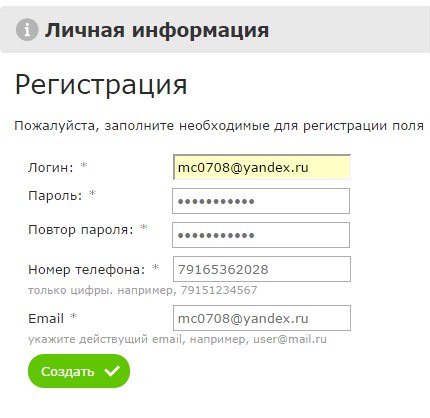
The requirement to register after placing an order is a serious mistake, which has the most unpleasant consequences - not receiving customer data necessary for further interaction with him from both a service and marketing point of view. Registration before placing an order is also not the best solution, because the user spends additional time filling out data, which may not be necessary for him if he then does not buy anything, and as a result, there will be dissatisfaction from the time wasted.
The best way is to collect the necessary information during ordering and provide the ability to create an account password at the end of the order. Also, regardless of the organization of user registration on the website of the online store, it is better to provide clear and well-structured information about the benefits that a registered buyer receives.
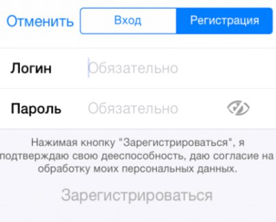
Sometimes online stores are asked to create a separate login to use the service. In exceptional cases, this is a justified decision, but in most situations it is the right way to be forgotten or get double or even triple registrations of the same user who forgot his username.
For example, on the Aeroexpress website you need to separately enter the phone number, e-mail and login. At the same time, the study respondents who wanted to register on the site entered an email address and then copied it into the login field, without worrying about creating a separate username.
If the login can only be e-mail, this must be indicated. When registering in the Ozon application, the user is asked to enter a login, while it is not explained anywhere that only an email address can be a login. Users do not understand why an error is generated during registration, and how to fix it. The email address is used as the user identifier, but the field is called “Login”.
You need to understand that it is difficult for users to remember a huge number of logins for entering various systems, but it is difficult to forget their email address or phone in combination with the usual password chosen. Therefore, these identifiers must be used. And from the point of view of the user it’s easier to return to the store, the username and password from which you remember, than to go through the process of registration, confirmation of mail, authentication again.
Usability errors most unpleasant for the user are related to the final cost of the order, which may unexpectedly change for them - for example, increase due to the commission for the selected payment method. Many stores ignore the timely indication of a change in the order amount, while an increase in the amount at the last stage of registration can cause anger and lead to a rejection of the purchase. In turn, a timely bonus or discount not indicated will not have any effect on the decision to purchase, although they could stimulate payment for the order if the buyer has not made a final decision. An example of such a situation is the site of the store M.Video, where a discount is given when paying with a card, but there is no information about this.
In the case of an increase in the amount of the order, it is critical to report this as soon as possible. A bad example can be taken from the Zara store application, in which some payment methods increase the amount of the order, but nothing is reported about the commission at the stage of choosing the payment option.
A similar situation arises if the delivery cost is not indicated at the very beginning of the order process. The largest number of refusals from placing an order on the websites of online stores is usually associated with additional margins and hidden delivery conditions. The sooner the information that delivery is paid is provided, the better, since users will still be looking for the conditions for the profitable purchase of goods (coupon, discount, promotional code) and leave the store’s website.
For example, when choosing a delivery method, the Enter store website does not contain information that delivery is paid. In a real, and not a test situation, this could lead to a refusal to purchase or to take unnecessary actions to choose another delivery method.
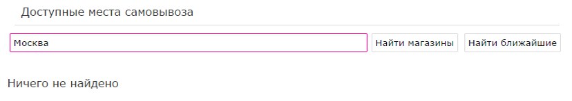
It is most convenient for the buyer to pick up the order along the way: to work, from work, near the house, not far from frequently visited places. Therefore, knowing your route, the user can easily find the point of issue on the map. However, the study revealed that not all sites had the ability to search for pickup points on the map. And in the application of the Ozon store, for example, possible items are represented by a list with the same names. The differences between them are not clear, you have to click on the "Information" icon several times to find out where a particular item is located.
The best solution is to combine the tabular, textual and presentation form of the list of points of issue on the map. In this case, the user will not be confused, but will quickly determine the point he needs.
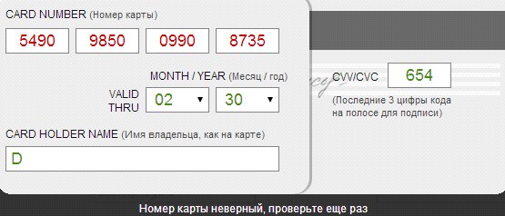
If possible, a technical check of the correctness of the entered data should be carried out while filling in the fields. However, in most of the tested services, the correctness check is performed after the form is submitted, and the error, the reasons for its occurrence and ways to fix it are not obvious.
When making a payment, there is a likelihood of technical problems, for example, from the side of the user (there is no money on the card) or any other problem leading to the cancellation of the payment. If error feedback is provided vaguely, incompletely, ambiguously or absent, it may be difficult for the user to solve the problem.
The screenshots from the Steam and Aeroexpress applications suggest possible actions (contact Steam support and repeat the payment later), but they are useless, since there is no money on the card - the problem is on the user's side.
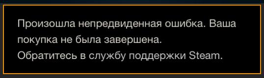

In order to avoid such situations, it is worthwhile to accurately indicate the source and cause of the problem, and it is also advisable to report on methods for its self-rectification (if possible) and indicate the contacts of technical support. For example, if it is indicated that there is not enough money on the card, the buyer will not need to take unnecessary actions and contact technical support specialists - he can use another card or other payment method and complete the purchase.
In cases where the content of the purchase is not indicated on the order confirmation page, the user may have doubts that the right products have been selected. For example, on the Enter store website after registration there is information only about the number and amount of the order. Moreover, if the purchase is made without registration, then you can check its composition and the specified contact information only in an e-mail.
Also on the order confirmation page should be described the next steps to receive the order and the store’s contact information. You must indicate that an email was sent to the email address with the details of the order and the necessary information about the delivery and receipt of goods. If the delivery of goods is arranged, then the terms and address of delivery must be indicated. If pickup was selected, then the page should contain the address and working hours of the store selected by the user.
All stores tested during the study sent a confirmation letter after placing the order. However, many letters did not indicate information important for the buyer about the receipt of goods by the buyer at the point of delivery: place of receipt of the order, delivery time, item operating time, etc. Errors here are different - for example, a letter that arrives in the mail after a purchase on the Ulmart store website indicates what actions need to be completed to receive the goods, but they do not correspond to the delivery method chosen by the user. The letter confirming the order in the Sportmaster store does not indicate information important to the buyer: cost, method and approximate delivery time.

Often, customers open letters from an online store from various devices, for example, mobile. It’s much more convenient for a person to specify the address and time of work of a pick-up point on the road by looking at a letter in a mail application than go to the website of an online store, as a rule, also too “heavy” for a mobile device. Therefore, the letter should be a universal cheat sheet with the maximum detail of the order and delivery parameters.
Undoubtedly, the problem of the usability of online shopping sites is of concern to researchers, marketers, programmers, designers and designers associated with online trading. Some of the analysts willingly share their experiences. For our readers, we decided to present an interesting article on user interface (UI) design techniques that should be avoided. Recently, these methods have been abused not only by online stores, but also commercial sites that do not imply online purchase, but are designed to give users all the information about the product / service. (Tip: if you know English, read the original article - it is written with excellent humor, which cannot be conveyed in adapted retelling).
To some, some errors may seem obvious or strange. However, the selected problems are highlighted precisely because they are often found in the interfaces of sites and online stores, significantly worsening usability. The solution of these problems does not require developers and site owners to have superpowers and knowledge of non-standard design and programming techniques. The only thing required is to conduct a little internal testing, recognize the problems and begin to fix them. Two or three iterations of refinement and self-examination - and you yourself will want to buy something on your own site. And that means that everything worked out! Learn more from our research (PDF, 15MB, 203 pages) Thank you for your attention, to be continued


According to a study conducted by MasterCard and UsabilityLab, the main points of usability control of the purchase process in the online store were identified. Experts assigned them various degrees of criticality: low, medium, high. Of course, when designing an interface, absolutely all aspects and details must be taken into account - there are no trifles in ensuring the convenience of the buyer. However, there are errors that all developers of online stores need to remember and which cannot be left as they are. We bring to your attention the 10 most gross usability errors of online stores that respondents and experts encountered when they started testing during the study. Note that at the moment, some of these errors on sites have been fixed - online stores still are constantly working to improve usability.
Lack of detailed product characteristics in the shopping cart
There are two main scenarios for using a basket by an online store buyer.
- Collect a list of goods and complete an order. Typically, such a scenario is triggered when the user knows exactly why he has visited the site and is ready to buy.
- “Throw” the goods into the basket instead of using the “defer” function and then, sorting through the items and studying the characteristics in detail, make a purchase decision and form an order. Such a scenario is common and works quite well during spontaneous purchases, on sales, during promotions and so on.
The interface and usability of the shopping cart should be consistent with these scenarios. Gross error - do not indicate in the basket information about the product, its characteristics, image and a link to a detailed description. The user should not determine the correctness of the choice based on the price of the goods alone. A non-clickable image is also not the best solution - when you click on it, either detailed information about the product, or an enlarged photo of the product or a slider with a photo in several angles should be opened.
Let's look at an example. There are no links to the full description of the goods in the catalog in the RIVGOSH shopping basket on the page, so it becomes difficult to check whether the right product is selected. The product photo is also not a link. During the study, this led to the fact that half of the respondents mistakenly ordered the wrong goods that were collected.
Lack of information on the available quantity of goods
You can get a large portion of user annoyance if you do not indicate the available quantity of the product both on the product page itself and in the shopping cart. If information about the availability of goods (or rather, about its lack of availability) is provided too late at the end of the order process, this can significantly reduce customer loyalty to the store. Unfortunately, such an obvious and very annoying mistake is found on the sites of large online stores.
For example, on the M.Video store website, one respondent tried to order a product that was not in the store. Information that the product is not available was provided only at the end of the order process.
On the RivGosh store website, the user learns that the product is not in his city, only after authorization when choosing a delivery method.
Indicate information about the availability of goods in the online store or offline point in a timely manner: for example, in the product card or when adding to the basket. By doing this, you give the buyer the opportunity to make a decision on replacing the product or rejecting the purchase in order to avoid wasting time on placing an unenforceable order.
Reset basket contents in case of technical failure
During the purchase, technical failures are not ruled out: the user accidentally closed the page, the connection was broken, etc. ... In case of a technical problem, the user should be able to continue the order from the same place where he stopped. But often the basket is automatically emptied, and the purchase process has to be started anew. This is a serious usability error: in such situations, there is a high risk that the buyer will refuse to purchase.
During the study, respondents had technical problems with payment, due to which ordering was interrupted. Most often, after this the goods from the basket disappeared, and the respondent had to dissatisfy again to re-enter the goods into the basket for purchase. In one of the situations, the respondent ordered the last product in the Enter store, and after resetting the basket, the product could not be ordered again - it was already out of stock.
Several respondents encountered a similar problem when shopping on the Utkonos store website. At the time of the study, after the completion of registration, the goods disappeared from the basket, and the respondents had to search again on the site. Specifically for the grocery store, this situation is extremely critical - buyers form bulk orders and the repeated search of each item takes considerable time.
Even if the buyer chooses the goods again, with a certain probability the store runs the risk of getting lower payment: during the repeated selection, the user can review the list and cross out a number of goods that he does not seem so necessary. Therefore, for the convenience of the user and the store’s confidence, all products must be stored in the basket until the order process is completed and not disappear after a temporary exit from the site, registration, and when technical problems occur at any stage of the purchase.
Usability problems of the registration process
The requirement to register after placing an order is a serious mistake, which has the most unpleasant consequences - not receiving customer data necessary for further interaction with him from both a service and marketing point of view. Registration before placing an order is also not the best solution, because the user spends additional time filling out data, which may not be necessary for him if he then does not buy anything, and as a result, there will be dissatisfaction from the time wasted.
The best way is to collect the necessary information during ordering and provide the ability to create an account password at the end of the order. Also, regardless of the organization of user registration on the website of the online store, it is better to provide clear and well-structured information about the benefits that a registered buyer receives.
Sometimes online stores are asked to create a separate login to use the service. In exceptional cases, this is a justified decision, but in most situations it is the right way to be forgotten or get double or even triple registrations of the same user who forgot his username.
For example, on the Aeroexpress website you need to separately enter the phone number, e-mail and login. At the same time, the study respondents who wanted to register on the site entered an email address and then copied it into the login field, without worrying about creating a separate username.
If the login can only be e-mail, this must be indicated. When registering in the Ozon application, the user is asked to enter a login, while it is not explained anywhere that only an email address can be a login. Users do not understand why an error is generated during registration, and how to fix it. The email address is used as the user identifier, but the field is called “Login”.
You need to understand that it is difficult for users to remember a huge number of logins for entering various systems, but it is difficult to forget their email address or phone in combination with the usual password chosen. Therefore, these identifiers must be used. And from the point of view of the user it’s easier to return to the store, the username and password from which you remember, than to go through the process of registration, confirmation of mail, authentication again.
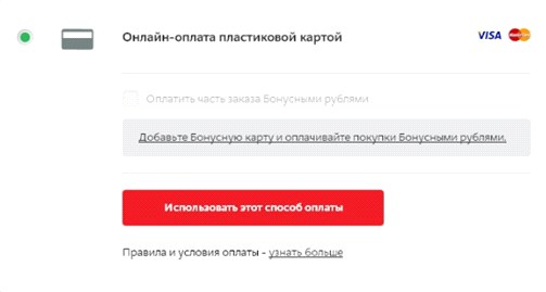
No change in order amount
Usability errors most unpleasant for the user are related to the final cost of the order, which may unexpectedly change for them - for example, increase due to the commission for the selected payment method. Many stores ignore the timely indication of a change in the order amount, while an increase in the amount at the last stage of registration can cause anger and lead to a rejection of the purchase. In turn, a timely bonus or discount not indicated will not have any effect on the decision to purchase, although they could stimulate payment for the order if the buyer has not made a final decision. An example of such a situation is the site of the store M.Video, where a discount is given when paying with a card, but there is no information about this.
In the case of an increase in the amount of the order, it is critical to report this as soon as possible. A bad example can be taken from the Zara store application, in which some payment methods increase the amount of the order, but nothing is reported about the commission at the stage of choosing the payment option.
A similar situation arises if the delivery cost is not indicated at the very beginning of the order process. The largest number of refusals from placing an order on the websites of online stores is usually associated with additional margins and hidden delivery conditions. The sooner the information that delivery is paid is provided, the better, since users will still be looking for the conditions for the profitable purchase of goods (coupon, discount, promotional code) and leave the store’s website.
For example, when choosing a delivery method, the Enter store website does not contain information that delivery is paid. In a real, and not a test situation, this could lead to a refusal to purchase or to take unnecessary actions to choose another delivery method.
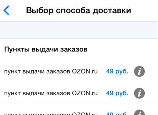
Inconvenient presentation of points of delivery
It is most convenient for the buyer to pick up the order along the way: to work, from work, near the house, not far from frequently visited places. Therefore, knowing your route, the user can easily find the point of issue on the map. However, the study revealed that not all sites had the ability to search for pickup points on the map. And in the application of the Ozon store, for example, possible items are represented by a list with the same names. The differences between them are not clear, you have to click on the "Information" icon several times to find out where a particular item is located.
The best solution is to combine the tabular, textual and presentation form of the list of points of issue on the map. In this case, the user will not be confused, but will quickly determine the point he needs.
Insufficient interface feedback when data is filled in incorrectly
If possible, a technical check of the correctness of the entered data should be carried out while filling in the fields. However, in most of the tested services, the correctness check is performed after the form is submitted, and the error, the reasons for its occurrence and ways to fix it are not obvious.
Uninformative payment error messages
When making a payment, there is a likelihood of technical problems, for example, from the side of the user (there is no money on the card) or any other problem leading to the cancellation of the payment. If error feedback is provided vaguely, incompletely, ambiguously or absent, it may be difficult for the user to solve the problem.
The screenshots from the Steam and Aeroexpress applications suggest possible actions (contact Steam support and repeat the payment later), but they are useless, since there is no money on the card - the problem is on the user's side.
In order to avoid such situations, it is worthwhile to accurately indicate the source and cause of the problem, and it is also advisable to report on methods for its self-rectification (if possible) and indicate the contacts of technical support. For example, if it is indicated that there is not enough money on the card, the buyer will not need to take unnecessary actions and contact technical support specialists - he can use another card or other payment method and complete the purchase.
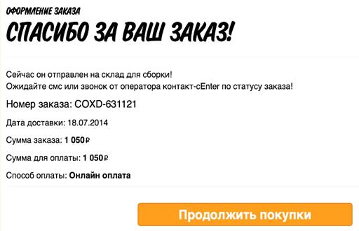
Little information on the order confirmation page
In cases where the content of the purchase is not indicated on the order confirmation page, the user may have doubts that the right products have been selected. For example, on the Enter store website after registration there is information only about the number and amount of the order. Moreover, if the purchase is made without registration, then you can check its composition and the specified contact information only in an e-mail.
Also on the order confirmation page should be described the next steps to receive the order and the store’s contact information. You must indicate that an email was sent to the email address with the details of the order and the necessary information about the delivery and receipt of goods. If the delivery of goods is arranged, then the terms and address of delivery must be indicated. If pickup was selected, then the page should contain the address and working hours of the store selected by the user.
Order information is not duplicated by email
All stores tested during the study sent a confirmation letter after placing the order. However, many letters did not indicate information important for the buyer about the receipt of goods by the buyer at the point of delivery: place of receipt of the order, delivery time, item operating time, etc. Errors here are different - for example, a letter that arrives in the mail after a purchase on the Ulmart store website indicates what actions need to be completed to receive the goods, but they do not correspond to the delivery method chosen by the user. The letter confirming the order in the Sportmaster store does not indicate information important to the buyer: cost, method and approximate delivery time.
Often, customers open letters from an online store from various devices, for example, mobile. It’s much more convenient for a person to specify the address and time of work of a pick-up point on the road by looking at a letter in a mail application than go to the website of an online store, as a rule, also too “heavy” for a mobile device. Therefore, the letter should be a universal cheat sheet with the maximum detail of the order and delivery parameters.
... and 15 more enemies of usability
Undoubtedly, the problem of the usability of online shopping sites is of concern to researchers, marketers, programmers, designers and designers associated with online trading. Some of the analysts willingly share their experiences. For our readers, we decided to present an interesting article on user interface (UI) design techniques that should be avoided. Recently, these methods have been abused not only by online stores, but also commercial sites that do not imply online purchase, but are designed to give users all the information about the product / service. (Tip: if you know English, read the original article - it is written with excellent humor, which cannot be conveyed in adapted retelling).
- The reset button in the form (reset, clear). Such buttons can occur in the form of comments on the order or feedback forms with the online store, where the user enters his message. If such a button is located next to the submit button (send, submit, post), then when it is accidentally pressed, the entire form is reset. If the text is not copied, but created initially in the form, this is extremely annoying to the buyer.
- A similar problem occurs with the Cancel button (close, cancel). If it is close to the Back buttons or others, then its operation is also extremely undesirable.
- It happens that the button to close the window (the same “cross” in the upper right corner) performs an action not expected by the user, for example, minimizes the window to tray or reduces it. While this button should perform the only action - close the window by a user click.
- The appearance of a pop-up (window) callback form during the first minute of a user’s stay on the site. The visitor, perhaps, has not yet decided what he wants to find out or find, and he is compulsively offered to call back. It is better to create a noticeable call order button and enable the user to get acquainted with the site.
- The hidden password entry field is the very ***** that mask the entered characters. It is especially easy to make a mistake if the password is entered from the touch keyboard of a mobile phone - in such cases it is more convenient to control the characters on the screen. Users should be given a choice: show the password when entering or not.
- Slideshows (flash, video, etc.) that automatically play on the page without the visitor’s desire are another common mistake. Do not rely on this to cause interest - rather, the unexpected behavior of the page will cause the user to close it.
- No less popular carousel sites are not the best solution, especially if you do not have a separate adapted mobile site designed without a carousel. Carousels do not display well on mobile devices and the site on devices does not look up-to-date.
- A dropdown menu is far from the best way to navigate a site. First of all, because it is inconvenient for users of mobile devices. If one more menu is embedded in such a menu, then the site becomes completely uncomfortable, difficult to navigate and difficult to load.
- A docked toolbar (toolbar, toolbar, navigation menu) is a convenient solution for the user - no matter how much he uses the site, all the basic functions are fixed and available. However, often developers design the toolbar unsuccessfully, and it still disappears when scrolling. This behavior should be avoided .
- While navigating the site, the user should be able to return to the main page at any time. It’s bad if you don’t have a Home button (home, home), but it’s completely unacceptable if a user clicks on your logo on the site and does not return to the main page, but remains in the current position. And here’s the perfect site in terms of navigation instructions :-)

- The button for calling up the site menu in the corner (hamburger navigation icon) is a convenient solution for a mobile, but not the best one for a desktop site, where there is enough space for designing a full menu. Such navigation forces the user to perform unnecessary actions on the site.

- The fashion for long pages of sites (for scrolling) gave rise to the priority of the keyboard when navigating the site. For most users, this is an uncomfortable and unusual way and it is better to avoid it, giving priority to the mouse. This is not in the original article, but here you can add the incredibly inconvenient horizontal movement of pages when scrolling with the mouse ( try ). This is original and perhaps even convenient for mobile gadgets, when you can scroll through a site like a book, but this behavior of the pages on the screen contradicts the movements of the user and the mouse wheel and causes bewilderment.
- Bad color schemes are something that is very common on the Internet: red on burgundy, white font on yellow ... To avoid mistakes in color solutions, you should carefully study the theory of color or use special tools.
- Small print on the site - do not force the user to strain their eyes or use additional optical means to view pages.
- Captcha (captcha) - a computer test used to determine whether a user is a human or a robot) that occurs immediately upon entering the site is nonsense. It is better to check whether a robot or a person has visited the site and to protect itself from bots and spam at the stage of registration or sending feedback.
To some, some errors may seem obvious or strange. However, the selected problems are highlighted precisely because they are often found in the interfaces of sites and online stores, significantly worsening usability. The solution of these problems does not require developers and site owners to have superpowers and knowledge of non-standard design and programming techniques. The only thing required is to conduct a little internal testing, recognize the problems and begin to fix them. Two or three iterations of refinement and self-examination - and you yourself will want to buy something on your own site. And that means that everything worked out! Learn more from our research (PDF, 15MB, 203 pages) Thank you for your attention, to be continued