What was interesting on DataVizDay in Minsk
On Thursday, October 4, I attended the DataVizDay conference in Minsk as a speaker. I will share the most interesting ideas and impressions of Misna.
Key ideas:
- 80% of your efforts will be up to BI and visualization, because the data is either bad or very bad and basically you will spend time preparing and collecting data.
2. However, visualization creates the value of your product date. Without visualization it turns out just a bunch of numbers. - Unfortunately, very often visualization is bad, bad approaches are used, types of graphs and histograms overload views with details. As a result, we often see Kill by powerpoint and the abundance of data does not add transparency to the analytics.
- Excel continues to occupy a significant role in the processes. And often companies are not ready to move on to something advanced. But even on Excel you can build a lot of interesting things, because a good analyst probably starts with cleanliness and data preparation, and not with beautiful dashboards.
- From business cases - using data on social networks to build a map of "thoughts" about parts of the city. For example, in Moscow, all tweets about the center, and no one writes about life around the center. It is as if he is not in the social space, although most of the inhabitants of Moscow live there.
- More traditional cases are end-to-end analytics from contact to sale. True, so far no one came with a case study not just through analytics from the contact, but given the fact that the client may have many contacts and the last contact that led to the purchase is not the most reliable pointer to the channel of attraction. So while all of our end-to-end analytics is somewhat skewed by the excessive importance of the channels and the underestimation of the fact that people may have many contacts with the brand.
- There have been a lot of discussions about bad visualizations and how you can fix them. I learned that people are abusing a pie chart and a whole block of one of the presentations was set aside to overcome this problem. Pie charts are suggested to be changed to column, sankey diagrams or to replace lines altogether.
- Two paradigms struggle - the data analyst should only poke at the buttons and the data analyst should be able to write code (R / python, SQL) for his visualizations and data processing pipeline. Personally, I am a supporter of the second approach, something like the DevOps paradigm, only in analytics, when a technical issue should not be an obstacle in the delivery of an analytic product.
- Many people with whom I spoke often complain that they have never built a convenient data storage and have to finish a lot of things in Excel. This is despite the fact that they have many bearded Itshnikov, who saw this storehouse for years.
- Another problem is the strong IT / non-IT separation. People do not know how to speak the same language and do not solve the problem, but only solve problems in “their area of responsibility”. From this and there are no necessary storage, and next to them people saw their pipeline on the Excel.
- We talked with a colleague about another pressing issue - how to increase Data Literacy in the company. Whatever the data and storage of their incorrect extraction, interpretation and processing means fake analytics. And since the data is becoming more democratic, then each user must somehow receive minimal training in order to use this data. But often in companies, things are not so good with this preparation, training and documentation on the use of storage. If someone was able to organize a good training on Data Literacy, then you can speak - the actual topic and I will sit in the front row.
- Some of the topics affected work with maps. I unfortunately missed these speeches. I can only say that working with maps and their visualization is really interesting and important for managing a company. Boards and power BI can draw various maps, points, polygons and lines on maps, a circle full of geodata sources that you can combine with your company's data and get interesting insights: new points for business, concentration of competitors, information about the distance to your customers, the relationship between housing level and consumption level and much more. Soon I will write my experience with maps and what tools we tried.
- My topic of the report was devoted to the experience of organizing the work of the analyst department on scram. About this I will do a separate post.
Should I go to the conference? Yes worth it. But just expect that you should receive a comparable piece of useful information not from reports, but from communication with people who come with problems similar to yours. Do not tuple on coffee breaks, but communicate with as many people as possible!
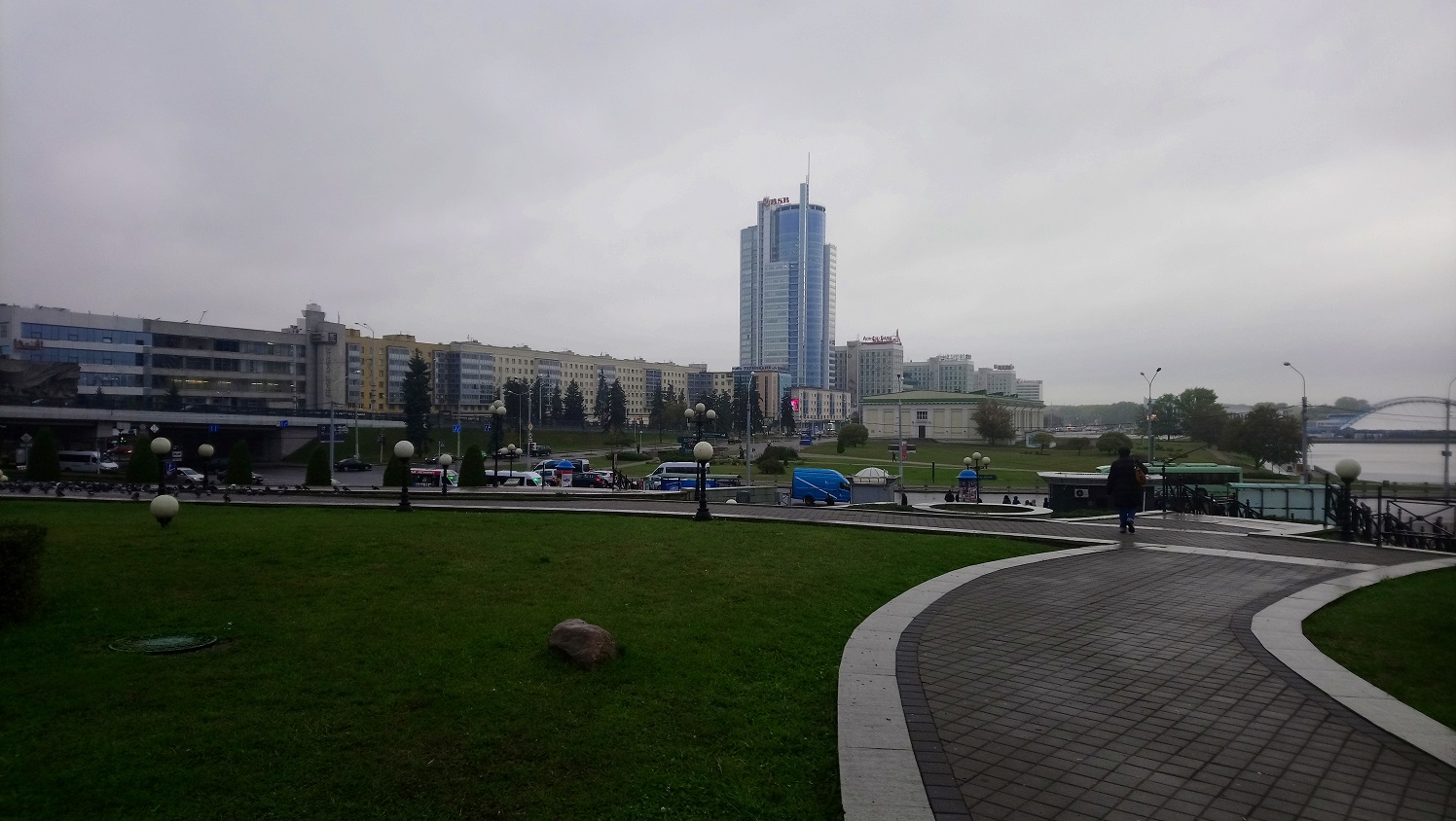
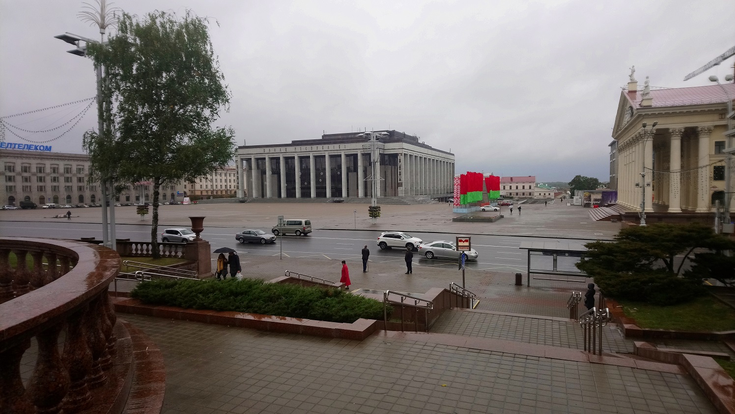
Minsk itself is a beautiful city. For some reason I was expecting a “frozen scoop”. In any case, this impression remains from the international part of Minsk airport. But the city itself looks like a mixture of St. Petersburg, Stalin’s Moscow and not a lot of Sovka. At the same time, everything is neat, not overloaded with sealing buildings, a lot of space and even “soviet” houses look decent.
The organizers promised to hold a conference next year at two venues in Moscow and Minsk, so if you don’t come to come to Minsk, then try to come to Moscow.
I also had a report and not at all about visualization, but about how we did the scrum in the analytical team. I will share the reports in the next article.