 June 23, 2015 at 02:51
7 web design trends in the near future
- Transfer
Many articles try to talk about what is now considered to be cool in web design. I will try to go beyond obvious boundaries and make predictions on this topic.
We forgot how difficult it was to scroll pages before. I had to drag the cursor to the right edge to use such an ancient thing as a scroll bar. If you were already a professional then, you could use the mouse wheel, cursor keys or trackpad - but in this you overtook most users.
In 2015, scrolling is easier than clicking. On the mobile, you can scroll with your thumb. And getting hit on the target is harder - exactly the opposite compared to the desktop.
As a result, more and more sites will be built on the idea of the superiority of scrolling over clicks. And of course, that is what we see.
This trend will continue as mobile devices become larger. Modern sites have less click space and more scrolling. Fewer links, more buttons, large clickable areas and tall pages to scroll through.
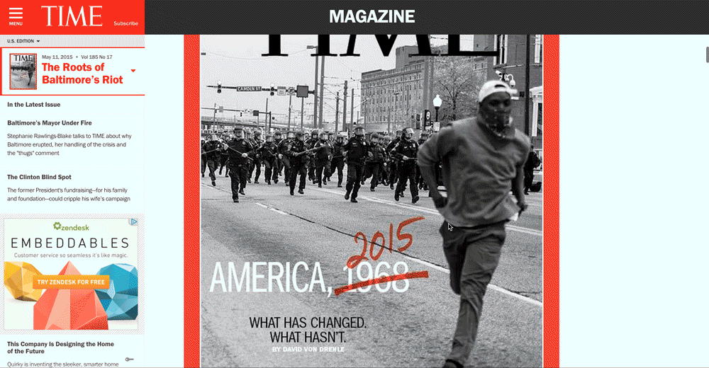
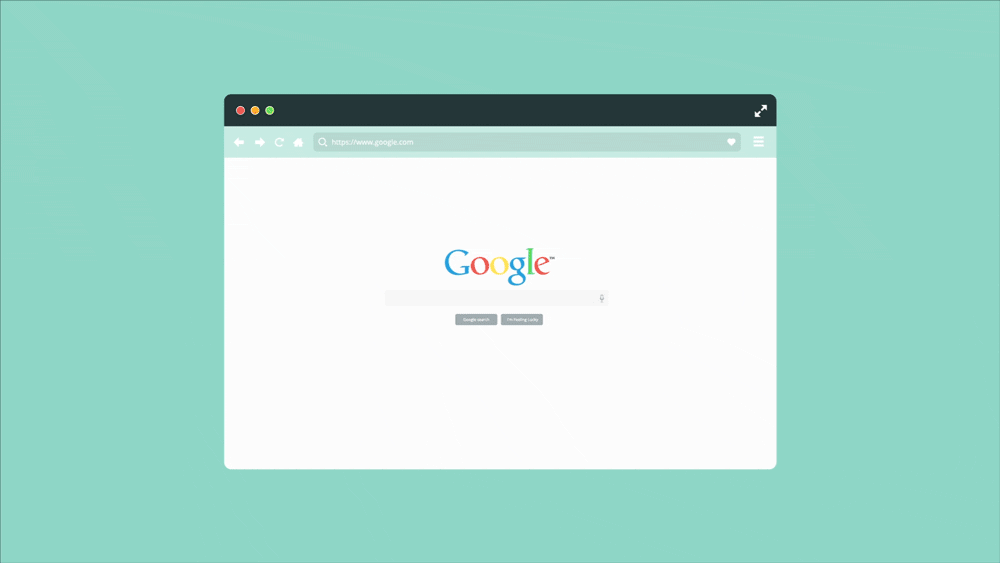
Sites dividing articles into several pages will soon realize this. They will turn into single-page pages, or even, like TIME, into endless pages.
It is not yet known whether the web will appear on the watch - but if so, then it will probably be controlled by gestures there.
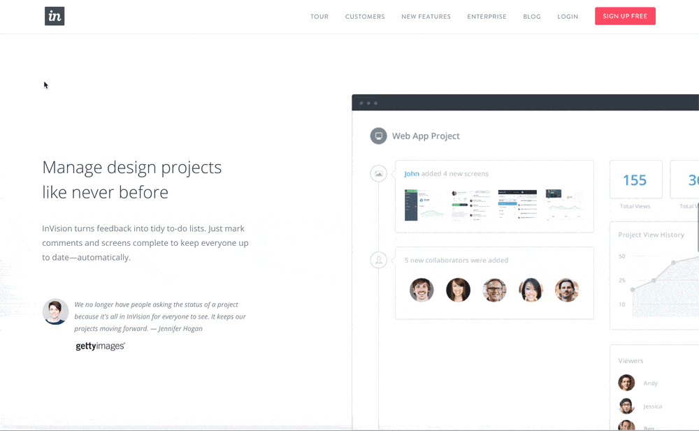
Scrolling does not cost anything, and devices vary greatly in size - so minimized menus go away. Designers can finally not push everything to the top of the page. This leads to a design like Medium - full-page page headers, with content that only opens after scrolling.

Using tall pages, designers can fill them with large beautiful pictures. In 2015 there will be more sites using vertical space and more large images.
Today, any teenager is an expert on the use of the web. Even beginners are able to use browser tabs and a gesture to return to the previous page. As a result, everything speeds up and the user becomes less tolerant. If you want to make yourself calm, slow down the Internet for a while.
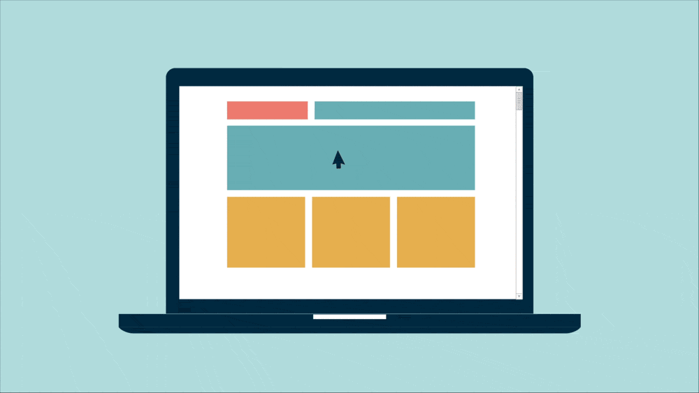
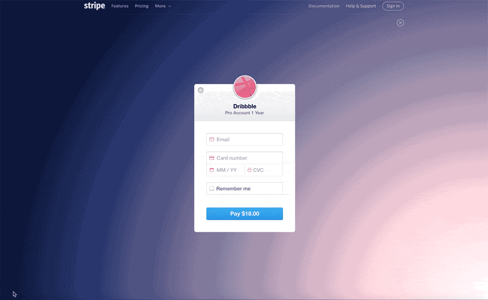
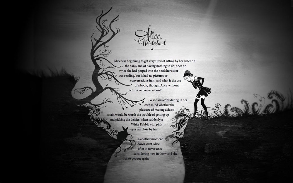
Sites should become not only faster technically, but also easier to understand. User-retarding designs are similar to sites that load slowly. Simple designs are easier to look around. It’s easier to see which of these designs is newer - the one that you can enjoy faster:
This is the main cause of death of skeuomorphic design (copying the form or appearance of objects by other means) - users are more susceptible, less patient and a lot of information slows them down.
Mobile applications are ahead of websites by offering minimalistic and beautiful interfaces. This is because minimalism works better.

Flat design is just the beginning. The trend is towards immediateness and simplicity.
On a desktop, a pixel is a pixel. It is even known how many pixels in an inch are usually 72 dpi. Now few people know what it is.
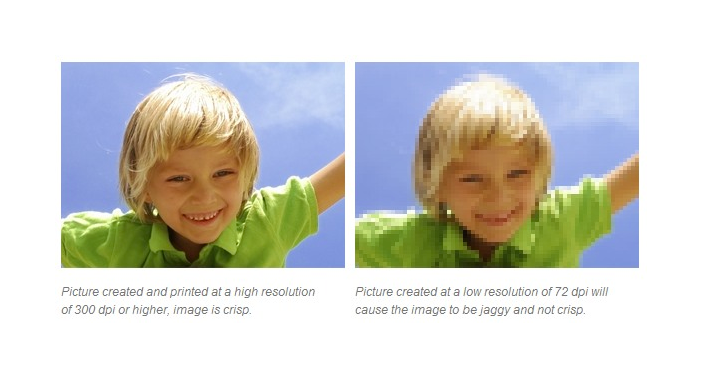
In responsive design, everything goes to grids and percentages. But there is another unreached topic: bitmap images. Almost the entire web is built on half-screen images, and they do not scale. On retina displays and modern browsers, it's time for vector images.
This is already happening with font-based and Material design icons from Google. They are ideal for designers and modern browsers.
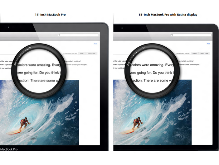
There are already technologies, but a professional designer needs to give time to change habits so that they can make websites for high-quality screens. When the mid-desktop screen reaches retin quality, designers will follow.
Throw in “Under Construction” GIFs and Flash animations to create the impression of an old site. But in the modern world, animation is returning in a new form. The flat design looks pretty dull. Animation helps sites stand out and push more information into the same space.
Mobile applications have changed user expectations. They use movement to convey meaning, and sites begin to do roughly the same thing.
Technologies like CSS animations make it easy to improve designs without the need for plugins or problems with speed and compatibility. Web components (about them below) will accelerate this process.
GIF animation has returned and works efficiently, it's so easy to create and share it.
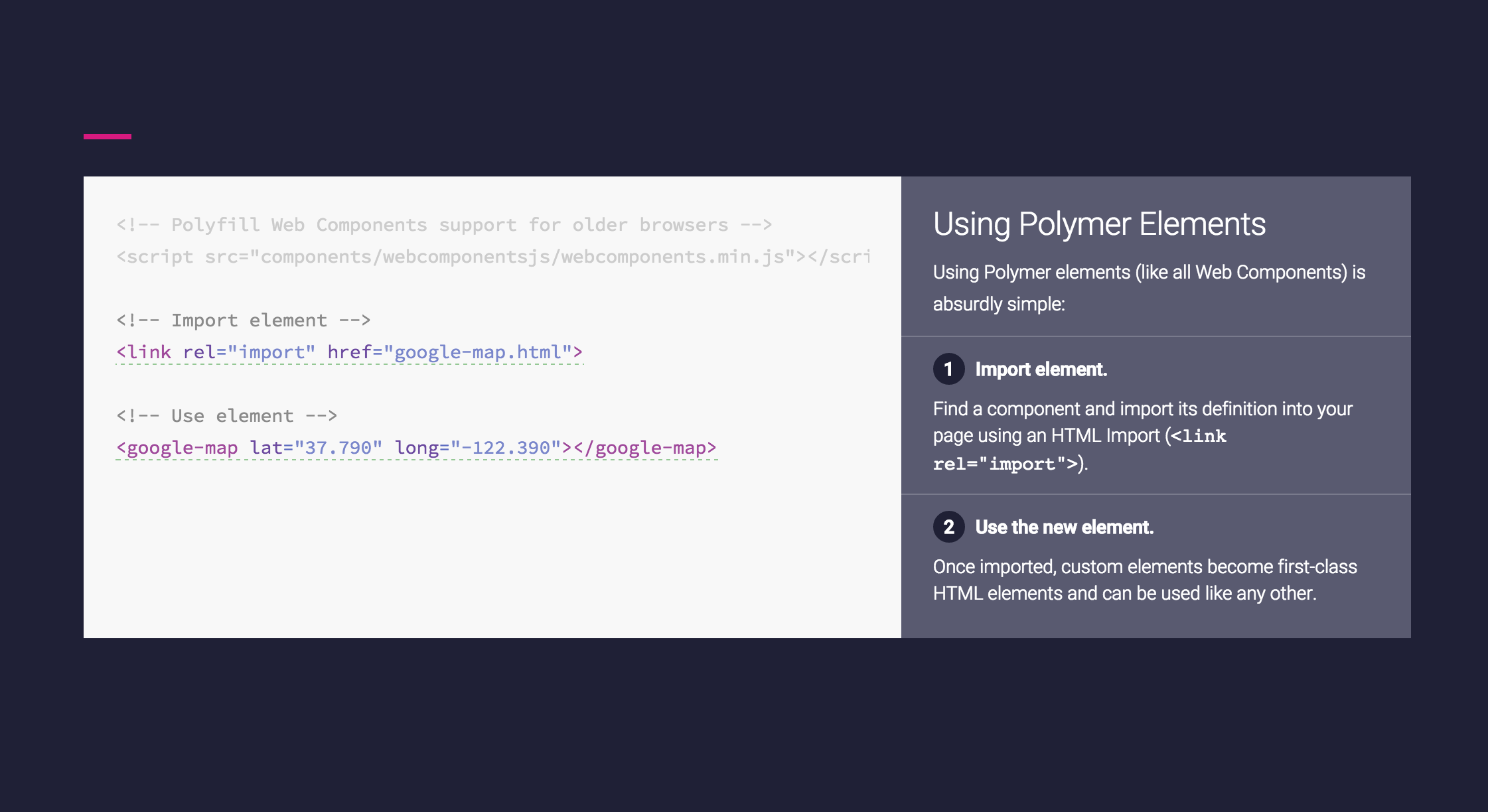
Web technologies are becoming more complex and less semantic. Designers have to write complex code on pages to use simple things, such as inclusion in the Google Analytics page or the Facebook Like button. It would be easier if they could write something like:
And this is possible with web components that will begin to be distributed in 2015. Google's Material design has already come to us, and can serve as a catalyst for this movement. It provides animations and interaction components taken from Android applications, with simple tags like
If it takes root, then many more frameworks will appear on the basis of components. Perhaps Bootstrap 4.0?
Social networks are very successful, but content producers are not so happy. The problem is saturation. On Facebook, users see only those of the billions of posts that, according to the network, will appeal to most users. Over time, fewer people see your posts. This problem can be solved, oddly enough, by paying Facebook.
Social networks will not die, but in 2014 many notable bloggers like Tim Ferris turned their backs on social networks and focused on the good old email newsletters. Emails have an advantage - they will see a larger percentage of people.
I believe that this trend will intensify in 2015, along with web notifications (which work the same way as notifications in mobile applications).
This cool technology will be noticed only by designers. CSS shapes allow you to embed content in forms, for example, in circles:
This is cool, but until browsers are guaranteed to support it, it is probably risky to spend time on this and make two different design implementations for old and new browsers. And besides designers, no one will notice. But this is awesome.
In 2014, mobile applications replaced desktops, but the bulk of web designers have not yet pulled themselves up. Most organizations order a website that looks good on a computer, and works on a mobile secondarily. In 2015, such a strategy seems unprofessional. Mobile phones are becoming the main web devices.
Flat design is already everywhere, but it's not just flat buttons - most importantly, these are simpler and faster sites. Simplicity is not fashion, it is the future.
It’s becoming more and more fashionable to insert animations into posts that look high quality and improve user experience.
Pixels and hidden menus with clicks go away, giving way to scrolling. Web components make it easy to create sites that are similar to mobile apps.
We are now witnessing the arrival of best practices from mobile apps to the web. Over time, the difference between applications and sites may completely disappear.
1. Gestures instead of clicks
We forgot how difficult it was to scroll pages before. I had to drag the cursor to the right edge to use such an ancient thing as a scroll bar. If you were already a professional then, you could use the mouse wheel, cursor keys or trackpad - but in this you overtook most users.
In 2015, scrolling is easier than clicking. On the mobile, you can scroll with your thumb. And getting hit on the target is harder - exactly the opposite compared to the desktop.
As a result, more and more sites will be built on the idea of the superiority of scrolling over clicks. And of course, that is what we see.
This trend will continue as mobile devices become larger. Modern sites have less click space and more scrolling. Fewer links, more buttons, large clickable areas and tall pages to scroll through.
Sites dividing articles into several pages will soon realize this. They will turn into single-page pages, or even, like TIME, into endless pages.
It is not yet known whether the web will appear on the watch - but if so, then it will probably be controlled by gestures there.
2. Collapsed menus die off
Scrolling does not cost anything, and devices vary greatly in size - so minimized menus go away. Designers can finally not push everything to the top of the page. This leads to a design like Medium - full-page page headers, with content that only opens after scrolling.
Using tall pages, designers can fill them with large beautiful pictures. In 2015 there will be more sites using vertical space and more large images.
3. Users are accelerated, sites are simplified
Today, any teenager is an expert on the use of the web. Even beginners are able to use browser tabs and a gesture to return to the previous page. As a result, everything speeds up and the user becomes less tolerant. If you want to make yourself calm, slow down the Internet for a while.
Sites should become not only faster technically, but also easier to understand. User-retarding designs are similar to sites that load slowly. Simple designs are easier to look around. It’s easier to see which of these designs is newer - the one that you can enjoy faster:
This is the main cause of death of skeuomorphic design (copying the form or appearance of objects by other means) - users are more susceptible, less patient and a lot of information slows them down.
Mobile applications are ahead of websites by offering minimalistic and beautiful interfaces. This is because minimalism works better.
Flat design is just the beginning. The trend is towards immediateness and simplicity.
4. Pixels are dead
On a desktop, a pixel is a pixel. It is even known how many pixels in an inch are usually 72 dpi. Now few people know what it is.
In responsive design, everything goes to grids and percentages. But there is another unreached topic: bitmap images. Almost the entire web is built on half-screen images, and they do not scale. On retina displays and modern browsers, it's time for vector images.
This is already happening with font-based and Material design icons from Google. They are ideal for designers and modern browsers.
There are already technologies, but a professional designer needs to give time to change habits so that they can make websites for high-quality screens. When the mid-desktop screen reaches retin quality, designers will follow.
5. The animation is back
Throw in “Under Construction” GIFs and Flash animations to create the impression of an old site. But in the modern world, animation is returning in a new form. The flat design looks pretty dull. Animation helps sites stand out and push more information into the same space.
Mobile applications have changed user expectations. They use movement to convey meaning, and sites begin to do roughly the same thing.
Technologies like CSS animations make it easy to improve designs without the need for plugins or problems with speed and compatibility. Web components (about them below) will accelerate this process.
GIF animation has returned and works efficiently, it's so easy to create and share it.
6. Components are new frameworks.
Web technologies are becoming more complex and less semantic. Designers have to write complex code on pages to use simple things, such as inclusion in the Google Analytics page or the Facebook Like button. It would be easier if they could write something like:
And this is possible with web components that will begin to be distributed in 2015. Google's Material design has already come to us, and can serve as a catalyst for this movement. It provides animations and interaction components taken from Android applications, with simple tags like
If it takes root, then many more frameworks will appear on the basis of components. Perhaps Bootstrap 4.0?
7. Social saturation and direct email sunrise
Social networks are very successful, but content producers are not so happy. The problem is saturation. On Facebook, users see only those of the billions of posts that, according to the network, will appeal to most users. Over time, fewer people see your posts. This problem can be solved, oddly enough, by paying Facebook.
Social networks will not die, but in 2014 many notable bloggers like Tim Ferris turned their backs on social networks and focused on the good old email newsletters. Emails have an advantage - they will see a larger percentage of people.
I believe that this trend will intensify in 2015, along with web notifications (which work the same way as notifications in mobile applications).
Bonus Non-Prediction: CSS Forms
This cool technology will be noticed only by designers. CSS shapes allow you to embed content in forms, for example, in circles:
This is cool, but until browsers are guaranteed to support it, it is probably risky to spend time on this and make two different design implementations for old and new browsers. And besides designers, no one will notice. But this is awesome.
What to expect in 2015
In 2014, mobile applications replaced desktops, but the bulk of web designers have not yet pulled themselves up. Most organizations order a website that looks good on a computer, and works on a mobile secondarily. In 2015, such a strategy seems unprofessional. Mobile phones are becoming the main web devices.
Flat design is already everywhere, but it's not just flat buttons - most importantly, these are simpler and faster sites. Simplicity is not fashion, it is the future.
It’s becoming more and more fashionable to insert animations into posts that look high quality and improve user experience.
Pixels and hidden menus with clicks go away, giving way to scrolling. Web components make it easy to create sites that are similar to mobile apps.
We are now witnessing the arrival of best practices from mobile apps to the web. Over time, the difference between applications and sites may completely disappear.