Secrets of formatting letters in helpdesk
You do not judge the book by its cover, but the text should be judged by style. Appearance in this case is not just something superficial. We write to convey information, but the wrong style always prevents it. We have prepared some tips so that each of your letters the client clearly heard and understood.
Customer Procedures A
poorly written support letter is read as an airplane instruction manual. To prevent the client from floundering like a fish pulled out of water, let him calmly go with the flow.
See how the client actually uses the advice that you give him. Does it really follow the steps 1,2,3 you proposed? How logical is the instruction organized, not only by what should be done, but also by complexity?
Here are a few principles:
Follow the chronology
without exception. The first action that the client must take should be at step 1. And so with each next step. Arrange the
steps for difficulty.
A support letter can also be organized based on the complexity of the actions taken. If the complex task can be represented as “First” (that is, the order is not too significant), show customers that the simplest thing is to be done first. Difficulties at the very beginning reduce the likelihood that the client will approach the last step.
Hold attention
Most likely, the client will lose the thread of the story if you send him a link to the video, a few paragraphs long. Support should structure the response in such a way that the client is not distracted from reading / performing actions until it reaches the end.
Like posting help information, put the links in a special section to encourage customers to click on them only when everything else is ready.
Using underline, bold, and italics
In hell there is a special place for those who underline text that is not a link. No, really, it's 2015. There is no reason to underline the text in letters.
Bold is a good way to organize customer requests in response to segments. But it becomes completely uselesswhen you start highlighting random words, causing customers to stumble for no reason.
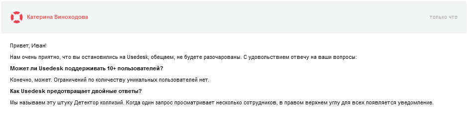
You can even rethink the client’s question and add clarity. Bold what he really asks and answer below on this. Here is an example:
This is the most common type of letter: the meaning is generally clear, but the question is not exactly asked. Decrypt for yourself and use bold to structure your answer.
In short, bold frames your answer, separates chunks of text, and makes reading easy from top to bottom.
Italics are useful for a slight emphasis on something useful. For example, you can tell the client "go to your settings", but it is better to answer "in the upper right corner, click My settings". So you focus on what exactly the customer should look for. It’s not easy to read when everything is highlighted in italics; use it only as a highlight.
Using bulleted lists and links
Flexible structure always makes reading easier. A bulleted list is a simple example. Use bullet points to the “ladder” of the long instruction. And if you need to discuss the list of orders, use the numbering. Example below:

The wording points to the main points, but it’s even easier to follow the list:
It seems obvious, but I got a lot of answers in which support missed the opportunity to simplify my life by breaking the structure into steps in this way.
Links are a little trickier. It is known that an excessive number of links in any part of the letter interfere with understanding. They are too distracting. Use the principle of email marketing: select only those links that you just click on. It matters when you share important documentation or just want the client to watch something. Here are two examples.

The problem with the links here is that they are buried in the message, and the anchor text poorly describes where the link leads. Call to action is easy to apply outside of marketing. In a letter of support, you also encourage the client to move towards a specific goal.
Let's try again:

Leaving links to dessert, you do not interrupt the client while reading. Add text around links so that the client understands what to do next.
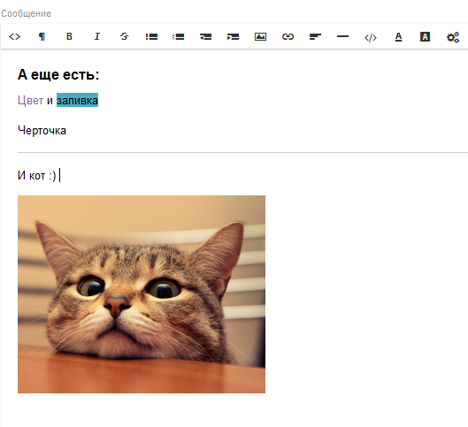
In order to make it easy for you to write clear instructions to your customers, we have built a formatting line in Usedesk. Change the font, insert links, lists, pictures - just like in a regular Word and no troubles with html.
Excellent support to you, your Usedesk .
Customer Procedures A
poorly written support letter is read as an airplane instruction manual. To prevent the client from floundering like a fish pulled out of water, let him calmly go with the flow.
See how the client actually uses the advice that you give him. Does it really follow the steps 1,2,3 you proposed? How logical is the instruction organized, not only by what should be done, but also by complexity?
Here are a few principles:
Follow the chronology
without exception. The first action that the client must take should be at step 1. And so with each next step. Arrange the
steps for difficulty.
A support letter can also be organized based on the complexity of the actions taken. If the complex task can be represented as “First” (that is, the order is not too significant), show customers that the simplest thing is to be done first. Difficulties at the very beginning reduce the likelihood that the client will approach the last step.
Hold attention
Most likely, the client will lose the thread of the story if you send him a link to the video, a few paragraphs long. Support should structure the response in such a way that the client is not distracted from reading / performing actions until it reaches the end.
Like posting help information, put the links in a special section to encourage customers to click on them only when everything else is ready.
Using underline, bold, and italics
In hell there is a special place for those who underline text that is not a link. No, really, it's 2015. There is no reason to underline the text in letters.
Bold is a good way to organize customer requests in response to segments. But it becomes completely uselesswhen you start highlighting random words, causing customers to stumble for no reason.
You can even rethink the client’s question and add clarity. Bold what he really asks and answer below on this. Here is an example:
This is the most common type of letter: the meaning is generally clear, but the question is not exactly asked. Decrypt for yourself and use bold to structure your answer.
In short, bold frames your answer, separates chunks of text, and makes reading easy from top to bottom.
Italics are useful for a slight emphasis on something useful. For example, you can tell the client "go to your settings", but it is better to answer "in the upper right corner, click My settings". So you focus on what exactly the customer should look for. It’s not easy to read when everything is highlighted in italics; use it only as a highlight.
Using bulleted lists and links
Flexible structure always makes reading easier. A bulleted list is a simple example. Use bullet points to the “ladder” of the long instruction. And if you need to discuss the list of orders, use the numbering. Example below:
The wording points to the main points, but it’s even easier to follow the list:
It seems obvious, but I got a lot of answers in which support missed the opportunity to simplify my life by breaking the structure into steps in this way.
Links are a little trickier. It is known that an excessive number of links in any part of the letter interfere with understanding. They are too distracting. Use the principle of email marketing: select only those links that you just click on. It matters when you share important documentation or just want the client to watch something. Here are two examples.
The problem with the links here is that they are buried in the message, and the anchor text poorly describes where the link leads. Call to action is easy to apply outside of marketing. In a letter of support, you also encourage the client to move towards a specific goal.
Let's try again:
Leaving links to dessert, you do not interrupt the client while reading. Add text around links so that the client understands what to do next.
In order to make it easy for you to write clear instructions to your customers, we have built a formatting line in Usedesk. Change the font, insert links, lists, pictures - just like in a regular Word and no troubles with html.
Excellent support to you, your Usedesk .