We optimize the web with Vitaly Friedman: download speed, memory, CPU
This is the second post about all sorts of tricks in front-end development. It addresses the issue of optimizing the site, its download speed on devices with insufficient RAM and a slow CPU.
A separate conversation about the tools that will help speed up and monitor the work of the site and third-party applications that are connected to it. Plus, a story about the features of the layout of email-mailings, which will surprise you a lot.

The material is based on the transcript of Vitaly's report from the HolyJS 2018 Piter conference .
The first part is here: Optimizing the web with Vitaly Friedman - compression, images, fonts, HTTP / 2 features and Resource Hints .
The second part of:
This part is about performance. How to raise it? For a while, we used the Cutting the mustard technique. Its essence is to find out with the help of a snippet whether we are dealing with an old or new browser. Depending on this, it was determined which script and styles to load, so as not to load them with unnecessary functionality.
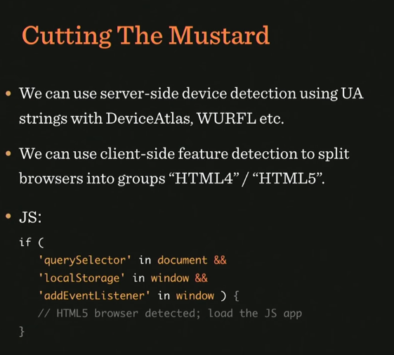
Sample snippet for browser definition

Then it became possible to replace the sequence from the querySelector, localStorage and addEventListener with the visibility state API - and that was basically what they did in small projects. But there was a problem with this technique - the same thing that happens with all other technicians, including those that you use.
The problem is that when we want to give beautiful styles to a new browser, we do not know how well it will draw them, because it depends on the device on which it is running. The fact is that there are devices from the low-end segment (for example, Motorola Moto G4), which have little RAM and a weak processor. Nevertheless, they installed a new browser that supports all (or almost all) technologies that we have.
Therefore, to use this technique today is no longer possible.
Why not make it so that the responsive layout is displayed only on those devices that "pull" it in terms of hardware resources? For this we can use the Device Memory API. If this API is not available, you can roll back to "cutting the mustard".
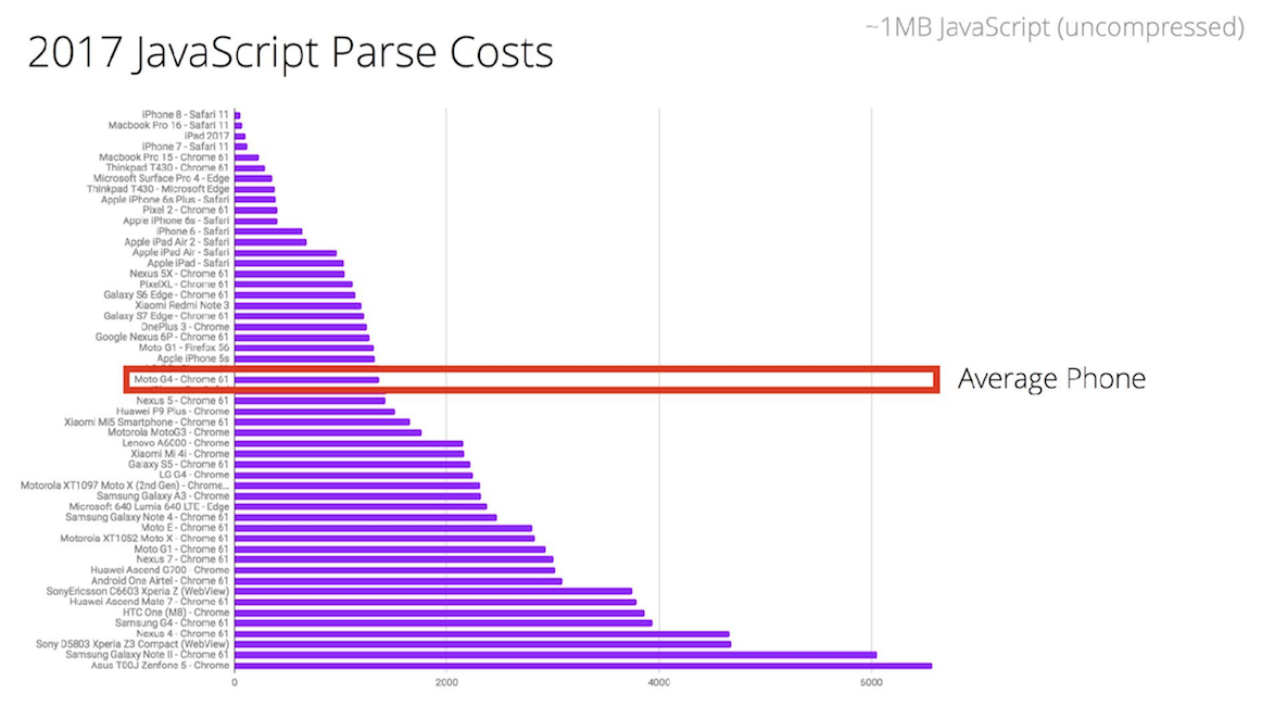
And here is the Moto G4 itself:

In the figure below you can see where the Moto G4 is in the ranking of phones by the criterion of time for which javascript is parsed. This is middling - and there are many such phones. In comparison with the leader of the rating, this phone needs 16 times more time for parsing.
If you look at the data on the sites on mobile phones, it is clear that the most time is spent on parsing JS.
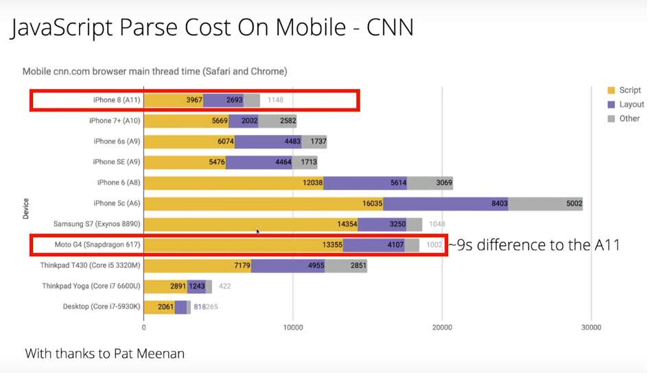
Yellow indicates page parsing time.
In fact, this is a very big problem. In order to parse 1 megabyte of scripts, Moto G4 takes 35 seconds. Considering that most sites use only 40% of the entire script on the site, you can try to find a way out of this situation in order to reduce the time for parsing. Gmail, for example, commented on all the code and sent it as a text variable, and then, when this code was required, eval was made of that variable.
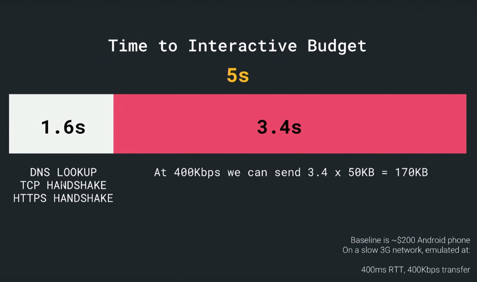
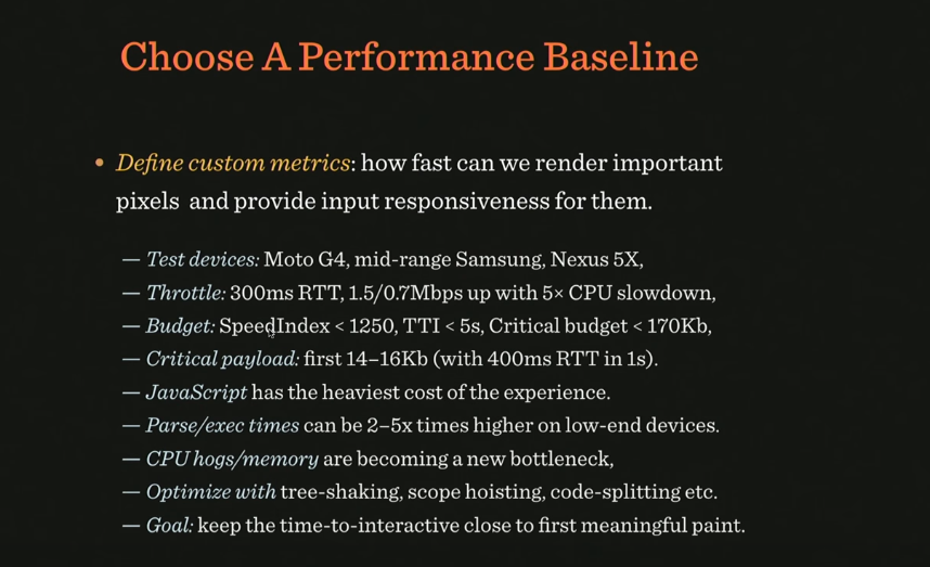
Google recommendations state that there is a so-called Time to Interactive Budget, a period of time during which most users wait for the opportunity to interact with the site - and this is only 5 seconds. Considering that 1.6 seconds go on networking, we only have 3.4 seconds left - that is, if we take an average connection speed of 400kbps, during this time we can send a maximum of 170KB of data. This is a bit to send something suitable for immediate use. Given that this includes frameworks, utilities, critical path, js, css, html, such a volume of data is very, very small.
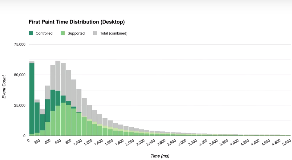
How to fit the core application in 170 KB? Google recommends a lot of different metrics that you can use, they divide the download into stages by time: time-to first byte (navigation begins) - before sending the first byte, first paint - before loading the first image, first contentful paint - before navigation on the site , first meaningful paint - when almost everything is ready for the content, visualy ready - before loading the entire page, time to interactive - before being able to interact with the page, fully loaded - when the page is completely ready.
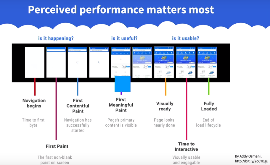
In general, for each site, this metric will be special, so for our project we also need to make our own. So, how does the optimal performance (baseline) look like today?
The image indicates which aspects and goals need to be taken into account when developing your own metrics.
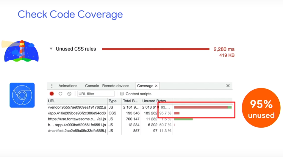
What is useful to use in the fight for boot time? For example, code-coverage tool - to look at code page coverage. And it shows what percentage of the code is not used.
You can also use the JavaScript Bundle Auditing. If you use any third libraries, you can remove them from runtime using, for example, webpack-libs-optimizations. And, of course, you need to abandon gif. If you can give up the video, since the parsing of the video container itself also takes a long time. If you can’t refuse video, use <
Even if you have responsive images on the page, you can use the Responsive Image Breakpoints Generator. It will help to generate an image from a downloaded image or group of images for responsive layout. You can specify how many kilobytes you need a picture with the help of generator engines. In addition, the tool generates the markup itself on the site.
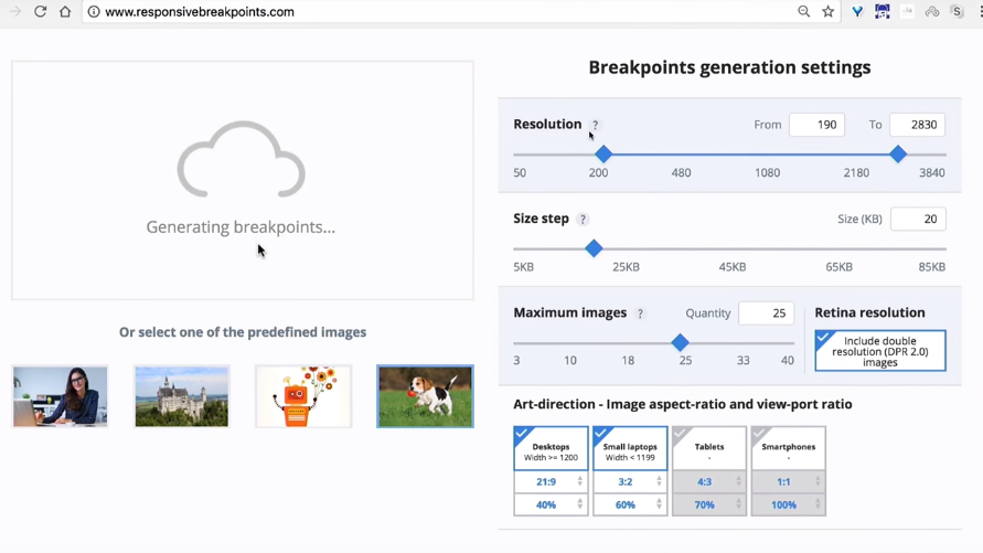
If there is any important part in your picture, for example, a face or an object, it will make cropping the way you need it, which is very convenient.
Suppose you have a lot of pictures. Then you can resort to using LazySizes. This is a library that does everything the same as the previous tool, but only with JavaScript.

You can see where the time goes when parsing occurs.
An interesting tool is Priority hints - in it you can ask the browser what is important to download earlier and what later.
But what to do with critical CSS? It is not necessary if you have a good server and CDN, browsers try to open another connection if it is HTTP / 1. And if it is HTTP / 2, they try to “guess” which CSS is needed and which is not. Therefore it is worth testing how the version with critical CSS works and how - if critical CSS is saved as a separate file as root.
Yes, we have a webpack, bundling, chunks. But what if there is a tool that with the help of prediction and machine learning algorithms helps to predict which chunks will be needed at the next iteration of user interaction? Guess.js using predictive analysis, based on google-analytics data, can understand what the next action the user will take, and download exactly that piece of code that is needed for this interaction.
For webpack there is a Guess plugin that you can try.

All this is happening at the global level: there are more and more services based on machine learning and artificial intelligence, which can improve the lives of not only users, but also developers. Such a tool is, for example, in Airbnb: air / shots, a search engine that designers and developers of this company can use. In it, you can find components by tags, look at their connections and select the ones needed for the project.
A very impressive feature for designers: the designer draws a sketch on paper, brings it to the camera, and the necessary interface is automatically designed for it from pre-designed components. Work is almost completely automated.

Another tip: carefully choose a framework for development. Suppose we need to consider the following things: network transfer, parse / compile, runtime cost. Of course, there are tools for this, for example, you can test how your application will work in different data networks: 2G, 3G, Wi-Fi.
The problem is that HTTP / 2 is of course a good new standard, but it is always faster than HTTP / 1, and secondly, it is much slower on slow connections, especially if it is a mobile device. Another problem it has is server push: if there is a server push, this would be an ideal replacement for critical CSS. In this case, the user, requesting index.html, would receive it in the appendage of critical.css. But as soon as we request a page from the server, the latter does not always know if it is already in the cache.
Therefore, a mechanism called cache-digest is being developed: if we go to the page for the first time, a server push occurs, if no push - no repeat. If this is not the first entry on the page, the server will still push. This is a problem that Google decided to fix with QUIC. This is an add-on over HTTP, which will make the mechanism more thoughtful, it works instead of TCP on the UDP protocol.

QUIC has a lot of interesting stuff: it's faster on fast connections, on 4G. At the same time, it is slower on slower connections. Moreover, since it uses UDP, it requires a lot of CPU resources in the case of JavaScript. This reflects the following image:

Maybe they can help us? Judging by the statistics, they give a tangible performance boost if you use them for caching. The first is to optimize the fonts, the second is to set up service workers.
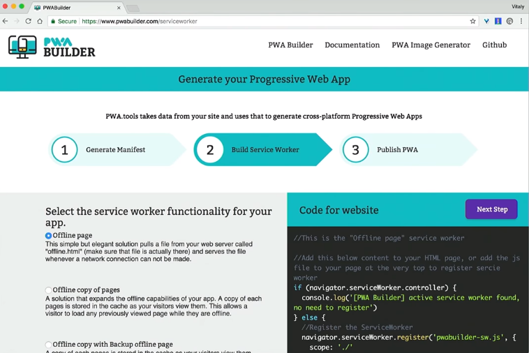
How to create a service worker? You can use PWA Builder, it will even generate an icon and a manifest for you to make your application more progressive.
There is a wonderful site PWA Stats, which collects various stories and cases on working with PWA.
Would it be a good idea to improve performance, if you installed third-party scripts on the site, did they load up the scripts from the side and eventually overloaded the user's device?
We do not even know what data these scripts collect. They can load dynamic resources that can vary between page loads. Thus, neither the hosts nor the resources used by third-party applications are unknown to us. And if we upload them to the script tag, they get access to all the information that is on the site.
In order to find out this information, there is the request map tool.

It shows where the requests go, you can see the resources that are allocated for these requests. You will be especially surprised if it turns out that a third-party script uses the CPU of the device to mine some bitcoins. Surprise!
Chrome is trying to block unfair advertising with its own blocker. Based on coalition provisions for better advertising.
There is also such a phenomenon as GDPR - an agreement on the procedure for processing personal data. It says that if there are Europeans among the audience of your site, you must comply with the agreement on the processing of their personal data, delete them on demand, describe each cookie-file that you keep. If a third-party script violates this agreement and there are problems - you will respond and be liable.
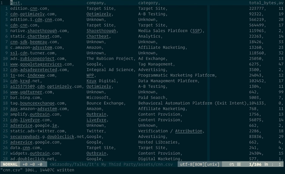
So how to understand what the third-party scripts do while you are not looking at them? Using tools to control them, for example, using requestmap.webperf.tools we can audit the site and third-party scripts. You can view statistics later by ID: requestmap.webperf.tools/render/[ID]
On the page below there is a link for downloading a CSV file with a report:
Then you can parse the data through the terminal:
And get the code that needs to be inserted into the web page test block, and then measure the difference in performance between the application with and without third-party scripts. The difference will be obvious. This does not mean that they need to be deleted. We just need to understand how to optimize them.
As usual, there are also tools for this. You can insert this CSV into Excel and get a fairly detailed overview of what third-party applications you have, how much they weigh, how much they load. And it will be even more interesting to try blackhole server, its IP:
To find out how your application will behave in case all third-party applications go into a timeout, add this ip to the hosts file and see what happens to your application.
Another tip: never add third-party scripts via the script tag. It’s better to do this through an iframe, because then they won't have access to the DOM on your page. By the way, the iframe has a sandbox property in which you can specify what exactly the script on the page can do and what not. Even the Safe Frame specification was created, which talks about isolating the external script from the application data and monitoring its activities. If you are interested in this topic, information on it can be found on github, project safeframe.
Use the service worker to block or delete a third-party script if it hangs.
With the help of Intersection Observer, you can see if an ad is displayed when it is next to Viewport. This allows you to download ad units when the user is viewing a page near the ad unit. The distance to the ad unit can be specified even in pixels.
This you can read articles Denis Mishunova «Now You See Mee: How the To Defer, Lazy-the Load And Act With Intersection the Observer», of Harry Roberts «It's the My (Third) Party, and I of'll Cry the if I of Want the To» , Yoav Weiss "Taking back control over third-party content".
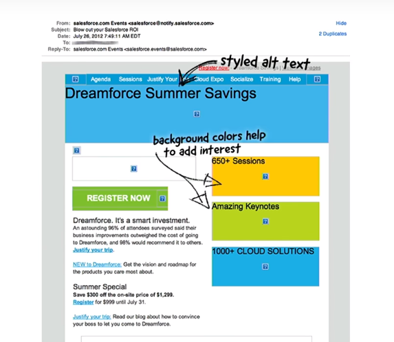
The layout of email-mailing has its own features and rules. Img tags for clients without displaying pictures in letters need to be changed for something, so the alt and other black magic attributes are used.
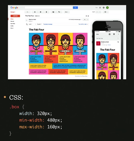
For normal layout of letters, table-header-group, table-footer-group and other table attributes are used. But what if you want something new, such as media queries: they are supported in some browsers, but things are worse with mobile versions of email clients. What if you use:

Here is an example of such magic:
What is the total value of the box class? Depends on the situation, according to the specification we read as follows: if the width value is greater than the max-width, the max-width is in priority.
But if min-width is greater than width or max-width, then min-width is applied.
This can be used when media queries are not supported. Here's an example: how to make two out of four columns on a mobile? Answer:
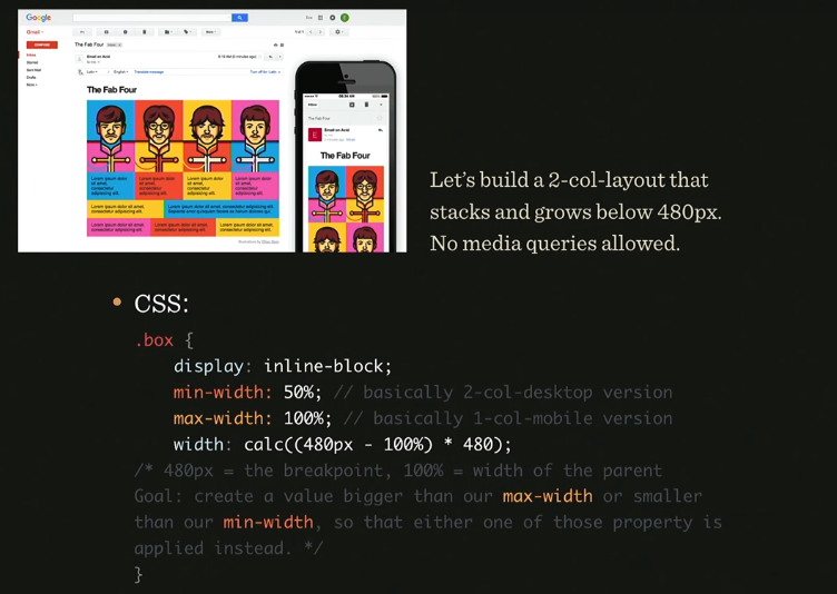
Roughly speaking, the width value determines whether max or min-width will win. This is a gorgeous hack!
How to make an interactive letter? For example, add live twitter feed there. Yes it is possible! There is a picture with all the tweets that are generated on the server every 2 seconds, we just animate it and that's it. So much for the solution.
How to make an interactive email in which you can carry out the entire order and product selection? Look at the image and you will understand everything:

The logic tied to the label, checked and input'ah. The result is a rather long chain, but, nevertheless, it is possible to do it. Here is an example with statistics of used items. Please note, the price is also considered, through the counter and increments:

It would seem, fiction, it turns out, through email you can bring a person to purchase. But not everything is so simple, email has limitations on the number of characters (12000), support for: checked and the size of the letter is limited to 102kb.
Nevertheless, these are the main trends in marketing today, and this can be seen in the graphs:

This is why Google created AMP. It is needed to automatically generate the necessary markup in the letter to suit your desires.
Laurence Penney gave a useful talk on this subject, be sure to take a look .
Here is a comment from Hakon Wium Lie, one of those who wrote the font specification:
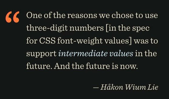
It sounds like this: “One of the reasons why we chose to use three-digit numbers (in the specification for the value of font-weight) in support of intermediate values in the future. And the future has already come. ”
A very big problem with fonts in Asia: given the total number of hieroglyphs and their different styles. Loading different fonts for hieroglyphs could turn into a big performance problem. Fortunately, we now have interpolated fonts, for which you can specify just one of the three-digit values that the person who wrote the specification mentioned.
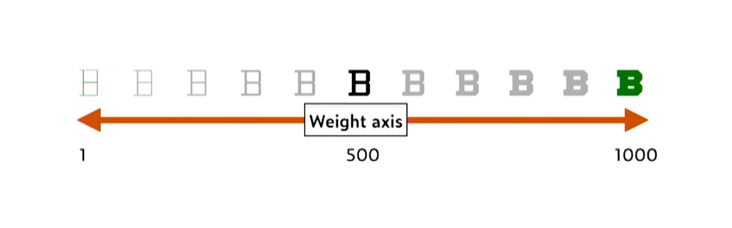
It is enough for the designer to create two character outlines — very thick, for a value of 1000, and very thin, for a value of 1. All other styles are created automatically when needed. But this is true not only for the width axis, it also works with height.
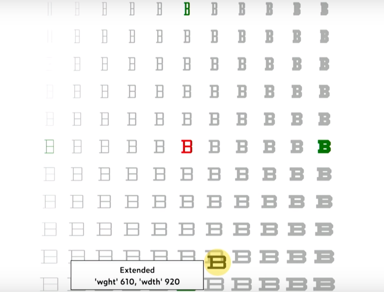
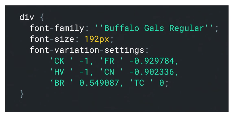
Another surprise: we can create axes ourselves without much difficulty. To use for this in CSS, you need the font-variation-settings property. It sets values for high-level properties, such as font-weight, font-stretch, and others.
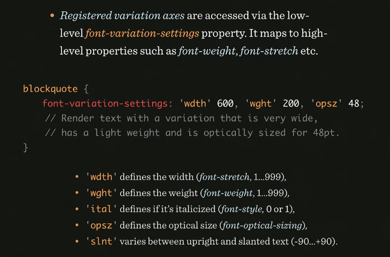
Here is an example of setting the desired font by the font designer:
And what if this is not supported somewhere? You need to use some kind of font format, take care of rollback, for older versions of browsers, and think about responsive behavior - set values correctly for different screens. Thus, we use the WOFF2 format for fonts, it is more progressive. For older versions, the browser will select the font itself, however, this means some lack of control over the style.
Summarizing, we can say that the specifications are accepted much faster than before. It takes two months and there are new standards, approaches, application. But this is normal, and it should be, this is a reason to develop further.
A separate conversation about the tools that will help speed up and monitor the work of the site and third-party applications that are connected to it. Plus, a story about the features of the layout of email-mailings, which will surprise you a lot.
The material is based on the transcript of Vitaly's report from the HolyJS 2018 Piter conference .
The first part is here: Optimizing the web with Vitaly Friedman - compression, images, fonts, HTTP / 2 features and Resource Hints .
The second part of:
Mustard and slow devices
This part is about performance. How to raise it? For a while, we used the Cutting the mustard technique. Its essence is to find out with the help of a snippet whether we are dealing with an old or new browser. Depending on this, it was determined which script and styles to load, so as not to load them with unnecessary functionality.
Sample snippet for browser definition
Then it became possible to replace the sequence from the querySelector, localStorage and addEventListener with the visibility state API - and that was basically what they did in small projects. But there was a problem with this technique - the same thing that happens with all other technicians, including those that you use.
The problem is that when we want to give beautiful styles to a new browser, we do not know how well it will draw them, because it depends on the device on which it is running. The fact is that there are devices from the low-end segment (for example, Motorola Moto G4), which have little RAM and a weak processor. Nevertheless, they installed a new browser that supports all (or almost all) technologies that we have.
Therefore, to use this technique today is no longer possible.
In the wake of Google with a Moto G4 in your pocket
Why not make it so that the responsive layout is displayed only on those devices that "pull" it in terms of hardware resources? For this we can use the Device Memory API. If this API is not available, you can roll back to "cutting the mustard".
And here is the Moto G4 itself:
In the figure below you can see where the Moto G4 is in the ranking of phones by the criterion of time for which javascript is parsed. This is middling - and there are many such phones. In comparison with the leader of the rating, this phone needs 16 times more time for parsing.
If you look at the data on the sites on mobile phones, it is clear that the most time is spent on parsing JS.
Yellow indicates page parsing time.
In fact, this is a very big problem. In order to parse 1 megabyte of scripts, Moto G4 takes 35 seconds. Considering that most sites use only 40% of the entire script on the site, you can try to find a way out of this situation in order to reduce the time for parsing. Gmail, for example, commented on all the code and sent it as a text variable, and then, when this code was required, eval was made of that variable.
Google recommendations state that there is a so-called Time to Interactive Budget, a period of time during which most users wait for the opportunity to interact with the site - and this is only 5 seconds. Considering that 1.6 seconds go on networking, we only have 3.4 seconds left - that is, if we take an average connection speed of 400kbps, during this time we can send a maximum of 170KB of data. This is a bit to send something suitable for immediate use. Given that this includes frameworks, utilities, critical path, js, css, html, such a volume of data is very, very small.
How to fit the core application in 170 KB? Google recommends a lot of different metrics that you can use, they divide the download into stages by time: time-to first byte (navigation begins) - before sending the first byte, first paint - before loading the first image, first contentful paint - before navigation on the site , first meaningful paint - when almost everything is ready for the content, visualy ready - before loading the entire page, time to interactive - before being able to interact with the page, fully loaded - when the page is completely ready.
In general, for each site, this metric will be special, so for our project we also need to make our own. So, how does the optimal performance (baseline) look like today?
The image indicates which aspects and goals need to be taken into account when developing your own metrics.
How to increase download speed?
What is useful to use in the fight for boot time? For example, code-coverage tool - to look at code page coverage. And it shows what percentage of the code is not used.
You can also use the JavaScript Bundle Auditing. If you use any third libraries, you can remove them from runtime using, for example, webpack-libs-optimizations. And, of course, you need to abandon gif. If you can give up the video, since the parsing of the video container itself also takes a long time. If you can’t refuse video, use <
img src> container for its placement .Even if you have responsive images on the page, you can use the Responsive Image Breakpoints Generator. It will help to generate an image from a downloaded image or group of images for responsive layout. You can specify how many kilobytes you need a picture with the help of generator engines. In addition, the tool generates the markup itself on the site.
If there is any important part in your picture, for example, a face or an object, it will make cropping the way you need it, which is very convenient.
Suppose you have a lot of pictures. Then you can resort to using LazySizes. This is a library that does everything the same as the previous tool, but only with JavaScript.
You can see where the time goes when parsing occurs.
An interesting tool is Priority hints - in it you can ask the browser what is important to download earlier and what later.
But what to do with critical CSS? It is not necessary if you have a good server and CDN, browsers try to open another connection if it is HTTP / 1. And if it is HTTP / 2, they try to “guess” which CSS is needed and which is not. Therefore it is worth testing how the version with critical CSS works and how - if critical CSS is saved as a separate file as root.
Guess.js
Yes, we have a webpack, bundling, chunks. But what if there is a tool that with the help of prediction and machine learning algorithms helps to predict which chunks will be needed at the next iteration of user interaction? Guess.js using predictive analysis, based on google-analytics data, can understand what the next action the user will take, and download exactly that piece of code that is needed for this interaction.
For webpack there is a Guess plugin that you can try.
All this is happening at the global level: there are more and more services based on machine learning and artificial intelligence, which can improve the lives of not only users, but also developers. Such a tool is, for example, in Airbnb: air / shots, a search engine that designers and developers of this company can use. In it, you can find components by tags, look at their connections and select the ones needed for the project.
A very impressive feature for designers: the designer draws a sketch on paper, brings it to the camera, and the necessary interface is automatically designed for it from pre-designed components. Work is almost completely automated.
Another tip: carefully choose a framework for development. Suppose we need to consider the following things: network transfer, parse / compile, runtime cost. Of course, there are tools for this, for example, you can test how your application will work in different data networks: 2G, 3G, Wi-Fi.
The problem is that HTTP / 2 is of course a good new standard, but it is always faster than HTTP / 1, and secondly, it is much slower on slow connections, especially if it is a mobile device. Another problem it has is server push: if there is a server push, this would be an ideal replacement for critical CSS. In this case, the user, requesting index.html, would receive it in the appendage of critical.css. But as soon as we request a page from the server, the latter does not always know if it is already in the cache.
Therefore, a mechanism called cache-digest is being developed: if we go to the page for the first time, a server push occurs, if no push - no repeat. If this is not the first entry on the page, the server will still push. This is a problem that Google decided to fix with QUIC. This is an add-on over HTTP, which will make the mechanism more thoughtful, it works instead of TCP on the UDP protocol.
QUIC has a lot of interesting stuff: it's faster on fast connections, on 4G. At the same time, it is slower on slower connections. Moreover, since it uses UDP, it requires a lot of CPU resources in the case of JavaScript. This reflects the following image:
Service workers
Maybe they can help us? Judging by the statistics, they give a tangible performance boost if you use them for caching. The first is to optimize the fonts, the second is to set up service workers.
How to create a service worker? You can use PWA Builder, it will even generate an icon and a manifest for you to make your application more progressive.
There is a wonderful site PWA Stats, which collects various stories and cases on working with PWA.
Third-party scripts - a step towards evil?
Would it be a good idea to improve performance, if you installed third-party scripts on the site, did they load up the scripts from the side and eventually overloaded the user's device?
We do not even know what data these scripts collect. They can load dynamic resources that can vary between page loads. Thus, neither the hosts nor the resources used by third-party applications are unknown to us. And if we upload them to the script tag, they get access to all the information that is on the site.
In order to find out this information, there is the request map tool.
It shows where the requests go, you can see the resources that are allocated for these requests. You will be especially surprised if it turns out that a third-party script uses the CPU of the device to mine some bitcoins. Surprise!
Chrome is trying to block unfair advertising with its own blocker. Based on coalition provisions for better advertising.
There is also such a phenomenon as GDPR - an agreement on the procedure for processing personal data. It says that if there are Europeans among the audience of your site, you must comply with the agreement on the processing of their personal data, delete them on demand, describe each cookie-file that you keep. If a third-party script violates this agreement and there are problems - you will respond and be liable.
So how to understand what the third-party scripts do while you are not looking at them? Using tools to control them, for example, using requestmap.webperf.tools we can audit the site and third-party scripts. You can view statistics later by ID: requestmap.webperf.tools/render/[ID]
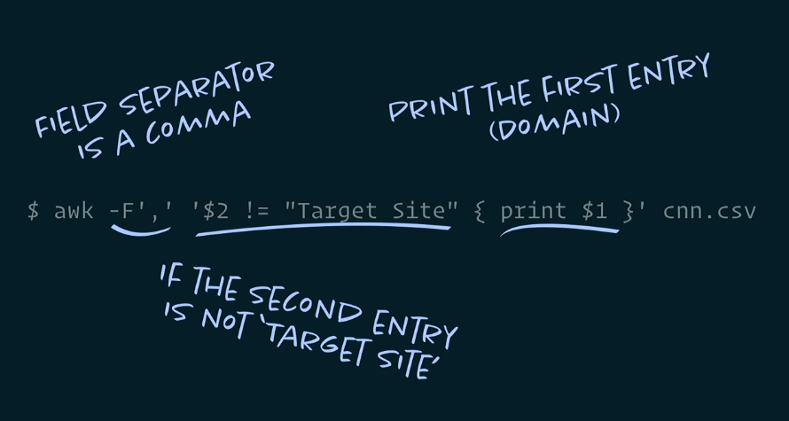
On the page below there is a link for downloading a CSV file with a report:
Then you can parse the data through the terminal:
And get the code that needs to be inserted into the web page test block, and then measure the difference in performance between the application with and without third-party scripts. The difference will be obvious. This does not mean that they need to be deleted. We just need to understand how to optimize them.
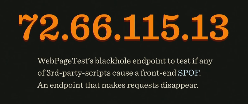
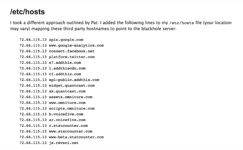
As usual, there are also tools for this. You can insert this CSV into Excel and get a fairly detailed overview of what third-party applications you have, how much they weigh, how much they load. And it will be even more interesting to try blackhole server, its IP:
To find out how your application will behave in case all third-party applications go into a timeout, add this ip to the hosts file and see what happens to your application.
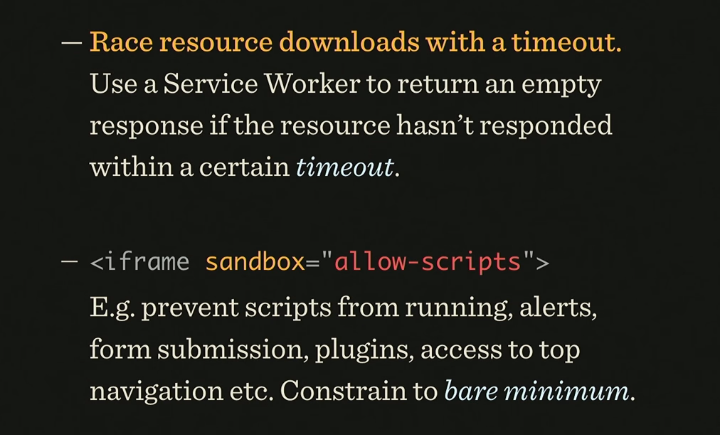
Another tip: never add third-party scripts via the script tag. It’s better to do this through an iframe, because then they won't have access to the DOM on your page. By the way, the iframe has a sandbox property in which you can specify what exactly the script on the page can do and what not. Even the Safe Frame specification was created, which talks about isolating the external script from the application data and monitoring its activities. If you are interested in this topic, information on it can be found on github, project safeframe.
Use the service worker to block or delete a third-party script if it hangs.
With the help of Intersection Observer, you can see if an ad is displayed when it is next to Viewport. This allows you to download ad units when the user is viewing a page near the ad unit. The distance to the ad unit can be specified even in pixels.
This you can read articles Denis Mishunova «Now You See Mee: How the To Defer, Lazy-the Load And Act With Intersection the Observer», of Harry Roberts «It's the My (Third) Party, and I of'll Cry the if I of Want the To» , Yoav Weiss "Taking back control over third-party content".
Responsive email
The layout of email-mailing has its own features and rules. Img tags for clients without displaying pictures in letters need to be changed for something, so the alt and other black magic attributes are used.
For normal layout of letters, table-header-group, table-footer-group and other table attributes are used. But what if you want something new, such as media queries: they are supported in some browsers, but things are worse with mobile versions of email clients. What if you use:
Here is an example of such magic:
What is the total value of the box class? Depends on the situation, according to the specification we read as follows: if the width value is greater than the max-width, the max-width is in priority.
But if min-width is greater than width or max-width, then min-width is applied.
This can be used when media queries are not supported. Here's an example: how to make two out of four columns on a mobile? Answer:
Roughly speaking, the width value determines whether max or min-width will win. This is a gorgeous hack!
How to make an interactive letter? For example, add live twitter feed there. Yes it is possible! There is a picture with all the tweets that are generated on the server every 2 seconds, we just animate it and that's it. So much for the solution.
How to make an interactive email in which you can carry out the entire order and product selection? Look at the image and you will understand everything:
The logic tied to the label, checked and input'ah. The result is a rather long chain, but, nevertheless, it is possible to do it. Here is an example with statistics of used items. Please note, the price is also considered, through the counter and increments:
It would seem, fiction, it turns out, through email you can bring a person to purchase. But not everything is so simple, email has limitations on the number of characters (12000), support for: checked and the size of the letter is limited to 102kb.
Nevertheless, these are the main trends in marketing today, and this can be seen in the graphs:
This is why Google created AMP. It is needed to automatically generate the necessary markup in the letter to suit your desires.
Variable fonts
Laurence Penney gave a useful talk on this subject, be sure to take a look .
Here is a comment from Hakon Wium Lie, one of those who wrote the font specification:
It sounds like this: “One of the reasons why we chose to use three-digit numbers (in the specification for the value of font-weight) in support of intermediate values in the future. And the future has already come. ”
A very big problem with fonts in Asia: given the total number of hieroglyphs and their different styles. Loading different fonts for hieroglyphs could turn into a big performance problem. Fortunately, we now have interpolated fonts, for which you can specify just one of the three-digit values that the person who wrote the specification mentioned.
It is enough for the designer to create two character outlines — very thick, for a value of 1000, and very thin, for a value of 1. All other styles are created automatically when needed. But this is true not only for the width axis, it also works with height.
Another surprise: we can create axes ourselves without much difficulty. To use for this in CSS, you need the font-variation-settings property. It sets values for high-level properties, such as font-weight, font-stretch, and others.
Here is an example of setting the desired font by the font designer:
And what if this is not supported somewhere? You need to use some kind of font format, take care of rollback, for older versions of browsers, and think about responsive behavior - set values correctly for different screens. Thus, we use the WOFF2 format for fonts, it is more progressive. For older versions, the browser will select the font itself, however, this means some lack of control over the style.
We summarize
Summarizing, we can say that the specifications are accepted much faster than before. It takes two months and there are new standards, approaches, application. But this is normal, and it should be, this is a reason to develop further.
If you like the report, please note: on November 24-25, a new HolyJS will take place in Moscow , and there will also be many interesting things there. Already known information about the program - on the site, and tickets can be purchased there.