 March 9, 2015 at 15:00
Half a pixel?
If you google “half a pixel” in Russian, there’s some kind of hysteria everywhere: the pixel doesn’t share, and that’s it. In English everything is decorous :) for example . Half a pixel exists, but browsers still render them poorly. In some places they react to fractions of a pixel (for example, in font settings), but more often they like to round to the nearest whole.
Why is that? It used to be clear that iron did not allow to draw “halves”. Now they are lazy. But some progress can be expected: Flash technology already supports accuracy up to 1/20 pixel.
According to Google terminology , the word “pixel” has 3 meanings:
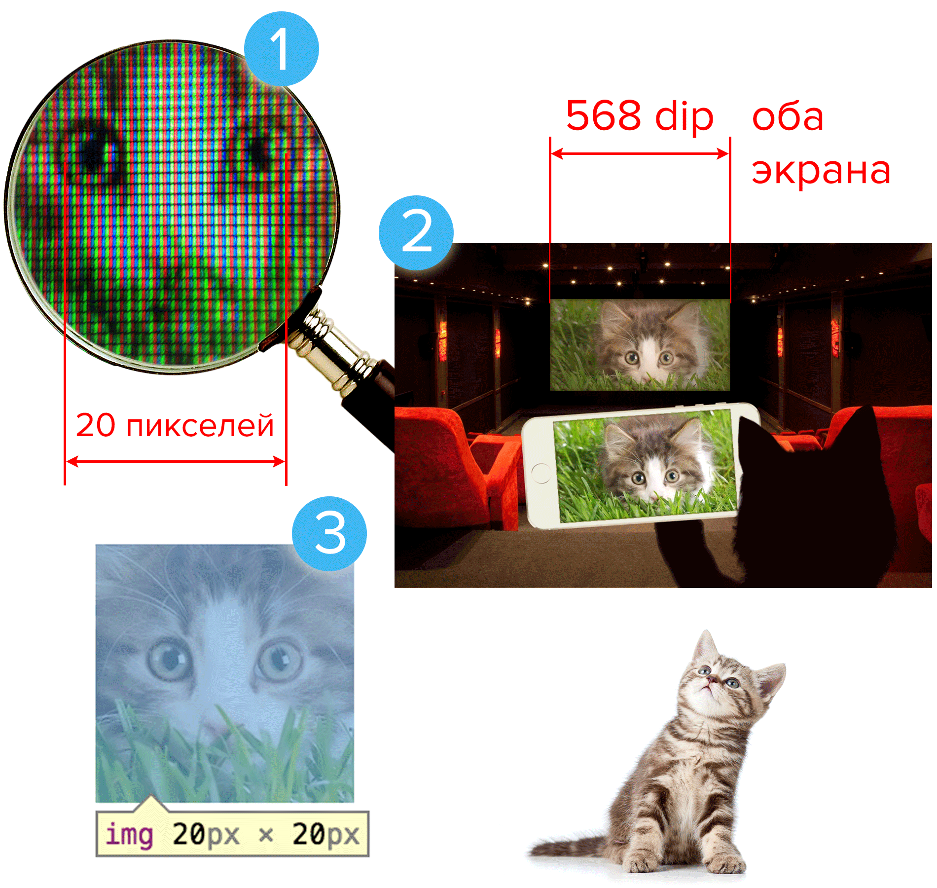
1. An element of the screen matrix . For example, in LCD-screens one pixel - 3 luminous elements (RGB).
2. Device-independent pixel (dip) - a scaled, “apparent” pixel size that looks the same on any screen. This takes into account the typical distance from the eyes to the device.
3. CSS pixel . For instance,
The bottom line is:
1) screen pixels and CSS pixels may not match;
2) the connection between them depends on many things.
From the foregoing it is clear:
But browsers do it easier for them:


A contest is announced for any practical conclusions from this article. Summing up - April 1.
Why is that? It used to be clear that iron did not allow to draw “halves”. Now they are lazy. But some progress can be expected: Flash technology already supports accuracy up to 1/20 pixel.
What is a pixel?
According to Google terminology , the word “pixel” has 3 meanings:
1. An element of the screen matrix . For example, in LCD-screens one pixel - 3 luminous elements (RGB).
2. Device-independent pixel (dip) - a scaled, “apparent” pixel size that looks the same on any screen. This takes into account the typical distance from the eyes to the device.
3. CSS pixel . For instance,
width:20px;Learn more about the different definitions of Google and W3C.
So, according to Google:
1. Hardware pixel - the physical pixel of the display matrix (or, say, the camera). For example, the iPhone 5 screen has 640 physical pixels in width.
2. Device-independent pixel (dip) - display pixels reduced to a single scale to correspond to approximately the same angle of view on all devices (taking into account the distance at which we hold them).
Definition of nothing, let's get it on your fingers.
We take a monitor (the most ordinary, not high definition):
- a strip of 320 pixels has a length of even 8 cm;
- we usually look at the monitor from a distance of, say, 50 cm.
We take the iPhone 5:
- always keep it closer, even 30 cm;
- the strip of 320 device-independent pixels should matchthe same angle of view .
This means that the strip in 320 dip is no longer 8 but 5 cm long.
Well, of course, a simple proportion: 8: 50 ≈ 5: 30. The greater the distance, the larger these “independent” pixels must be so that they can be seen in the same way .
For example, the iPhone 5 is considered that the screen width (about 5 cm) is just 320 dip.
If this is a 40-inch bulletin board at the station, which is looked at from a distance of 7 meters, then ... calculate for yourself how many dip's there are. :)
3. CSS pixel - layout unit. If "
According to the W3C , 1px = 1/96 inch or approximately 0.26 mm. But the W3C doesn’t care for everyone (and it doesn’t starteven before the advent of W3C), so browsers have always stupidly thought that a CSS pixel is equal to a screen pixel at a scale of 100%. But when the high-definition screens arrived, they realized the whole... the incorrectness of this approach. And now it is impossible for the coder to explain how it is half a pixel!
UPD: they correct me in the comments . There are already two versions of the definition of '1px' in the W3C standard. Therefore, I am glad that I immediately took the terminology of Google as a basis. :)
In general, Google offers the formula:
Scale = CSS_pixels / dip
Scale - page scale
CSS_pixels - number of CSS pixels on a certain segment (for example, block width)
dip - number of conditional device-independent pixels on the same segment
Should this be explained further?

1. Hardware pixel - the physical pixel of the display matrix (or, say, the camera). For example, the iPhone 5 screen has 640 physical pixels in width.
2. Device-independent pixel (dip) - display pixels reduced to a single scale to correspond to approximately the same angle of view on all devices (taking into account the distance at which we hold them).
Definition of nothing, let's get it on your fingers.
We take a monitor (the most ordinary, not high definition):
- a strip of 320 pixels has a length of even 8 cm;
- we usually look at the monitor from a distance of, say, 50 cm.
We take the iPhone 5:
- always keep it closer, even 30 cm;
- the strip of 320 device-independent pixels should matchthe same angle of view .
This means that the strip in 320 dip is no longer 8 but 5 cm long.
Well, of course, a simple proportion: 8: 50 ≈ 5: 30. The greater the distance, the larger these “independent” pixels must be so that they can be seen in the same way .
For example, the iPhone 5 is considered that the screen width (about 5 cm) is just 320 dip.
If this is a 40-inch bulletin board at the station, which is looked at from a distance of 7 meters, then ... calculate for yourself how many dip's there are. :)
3. CSS pixel - layout unit. If "
width:20px" is written , this is the width of 20 CSS pixels. According to the W3C , 1px = 1/96 inch or approximately 0.26 mm. But the W3C doesn’t care for everyone (and it doesn’t starteven before the advent of W3C), so browsers have always stupidly thought that a CSS pixel is equal to a screen pixel at a scale of 100%. But when the high-definition screens arrived, they realized the whole
UPD: they correct me in the comments . There are already two versions of the definition of '1px' in the W3C standard. Therefore, I am glad that I immediately took the terminology of Google as a basis. :)
In general, Google offers the formula:
Scale = CSS_pixels / dip
Scale - page scale
CSS_pixels - number of CSS pixels on a certain segment (for example, block width)
dip - number of conditional device-independent pixels on the same segment
Should this be explained further?
The bottom line is:
1) screen pixels and CSS pixels may not match;
2) the connection between them depends on many things.
Is there half a pixel?
From the foregoing it is clear:
- half a CSS pixel - it happens;
- half of the screen pixel does not happen.
But browsers do it easier for them:

20?21conclusions
A contest is announced for any practical conclusions from this article. Summing up - April 1.