 January 7, 2015 at 22:20
Beautiful Fall: Gravity CSS3 Animation
- Transfer
- Tutorial
A long time ago (in the summer of 2014), when I worked hard with the design, the following problem arose in front of me. I wanted to use CSS3 to create the effect of a bouncing ball, taking into account the natural laws of physics. I went through the Internet looking for some way to “breathe” gravity into my ball.
After hours of browsing Stackoverflow and CSS docks, I found a few options, but it still didn't work out for me. Using Javascript and Jquery would be redundant and inefficient for such a simple task, which, it seems, should be easily solved using the existing options for animation in CSS3.
I first tried using ease-in (ease-out) transitionsthat are represented by CSS. But despite the fact that they looked quite smooth, it was too difficult to achieve a sense of naturalness. And each new jumping object would need a completely new function, which is very time-consuming to select. Many sites that I visited suggested using bulky keyframe functions to describe the animation of each jump. The code for these functions looks too complex and redundant. Moreover, the resulting jumps of the object looked jerky and unprofessional.
In the end, I started experimenting with cubic Bezier curves . But all the examples that I found were a little not what I needed. However, this was closest to what I wanted to achieve. I started from scratch, spending hours trying to properly configure this flexible function, until finally something came out.
To easily implement your plan, you first need to define the jump animation by setting a general change in the position of the object using the keyframe function:
Then, you need to calculate the required duration:
Adding just one CSS3 transition is enough to give a bouncing object gravity:
Here are some potential ideas that will add gravity to your site in a few minutes.
The jumping effect can be used on websites as a means of paying attention to a notification or a new unread message. The example below shows an unread message option for an online mail client.

This implementation shows the typical behavior of an object under the action of gravity. Jump animation, which is actually just a shift with specially calculated time parameters, can also be combined with other effects. In this example, rotation and slight resizing of the ball is seen to add the illusion of elasticity. The shadow is simply scaled at the same time with each jump using the same magical Bezier cubic curves.
This effect may look quite complicated, but it uses the same functions as all of the above examples. The letter “I” is deformed and the lamp jumps using exactly the same cubic Bezier curves. With this synchronous animation, the lamp seems to flatten the letter “I”.

After hours of browsing Stackoverflow and CSS docks, I found a few options, but it still didn't work out for me. Using Javascript and Jquery would be redundant and inefficient for such a simple task, which, it seems, should be easily solved using the existing options for animation in CSS3.
I first tried using ease-in (ease-out) transitionsthat are represented by CSS. But despite the fact that they looked quite smooth, it was too difficult to achieve a sense of naturalness. And each new jumping object would need a completely new function, which is very time-consuming to select. Many sites that I visited suggested using bulky keyframe functions to describe the animation of each jump. The code for these functions looks too complex and redundant. Moreover, the resulting jumps of the object looked jerky and unprofessional.
Decision
In the end, I started experimenting with cubic Bezier curves . But all the examples that I found were a little not what I needed. However, this was closest to what I wanted to achieve. I started from scratch, spending hours trying to properly configure this flexible function, until finally something came out.
To easily implement your plan, you first need to define the jump animation by setting a general change in the position of the object using the keyframe function:
@-webkit-keyframes bounce {
  from, to {
    bottom: [нижняя точка прыжка]px;
    height: [высота сплющенного объекта в нижней точке]px; /*смотри про сплющивание ниже в топике*/
  }
  80% {
    bottom: [верхняя точка прыжка]px;
    height: [полная высота объекта в верхней точке прыжка]px;
  }
}
Then, you need to calculate the required duration:
Длительность прыжка ≈ ( ( (Верхняя точка прыжка) - (Нижняя точка прыжка) ) / 125 )Adding just one CSS3 transition is enough to give a bouncing object gravity:
#Myball {
    -webkit-animation: bounce [длительность прыжка] cubic-bezier(0.30, 2.40, 0.85, 2.50) infinite;
}
Applying effect
Here are some potential ideas that will add gravity to your site in a few minutes.
Notification
The jumping effect can be used on websites as a means of paying attention to a notification or a new unread message. The example below shows an unread message option for an online mail client.
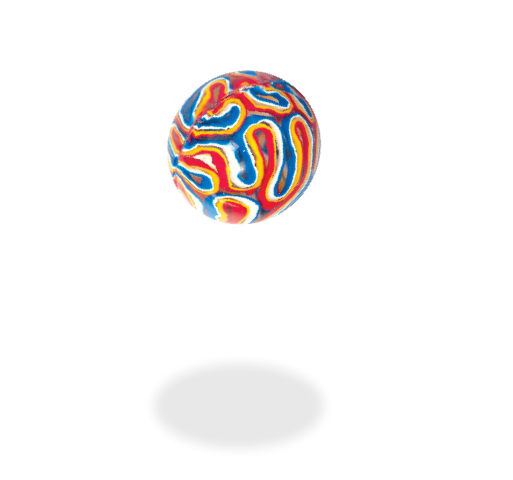
Bouncing ball
This implementation shows the typical behavior of an object under the action of gravity. Jump animation, which is actually just a shift with specially calculated time parameters, can also be combined with other effects. In this example, rotation and slight resizing of the ball is seen to add the illusion of elasticity. The shadow is simply scaled at the same time with each jump using the same magical Bezier cubic curves.
Flattening effect
This effect may look quite complicated, but it uses the same functions as all of the above examples. The letter “I” is deformed and the lamp jumps using exactly the same cubic Bezier curves. With this synchronous animation, the lamp seems to flatten the letter “I”.