A pair of small lifehacks searching for products in the online store
I accidentally saw this clue on Ozone:
This is probably the best example for me how to not do a search in an online store . The fact is that all these tips can easily be taken over by the iron brain, and thereby relieve the user's brain. At the same time, the buyer will not even notice that something has gone wrong, which means that nothing will stop him before buying. It should be noted that a number of errors correct this particular search, but in my case with copy-paste the name of the book from the wholesale price did not work.
We ourselves are not the best search in the world, but it sells. Let's show what we have done.
Until approximately 2011, we used a hierarchical navigation system when the product belonged to a category, and the category always lay in the supercategory. Well, an ordinary tree. After that we switched to tag navigation: in fact, any page of a site’s catalog is always a search result. Speaking a little more broadly, the category itself contains data on which product to select. That is, ideally, the data themselves dictate to our robots how to read them and what to do with them. This paradigm was needed for a number of next steps, but for now let us dwell on the search.
So, any page on the site is the result of a search. “All products” is a search without conditions. “Baby” is a search by age or “Baby” tag. "Mafia" is a subcategory of the search for all games in the series.
Some requests have a static address - it appears when we decide to register them in the navigation. A number of requests also have a static address-alias, but they are not shown in the navigation - they are needed to maintain the correct SEO structure.
With the cache device, of course, we drank, but it was worth it.
The user enters a search query. If there are no products in it, the “user made a mistake” state is generated, and the following theses are checked further:
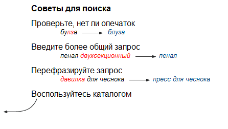
1. Typos
Each product has a set of associative keys that are associated with it. This name, sometimes the manufacturer, different variants of the name, original name (in the language of the manufacturer), transcription options. The first approach was to rewrite the known typos and put them as hidden (for displaying) name aliases. We created such a database of incorrect names and entered into it everything that users wanted, but could not find. The approach was not the most correct, but then it was faster to decide by the work of a content manager than by development. Later, an update arrived that simply built the distance of Damarau-Levenshtein to the nearest product and assumed it was it or not. So we completely solved the problem of even very severe typos.
2. Wrong layout
A query with an inverted layout is simply added to the search. The main thing is to go through later and the typos filter too. For some time now we have been supporting and translating for people without a Russian keyboard.
3. Invalid product name
Many products are searched so that a typo filter does not help. If, for example, “Activiti” - “Activia” will be well disassembled by previous filters, then at the request of “Scrabble” some used seriously expect to find a “Scrabble”. As well as Jengu on request "tower". This is solved, again, by creating synonyms for each game, including the most common mistakes in remembering product names. Just the other day, journalists from television presented a new synonym to our beloved “Jackal” - now it is also searched for by the request of “Coyote”.

Hints do not stop showing even with a deliberately wrong option
4. We have the wrong word order
, in general, we don't care about it, the processing logic does not change. But there are people who use hints, so we display in the list of hints not only what begins with the specified word, but also that corresponds to synonyms and components in any order. For example, if you start typing "det ...", the prompts will look something like this:

Driving 5 is also a child.

Closer to users. Damerau and Levenshtein do not know, but Cheburashka is a friend of the crocodile Gena. Our database of product synonyms knows this.
Let's go back one step. The user enters a request. Possible results:
More than one result without modifying the query.
Well, it seems that the user has found the item he needs in the assortment. Just show the catalog page with the search form and all that.

The synonym filter is used before error checking - for “scrabble” there is “Scrabble”.
Exactly one search result
In this case, we learned from Wikipedia - you need to immediately transfer it to the result page, that is, to the product card. Our search right in the header of the site, in a conspicuous place, does not disappear, that is, if the product is not the right one, the user will continue. But if that one (which is where, much more likely), it will not have a blank page where the only possible action is to simply click on the only search result.
Nothing was found, but after the filters there is one result.
Here you need to show the search page with an explanation of how we corrected the request in order to find the right product. The same thing is done if there are a lot of goods, but it is here that it is important not to immediately transfer to a "strange" result.

There was nothing at all
This means that some real garbage got into the search field. This is an occasion to write it to the log and think if it happens again ten times a month. And the user is shown an empty box - and immediately below it hits (so that only he would not take them for the search result). Why? Because the logic suggests that if a person does not find anything, then he will either continue to search, or go to the directory. And here we brought the most probable page of the catalog directly to his mouse.
Product found but out of stock
This is no longer a search task. If the product is found, we ship to it. If this is, for example, an old version of the game that has been discontinued, or some publication that is temporarily not available, a special block may be displayed explaining why you should not count on this position, for example: “The product was discontinued in 2011”. And next will be either new publications or similar products that are already taken from a database of related products or a matrix of paired products, but not from a search.
It is interesting, but we do not have a full-text search on the product description - such a task is simply not worth it, and even confuses the user a little. If desired, this can easily be done by changing one parameter in the request, but we are not doing this yet. Because 99% of our requests are names or something similar to them.
Recently, users often complain that when you select an item from the list of prompts, you must additionally press the button, the movement does not immediately happen. Google and Yandex did just that, hence the experience. And when designing, I remembered Nielsen’s grandfather, who taught the opposite - they say the list is a choice, but not an action, the user must feel control at such moments. Apparently, this view is already old-fashioned, and a new familiar type of behavior of this interface element has appeared.
One of the known problems is the form of a subtle search by party time, game genre, and so on is where navigation usually happens. Some do not notice it there and say that we do not have a search for availability in specific stores. He is, just stumbled. In the next major release, we want to place this form directly in the catalog page in place of the first products.
From the features - we got the entertainment "find your game" - people enter the name, and the search corrects five or six "typos" in it and suggests that it is closest to it.
This is probably the best example for me how to not do a search in an online store . The fact is that all these tips can easily be taken over by the iron brain, and thereby relieve the user's brain. At the same time, the buyer will not even notice that something has gone wrong, which means that nothing will stop him before buying. It should be noted that a number of errors correct this particular search, but in my case with copy-paste the name of the book from the wholesale price did not work.
We ourselves are not the best search in the world, but it sells. Let's show what we have done.
General architecture
Until approximately 2011, we used a hierarchical navigation system when the product belonged to a category, and the category always lay in the supercategory. Well, an ordinary tree. After that we switched to tag navigation: in fact, any page of a site’s catalog is always a search result. Speaking a little more broadly, the category itself contains data on which product to select. That is, ideally, the data themselves dictate to our robots how to read them and what to do with them. This paradigm was needed for a number of next steps, but for now let us dwell on the search.
So, any page on the site is the result of a search. “All products” is a search without conditions. “Baby” is a search by age or “Baby” tag. "Mafia" is a subcategory of the search for all games in the series.
Some requests have a static address - it appears when we decide to register them in the navigation. A number of requests also have a static address-alias, but they are not shown in the navigation - they are needed to maintain the correct SEO structure.
With the cache device, of course, we drank, but it was worth it.
Search input error handling
The user enters a search query. If there are no products in it, the “user made a mistake” state is generated, and the following theses are checked further:
1. Typos
Each product has a set of associative keys that are associated with it. This name, sometimes the manufacturer, different variants of the name, original name (in the language of the manufacturer), transcription options. The first approach was to rewrite the known typos and put them as hidden (for displaying) name aliases. We created such a database of incorrect names and entered into it everything that users wanted, but could not find. The approach was not the most correct, but then it was faster to decide by the work of a content manager than by development. Later, an update arrived that simply built the distance of Damarau-Levenshtein to the nearest product and assumed it was it or not. So we completely solved the problem of even very severe typos.
2. Wrong layout
A query with an inverted layout is simply added to the search. The main thing is to go through later and the typos filter too. For some time now we have been supporting and translating for people without a Russian keyboard.
3. Invalid product name
Many products are searched so that a typo filter does not help. If, for example, “Activiti” - “Activia” will be well disassembled by previous filters, then at the request of “Scrabble” some used seriously expect to find a “Scrabble”. As well as Jengu on request "tower". This is solved, again, by creating synonyms for each game, including the most common mistakes in remembering product names. Just the other day, journalists from television presented a new synonym to our beloved “Jackal” - now it is also searched for by the request of “Coyote”.
Hints do not stop showing even with a deliberately wrong option
4. We have the wrong word order
, in general, we don't care about it, the processing logic does not change. But there are people who use hints, so we display in the list of hints not only what begins with the specified word, but also that corresponds to synonyms and components in any order. For example, if you start typing "det ...", the prompts will look something like this:
Driving 5 is also a child.
Closer to users. Damerau and Levenshtein do not know, but Cheburashka is a friend of the crocodile Gena. Our database of product synonyms knows this.
Increase user convenience
Let's go back one step. The user enters a request. Possible results:
More than one result without modifying the query.
Well, it seems that the user has found the item he needs in the assortment. Just show the catalog page with the search form and all that.
The synonym filter is used before error checking - for “scrabble” there is “Scrabble”.
Exactly one search result
In this case, we learned from Wikipedia - you need to immediately transfer it to the result page, that is, to the product card. Our search right in the header of the site, in a conspicuous place, does not disappear, that is, if the product is not the right one, the user will continue. But if that one (which is where, much more likely), it will not have a blank page where the only possible action is to simply click on the only search result.
Nothing was found, but after the filters there is one result.
Here you need to show the search page with an explanation of how we corrected the request in order to find the right product. The same thing is done if there are a lot of goods, but it is here that it is important not to immediately transfer to a "strange" result.
There was nothing at all
This means that some real garbage got into the search field. This is an occasion to write it to the log and think if it happens again ten times a month. And the user is shown an empty box - and immediately below it hits (so that only he would not take them for the search result). Why? Because the logic suggests that if a person does not find anything, then he will either continue to search, or go to the directory. And here we brought the most probable page of the catalog directly to his mouse.
Product found but out of stock
This is no longer a search task. If the product is found, we ship to it. If this is, for example, an old version of the game that has been discontinued, or some publication that is temporarily not available, a special block may be displayed explaining why you should not count on this position, for example: “The product was discontinued in 2011”. And next will be either new publications or similar products that are already taken from a database of related products or a matrix of paired products, but not from a search.
Summary
It is interesting, but we do not have a full-text search on the product description - such a task is simply not worth it, and even confuses the user a little. If desired, this can easily be done by changing one parameter in the request, but we are not doing this yet. Because 99% of our requests are names or something similar to them.
Recently, users often complain that when you select an item from the list of prompts, you must additionally press the button, the movement does not immediately happen. Google and Yandex did just that, hence the experience. And when designing, I remembered Nielsen’s grandfather, who taught the opposite - they say the list is a choice, but not an action, the user must feel control at such moments. Apparently, this view is already old-fashioned, and a new familiar type of behavior of this interface element has appeared.
One of the known problems is the form of a subtle search by party time, game genre, and so on is where navigation usually happens. Some do not notice it there and say that we do not have a search for availability in specific stores. He is, just stumbled. In the next major release, we want to place this form directly in the catalog page in place of the first products.
From the features - we got the entertainment "find your game" - people enter the name, and the search corrects five or six "typos" in it and suggests that it is closest to it.