Effective Navigation Simplification, Part 1: Information Architecture
- Transfer
From translator
I decided to translate one interesting article on simplifying the site’s navigation system. This is only the first part about structuring content on a site. It is quite voluminous, but no less interesting from this, I hope you will not get tired of reading. It contains rather detailed explanations of how to make the information architecture simpler and more understandable, especially for large sites with a lot of content, such as online stores.
If you find any errors, please write in PM, I will fix it.
Go!
Navigation is one of the most important components of user experience (UX). For the user, this is just a way to achieve the ultimate goal, and the final goal is the consumption of content. Therefore, users have rather conflicting expectations regarding content and navigation. If the content is supposed to be unique, unpredictable and exciting, then navigation should be as simple and predictable as possible.
Four steps to a perfect navigation system
To create a convenient navigation system, the website designer must answer four questions in a certain order:
1. What is the best way to structure the content?
2. What is the best way to clarify choices in navigation?
3. What type of navigation menu is best suited to accommodate all choices?
4. What is the best way to design a menu?
The first two questions relate to the structuring and naming of content, which is usually related to information architecture . Information architects usually visualize the results of their work on a site map diagram .
The site map diagram gives an idea of the navigation structure of the site.
However, for reasons that will be explained in detail in this series of articles, a site map as a navigation will not contribute to the best possible user experience. Equally important is the creation of a custom navigation menu that correctly holds, organizes and gradually reveals all the options. It allows users to comfortably search, view and skip possible choices.
The development of such a navigation menu can be achieved by answering the third and fourth questions mentioned above related to the design of interaction with navigation. The first two questions will be considered in the first part, the second two in the second part of the article.
Content Structuring
To properly structure the content of a website, firstly, you need to consider how users search for information, then structure the content in such a way that it best suits these preferences.
How users search for information
When a user searches for something, be it a car, prescription, financial service, item of clothing, news article, fitness exercise, entertainment video or any other object or information, they may not know the exact name of what they are looking for. If we assume that users always know the exact name of what they are looking for, the best way to help them find it would be to provide a large list from A to Z or simple input through the search field.
Of course, everything is not so simple. As will be shown in the second part, even if users know the exact name of what they are looking for, both the list from A to Z and the search have some interaction problems that make them unsuitable navigation tools as the main or only ones. In addition, users often do not know the exact name or are not even interested in the thing or its exact name; rather, they have a keyword or a trait related to what they are looking for.
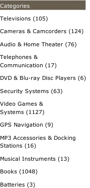
The first step towards directing the user to the necessary content is the aggregation or categorization of the types of goods or information on the site.
Metadata as the basis of the navigation system
Information collected about a particular subject or piece of content usually refers to metadata - this is information about information.
Without going into details, items can belong to certain categories of metadata, whether it is the political focus category of a news article, monitor screen size, movie director, type of shirt collar, or fitness exercise difficulty level. Of course, the categories themselves can be divided into subcategories, by such indicators as price, popularity or publication date.
Users can search for content through these metadata categories. Nevertheless, as we will see, it is not necessary to provide users with all possible options for searching for content. In the best case, this would simply clutter up the interface, slow down and complicate the navigation process, and in the worst, it would knock down the table, tire and annoy users to the point that they would leave the site.
You need to carefully consider which and at what stage to show categories to users.
Three types of metadata categories
To decide which and when to display metadata categories, divide your categories into three groups: key, additional, and non-essential.
The problem of the information architecture is that the classification of categories into key, additional and non-essential depends largely on the preferences of the target audience, the purpose of the website and even the volume of content. One way or another, having formed groups of categories once, simple rules will help you decide when to show which category.
Key categories
Key categories include those that will be important to all target users. There are usually few such categories, but any element should belong to at least one such category, which will simplify both the work of the designer and navigation for users.
Highlighting key categories
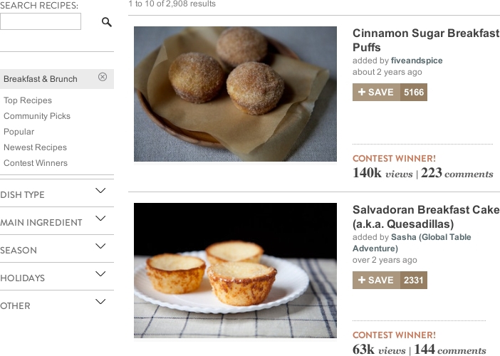
A small selection of metadata categories for food recipes can include “dish”, “main ingredient”, “special diet”, “special occasion”, “cuisine” and “cooking time”. For all of these categories, the “key” will be the only key. Not everyone is on a special diet and not every dish should be suitable for some special occasion, but almost every day they share meals for snacks, breakfast, main course, side dish, salad, dessert, etc.
Since the division into dishes will be important for all target users, this should be the first group of categories that will be presented to users.
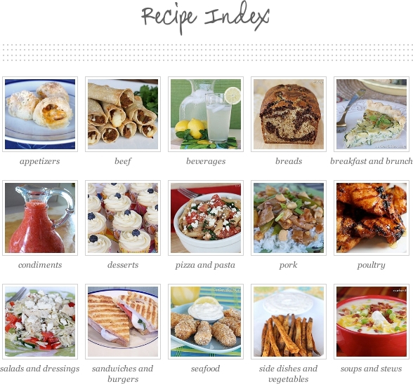
Dish is a key group of recipes metadata categories.
However, as mentioned above, the target audience or goals of a website can influence the classification of categories, especially on thematic sites.
For example, dividing into “dishes” may not be entirely relevant for all users who visit recipes sites. But, if the site collects the best recipes of popular cuisines from around the world, then “cuisine” can become a key group of categories for the target audience, either in addition to “dishes” or replacing them. In any case, since the "kitchen" is the key for the thematic site, showing it first (instead of "dishes") will be more appropriate.
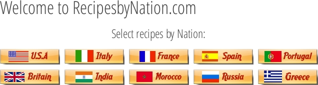
Themed websites have excellent key metadata categories.
Organization of key categories
The examples above apply only to a single group of key categories. However, a set of products or services may cover several key categories.
Take, for example, clothes. One of the key groups of categories can be the division into types of clothes, such as “shirts”, “trousers”, “shoes” and “sweaters”. Another key and mutually exclusive category will be the separation by gender: “male” and “female”. The third category may be a division into circumstances, such as “everyday”, “working” and “solemn”. Of course, you can come up with even more key categories, but for now let's dwell on this.
The question then becomes, how best to place categories and resolve potential conflicts between several key categories.
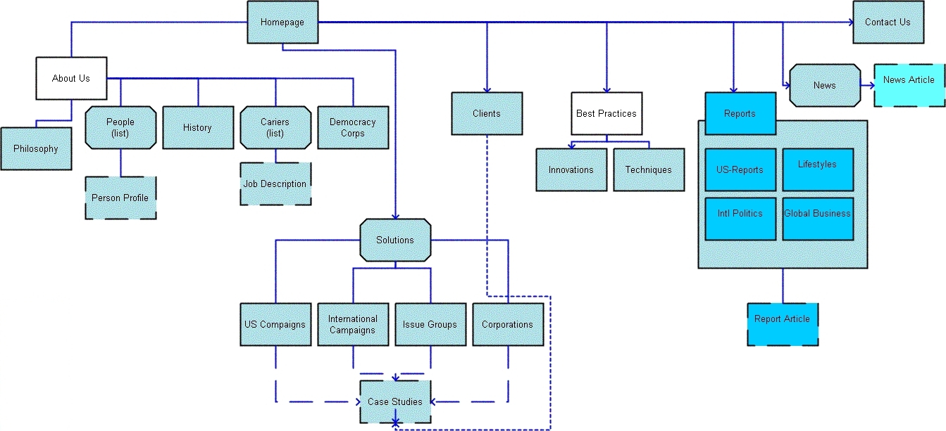
At first, the location of all key categories at the same level in the top menu may seem logical. In the end, they are all key. However, it is better to do the opposite. Key categories work best one after another, at subsequent levels. For a better understanding, let's look at the information architecture of the website below.

The horizontal menu is most often used for products that offer sites.
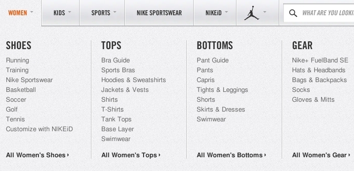
The horizontal navigation menu lists LL Bean's available products, such as “home accessories”, “hunting and fishing”, “outdoor equipment”, “shoes” and “clothes”. However, the designer did something different for the "clothes." Clothing is divided into “men's”, “female” and “children's”, but instead of a list of dozens of types of clothes in the horizontal menu, designers decided to make key categories with less weight. The user simply starts with the categories “male” and “female”, and then in the drop-down menu he can see all types of clothes, which gives more options than one horizontal menu.
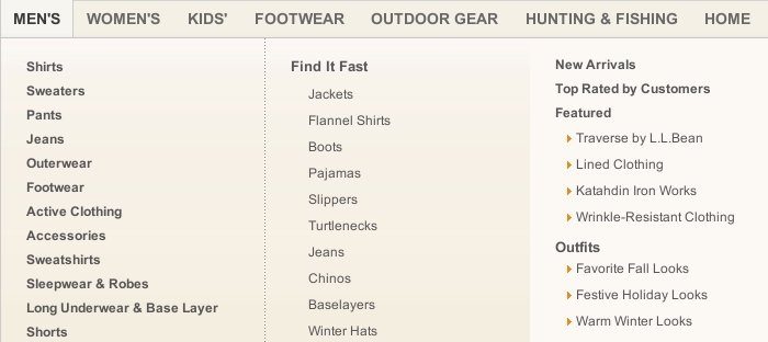
Using key categories with lower weights in the main navigation menu frees up space.
There is a slight discrepancy in the information architecture, but the designers decided to free up space in the horizontal menu. Such a solution is acceptable until the discrepancy confuses users, which is unlikely to happen in this case. Nevertheless, the location of the category “shoes” (which, for obvious reasons, is divided into male and female) in the same horizontal menu is no longer such a good solution.
Key categories should be located one after the other, and not one next to the other.
The problem with this solution is that the two key categories were located at the same level. Both "Shoes - Men" and "Men - Shoes" are direct paths to the same products. Nevertheless, since both categories are key, the user should in any case look through both paths. But since they are located on the same level, the user must choose between them, which erodes the assumption that both categories are key. Therefore, one of the paths can be removed, for example, “Shoes - Men's”.
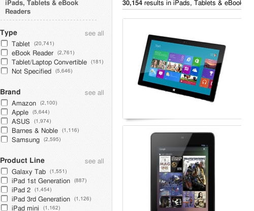
Additional categories
If there are already several key categories, then depending on the quantity of goods and services, additional ones may not be required. If the website has no more than a dozen items of clothing, the designer can provide users with a choice, see men's or women's clothing, and stop there.
However, in many cases the opposite happens. Even after all key categories have been exhausted, an abundance of items can be a nuisance to navigation. Therefore, additional categories should be introduced that allow the user to filter the content further.
Additional categories are important to some users, but not to all.For example, two additional metadata categories for “cars” could be “number of doors” and “type of fuel”. Some people are very fanatical about the type of fuel, but they care less about the number of doors. Others are exactly the opposite.
Key priority over additional categories
As a rule, additional categories should be shown to the visitor after he has passed through the key ones.
However, many shopping sites, such as clothing or electronics sites, list brands (additional categories) at the same level as product types (key categories).
Key and additional categories should be at different levels.
The problem with this approach is that even if a visitor chooses a brand, say from clothes, he will encounter hundreds or thousands of different products, and he still needs to choose the type of clothing to limit the search. Thus, the location of additional categories at the key level creates unnecessary workarounds, complicating the choice and cluttering up the navigation.
Instead of showing many navigation options at the same time from the very beginning, show users a few key categories first, and then introduce additional ones.
So, in the example above, it would be better to remove brands from key categories and provide users with the choice of only clothing types first. And only then, at the next level, to provide users with brand selection options.
Additional categories should be presented only when the user has already selected a key one.
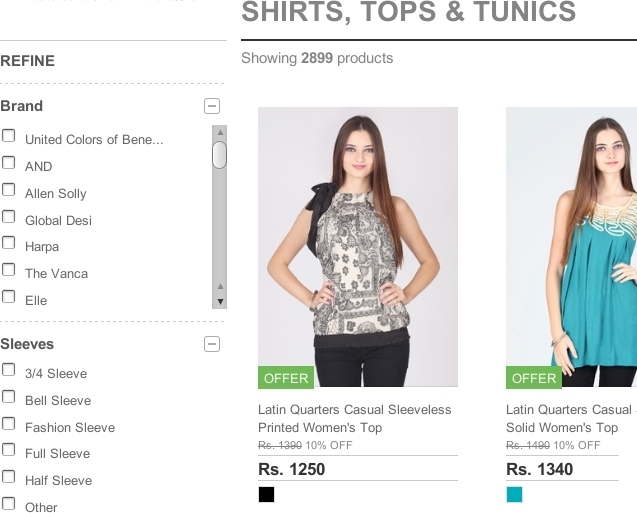
Dynamic filters
As already noted, key categories should be presented one after another at appropriate levels. All additional categories are best represented on the same level.
The only exception is when additional categories are mutually exclusive, in which case they should be shown at the next level in the same menu as the key categories. If additional categories can be combined, then it is better to implement them as dynamic filters.
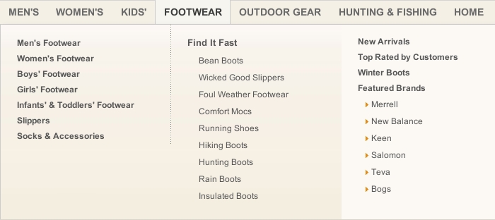
In the screenshot below, note how Sears shows key categories as a breadcrumbs or breadcrumbs, while additional categories are presented as dynamic filters.

Additional categories that can be combined should be shown as dynamic filters.
The difference between the key and additional categories can be explained as follows. Each category is a filter for accessible content, and dynamic filters are called dynamic because they allow users to select and change values continuously. In contrast, in a traditional level-based navigation system, the user must move from one level to another to select the desired value. If these are key categories, then problems should not arise. But with the additional categories, the situation is different.
When a user searches for a shirt, many additional categories may matter to him: “brand”, “collar type”, “sleeve length”, “fabric”, “pattern”, “pockets”, “discount”, “price”, “rating "," Popularity ", etc. It is difficult to understand exactly which categories he will be interested in. Someone will not be interested in any, someone a few, but someone all.
Instead of leading the user through all the additional categories, one after the other, regardless of whether they are interesting to him or not, the designer can make dynamic filters at the same level. Then users will be able to select only the categories that they prefer.
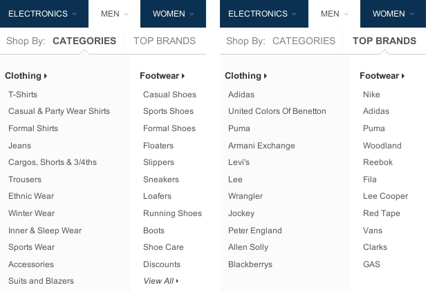
On the other hand, let's look at the site shown below, which has no clear differences between the key and additional categories. Instead, it shows all categories as dynamic filters, including key categories.
Key categories should not be presented as dynamic filters.
This lack of distinction leads to several problems. First, it takes up vertical space and moves additional categories down, requiring the user to scroll down more often to change values.
Secondly, dynamic filters are known as “heavy” widgets: they are powerful, but resource-intensive. Whenever the user selects one value, the entire list of results is updated to fit the filter. The same result can be achieved much faster by selecting the same key categories from the traditional menu.
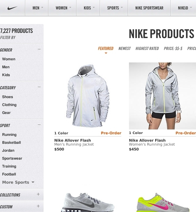
In fact, Nike's designers made the usual menu, allowing us to test assumptions and compare the speed and effectiveness of both interaction models with the same interface. (They also provided the ability to remove key categories from dynamic filters. Note translation. ).
Key categories are best represented in the traditional navigation menu.
Mutually exclusive categories
Dynamic filters are only needed if additional categories can be combined. If the additional categories are mutually exclusive , then they should be presented at the next level of the main navigation menu.
In the screenshot below, Daily Express asks users a key question at the first level: choose a news topic, such as “finance,” “entertainment,” or “lifestyle.” Then, on the main page of the selected section, a digest of the latest news on the topic is presented. Most users want to check out the last three or four articles. For those who want to delve into the chosen topic, the subcategories are listed below the first level.

Mutually exclusive additional categories are best shown at an additional level in the main navigation menu.
The subcategories in the image above can be considered as mutually exclusive, since entertainment is usually allocated either in the form of books, or in the form of films, or as TV shows, etc. Of course, combinations are also possible; a film or a theatrical production can be made from a book. But would users want to see a digest of such combinations? If yes, then it makes sense to apply dynamic filters.
Keep in mind that the answer to this question will depend less on the type of elements (items on the site) than on the volume and variety of elements, as well as on the specific interests of the target audience.
For example, users most likely will not look for a breakfast recipe such that it is Chinese, low-calorie, and Christmas. On the contrary, they will look for breakfast that would be either Chinese, or low-calorie, or Christmas. Therefore, additional categories of recipes will most likely not be combined into a common one. Nevertheless, if there are thousands of recipes on the site, and the target audience has rather specific preferences, providing them with more numerous dynamic filters can be useful.
The large and varied volume of content, as well as the specific interests of users, can serve as the basis for applying a variety of dynamic filters.
Finally, consider a third group of metadata categories.
Minor categories
Non-essential categories are categories by which a non-target visitor is likely to want to search for content. However, such categories are not at all insignificant for the overall user experience.
Two categories of metadata to search for articles can be “word count” and “number of images”. If these categories were implemented as columns in the database, the content strategist can look at the values for these categories and find that most of the articles are too long and without pictures, which may cause many visitors to leave the site before finishing reading the articles. In this case, the content strategist can discuss this issue with the designer or client, which will help improve the content. However, even if these categories can provide valuable information to the designer, users are unlikely to want to search for articles by “word count” or “number of images”.
In short, non-essential categories should not be visible on the site. They will be ignored, clutter up the interface and may even confuse users. Although, a large number of elements can make non-essential categories additional.
For example, the “word count” will usually be an inconsequential category with which you can search for articles. However, the site shown below has accumulated so many articles over many years that the designers decided that it was necessary to add the length of the article as an additional category for filtering content.

A large amount of content can make non-essential categories additional.
The websites above, with recipes and clothing, are suitable for explaining the importance of category priority, as they usually require a large number of metadata categories. But they do not show one problem that designers face at some point, especially when designing for a corporation.
Corporate Product Classification
Most recipes sites collect recipes indiscriminately and leave their classification to the designer. But corporations often have their own internal way of classifying products, which can lead to conflicting requirements.
Consider the first key category for machines. You would choose a category depending on size or lifestyle, with meanings such as “compact car”, “van”, “sports cars”, “sedan”, “limousine”, etc. Such categories are key, as each type of car takes into account a private lifestyle, which is important for almost all car drivers. For example, a small car is small, cheap, easy to drive, and it’s easy to park in the city with it. The van has a large trunk and is great for families. Sports cars for a completely different lifestyle. And so on.
However, most auto companies classify their models in their own way. BMV, below, follows classification by numbers (1, 3, 5, 7, etc.).
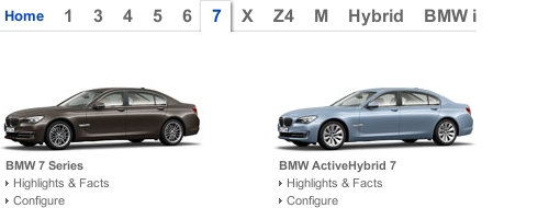
Sometimes corporate classification works well.
While internal classification schemes can cause usability problems, BMV classification actually makes the information architecture more convenient. Despite the fact that such a scheme is corporate, it is well known to the general public, and car numbers increase logically with an increase in car size, more or less coinciding with the widespread classification of small cars, sedans, limousines, etc. In this case, anything other than corporate classification may rather push away than help the user.
The following example is not so simple. Opel likewise lists its machine models according to its own internal names.

Internal classification is not always understood by external users.
The problem is that the structure of these product lines is not very clear, and this is not facilitated by the fact that users must interact with the slider to see all the models. Users have no easy way to understand how products are interconnected and therefore products cannot be filtered according to preferences.
If the internal classification scheme does not work for users, then the well-known external should take precedence over the internal.
Note how Volkswagen (below) applied its own path in the name and classification of car models: Jetta, Passat, Touareg, etc. But the company prioritized a common external classification over its corporate one. The result is a menu that is easy to understand and that allows users to focus on what they are interested in.

The priority of the general classification scheme over the corporate one can make the navigation menu easier to understand.
Of course, the client may not want to see their corporate classification in the background. Nevertheless, this need should be explained in detail to the client.
Explanations of navigation choices
Structuring navigation options according to user preferences is an important step in simplifying the information architecture of the site. But if users cannot understand the navigation functions in the first place, then even the most advanced structures will be in vain. Therefore, take a moment to think about how best to explain to the user the options.
Show users as much information as they need to understand their choices. If you add anything in excess of what is necessary, there may be a risk of tiring users, cluttering up the interface and slowing down navigation, up to failure.
On the other hand, they should not give too little information. If users have to guess where the links lead, and then get upset at where they ended up, they will soon lose confidence in the interface and leave the website.
Designers can choose one of three methods to explain the options:
1. Simple names;
2. Names and images;
3. Names, images and descriptions.
To choose the right method, evaluate how clear the simple names are for the target audience.
Simple names
If the names you use are recognizable enough, then they will be enough. Large images and long descriptions are not needed to explain what “jeans”, “shorts”, “shirts” and “jackets” are.

Simple notation is enough for familiar things.
It is desirable that the names be as concise as possible, at the same time, brevity should not be achieved due to clarity. Acronyms and jargon, such as UX and BMI (body mass index), can only work if they are familiar and convenient for the target audience.
However, sometimes the term itself may be clear, but the context in which it appears makes it ambiguous. Many sites of large organizations contain constant horizontal navigation, which indicates aspects of the organization’s core business, as well as context-sensitive vertical navigation, which shows the subsections. This approach may lead to duplicate notation. The University of Bath (presented below) includes the designation “Research” in the general horizontal navigation menu at the top and in the vertical submenu on the left.

Large organizations with many subsections tend to duplicate names.
This may confuse users a bit, but careful design can help to avoid ambiguity. In the screenshot above, the heading for the Explore the Department menu is a good hint that the term Research refers to a department, not to an entire university. Just in case, we could lengthen the designation "About us," say, "About this department."
Another option is to show the context of the names using numbers indicating how many objects are in this category.
In some menus, the number of items in the category is displayed next to the name.
Such numbers are often included in dynamic filters.
In many interfaces with dynamic filters, the number of items in a category is displayed along with the name.
Although most users like to see these numbers, they need to carefully consider when they really need to be shown. For example, guessing how much content is on the site by looking at the home page is quite difficult. Therefore, by showing clearly how much content the site contains, you can win the user, as he might think: “Surely there is something for the site for me as well.”
A quantitative assessment of the volume of site content can attract a visitor.
Of course, you probably would not want to disclose this figure if there is not enough content on your website yet.
Similarly, when a user looks at categories and is interested in a particular topic, he would like to study the corresponding category, even if it contains fewer objects than another less significant one. Perhaps even the display of numbers in this case can slow down the search and clutter up the interface.
In some situations, statistics may discourage users.
The same is possible for dynamic filters. Will users choose a category based on the number of objects it contains? If yes, then the mapping of numbers takes place. If not, it is best to grayen the values or delete them altogether.
In any case, after the user has already made a choice, displaying the number of objects in the category, or after applying dynamic filters, can provide useful information to the user.
Icons are another type of element that is sometimes added to symbols. They can be a useful addition if they are well made and easily recognizable. It is not necessary that they will explain to the user the options, however, the icons will make it easier to process and share the choices. In the screenshot below, I removed the icons from the menu items. Note that the names are still enough to explain the alternatives. Everyone knows that “cars”, “motorcycles” and “trucks” mean.
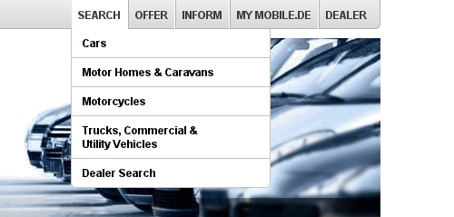
The names themselves are often enough, but it takes a little longer to process.
However, adding icons next to the names will make it easier for users to recognize and share choices.
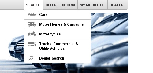
Adding icons next to the names will make it easier for users to recognize and share choices.
Icons without names can lead to confusion. Even if the icon is familiar, the user may not be sure what it means in a particular context.
Names and Images
Symbols and icons work well with easily recognizable objects. For less common, images are needed. Consider the names of the brands. In the screenshot below, the car models are presented as plain text in the menu.
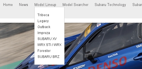
Brand names require more than just names to understand.
Actually, I don’t know what Tribeca and Legacy mean. Therefore, the names are not enough to decide which product to see. Names with images as shown below are the best solution.

Names and images are the best way to explain unfamiliar terms.
When is it better to use images or icons in the navigation menu - this is an interesting question. Obviously, to explain a very specific object, for example, “13-inch Macbook Pro” or “Samsung Galaxy Note 3”, nothing but the corresponding image will help.
Explaining a product category is not so simple. In some menus, categories are explained using icons.

Some menus use icons to explain categories.
In other menus, the same categories are explained using images of the corresponding products in the categories.

In some menus, categories are explained using images of the corresponding products in the categories.
For product categories, icons are more suitable than images. The menu will look more professional with well-made icons than with realistic product images.
Moreover, the use of product images from the corresponding category may subconsciously raise questions among users. “Why is this particular product representing this category?”, “Is this the best that they have?”, “Is the set of products in the category directly related to this type of item?”, “If I don’t need such an item, then this site is not for me?". These fears will increase if users see the first objects in the category, similar to the image in the menu. The icon, on the contrary, simply conveys information that this category contains a certain type of product, nothing more, nothing less.
However, this works with icons if they meet certain standards. An icon can easily seem out of place if it is poorly drawn. And if it is not recognizable enough, it can easily confuse users. Therefore, despite the fact that the icons are more suitable for product categories, if you are not sure that you can make them professionally and recognizably, it is better to remove them altogether.
Names, Images, and Descriptions
Sometimes even names and images are not enough to clarify product categories. Integrated solution service providers, such as banks, insurance companies, and Internet service providers, often call their services, such as “50 plus” or “Internet on the go.” A large image of a couple talking with a broker or a girl talking on a smartphone may not be enough to indicate the services provided. For such products, a couple of lines along with the name and image will be most useful.
Complex products require names, images, and descriptions to be clear.
The headings and titles of articles are a separate type of designation that may need an image and description, or maybe not.
Many authors use talking headlines with key information in them and to keep them as short as possible.

General recommendation: Keep headings as short as possible and speak for themselves.
The headings above are short and essentially, at the same time, this writing style has its risks and does not fit all sites.
The first question is where and how to write descriptions. BBC headings are often accompanied by descriptions. The headings with descriptions are shown below, which, as you can note, simply consist of more words, but do not carry new information.
Descriptions should not contain information that the header already carries.
If the headings already contain key information, as shown above, then descriptions are not needed. Perhaps even this will slow down users due to reading the description, although they could just as well orient themselves in the articles after reading the headings.
However, displaying headings alone or writing headings in this style is not always the best option or even appropriate. If the article is just a short story about the event, then headings like in the BBC are a good choice. But if the article is deeper than the title, then the image and description can become more effective and engaging.
The title in the screenshot below is more catchy than informative, and all key information is presented in a couple of lines below. An image has also been added to set the tone for the article.
Titles, images, and descriptions are often the best way to give an in-depth explanation of an article.
It is not difficult to understand what this article is about from the snippet (short description). Moreover, the use of a captivating title and description to clarify the article, and images to set the tone for the article, provides the author with more space not only to inform the user, but also to convey the problems of the article.
Finally, take into account the advice that is often given when writing headings, which is to make the title clear outside the context of the site. In the end, the title may appear in search results, on social media, and in the context of other websites. Some authors even come up with formulas for this purpose.

Many authors try to write headings so that they are understandable outside the context of the original website.
Just be careful not to add unnecessary information when adding context to the header.
The title shown above “Avoid Multi-Column Layouts” does not provide sufficient context, since the website is about web design, and multi-column layouts can play a role on home pages, menus, articles, etc. ., not only in forms. Therefore, “Form Field Usability" directly adds context to the original header. Although writing for an external context is not always necessary, as other people who will refer to the heading will seek to provide their own context.
Search engine developers know that users will bypass them if the search results do not meet their expectations. Therefore, they are constantly working to increase the relevance and success of their results, whether it is expanding snippets, images or previews or by improving their algorithms. Similarly, if the title appeared in a “recommended reading” for another article, then the article itself will provide the necessary context.
To summarize
Information architecture, i.e. the structure and designation of the content is the basis for easy navigation. Designers can effectively simplify the information architecture of a website by structuring the content in a way that naturally narrows and complements the navigation capabilities of the target audience, as well as explaining the choices, minimizing the mental load on users.
The recommendations given in this article can be divided into the following two lists, divided into “content structuring” and “element names”.
Content Structuring
1. Collect and organize metadata about the types of elements that users should navigate through.
2. Group metadata categories into key, optional, and non-essential. Key categories are important to all target users, additional ones are important for some, and non-essential ones are for non-target users.
3. Introduce only one group of key categories at the first level.
4. If the elements at the next level do not exceed a certain amount, then the following categories are not needed. Otherwise, show the following key categories one after another, at each subsequent level.
5. After exhausting all key categories, show a page on which all items corresponding to the selected key categories will be shown.
6. If there are still too many remaining elements, then imagine all the additional categories on the same level.
7. If the additional categories are mutually exclusive, enter them at an additional level to the key. If you can combine additional categories, imagine them as dynamic filters.
Item Names
• If the designation of an element is sufficiently known, then its sufficient in itself. Make designations as short as possible, without loss of clarity. Show the total number of elements on the main page and on the category page, but not between. Also consider adding icons to the symbols to simplify the process of processing and choosing between alternatives.
• If the notation is not enough, consider adding images. Use icons to indicate categories, but only if the icons are well-made and recognizable. Otherwise, use images better.
• For comprehensive services and products, consider adding images and descriptions to symbols. Descriptions should provide truly new information, not just rephrase headings. Also, be careful when adding context to the header so as not to add redundant information.
After you simplify the architecture, users will be given the choice of interaction for their own satisfaction. Therefore, you should always develop a navigation menu that is suitable for the user's choice and creates the comfort of interaction. The navigation menu design process will be explained in the second part of this series.