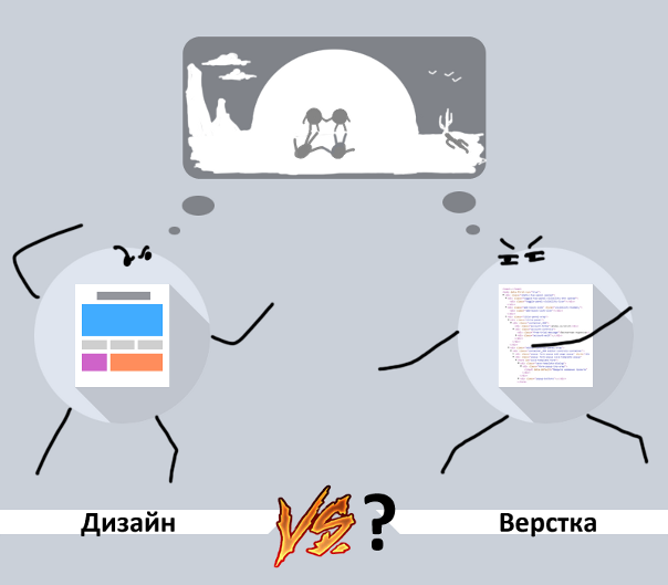
Design vs. Layout?
At Habrahabr, the question has repeatedly been raised that the life cycles of developing web interfaces, which are popular today, are, quite frankly, outdated. The last time he was discussed in the publication "Design in a browser" , but did not come to a consensus.
It is time to finally find answers to two main questions: “Who is to blame?” And “What to do?” In the eternal struggle of design and layout ...
It’s worth starting the article by considering how the development of web interfaces actually takes place, who participates in it, what exactly it does and what it is responsible for. There are dozens of methodologies that build the life cycle of developing web interfaces, but they are all united by the basic stages:
Stage One: Creating formal requirements for the interface being developed. The end result of this stage is a brief or technical task, which describes what should be on the layout and how it will be implemented. People with project roles are engaged in this: business analyst, technical writer;
Stage Two: Development of a graphic design layout for a brief or TK. This work is performed by the designer (web designer, GUI designer);
Stage Three:Layout of the interface (creating html \ css \ JS code) according to the graphic design layout. The typesetter works (front-end developer, web developer).
It is possible to confine oneself to the basic stages and obtain a high-class result only in “spherical conditions in a vacuum”. In practice, at each stage, a number of problems arise, which have to be solved by introducing sub-steps and complicating the life cycle of interface development.
Examples of problems and sub-steps arising from their fault can be:
We will talk more about the problems that arise and how to solve them below, starting with the question of objectivity in assessing the quality of design layouts.
By designing web interfaces, we mean work on designing interaction and designing the appearance of web pages. Appearance is conveniently conveyed in a graphic design layout. Those. design work comes down to creating a layout.
Evaluation of the layout, by and large, is subjective. It is often built on such epithets as beautiful, like, pleasant, neat, and their variants with the prefix “not” ... The quality of the layout is judged by personal preference. The question arises: is it possible to formally evaluate the layout in general according to subjective criteria? Can. And the most effective way is testing for a focus group: a group of people from the target audience is recruited, for which a layout is being developed, a demonstration is conducted, after which the study participants fill out questionnaires, setting estimates based on their personal opinions on these subjective parameters. The average value is an adequate assessment of the quality of the layout.
How often does this focus group test take place in practice? Unfortunately, very rarely. Usually it comes down to agreeing on the personal opinions of the designer and the customer. Moreover, according to experience, as a contractor can not always adequately evaluate his work, so the customer has an opinion that is useless or even detrimental to quality. As a result, the end user suffers, for the sake of which, it would seem, the layout is being made.
Another approach to formal layout evaluation is based on the principles of user interaction, sometimes called the “Steve Jobs Principles”:
According to these principles, at the beginning of the era of home computers, Apple created solutions that turned these very PCs into a work of design art, as opposed to the “square-practical” appearance of competitors' products. Consumers themselves did not realize that they would like the fact that such a utilitarian thing like a computer can be a stylish design decision. But after seeing the implementation created by designers who did not take into account the opinion of the consumer, they nevertheless appreciated it. However, this is another story, back to the development of the appearance of web pages ...
Yes, many design studios are working on evaluating layouts according to similar principles, without any focus groups from representatives of Central Asia, independently determining what the layout should be, and getting a very successful and high-quality result. Everything happens the same as with the focus group, only an expert group gathers here , consisting of several experienced designers working in the same field, they are also presented with a layout, and it is evaluated.
But, again, how often do expert groups come together in practice, consisting of at least someone other than the executing designer and customer? It seems that we have already talked about this ...
A formal assessment of the quality of the design layout is possible, but in practice is rarely feasible. Any individual assessment is subjective, and this, among other problems of developing web interfaces ...

The problem mentioned in the subtitle is well known among web designers:
No matter how high-quality and detailed the layout is drawn, it remains a graphic image, sometimes it is also called a “dead” layout. Even if you are developing a web page design where there are no dynamic elements (drop-down menus, changing by clicking shadows, etc.), your layout still feels different from the final, page layout (even on statics you can select text, scroll and other).
This issue and usability concerns. Partly usability expertise can be carried out using a graphic layout (evaluating the location and layout of elements, etc.), but you can fully understand how convenient the interface turned out, to identify all the pitfalls in working with it, you can only use the final, finished web page .
Here comes another misfortune of both designers and layout designers - lack of content. Sometimes in the brief it is written: “here is the text on the page, and here is the picture”. And what kind of text is it, what size is it, how many paragraphs and headings are in it; what kind of picture is there, in what color scale it is, what proportions it has - it is not indicated. Then you have to use “fish” (stubs) in the design layout — third-party texts, pictures. Sometimes they also have to be used for layout. And then, when the final, working content is already placed on the page, horrified by the final result,
It turns out that even if the initial design layout was evaluated positively, the assessment of the final result can change for the worse.
What do we have in the end? Embittered designers, drawing the N'th version of the layout and legitimately declaring: "you need to more formally set the requirements for the layout." No less annoyed layout designers turning the page for the Mth time. This picture is complemented by extended periods, failed deadlines, exceeded budgets and the eternal questions “Who is to blame?” And “What to do?”
All of this could have been avoided if we changed the standard model of the life cycle of developing web interfaces. After a small adjustment, it would look like this:
Stage One: Content preparation;
Stage Two: Creating a brief brief with a description of the functionality and formal requirements for the interface being developed;
Stage Three:Rapid development of the interface in the conditions where it will be used (directly in the browser), immediately imposing it as a finished web page, with continuous expert and usability assessment.
All problems disappear on their own, the end result is always at a high level, in addition - the time and costs of development are reduced by several times, compared with the existing standard life cycles of developing web interfaces. The question is, why is everyone still not using such a successful scheme? In fact, just now this approach is gaining momentum.
This was stated in the article, a link to which we gave at the beginning of the post ( http://habrahabr.ru/post/238485/ ), but I will duplicate it here again:
In the text of that article and in the comments to it, the thesis was expressed, and most importantly, how to implement this approach: “It is necessary for the designer to be a typesetter and to develop the interface immediately as a ready-made layout.”
In the same place, other examples were voiced in the comments that spoke about the relevance of the described approach - these are specialized products that have appeared recently. Firstly, these are solutions for rapid prototyping of web pages, such as: www.axure.com , http://froont.com . Secondly, these are new generation programs and services where, upon visual development of the layout, a ready-made layout is immediately generated (and unlike similar products of the “old generation”, these solutions generate clean and concise code, as if written by a high-end typesetter):http://macaw.co , https://webflow.com .
Products for creating prototypes are good in that you can quickly get a visual result, but there is no question of a concise and clean layout, and even more so about the full-fledged interfaces created in them. Solutions that generate high-quality code cannot be called simple, and they won’t work quickly. Sometimes, the time of working with them, on the contrary, is commensurate or even longer than when you first need to draw a graphic layout, and then “manually” make it up. At the same time, neither one nor the other has the opportunity to work on the layout in the conditions in which it will be used (i.e., directly in the browser, with the missing editor working elements). And the function of autosaving and project hosting, which provides continuous access to the intermediate result to third parties (for quality assessment, usability expertise, etc.), is far from all ...
When a solution appears that is devoid of all these shortcomings and able to fully implement the proposed life cycle of developing web interfaces, it remains only a matter of time. All trends lead precisely to such a product.
If you are interested in the problems described in the article and its solution, we offer you to watch this short video as a bonus - http://www.youtube.com/watch?v=nIOVU9_KRKA
Kirill,
project manager of the Mockup editor SletchBuilder
Co-authored with our designer Sergey Sevenvampire and web developer Anton skrutty .
It is time to finally find answers to two main questions: “Who is to blame?” And “What to do?” In the eternal struggle of design and layout ...
Typical Web UI Development Life Cycle
It’s worth starting the article by considering how the development of web interfaces actually takes place, who participates in it, what exactly it does and what it is responsible for. There are dozens of methodologies that build the life cycle of developing web interfaces, but they are all united by the basic stages:
Stage One: Creating formal requirements for the interface being developed. The end result of this stage is a brief or technical task, which describes what should be on the layout and how it will be implemented. People with project roles are engaged in this: business analyst, technical writer;
Stage Two: Development of a graphic design layout for a brief or TK. This work is performed by the designer (web designer, GUI designer);
Stage Three:Layout of the interface (creating html \ css \ JS code) according to the graphic design layout. The typesetter works (front-end developer, web developer).
It is possible to confine oneself to the basic stages and obtain a high-class result only in “spherical conditions in a vacuum”. In practice, at each stage, a number of problems arise, which have to be solved by introducing sub-steps and complicating the life cycle of interface development.
Examples of problems and sub-steps arising from their fault can be:
- Lack of general vision or lack of understanding of the subject area - it will not work out to be limited to a text description in the brief or TK. It will be necessary to create several prototypes and conduct additional research.
- A nice looking interface may be inconvenient to use. To avoid this, you have to involve a usability specialist in the work and conduct an additional examination for ease of use, etc.
We will talk more about the problems that arise and how to solve them below, starting with the question of objectivity in assessing the quality of design layouts.
The problem of formal design assessment
By designing web interfaces, we mean work on designing interaction and designing the appearance of web pages. Appearance is conveniently conveyed in a graphic design layout. Those. design work comes down to creating a layout.
Evaluation of the layout, by and large, is subjective. It is often built on such epithets as beautiful, like, pleasant, neat, and their variants with the prefix “not” ... The quality of the layout is judged by personal preference. The question arises: is it possible to formally evaluate the layout in general according to subjective criteria? Can. And the most effective way is testing for a focus group: a group of people from the target audience is recruited, for which a layout is being developed, a demonstration is conducted, after which the study participants fill out questionnaires, setting estimates based on their personal opinions on these subjective parameters. The average value is an adequate assessment of the quality of the layout.
How often does this focus group test take place in practice? Unfortunately, very rarely. Usually it comes down to agreeing on the personal opinions of the designer and the customer. Moreover, according to experience, as a contractor can not always adequately evaluate his work, so the customer has an opinion that is useless or even detrimental to quality. As a result, the end user suffers, for the sake of which, it would seem, the layout is being made.
Another approach to formal layout evaluation is based on the principles of user interaction, sometimes called the “Steve Jobs Principles”:
Developers do not take into account the opinions of users, they themselves determine what the user needs, because developers are experts and professionals who see the situation as a whole and adequately, and in most cases end users themselves do not know what they want, and can only enjoy a result that satisfies their needs, which they had not previously suspected.
According to these principles, at the beginning of the era of home computers, Apple created solutions that turned these very PCs into a work of design art, as opposed to the “square-practical” appearance of competitors' products. Consumers themselves did not realize that they would like the fact that such a utilitarian thing like a computer can be a stylish design decision. But after seeing the implementation created by designers who did not take into account the opinion of the consumer, they nevertheless appreciated it. However, this is another story, back to the development of the appearance of web pages ...
Yes, many design studios are working on evaluating layouts according to similar principles, without any focus groups from representatives of Central Asia, independently determining what the layout should be, and getting a very successful and high-quality result. Everything happens the same as with the focus group, only an expert group gathers here , consisting of several experienced designers working in the same field, they are also presented with a layout, and it is evaluated.
But, again, how often do expert groups come together in practice, consisting of at least someone other than the executing designer and customer? It seems that we have already talked about this ...
A formal assessment of the quality of the design layout is possible, but in practice is rarely feasible. Any individual assessment is subjective, and this, among other problems of developing web interfaces ...
The mismatch between the sensations of the graphic layout and the layout of the web page
The problem mentioned in the subtitle is well known among web designers:
No matter how high-quality and detailed the layout is drawn, it remains a graphic image, sometimes it is also called a “dead” layout. Even if you are developing a web page design where there are no dynamic elements (drop-down menus, changing by clicking shadows, etc.), your layout still feels different from the final, page layout (even on statics you can select text, scroll and other).
This issue and usability concerns. Partly usability expertise can be carried out using a graphic layout (evaluating the location and layout of elements, etc.), but you can fully understand how convenient the interface turned out, to identify all the pitfalls in working with it, you can only use the final, finished web page .
Here comes another misfortune of both designers and layout designers - lack of content. Sometimes in the brief it is written: “here is the text on the page, and here is the picture”. And what kind of text is it, what size is it, how many paragraphs and headings are in it; what kind of picture is there, in what color scale it is, what proportions it has - it is not indicated. Then you have to use “fish” (stubs) in the design layout — third-party texts, pictures. Sometimes they also have to be used for layout. And then, when the final, working content is already placed on the page, horrified by the final result,
It turns out that even if the initial design layout was evaluated positively, the assessment of the final result can change for the worse.
How to avoid all these problems when developing web interfaces
What do we have in the end? Embittered designers, drawing the N'th version of the layout and legitimately declaring: "you need to more formally set the requirements for the layout." No less annoyed layout designers turning the page for the Mth time. This picture is complemented by extended periods, failed deadlines, exceeded budgets and the eternal questions “Who is to blame?” And “What to do?”
All of this could have been avoided if we changed the standard model of the life cycle of developing web interfaces. After a small adjustment, it would look like this:
Stage One: Content preparation;
Stage Two: Creating a brief brief with a description of the functionality and formal requirements for the interface being developed;
Stage Three:Rapid development of the interface in the conditions where it will be used (directly in the browser), immediately imposing it as a finished web page, with continuous expert and usability assessment.
All problems disappear on their own, the end result is always at a high level, in addition - the time and costs of development are reduced by several times, compared with the existing standard life cycles of developing web interfaces. The question is, why is everyone still not using such a successful scheme? In fact, just now this approach is gaining momentum.
This was stated in the article, a link to which we gave at the beginning of the post ( http://habrahabr.ru/post/238485/ ), but I will duplicate it here again:
- At the St. Petersburg WSD, most of the reports were devoted to this topic - http://webstandardsdays.ru/2014/06/28/ ;
- This was stated in a report by Anton Vinogradov from Alpha Lab at BEMup ( https://tech.yandex.ru/events/bemup/6-september-2014/talks/2189/ ), where he examined the topic using the example of a Yandex application layout. Taxi;
- The report by Ilya Pukhalsky on Rest in PS ( https://vimeo.com/85995812 ) also clearly clarified a similar problem.
In the text of that article and in the comments to it, the thesis was expressed, and most importantly, how to implement this approach: “It is necessary for the designer to be a typesetter and to develop the interface immediately as a ready-made layout.”
In the same place, other examples were voiced in the comments that spoke about the relevance of the described approach - these are specialized products that have appeared recently. Firstly, these are solutions for rapid prototyping of web pages, such as: www.axure.com , http://froont.com . Secondly, these are new generation programs and services where, upon visual development of the layout, a ready-made layout is immediately generated (and unlike similar products of the “old generation”, these solutions generate clean and concise code, as if written by a high-end typesetter):http://macaw.co , https://webflow.com .
Products for creating prototypes are good in that you can quickly get a visual result, but there is no question of a concise and clean layout, and even more so about the full-fledged interfaces created in them. Solutions that generate high-quality code cannot be called simple, and they won’t work quickly. Sometimes, the time of working with them, on the contrary, is commensurate or even longer than when you first need to draw a graphic layout, and then “manually” make it up. At the same time, neither one nor the other has the opportunity to work on the layout in the conditions in which it will be used (i.e., directly in the browser, with the missing editor working elements). And the function of autosaving and project hosting, which provides continuous access to the intermediate result to third parties (for quality assessment, usability expertise, etc.), is far from all ...
When a solution appears that is devoid of all these shortcomings and able to fully implement the proposed life cycle of developing web interfaces, it remains only a matter of time. All trends lead precisely to such a product.
If you are interested in the problems described in the article and its solution, we offer you to watch this short video as a bonus - http://www.youtube.com/watch?v=nIOVU9_KRKA
Kirill,
project manager of the Mockup editor SletchBuilder
Co-authored with our designer Sergey Sevenvampire and web developer Anton skrutty .