Mobile version for Django-project

Every day, smartphone users occupy an increasing share of the Internet. According to LiveInternet, the share of Russian users of OS Android has already exceeded the share of Windows7. On weekends, users of mobile platforms use the Internet more often. The same trend is observed in the world. All this once again proves the need to adapt the site for smartphones and tablets.
I’ll talk about how to adapt your Django project for mobile devices in this article. But first, let's look at what are the options for creating a mobile version of the site.
1. Options for the mobile version of the site
1.1 Adaptive layout
In this case, we give the same amount of data for a large and mobile version of the site. This approach is the easiest for backend development, everything is decided by layout.
From the pros:
- does not require redirects;
- no need to separately inform search bots about the presence of a mobile version (alternate meta tags, sitemaps, etc.).
Of the minuses:
- since on the mobile version you have to give everything in and hide the excess, excess traffic and server load are created;
- Mobile version should always be created with a large version of the site;
- since the data on both versions is the same, it can be difficult to conveniently organize both versions, most likely you will have to sacrifice the mobile version; For example, I can’t imagine how you can make a convenient forum with this approach.
This approach is well suited for small sites. When there is a lot of output content on a page, ease of implementation creates a big problem in usability.
1.2 Mobile version on the subdomain
In fact, these are two separate sites. This approach solves the problems of excess traffic, gives more flexibility and opportunities in developing a version for mobile devices. However, at the same time, the question of which version to display to the user is decided by the server, and not by the browser. You also need to give the user the opportunity to choose which version of the site he needs and to “make friends” both versions of the site with redirects and alternates.
Different URLs of one page lead to a disadvantage of this method: relative links in the materials of the site can lead to pages that are not in the mobile version. Therefore, you have to specify absolute links to the main domain and then redirect the user to the desired version. The solution to this shortcoming will be a fully appropriate large and mobile version, but in this case it is more correct to go in a third way.
1.3 Mobile version on the same domain
This is a refinement of the first approach and the solution of its minus with traffic and excess load. It is implemented in the same way as with a subdomain: you determine which version the client needs and transfer the necessary amount of data to the desired template. The same URL for both versions of the site is certainly a plus. Although the problem of organizing content for both versions still remains, it is already easier to solve, since there are no restrictions on the same data.
1.4 Our experience
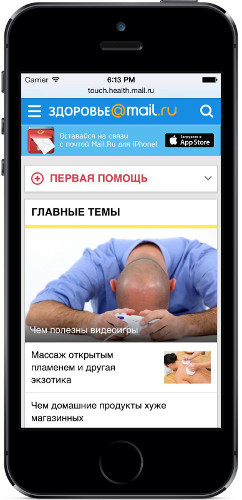
In the content project department of Mail.Ru Group, we use the second approach, although we are moving smoothly towards the third. Projects Mail.Ru Kids and Mail.Ru Health are written in Django, both have mobile and / or touch versions. Despite the fact that the projects under the hood are slightly different, the mechanism for creating mobile versions is the same. I want to share this with you.
2. Original agreements
2.1 All routes we name
url(r'^$', views.MainIndexView.as_view(), name='health-main-index')
url(r'^(?P[-\w]+)/$', views.NewsDetailView.as_view(), name='health-news-detail')
And we always turn to them by that name.
reverse('health-main-index')
We never collect URLs ourselves in controllers or templates, they are specified only in urls.py. DRY .
2.2 Using django-hosts
This library was already mentioned on Habré. Initially, we used it on the “children” for the forum on the subdomain, now the forum has moved to our main host, and this library is used only for the mobile version.
In short, how it works: you connect middleware, which, depending on the Host header, replaces the URL scheme. Besides the jung function
reverse, you can use from this library reverse_full, which builds an absolute URL. A similar tag host_urlcan be used in templates. Used functions reverse_host, get_hostalso taken from this application.2.3 Separate controllers for large and mobile versions
Despite the fact that sometimes the controllers of the large and mobile versions of the site give the same data to the context, we divided them into separate functions / classes. Yes, there is duplication between them, but on the other hand, the code becomes clearer without unnecessary abstractions and checks, when what functions are needed and in what form.
3. Mobile version development
The mobile version should solve the following tasks:- Determining the site version and redirect for the corresponding devices.
- The ability of the user to abandon the mobile version and use the main one.
- Redirects should redirect to the appropriate mobile version and vice versa. It is not good to throw the user to the main page and force them to search from the beginning.
- If a user lands on a missing page in the mobile version, for which there is an analogue in the large version, he needs to explicitly report this. This task was not if both versions corresponded to each other.
- You must specify the metate tags alternate and canonical if a mobile counterpart is available for the page.
3.1 Determining the site version
From which device the user entered our project, we determine using our nginx module. It looks something like this:
set $mobile $rb_mobile;
if ($cookie_mobile ~ 0) { set $mobile ""; }  # discard by cookie
proxy_set_header X-Mobile-Version $mobile;
The module determines the type of version to be shown (m or touch), but if the user has the mobile cookie, we ignore it. The result is transmitted as an http header to the backend.
Further processing of the request occurs in middleware.
class MobileMiddleware(object):
    def process_request(self, request):
        if request.method != 'GET':  # redirect only GET requests
            return
        mobile_version = request.META.get(MOBILE_HEADER, '')
        if not mobile_version:  # redirect only for mobile devices
            return
        hostname = request.host.name
        if hostname in settings.MOBILE_HOSTS:  # redirect only for main version
            return
        if mobile_version == 'm':
            host = get_host('mobile-' + hostname)
        elif mobile_version == 'touch':
            host = get_host('touch-' + hostname)
        else:
            # wrong header value
            return
        if not is_valid_path(request.path, host.urlconf):
            # url doesn't exist in mobile version
            return
        redirect_to = u'http://{}{}'.format(reverse_host(host), request.get_full_path())
        return http.HttpResponseRedirect(redirect_to)
A user redirect is possible if:
- GET request came;
- the request came to the main version of the site (if the user explicitly typed the address of the mobile version - leave it on it);
- check if there is such a page in the mobile version (do not redirect it to 404).
In the general case, which version to give to the user is determined by the UserAgent in middleware. There you need to check the value of cookies mobile. I myself did not use the django-mobile application, perhaps there are other more accurate libraries for determining the type of device. Suggest them in the comments.
3.2 Switching to a large version of the site
We sent the user to the mobile version, we will also give him the opportunity to switch back to the larger version. In the basements of our projects contains a link of the type
/go-health/by which the transition is carried out.url(r'^go-health(?P/.*)$', 'health.mobile.views.go')
Unfortunately, sometimes the pages of the mobile version differ from the main one. The information that easily fits on a large version in the mobile is divided into 3 pages. Therefore, dropping a subdomain and redirecting to the same URL would be wrong. We have chosen the following algorithm:
- We determine the name of the route of the page on which we are.
- A controller function may contain a special attribute
go_view_name. In this case, we redirect to the page with this (other) name of the route. This is necessary just for the case when several pages of one version correspond to one page of a large version. - In other cases, redirect to the large version of the route with the same name.
Thus, the name of the routes acts as a link between the controllers of the large and mobile versions.
@never_use_mobile
def go(request, path):
	meta_query_string = request.META.get('QUERY_STRING', '')
	query_string = '?' + iri_to_uri(meta_query_string) if meta_query_string else ''
	main_host = get_main_host(request.host)
	try:
		resolver_match = resolve(path)
	except Resolver404:
		pass
	else:
		if hasattr(resolver_match.func, 'go_view_name'):
			redirect_to = 'http:%s%s' % (reverse_full(
				main_host.name, resolver_match.func.go_view_name,
				view_args=resolver_match.args, view_kwargs=resolver_match.kwargs),
				query_string)
			return HttpResponseRedirect(redirect_to)
	# path matches url patterns, otherwise 404
	resolver_match = resolve(path, main_host.urlconf)
	redirect_to = 'http:%s%s' % (reverse_full(
		main_host.name, resolver_match.view_name,
		view_args=resolver_match.args, view_kwargs=resolver_match.kwargs),
		query_string)
	return HttpResponseRedirect(redirect_to)
Attribute
go_url_nameassigned through decoratordef go(url_name):
def decorator(view_func):
@wraps(view_func, assigned=available_attrs(view_func))
def _wrapped_view_func(*func_args, **func_kwargs):
return view_func(*func_args, **func_kwargs)
_wrapped_view_func.go_url_name = url_name
return _wrapped_view_func
return decorator
@go('health-news-index')
def rubric_list(request):
...
And the decorator
never_use_mobileputs the cookie mobile to cancel the automatic redirectdef never_use_mobile(view_func):
@wraps(view_func, assigned=available_attrs(view_func))
def _wrapped_view_func(request, *args, **kwargs):
response = view_func(request, *args, **kwargs)
set_mobile_cookie(response, 0)
return response
return _wrapped_view_func
Unfortunately, touch versions develop after the main sections and do not always correspond to pages on a large version, so you have to keep such code.
The attribute
go_view_namesimply replaces the name of the route for the analog page. This is a fairly limited solution, but it is enough for now.3.3 404 for the mobile version
You can not only inform the user that the page was not found, but also indicate that such a page is in the full version of the site. At the same time, checking the URL using the URL scheme is not enough: the request
/news/foo/matches the URL scheme , but there is no such news. Therefore, we must try to perform the function of the controller in the main url scheme. There is one more subtlety: it is necessary to replace the current URL scheme for the large version, as functions reverseand the url tag need it . Otherwise, you will render the large version page in the mobile URL scheme.def page_not_found(request):
current_host = request.host
hostname = current_host.name
main_host = get_host(hostname.replace('mobile-', ''))
try:
# path matches url patterns
resolver_match = resolve(request.path, urlconf=main_host.urlconf)
except Resolver404:
return mobile_404(request)
set_urlconf(main_host.urlconf)
try:
# function returns not 404 with passed arguments
resolver_match.func(request, *resolver_match.args, **resolver_match.kwargs)
except Http404:
set_urlconf(current_host.urlconf)
return mobile_404(request)
set_urlconf(current_host.urlconf)
meta_query_string = request.META.get('QUERY_STRING', '')
query_string = '?' + iri_to_uri(meta_query_string) if meta_query_string else ''
redirect_to = 'http:%s%s' % (reverse_full(
main_host.name, resolver_match.view_name,
view_args=resolver_match.args, view_kwargs=resolver_match.kwargs),
query_string)
return mobile_fallback404(request, redirect_to)
3.4 meta tags alternate and canonical
These URLs are built using django-host application functions or template tags.
context['canonical'] = build_canonical(reverse_full('www', 'health-news-index'))
context['alternate'] = {
    'touch': build_canonical(reverse_full('touch-www', 'health-news-index'))
}