Effective or effective? Workshop on creating website design
- From the sandbox
- Tutorial

Effective or effective?
Of course, from any site I want both the first and the second. Some manage to achieve this, some do not. In the format of a certain master class, I will try to explain how to get both the very first and second,
Which site can be called effective? For me, this is the one that solves the tasks, contributes to the achievement of the goals. Despite the fact that it sounds extremely stereotyped and bureaucratic - it applies absolutely to any project. In many ways, the effectiveness of the site is laid at the stage of analysis and prototyping. I will talk about this in the first part.
Patient examination
Targets and goals
I want to warn you right away , I don’t know what goals and objectives the nginx.org authors set . I came up with my own - how close they are to reality is not so important, we just need to work with something.
So, the tasks will be quite trivial for themselves:
- Distribution and support of the main product.
- Promotion of a commercial package.
The goals are no less obvious: more installs of the first, more subscribers of the second. And yes, a small digression - we will forget about the existence of nginx.com (everything is fine with efficiency, only effectiveness can cause questions).
After setting goals and objectives, it is worth considering what we need to tell and show to the visitor. That is, start thinking about texts. Yes, this needs to be done now, and not the way it is done in 99% of cases - just before the launch. It is not necessary to prepare the final texts - it is enough to define the theses and the approximate volume.
In our case, everything is ready, so go to the next step.
Site structure
The next step is to develop the site structure. I’m staying captain: it should be as simple, understandable and logical as possible.
Since we are engaged in redesign, the task is simplified - we already have a ready-made structure presented in the main menu (except for nesting in the sections “documentation” and “faq”).

Let's group links by meaning in order to reduce the number of sections of the first level:
- In fact, a group of links (“faq”, “links”, “books”, “support”) help in the development of the product, they can be combined into a common group, let's call it “Help”. In addition, we will combine links leading to external resources (“trac”, “wiki”, “twitter”, “nginx.com”, “blog”) with the above “links” section. Looking ahead - we will duplicate links to external resources in the footer of the page. So they will not get lost, and access to them will still be possible from any page of the site.
- We will group the sections (“security advisories”, “pgp keys”) into one, let's call it “Patches”. Here I can be mistaken: combining these links, I hope that the same keys, except for installing patches, are not used anywhere. If this is not so, then grouping sections is not worth it.
- We will replace the choice of language with something more compact, most likely with a drop-down list.
As a result, the structure takes on this form (excluding nesting in the sections “Documentation” and “FAQ”):
- Download
- About
- Documentation
- Help
- FAQ
- Links
- Books
- Support
- News
- Patches
- Security advisories
- PGP keys
- Donation
Sections are listed in priority order. The first level will form the main menu of the site. There is a recommendation - there should be no more than seven items in the main menu. We got just seven, which is much better than a couple of dozen links that were there originally.
We proceed to the analysis of the current site (for clarity, I will hide screenshots from the future prototype under the spoilers).
Main page

Like no other, the main page determines how effective and effective the site will be. The content of the nginx.org homepage is an ad unit and a news feed. This is not enough for the design to contribute to the achievement of goals.
The biggest problem of the current site - the main page does not promote the product - looking at it, it is impossible to understand what kind of software is in front of you! To fix this, just place a capacious title, a brief description of the key features of the product and a prominent link to a detailed description.
On any site that represents any software available for download, it is vital that you have a large and prominent download button for this software itself. Is it logical?
Let's go back to the current content of the main page. We will leave the ad unit in one form or another, however, like the news. But the number of the latter is definitely worth reducing and giving a link to the full news feed.
Since we grouped the links into general sections, in the footer of the page it is worth duplicating the entire navigation in expanded form. We’ll also place the “Donate” button there - users are used to seeing it in the basement. And following user habits is good practice.
Updated Homepage
Download Page (Download)

We have specific software, so the download page meets us with dozens of links. But not all links are equally useful. I assume that in 95% of cases, visitors are interested in the “Mainline version” and “Stable version” - they should be the main focus. At a minimum, add prominent download buttons. And also indicate the size and format of the downloaded files - this is considered the rule of good taste.
Due to the abundance of links, the “Legacy versions” block takes too much attention, although it is the least important here. Move it to the end of the page, arrange it in the form of a table, and place the repeating words in the form of column headings.
Updated download page
About Product (About)

We take out the content in the column “glued” to the screen - it is much more convenient and more visual to see it constantly. To make it clear what I mean, look at how Affix is implemented in Bootstrap.

Why is he so good?
- The content is placed in the same column “attached” to the screen.
- When scrolling the page, the corresponding section in the content is highlighted.
- When you click on any item, the page is scrolled to the corresponding heading.
- Content can be layered.
All this is very convenient to use, so it’s worth implementing something similar in our project.
Updated Product Page
Documentation

We will form the content from the headings “Introduction”, “How-To”, “Development” and “Modules reference”. Take it out in a separate column on the right side of the page, similar to that described above for the “About” page. Do not forget that the internal pages also have content. Let's make it the same way, but add everything else to the link to return to the main content of the documentation.
Updated Documentation Page
Help
Let me remind you that when forming a new structure, we merged four sections (“faq”, “links”, “books”, “support”) into one - “Help”. We also included links to external resources in the “links” section.
Frequently Asked Questions (FAQ)

Very often for such sections use the so-called "accordion" - when you click on any question, the answer is immediately revealed. In my opinion, this is acceptable if the answer to the question is short, loaded dynamically and you can give a direct link to it, that is, there is a separate page on the site where only this answer is given.
Why are there so many requirements? In our case, there are not many questions, but imagine that there will be more of them. Search engines will index all the content on the page (including responses in hidden blocks). The user, going from the search engine, will fall on a sheet with dozens of questions, where he should find what he was looking for. And well, if his request is in the title of the question, if he is in a hidden block - there is practically no chance of finding him. Therefore, we will not change anything - each answer will be on a separate page.
Links

Add the subtitle “Resources” to the current content and place links to external resources (“trac”, “wiki”, “twitter”, “nginx.com”, “blog”) with short explanations.
Updated page with links
Books

Let’s make out the contents more densely - two or three books in a row. In my opinion, the publisher and the language are superfluous information, since links are given to online stores where these books can be bought, and there, in turn, a lot of additional information is posted about each publication.
Updated page with books
Support

It may be worth adding an emphasis on the commercial support unit.
News (News)

I love the way the current news feed is organized. There is not much news for the year, they are concise, therefore pagination is not used.
In the feed of current news, the last ten news will be displayed regardless of the year. If there are more than ten news for the current year, all news for the current year are displayed.
We will make a conclusion of dates "for people". If the news is published today or yesterday, we will display “Today” or “Yesterday,” respectively. If the news was published this year, we will display the month and day - “April 8”. If the news was published in the past years - by the month and the date we will add the year - “December 17, 2013”.
Updated News Page
Patches

Add an emphasis on the title, criticality, a link to the patch itself and make the content more dense. Despite the fact that the space for placing two patches in a row is available, this is not worth it, since there are fairly long headers - it will be easier to read them one at a time.

PGP keys are only mentioned on the “security advisories” page, so I assume that they are used only here. The list with the keys will be moved to the right column.
Updated patch page
Support the project (Donation)

Obviously, the breakdown into columns by year has its limitations. Change the layout of this page - we will not place the years in columns, but in rows. The request and the “Donate” button will be removed in the right column.
Updated Support Project Page
What's next?
We have completed the analysis of the current design. Even for such a simple project, it turned out to be very voluminous, let alone more complex. We transform this text analysis into a certain visual alternative - a prototype.
Prototyped, prototyped, but not prototyped
What is prototyping?
According to Wikipedia , prototyping is "... a quick" rough "implementation of basic functionality for analyzing the operation of the system as a whole ...".
In practice, in the context of web design and web development, by a prototype I mean a certain schematic draft of a site that allows us to evaluate the usability of the current concept.
Prototypes can be made in the form of html-pages, at least on the same bootstrap, but you can use specialized programs. On a habr there is an excellent overview of tools for prototyping .
Regardless of which tool you select, pay attention to these recommendations:
- Do not start right away with a digital prototype . Take paper, pen and sketch everything by hand. I am sure that at this stage you will notice some shoals and problem areas in the initial solutions.
- Make everything monochrome . Excluding color, when testing a prototype, it will be easier for you, your clients or colleagues to focus on functionality. Of course, where the color helps convey the functionality, it can be used (for example, blue links).
- Do not use pictures unless this is due to a functional solution.
- Do not go into details . The prototype implies a fairly quick creation. Therefore, do not try to draw the final design.
- Comment on all non-standard solutions . What may seem obvious to you will not seem to be the same for everyone else.
- Use an iterative approach . Analysis - prototyping - analysis (testing) of the prototype - new prototype - analysis and so on
until you get boreduntil you get an effective prototype. - Print the final prototype . Hang on the wall, look carefully. Most likely, you will find some flaws. In addition, it is nice to see the results of your work in material replication (especially when there are a hundred of these pages).
A bit about Axure
For prototyping, I use Axure . Moreover, the basic functionality is enough for me: standard widgets, notes for any elements and simple interactivity in the form of clickable links.
I will not step by step describe how I made the prototype - I will only briefly describe the Axure interface (in the screenshot version 6.5, the current 7th version is practically no different).
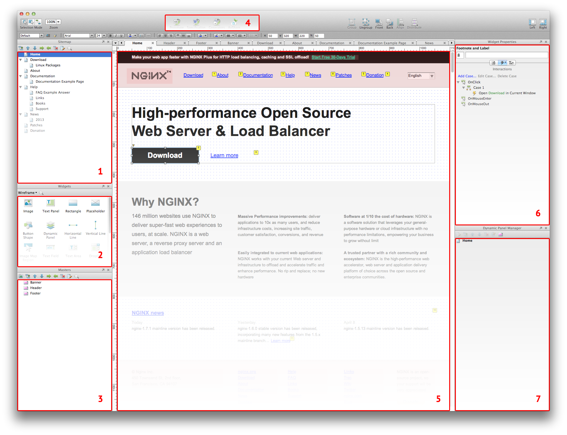
- Sitemap . As you might guess, this is a site tree. All pages are managed in this area.
- Widgets Of . These are the elements from which the prototype is built. The standard “Wireframe” library is enough for any occasion. However, those who wish can find many other libraries on the network (for example, for prototyping applications for iOS). Or make your own.
- Masters . This is actually just another name for grouped objects. The difference from ordinary groups (of course, they also exist) is that by updating the contents of the wizard, it will be updated on all pages where this wizard is used. That is, this is some analogue of Smart Objects from Photoshop. Usually, using wizards, they implement caps, page footers, and the like.
- Generate . After you made a prototype in Axure, you can export it as pictures, an html prototype or a specification in * doc format. You can also publish online using the AxShare service.
- Workspace . Workspace. All the fun happens in this area.
- Widget Properties . Widget settings. If you look closely, you will see a switch consisting of three buttons:
- Annotations . Text fields used to describe an element (name, description, etc.).
- Interactions . Interactivity Settings. Choose an event, for example, a click, and the action is to open the page from the prototype in the current tab.
- Formatting . Widget appearance settings. The contents of this tab are duplicated in a line above the workspace.
- Dynamic Panel Manager . The dynamic elements used on the current page. A typical use of “Dynamic Panel” is to display a modal window.
As you can see, everything is quite simple. I am sure that you will learn Axure at a basic level in 20 minutes.
But I got such a prototype .
Instead of a conclusion
In the article, I touched on efficiency in terms of usability and structure. Of course, they are one of the most important, but do not forget about others - quality content and accessibility. By accessibility, I mean technical aspects: browser support, download speed, and so on. But all this is a topic for another article.
That's all, thank you for your attention, see you!
What to read and see
Books
- Jacob Nielsen Web Design. The book of Jacob Nielsen ”(despite the fact that half of this book is hopelessly outdated, the other half will always be relevant).
- Vlad V. Golovach, “ User Interface Design II. The Art of Washing an Elephant ”(free e-book)
- Jeff Raskin, “Interface: New Trends in Computer Systems Design.”
- Alan Cooper, “About the Interface. Basics of interaction design. ”
- Alan Cooper, "The mental hospital in the hands of patients."
Articles
- Jakub Linowski, “ A Good User Interface ”. A huge collection of practical tips. It is worth printing and hanging on the wall. Most have been translated into Russian: one , two , three .
- Many translations of articles on UI / UX.
Video lessons
- Axure training in Russian.
- Official video tutorials from Axure developers.