The story of one logo
We want to share our experience how, in a short time and with a small budget, a logo was created for the RENTMANIA startup - a marketplace for renting things.
How it all began
The logo was not created from scratch. Already had the original logo from the prototype, with a given image. But, since he had outlived himself and completely did not fit the new main page of the site, it was necessary to create something else - high-quality and for a modest start-up budget (as always, high-quality and not expensive)
This is how our initial prototype looked.
The logo embodied important for us ideas: environmental friendliness (therefore the green color is chosen), globality (therefore the globe).
In addition, it was necessary to detach from the current colleagues at the time of the creation of the project (Usarium, Arenrorium):


All these conditions in the prototype were met. The problems were the logo, typography, and the metaphor itself, which was not readable in the context of renting / renting things and objects.
Here are some of the limitations we set when creating the new logo:
- there should not be a full website address, despite the domain being placed in the .ORG zone;
- the project has global ambitions, therefore only Latin;
- the logo was created “live”, i.e. already implemented in the existing site and the updated home page.
The work began to boil.
The first thing that needed to be beaten in the logo was environmental friendliness, softness and loyalty, which symbolizes the green color.
Then we worked on a rental / rental metaphor. To make it easy to read that this is a rental of things and a mass product.
These are the ideas that were born in the process.


All this did not fit.
We decided to focus on the phrase and play with color.

There were options where the letter R was played out.

An attempt in one color and another version of a frivolous inscription.

It's not that !!!
We also did not like the options for the letter R with the globe separately:


Suddenly! I liked it a bit ...


But immediately we reject it. Too not serious and not clear.
It's not that. From despair, they even wanted to change the name, but thought better of it and decided to return to the first concepts.
We select plates.

A metaphor resembles a bullet on a map or a footnote / comment. We evaluate different options:

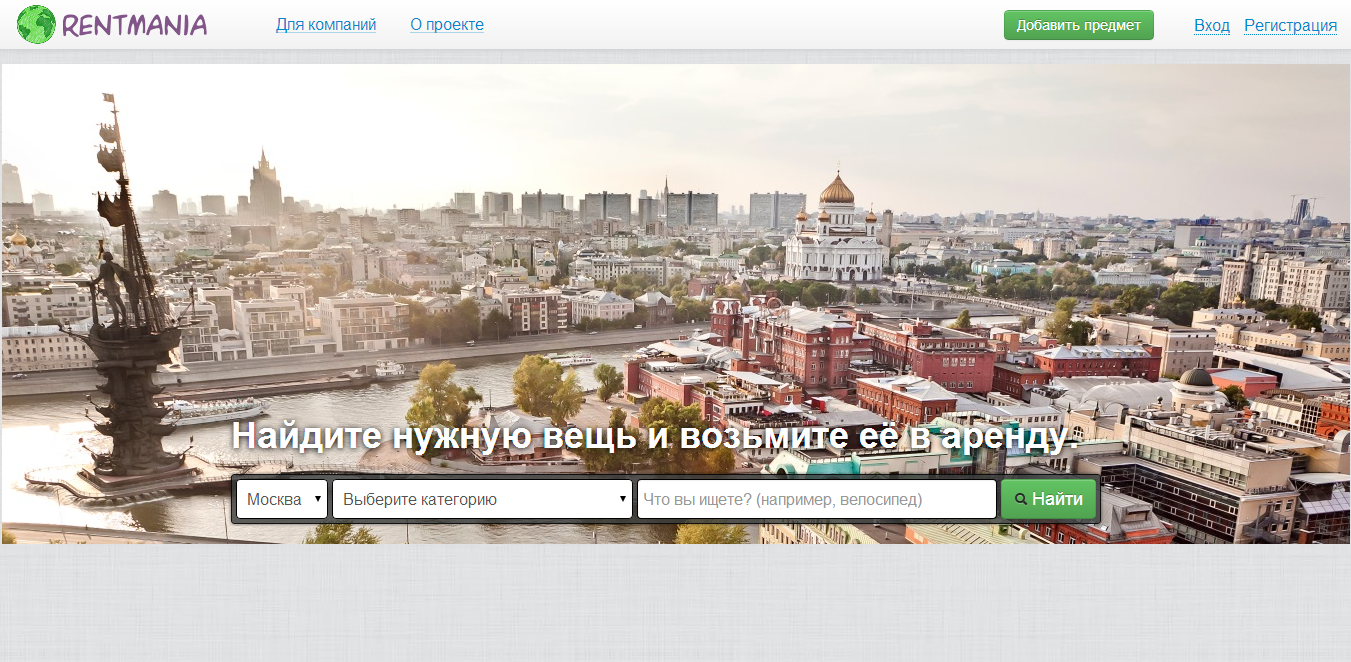
We try on the website:


We understand that it is pointless to beat the footnote. We decided to leave only the frame. And it was necessary to find a more acceptable color scheme.
We look monophonic options.


We see that there is no need to simplify further, we come to a logical conclusion of the work.
Geometrically substantiate the solution. Take the icon from the site as a basis.

We try on the site.


The option where the logo goes beyond, everyone likes. It looks confident and non-standard. We stop on it and adjust the color. The result is quite good.

It turns out a certain print that can be twisted, rotated, and it does not deteriorate, it can be molded into any image.
Logo creation conditions
The logo was developed over the course of the week in free mode, 5000 rubles were spent on it for three (graphic designer, idea generator and manager-critic).
Result

How to use
It can be used in black and white. Can be used in offline materials. And also - make a watermark.
What do you think?
I will be glad to any constructive comments, remarks and wishes that are not related, as they say, to taste.
And hopefully our experience will be useful to you!
How it all began
The logo was not created from scratch. Already had the original logo from the prototype, with a given image. But, since he had outlived himself and completely did not fit the new main page of the site, it was necessary to create something else - high-quality and for a modest start-up budget (as always, high-quality and not expensive)
This is how our initial prototype looked.
The logo embodied important for us ideas: environmental friendliness (therefore the green color is chosen), globality (therefore the globe).
In addition, it was necessary to detach from the current colleagues at the time of the creation of the project (Usarium, Arenrorium):
All these conditions in the prototype were met. The problems were the logo, typography, and the metaphor itself, which was not readable in the context of renting / renting things and objects.
Here are some of the limitations we set when creating the new logo:
- there should not be a full website address, despite the domain being placed in the .ORG zone;
- the project has global ambitions, therefore only Latin;
- the logo was created “live”, i.e. already implemented in the existing site and the updated home page.
The work began to boil.
The first thing that needed to be beaten in the logo was environmental friendliness, softness and loyalty, which symbolizes the green color.
Then we worked on a rental / rental metaphor. To make it easy to read that this is a rental of things and a mass product.
These are the ideas that were born in the process.
All this did not fit.
We decided to focus on the phrase and play with color.
There were options where the letter R was played out.
An attempt in one color and another version of a frivolous inscription.
It's not that !!!
We also did not like the options for the letter R with the globe separately:
Suddenly! I liked it a bit ...
But immediately we reject it. Too not serious and not clear.
It's not that. From despair, they even wanted to change the name, but thought better of it and decided to return to the first concepts.
We select plates.
A metaphor resembles a bullet on a map or a footnote / comment. We evaluate different options:
We try on the website:
We understand that it is pointless to beat the footnote. We decided to leave only the frame. And it was necessary to find a more acceptable color scheme.
We look monophonic options.
We see that there is no need to simplify further, we come to a logical conclusion of the work.
Geometrically substantiate the solution. Take the icon from the site as a basis.
We try on the site.
The option where the logo goes beyond, everyone likes. It looks confident and non-standard. We stop on it and adjust the color. The result is quite good.
It turns out a certain print that can be twisted, rotated, and it does not deteriorate, it can be molded into any image.
Logo creation conditions
The logo was developed over the course of the week in free mode, 5000 rubles were spent on it for three (graphic designer, idea generator and manager-critic).
Result
How to use
It can be used in black and white. Can be used in offline materials. And also - make a watermark.
What do you think?
I will be glad to any constructive comments, remarks and wishes that are not related, as they say, to taste.
And hopefully our experience will be useful to you!