Flat and thin
- Transfer
Over the past few years, we have witnessed a rapid transition from 3-D and skeuomorphism to flat forms and minimalism in the areas of software development and application interface design. Although this trend has become almost universal, let's think a bit about how we came to it and what impact it has on interface design in general. In addition, I will share some tips and considerations for creating flat interfaces.
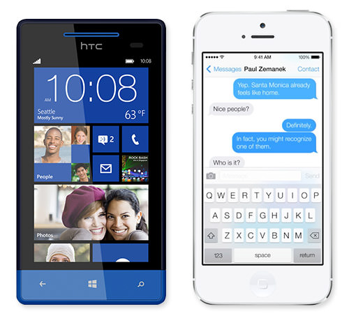
Interfaces on Windows Phone 8 and Apple ios 7
So, how did the collective consciousness move from a love of textures, volume and shadows to flat colors and simple layout? This transition was caused by many factors, but here are the most noteworthy of them.
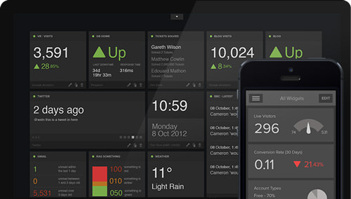
No unnecessary things: Geckoboard visualizations are designed to make key data easily visible at a glance.

A beautiful and minimalistic Oak Blue weather app .
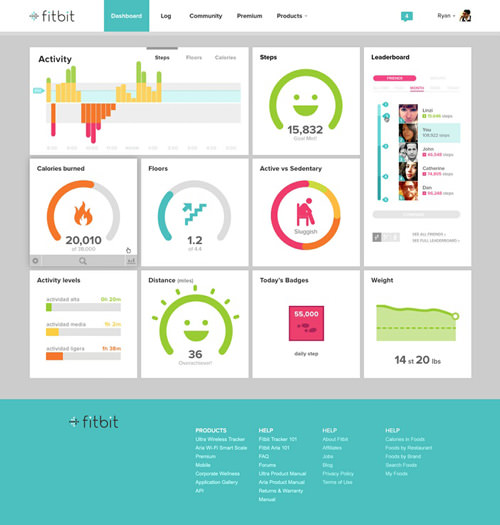
The Fitbit dashboard is presented in a bright, bold and understandable visual way.
If your target devices cannot support such nuances, you're out of luck. As screen size and pixel density on mobile devices continue to grow, it becomes possible to clearly display increasingly thin fonts. Of course, support for @ font-face also increased the appeal of a minimal layout.
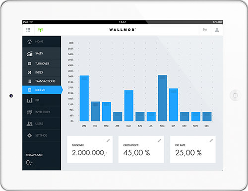
Real-time sales monitoring from Wallmob: monitors data from any device on which the browser is installed.
Concrete and simple: onsite ( large size ).
Alright, enough theory. Let's talk about practice. Creating an effective minimalist design is surprisingly difficult. When you remove the usual tricks of the user interface (shadows, bevels, textures, etc.), you will quickly understand how important the few remaining elements become. Although the following tips are mostly universal, they are especially important for flat interfaces.
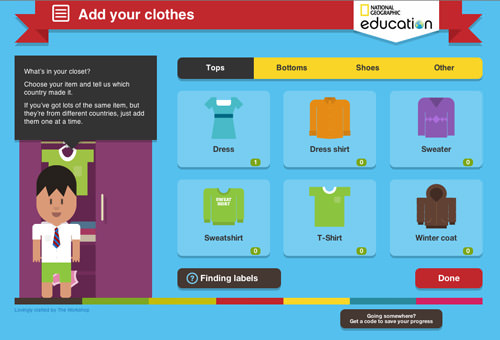
Global Closet : An interactive game for National Geographic Education by The Workshop .
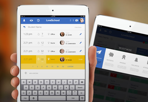
Live School app for ipad from Rossul Design.
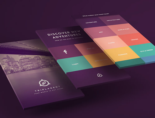
The visual design of triplagent uses a stunning color palette.
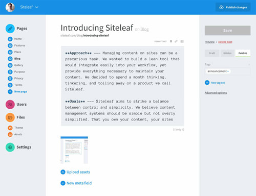
Clean and legible layout on Siteleaf .
Design elements in a simple layout and with optimal contrast: Taasky .
I do not believe in strict design rules. And I like that designers are trying so hard to create clean and simple interfaces. Does flat design exclude gradients and shadows? Of course not. In fact, some of the most interesting works I've seen lately balance between flat and volumetric design, intelligently presenting content and keeping the interaction intuitive.
We live in a cramped, information-rich and multi-functional digital world in which minimalistic design is spreading more and more. This is not to say that it is suitable for everything (no style is suitable), but if you use it thoughtfully and in place, it will bring a convenient and enjoyable experience with digital technologies.
Examples of good flat interfaces:
by Victor Erixon
by Jakub Antalík
by Tiberiu Neamu
Interfaces on Windows Phone 8 and Apple ios 7
What happened?
So, how did the collective consciousness move from a love of textures, volume and shadows to flat colors and simple layout? This transition was caused by many factors, but here are the most noteworthy of them.
Information overload
As people who are constantly in touch, we are dealing with an endless stream of information, some are important and relevant, the rest is not. We constantly evaluate, filter and, of course, create content, but all this becomes quite tedious. In addition, much of the perception of content now goes through devices with small screens, which exacerbates this feeling of overload. It appears too easily, and eliminating the unnecessary in the user interface (UI) can create a small visual zen.No unnecessary things: Geckoboard visualizations are designed to make key data easily visible at a glance.
Simplicity matters most
Following a similar trend, many breakthrough web applications and services offer highly specialized tools with a very limited set of features. While traditional software developers tend to push many features into their products to justify high prices, this shift to specialized micro-applications increases the value of ease of use, rather than the number of functions. Simpler applications have simple interfaces.A beautiful and minimalistic Oak Blue weather app .
Content is the head of everything
As often happens when new devices and technologies enter the market, we are literally fascinated by what they can do and how we can improve interactivity. This madness is usually accompanied by a return to emphasis on content. The consumption of media content, be it text, audio or video, is probably our main occupation on any devices, and therefore we just want the interface not to bother us.Technical literacy
When smartphones and tablets quickly became popular with any user, concern for the obviousness of controls declined. At one time, we were afraid that users might skip a button if it doesn’t jump to the middle of the screen, but now we are ready to learn more subtle aspects of interaction. Windows 8 and Chrome for Android even support touch commands without a visual indicator that turn on the screen.The Fitbit dashboard is presented in a bright, bold and understandable visual way.
Technology impact
Most software is limited to the platform on which it runs. Screen sizes and pixel density limit equipment capabilities. A minimalistic interface requires a very limited color palette, so each element should be striking. The layout scale and font weight will largely determine the aesthetics and usability of a flat design.If your target devices cannot support such nuances, you're out of luck. As screen size and pixel density on mobile devices continue to grow, it becomes possible to clearly display increasingly thin fonts. Of course, support for @ font-face also increased the appeal of a minimal layout.
Real-time sales monitoring from Wallmob: monitors data from any device on which the browser is installed.
Adaptive design
With the proliferation of paired devices of various sizes, the interfaces had to be made more flexible, which the responsive design reacted to. Although it is not the most beautiful from an aesthetic point of view, it can be argued that flat interfaces are much easier to interact with than many others. Another advantage of minimal design is the reduction in page weight and load time.Concrete and simple: onsite ( large size ).
Top tools
Alright, enough theory. Let's talk about practice. Creating an effective minimalist design is surprisingly difficult. When you remove the usual tricks of the user interface (shadows, bevels, textures, etc.), you will quickly understand how important the few remaining elements become. Although the following tips are mostly universal, they are especially important for flat interfaces.
Before the start
As with any project, you first need to make sure that the style you choose makes sense. Before diving into a flat design, make sure that it matches the receptivity of your target audience and the target platform, devices, and type of application. It makes no sense to follow the trend if it is not suitable for your project.Process
Following the process is very important, no matter what style you use. Here are some ideas to keep in mind when striving for simplicity.- When designing a minimalistic interface, I often look for inspiration in the days before the PC, when designers and artists did more with less. This is a great opportunity to review the activities of some design masters, such as Joseph Müller-Brockman and Wim Crowell. I also study the work of minimalist artists, for example, Ellsworth Kelly, architects, for example, Mies van der Rohe, and industrial designers, for example, Dieter Rams.
- It is useful to clear the head of work. Flat and minimalistic design pays great attention to nuances. Therefore, it is often better to take a break and come back with an unpopular look than go ahead.
- Comparing versions is also useful. Moving the line up and down by 5 pixels for 20 minutes, I save two versions and compare them: the best option is immediately evident.
- Since the relative scale of objects plays an important role, check out design concepts on various target devices at an early stage to make sure they work.
- While you are working, constantly ask yourself: “Do I need this?” It’s easy to get attached to some tricky find, but we should always look for elements that can be reduced or simplified. Removing what you have invested so much effort in is always difficult, but editing is critical.
Global Closet : An interactive game for National Geographic Education by The Workshop .
Grid
The grid is important in any kind of interface design, and minimalistic design is no exception. If you're trying to clean up and make usability intuitive with a limited set of visual elements, the grid will help you.- A grid does not just create a visual order. With its help, you can define content and functional groups. It is not always necessary to use lines or frames to group a set of objects. Simple alignment and spacing can help the user understand the structure of the interface.
- Try to break the grid with elements that are of particular importance to attract the user's attention. Without fake 3-D, basic layout principles, such as scale and placement, are the best tools by which to establish a visual hierarchy.
- Experiment with a denser mesh. When you sharply reduce the visual palette, you may find that the design can be given a more complex structure without cluttering it up. Check what additional information can be transmitted by posting it separately.
Live School app for ipad from Rossul Design.
Color
Clearly, color is a key component of visual design. In minimal interfaces, it is even more important.- Try a wider palette. If you are like me, you will feel that a more limited palette tends to lead to a more functional interface. Although I really want to make an application with all the colors of the rainbow. You can experiment here, because if you do not have so many controls, you can expand the palette a bit.
- When setting the palette, check the selected shades in a wide range of colors to make sure that they work in lighter and darker versions.
- You might want to experiment with tones and sharpness. Check your palette in advance to make sure that you have a fairly wide range of dull and noticeable elements.
The visual design of triplagent uses a stunning color palette.
Typography
Typography comes first when it comes to flat content sites.- Although serif fonts can be used, fonts look cleaner without them.
- Look for a font family with a variety of weights and styles. Of course, you do not need to use all of them, but a wide selection will help you to clearly define the hierarchy. You may find that some fonts look better under certain conditions.
- Don't be afraid to use fonts with large differences in size and weight together to create a visual order. Try using a large, ultra-thin font for headings and a small medium-weight font for the rest of the text.
- Watch for readability of fonts. It sounds silly, I know, but you will expect a lot from the selected fonts, so make sure they are readable at any scale.
Clean and legible layout on Siteleaf .
Interaction
In a flat user interface, it can be difficult to show that an element is interactive. Here are some methods that I use.- Contrast is very important. If the layout is mainly done in white, then you can change the color of the interactive elements. If the design is primarily based on text, then you can use simple iconography. If the headings are large and lowercase, links can be made small and spelled out in capital letters. In general, you understand.
- Proper placement also helps. If you use a thin chevron instead of the back button, place it in the upper left corner, where users usually look for this button.
- If you place many functions on a page, it makes no sense to make each interactive element in the form of a button. The interface should be as intuitive as possible. If somewhere the interaction is especially difficult or unexpected, make it easier.
- Dropdown, modal windows, tooltips, and other layer elements are especially difficult to implement in a flat design. Use sharper contrasts, borders, or tinting to visually separate the interaction levels.
Design elements in a simple layout and with optimal contrast: Taasky .
Conclusion
I do not believe in strict design rules. And I like that designers are trying so hard to create clean and simple interfaces. Does flat design exclude gradients and shadows? Of course not. In fact, some of the most interesting works I've seen lately balance between flat and volumetric design, intelligently presenting content and keeping the interaction intuitive.
We live in a cramped, information-rich and multi-functional digital world in which minimalistic design is spreading more and more. This is not to say that it is suitable for everything (no style is suitable), but if you use it thoughtfully and in place, it will bring a convenient and enjoyable experience with digital technologies.
From translator
Examples of good flat interfaces:
by Victor Erixon
by Jakub Antalík
by Tiberiu Neamu