Versatility vs. usability
So, in this post I want to talk about the confrontation between standardizing the interface and usability.
No, this is not about the Metro interface in Windows 8, although I also have a lot of words on this subject that I want to say (mostly obscene).
Now I want to talk about the interface of tablets on android. The story began about a year and a half ago, when I sold the iPad, which had tired me, and bought the Acer Iconia tab with Android Honeycomb 3.0 on board. It was by using the tablet android that I finally realized that the myth “everything is thought out to the smallest detail in the Apple technique” is just a myth. The Android tablet interface turned out to be really thought-out, after which the iPad interface was perceived as a banal stretching of the telephone interface without any emphasis on details.
Actually, why am I saying that? To do this, it is worth remembering how large (ten-inch) tablets hold. Here I will sopril the first googled picture more or less similar to the truth:
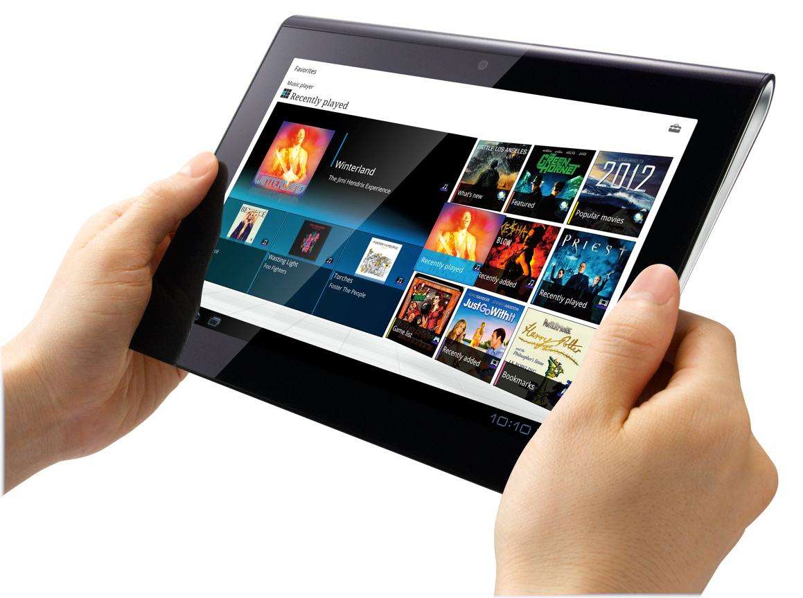
Those. the tablet is held in landscape orientation with two hands and the main control is done with two thumbs.
The convenient control area looks something like this (highlighted in blue):

As you can see from the picture above, all the main controls are concentrated in this most comfortable zone and do not require the user to intercept the tablet to reach any of them (the main buttons and the notification panel with There were also many more pleasant things, such as an experimental radial menu in the browser (which by the way was spoiled already in 3.1 making it two-level, which entailed the complication of motor skills its use), paging desktops with a simple tap, and not necessarily with a swipe, etc. etc.
But the main thing was precisely the excellent location of the interface elements specially under the grip with two hands, it was just a breath of fresh air after the “universal” iOS interface.
So, a year later, I decided that it was time to change the tablet already and ideally this candidate would be approached by rumors of preparing for release google nexus 10 (by analogy with nexus 7). And recently, the nexus 10 was really announced. I did not count on a memory card, a pretty good design (in black), gorgeous hardware and google support. What could be better, you ask? But there was one, but a huge fly in the ointment: A new "universal" interface for tablets, the so-called Phablet.
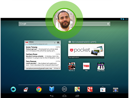
For those who do not understand the scale of the disaster:
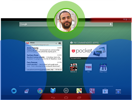
The “comfort zone” is highlighted in blue, and the controls, which unfortunately do not fall into it, are highlighted in red.
I read Matias Duarte’s comments in which he talks about “muscle memory” and “left-handed convenience” Post, and one of his comments
But it’s obvious that this does not correspond too much with reality:
Honestly, I don’t understand the logic of such an action - “to make everything bad for universality”. After all, there is a sea of other options, the simplest of which is to enable the user to configure mirror changes in the position of the notification panel and interface buttons.
I do not ask "Make me a tablet interface!", I just want the opportunity to choose what is convenient for users. With new profiles available in 4.2, this can be made as convenient as possible for everyone. Someone wants a Phablet interface, someone needs a honeycomb tablet interface, someone needs the same, but "for left-handed people" (because actually for a right-handed person). And all this can be made customizable for everyone so that "not one of the tablet users is hurt."
PS Yes, I am aware that this can be fixed using a custom, but I want a banal device out of the box with updates, the most buggy, etc., etc. A kind of "reference android"
PPS This post was written only in the hope that one of the Russian-speaking googlers will see, want and be able to convey to the company the idea that the Phablet interface is "too revolutionary". Or someone just tells you where you can try to write to bring it to the android developers. If there are any rational ideas, I’m concerned about translating this text into English
No, this is not about the Metro interface in Windows 8, although I also have a lot of words on this subject that I want to say (mostly obscene).
Now I want to talk about the interface of tablets on android. The story began about a year and a half ago, when I sold the iPad, which had tired me, and bought the Acer Iconia tab with Android Honeycomb 3.0 on board. It was by using the tablet android that I finally realized that the myth “everything is thought out to the smallest detail in the Apple technique” is just a myth. The Android tablet interface turned out to be really thought-out, after which the iPad interface was perceived as a banal stretching of the telephone interface without any emphasis on details.
Actually, why am I saying that? To do this, it is worth remembering how large (ten-inch) tablets hold. Here I will sopril the first googled picture more or less similar to the truth:

Those. the tablet is held in landscape orientation with two hands and the main control is done with two thumbs.
The convenient control area looks something like this (highlighted in blue):

As you can see from the picture above, all the main controls are concentrated in this most comfortable zone and do not require the user to intercept the tablet to reach any of them (the main buttons and the notification panel with There were also many more pleasant things, such as an experimental radial menu in the browser (which by the way was spoiled already in 3.1 making it two-level, which entailed the complication of motor skills its use), paging desktops with a simple tap, and not necessarily with a swipe, etc. etc.
But the main thing was precisely the excellent location of the interface elements specially under the grip with two hands, it was just a breath of fresh air after the “universal” iOS interface.
So, a year later, I decided that it was time to change the tablet already and ideally this candidate would be approached by rumors of preparing for release google nexus 10 (by analogy with nexus 7). And recently, the nexus 10 was really announced. I did not count on a memory card, a pretty good design (in black), gorgeous hardware and google support. What could be better, you ask? But there was one, but a huge fly in the ointment: A new "universal" interface for tablets, the so-called Phablet.

For those who do not understand the scale of the disaster:

The “comfort zone” is highlighted in blue, and the controls, which unfortunately do not fall into it, are highlighted in red.
I read Matias Duarte’s comments in which he talks about “muscle memory” and “left-handed convenience” Post, and one of his comments
Comment text
Why did you make the system buttons and status bar consistent across all devices in Jelly Bean?
Consistency and usability are really important to us, and that's something we strive to improve in every new version of Android. With Honeycomb we first introduced the idea of a completely onscreen navigation UI which gave us unprecedented flexibility in how that UI adapts and transforms - both when you turn the device in your hands and when the software changes and has different control needs. Now in Jelly Bean we've made the universal software navigation buttons and system bar consistent across all screen sizes.
This new configuration is based on usability research we did on all of the different form factors and screen sizes that Android runs on. What mattered most of all was muscle memory - keeping the buttons where you expect them, no matter how you hold the device.
Phones are almost always used in portrait mode, flip sideways occasionally, and never go upside down. As screen sizes get larger though, any which way goes. Imagine the frustration you'd feel if every time you picked up a tablet off the table 'the wrong way up' you found yourself reaching for a home button that wasn't where you expect it to be? That irritation adds up and over time like a tiny grain of sand in your shoe and undermines the rest of your experience.
The Jelly Bean system bar always keeps the same 3 buttons where you expect them. This happens dynamically for every screen size, up until you get to small handheld screens where stacking the bars in landscape mode would leave too little vertical space.
The second thing we discovered was that there are almost as many different ways of holding our devices as there are people. In fact people love to use their Nexus so much that they use them for such long periods of time that having a single 'correct grip' is actually counter productive and increases hand strain. The Jelly Bean navigation buttons work equally well for left handers and right handers, one handed use, or two handed use, and for devices you're carrying, resting on your knee, or putting on the table.
Last but not least, by unifying the design we are now able to put Notifications and Quick Settings right where you'd expect them, and only one swipe away.
But it’s obvious that this does not correspond too much with reality:
- The user of the smaller device (phone) is used to the controls being in thumb access. Immediately, the elements are unattainable in this way.
- In truth, the hanikomb interface is sharpened just under the left-hander - the control buttons are located precisely under the left hand. And, as far as I know, right-handed people didn’t suffer much from this
Honestly, I don’t understand the logic of such an action - “to make everything bad for universality”. After all, there is a sea of other options, the simplest of which is to enable the user to configure mirror changes in the position of the notification panel and interface buttons.
I do not ask "Make me a tablet interface!", I just want the opportunity to choose what is convenient for users. With new profiles available in 4.2, this can be made as convenient as possible for everyone. Someone wants a Phablet interface, someone needs a honeycomb tablet interface, someone needs the same, but "for left-handed people" (because actually for a right-handed person). And all this can be made customizable for everyone so that "not one of the tablet users is hurt."
PS Yes, I am aware that this can be fixed using a custom, but I want a banal device out of the box with updates, the most buggy, etc., etc. A kind of "reference android"
PPS This post was written only in the hope that one of the Russian-speaking googlers will see, want and be able to convey to the company the idea that the Phablet interface is "too revolutionary". Or someone just tells you where you can try to write to bring it to the android developers. If there are any rational ideas, I’m concerned about translating this text into English
