As I wrote my Postcrossing
When you go to Postcrossing , you realize how many people can go crazy for one simple idea. It was the capturing simplicity of the idea that became the main factor why I took up the implementation of one specific cross with my ladies and preference exchange objects and additional functionality.

It was January 2017. Once, one person in a conversation with me mentioned that he would like to realize the idea of sharing baubles (the so-called “friendship bracelets”) on the principle of Postcrossing: the user visits the site, presses a button - gets the address to which he should send the bauble woven by him , after which he himself begins to receive baubles from other users in response (and so on in a circle). It is desirable that the exchange was possible between different countries.
Then I already had about 5 years of experience developing web applications in Java and a little bit in PHP. When I was described the functionality necessary to work the desired crossing, I thought of using my old PHP practices and doing the project in about two weeks or a month in a month. But, as is often the case, my assessments were too optimistic. Already during the re-reading of the source code of my template engine for PHP, I wasscared of what I had written, and realized that these old university crafts require an immediate send to the scrap for at least good optimization.
The more I immersed in my old PHP sources, the more I realized that with my level of proficiency in this language and the state of the sources, even this small project would hurt me. That's why I decided to use the Spring Framework, which has become a warm and soft moss for me over the years with Java Web. I did not want to do this initially because of the seeming lack of scale. Of course, I was wrong, so the decision to use the familiar Java language turned a potential pain into a subsequent pleasure.
Since the idea was not mine, during the design, I often and many pulled the author of the idea to be sure that my vision of the project corresponds to the author's idea. In the course of lengthy discussions, I was filled with the project and already began to introduce various convenient and useful buns for users and administrators. The design was given due attention: we discussed every detail of the functionality, drew layouts of almost all pages, kept documentation describing the logic of the application and user functionality.
Layouts and documentation constantly evolved, overgrown with details and new functionality. Subsequently, the layouts became one of those things that showed how wrong I was with the assessment of the complexity of the project.
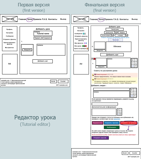
An example of the evolution of the lesson editor page layout
Of course, I myself am to blame for the subsequent complexity of the functional, thereby increasing the development time. However, I didn’t want anothergovnosay to appear on the Internet , thousands of which are of poor quality; I wanted to make the site enjoyable for users both in terms of ease of use and visually. Moreover, perfectionism in me simply did not allow to use the “herak-herak-and in production” method. Therefore, we even worked out the page layouts with meticulousness (and you will still see that this was far from the limit of confusion over the elaboration of details).

Layout of user profile settings page
Having reached the optional functionality, which I then planned to use alone, I began to draw layouts by hand on a graphic tablet.
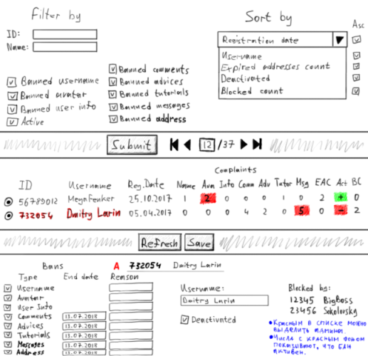
Layout of the “Users” page in the admin panel
During the design we tried to think over the system so that after launching our further involvement in the life of the site was minimal; we really did not want to engage in moderation of content published on the site by users, and even more so to hire moderators. We wanted the community to decide for itself which lesson to publish, which bauble to prevent from public, which user to ban for an obscene profile or comments. Of course, we didn’t manage to completely get rid of this, but in the end we managed to at least relieve ourselves of the potential routine.
At the end of the design phase, I realized that we had done the work for at least six months. Moreover, besides the possibility of sharing baubles, we decided to add the possibility of writing articles on weaving baubles (and later on needlework in general) and checking these articles by the community itself (later this feature turned out to be even more difficult and lengthy to implement than the exchange system) . But in general, I liked the way it worked “on paper” and looked on mock-ups, so I started the implementation and decided to bring it to the end.
So, according to our idea, the application should have the following basic functionality :
- registration on the site and setting up an account;
- The organization of the exchange of baubles with people around the world;
- writing lessons, checking and approval of their community site;
- pages with a specific lesson and a bauble;
- page with a list of lessons and baubles;
- Commenting lessons and baubles;
- event notification system;
- system of complaints, bans and quotas;
- chat between users;
- site statistics;
- admin panel
In addition, the site should initially be focused on an international audience.: the exchange can be carried out worldwide, the lessons can be written in any language, and the site itself can be localized into any language (of course, if there are translators willing to do this; for this, I later wrote a small application with which you can conveniently do website translation into a carrier language).
It was decided to create a website with minimal financial investments : no purchases or subscriptions to third-party services, no advertising investments, hiring translators and paying for an SSL certificate. All that we allowed ourselves to spend money was the domain name and VDS . And some floss threads, but more on that later.
Anticipating the future pleasure of developing a project, I proceeded directly to the implementation phase. And I decided to work full time (yes, it also happens with non-commercial projects).
In our two-person team, only I was a programmer, so most of the implementation narrative will be on my behalf.
First, I sketched a database model. After the first iterations I got about 30 tables. In the final version, there were already 43 of them. I chose Hibernate as the ORM, as I had a small, but quite pleasant experience with it. I chose MySQL as the base itself.

Database model, viewed from afar
Already at the very beginning, I thought about how I would fill the database with initial data. And there were quite a lot of data: languages, countries, static content, categories of lessons, and much more. I didn’t want to store and especially keep the data in SQL format, so I decided to write my system for importing and exporting data in a CSV-like format. And later did not regret it, since the system accelerated the development process several times and made it convenient to work with the data on production. I called the system Inida (from “Initial Data”, although this name is no longer very suitable).
One of the features of the site is the display of the user's city on a map in a profile. Since I wanted our site to be as self-sufficient as possible in terms of dependence on external services, I was pretty confused for this little feature, spending a lot of time searching for solutions and developing additional applications.
Another challenge, invented by himself, was the preparation of icons flags. Problems were both with flags for countries and for languages. Even after I downloaded a large free archive of good icons in permissions for every taste. I had to look through Wikipedia and photofix.
One of the parts of the site’s functionality that ensures its controllability by the community itself is the complaint and bans system. Users can complain about profile information (name, avatar, user information), comments, tips, mailing address, and uploaded images. When you recruit a sufficient number of complaints, the corresponding functionality is blocked for the appealed user. The first block is removed after one week, and the duration of each subsequent block is doubled. Some locks (for example, username) are permanent; This is one of those cases where the attention of admins is still needed.
Even during the design, I realized that bots could be set on the site. Of course, such a scenario is unlikely with the low popularity of the site and its target audience, but the desire to do everything “according to conscience” prevailed. To prevent potential spam, I introduced a quota system for users' actions, one way or another connected with the generation of content on the site: commenting, writing messages in a chat, writing lessons, requesting addresses, registering accounts (both from the same IP address and totally per day ) and some others.
An interesting task was the implementation of one of the admin features, namely, the search for similar addresses. I spotted the approach in one of the articles on Habré (unfortunately, I could not find the article, so I will briefly describe the essence of the approach below). Honestly, I am not very pleased with the result of implementing this feature due to the relatively large number of false positives.
While I was working hard on the server side of the application, my co-author did not sit with folded hands, but worked on marking the site using the Bootstrap library, since he really wanted the site to be easy to use also from mobile devices.
The page layouts we prepared here are very useful.
I do not like when the markup floats, the site looks bad, and the scripts work correctly only when performing the expected from the user actions. Even during development. Therefore, I always tried to maintain the accuracy of the appearance of the site, so that I was pleased to work with it, see new features in this design, create new pages for it. I allowed myself to spend time on licking trifles even knowing that they would not get into the final version anyway. Just because the site was waiting for a total redesign. This is how the site looked like before the start of the redesign When thinking about the appearance of the final version of the site, I took into account the following factors and wishes for myself:
I did not even think about the choice of approach to the design of the site, as it was for me unequivocal: skevomorphism. The above points convinced me even more of the correctness of my choice. I knew very well how labor-intensive this approach was, but I was willing to spend time on it, because I wanted a pleasant result. Moreover, years of experience in Photoshop made it easier and less stressful.
I really didn’t want the project we’re working to look like the vast majority of modern sites and were disgusted with both the first entry and the time it was used. Instead of abstract flat and unbounded blocks, I used the image of a real desktop of a person engaged in needlework. To make the site design look like a piece of the real world, I spent a lot of time searching for suitable images.
Also, much was photographed or scanned by us personally and then processed in Photoshop.
Kumihimo and beads
Here are some examples of real-world objects that were used in the design:
Home Footer
One of the most time consuming work was the preparation of images for use in conjunction with the CSS attribute border-image. The difficulty was that certain parts of the picture should look seamless when repeated. This is how to draw repetitive (seamless) textures, only harder. Most of the time was spent on the picture used in the design of pop-up windows (and the footer patch), since the size of the elements on which this picture “stretched” could change freely both vertically and horizontally.
Probably, with the design, we were confused more than with anything else. Moreover, they got so confused that many elements of the environment (for example, beads and beads) and some icons were modeled and rendered in Blender (something was even textured in Substance Painter). Yes, for the sake of icons measuring about 32x32 pixels, we were confused so much.

Rendering results
I liked the idea of automatically generated user avatars that I saw on various sites. But their problem was that often these were rather primitive and uniform patterns. People in JIRA looked more interesting, but still pretty simple and flat that did not fit into our design. Nothing good came to my mind until the moment when my co-author showed me a page from an old book on birds of Great Britain. And then I realized that before my eyes a great collection of ready-made avatorok. I asked to scan all the pages with birds, after which I sat in Photoshop for two days and cut these birds into avatars, removing artifacts from the book paper in the course. After registration, the user randomly received one of the 267 avatar-birds
After the work on the new (skeuomorphic) design was completed, and we completed its integration into the layout prepared by my coauthor on Bootstrap, I began to integrate the new design. I thought it would be the most embarrassing thing I do in this project. In fact, it was just a routine development work, and hell itself was still waiting for me to come.
So, all the planned features were developed, all critical and major problems were eliminated, the new design was stretched, and the site was translated by the co-author into English, it was time to test the project on an external server. We decided to start the project right away, but close it with a password so that the random guest would somehow not be able tosee the remaining bugs in advance. But for the start we lacked one little thing - the name of the site, which we simply have not yet invented.
During development, I used the name "fenker" ("Fenker"), which was essentially its codename. I suggested using it as a site name, but later this version was discarded, as it sounded too Russian. We have been sorting out names for a long time: Fenkexchange, Friendship Pigeon, Flossy Hearts, Silky Hearts,…. Yes, the names all turned out to be too long, then too Russian. Until the idea to combine the theme of the site (friendship bracelets) with one of its features (birds: pigeon on the logo and avatar birds) came to mind. And so it turned out a bird-friend - FriendBird.
While the co-author was involved in registering a domain name and searching for an acceptable VDS, I installed Debian Linux on VirtualBox in order to practice deploying our project. I used to work with Linux and used one period (about a year) only for this operating system, but later abandoned it because it didn’t grow together, and as a result I returned to Windows (mainly due to the lack of powerful software for working with 2D and 3D graphics); after that, I also had the experience of setting up an Apache web server under Linux as part of university classes. In general, when working with Linux, I didn’t have any serious problems, so I expected that the deployment of a freshly baked project would take place quickly and relaxedly. But in the end, this activity became the most unpleasant thing I did in the framework of this project.
Returning from the underworld After completing our difficult quest to deploy a web application under Linux and having done the same, but already on VDS, we began to search for volunteer testers among our friends, colleagues and acquaintances. Only a couple of people agreed who later did not take an active part in testing, so we had to test our project ourselves. For about two weeks we tested the site’s functionality, found errors with which I filled up my bug list and subsequently corrected them. Over time, only minor problems remained in the bug list, a trivial solution of which did not occur to me. The phase of testing and correcting errors was nearing its end, bringing the solemn moment that we both walked for so long.
On the night of January 25, 2018, I erased everything that was generated by us in the database during testing, and again launched the initialization process. When the process was completed, I removed the password to the site and restarted the web server. Now the site has been open to the public.
Since the co-author of the project himself was once engaged in needlework, kept his own website on this topic and administered his Vkontakte group, we didn’t have a question about where to get the original audience. The group was published news - and we saw the first registered users. In the first weeks, the number of page views was more than a thousand per day; a little, but even that we were happy. But most of all we were happy when the first results of exchanges of baubles began to appear on the site, which over time became more and more.
And users did not write lessons. Therefore, in order to somehow stir them up, the co-author first published a lesson, after which other users began to publish their own. Most of all, in this regard, the guys from Ukraine stood out, who willingly wrote lessons and translated them into Ukrainian, for which a special thanks to them.
The first month of the site looked like this:
Of course, during the production there were problems that I tried to solve quickly, continually updating the site. But over time, the application became stable, after which I began to deal only with data backup. In total, during the site’s operation (from 2018.01.25 to 2018.07.03 and including the testing phase) 29 updates were made. There were a couple of critical updates when I fixed bugs at night, and applied an update in the morning.
Not all the users liked it right away, but something was not enough at all. Already during the production, a page with a list of users, a page with a feedback form and the ability to exchange baubles only inside their own country was added. After the site was released to the public, the co-author of the project was engaged in its promotion in social networks and collecting feedback and suggestions. We tried to listen to the community gathered on the site, thanks to which some errors were corrected and changes were made to the site’s functionality. Thank them very much for that.
Probably the biggest problem for users of the site was downloading photos. To avoid uploading images that are too large, of excessive quality and of unsuitable format for our markup, we set appropriate restrictions (minimum and maximum allowable file size, height, width and aspect ratio). But, judging by the logs, it is often very difficult for users to comply with these restrictions, even though every time they try to load a message is displayed on the screen indicating the problem. I expected it to become a problem, but I did not expect the problem to be so large (so that some users eventually downloaded distorted or low-quality photos, referring to the fact that the system does not allow them to upload photos in normal quality). Maybe,
At the time of this writing, the site has been living for 5 months and 1.5 weeks, and the results of its work are as follows:
Statistics for 2018.07.05
For such a period, these are, of course, very modest numbers; the influx of users to this moment was greatly weakened, and the activity of writing lessons ended as sharply as it began. However, we are pleased that the exchange of baubles is going on actively, and non-Russian-speaking foreigners are taking part in this.
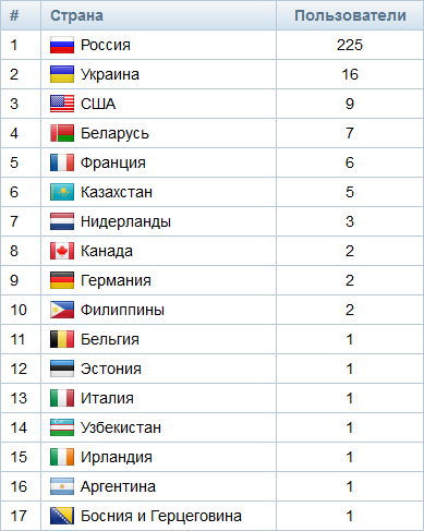
Statistics on the number of users
I well understand that the site could have been made more popular through advertising, but, as I said, one of our tasks was to keep to minimum financial expenses. When launching this project, we did not hope for any significant profit (due to its non-commercial nature and specificity of the target audience); At the moment, the profit from the project (advertising and donations) does not even cover the cost of its maintenance (domain name, VDS and a bit of our support time). But, as one of my Australian friends said, if the project made at least a couple of people happy, efforts to develop it were well spent.
Even despite the very small interest from the public and some imperfections of the site itself (for example, the absence of CDN and two-factor authentication), I like the way our project turned out. For about a year, I have been doing a great job, getting great pleasure from solving a variety of tasks and trying to do everything that was within my intellectual abilities. Also in the development process I was pleased that there are no customers above me, I am not driven by the deadlines for the project, and the style of writing the code is not constrained by agreements imposed from outside; the complete freedom of my decisions gave a special taste to the pleasure of working on this project.
Idea
It was January 2017. Once, one person in a conversation with me mentioned that he would like to realize the idea of sharing baubles (the so-called “friendship bracelets”) on the principle of Postcrossing: the user visits the site, presses a button - gets the address to which he should send the bauble woven by him , after which he himself begins to receive baubles from other users in response (and so on in a circle). It is desirable that the exchange was possible between different countries.
Then I already had about 5 years of experience developing web applications in Java and a little bit in PHP. When I was described the functionality necessary to work the desired crossing, I thought of using my old PHP practices and doing the project in about two weeks or a month in a month. But, as is often the case, my assessments were too optimistic. Already during the re-reading of the source code of my template engine for PHP, I was
The more I immersed in my old PHP sources, the more I realized that with my level of proficiency in this language and the state of the sources, even this small project would hurt me. That's why I decided to use the Spring Framework, which has become a warm and soft moss for me over the years with Java Web. I did not want to do this initially because of the seeming lack of scale. Of course, I was wrong, so the decision to use the familiar Java language turned a potential pain into a subsequent pleasure.
Design
Since the idea was not mine, during the design, I often and many pulled the author of the idea to be sure that my vision of the project corresponds to the author's idea. In the course of lengthy discussions, I was filled with the project and already began to introduce various convenient and useful buns for users and administrators. The design was given due attention: we discussed every detail of the functionality, drew layouts of almost all pages, kept documentation describing the logic of the application and user functionality.
Layouts and documentation constantly evolved, overgrown with details and new functionality. Subsequently, the layouts became one of those things that showed how wrong I was with the assessment of the complexity of the project.
An example of the evolution of the lesson editor page layout
Of course, I myself am to blame for the subsequent complexity of the functional, thereby increasing the development time. However, I didn’t want another
Layout of user profile settings page
Having reached the optional functionality, which I then planned to use alone, I began to draw layouts by hand on a graphic tablet.
Layout of the “Users” page in the admin panel
During the design we tried to think over the system so that after launching our further involvement in the life of the site was minimal; we really did not want to engage in moderation of content published on the site by users, and even more so to hire moderators. We wanted the community to decide for itself which lesson to publish, which bauble to prevent from public, which user to ban for an obscene profile or comments. Of course, we didn’t manage to completely get rid of this, but in the end we managed to at least relieve ourselves of the potential routine.
At the end of the design phase, I realized that we had done the work for at least six months. Moreover, besides the possibility of sharing baubles, we decided to add the possibility of writing articles on weaving baubles (and later on needlework in general) and checking these articles by the community itself (later this feature turned out to be even more difficult and lengthy to implement than the exchange system) . But in general, I liked the way it worked “on paper” and looked on mock-ups, so I started the implementation and decided to bring it to the end.
So, according to our idea, the application should have the following basic functionality :
- registration on the site and setting up an account;
- The organization of the exchange of baubles with people around the world;
- writing lessons, checking and approval of their community site;
- pages with a specific lesson and a bauble;
- page with a list of lessons and baubles;
- Commenting lessons and baubles;
- event notification system;
- system of complaints, bans and quotas;
- chat between users;
- site statistics;
- admin panel
In addition, the site should initially be focused on an international audience.: the exchange can be carried out worldwide, the lessons can be written in any language, and the site itself can be localized into any language (of course, if there are translators willing to do this; for this, I later wrote a small application with which you can conveniently do website translation into a carrier language).
It was decided to create a website with minimal financial investments : no purchases or subscriptions to third-party services, no advertising investments, hiring translators and paying for an SSL certificate. All that we allowed ourselves to spend money was the domain name and VDS . And some floss threads, but more on that later.
Anticipating the future pleasure of developing a project, I proceeded directly to the implementation phase. And I decided to work full time (yes, it also happens with non-commercial projects).
Implementation
In our two-person team, only I was a programmer, so most of the implementation narrative will be on my behalf.
First, I sketched a database model. After the first iterations I got about 30 tables. In the final version, there were already 43 of them. I chose Hibernate as the ORM, as I had a small, but quite pleasant experience with it. I chose MySQL as the base itself.
Database model, viewed from afar
Already at the very beginning, I thought about how I would fill the database with initial data. And there were quite a lot of data: languages, countries, static content, categories of lessons, and much more. I didn’t want to store and especially keep the data in SQL format, so I decided to write my system for importing and exporting data in a CSV-like format. And later did not regret it, since the system accelerated the development process several times and made it convenient to work with the data on production. I called the system Inida (from “Initial Data”, although this name is no longer very suitable).
Read more about Inida
Here is an example of data in inida format:
Первая строка здесь — заголовок, описывающий операцию (i — insert), тип данных (название сущности в БД) и поля. Строки, начинающиеся точкой с запятой — это сами данные. Если вышеупомянутый текст (Inida-данные) скормить Inida-импортеру, то в базу данных добавятся три записи (в данном примере — три страны). Inida-данные могут иметь несколько заголовков, что позволяет работать сразу с несколькими сущностями БД.
Inida поддерживает следующие операции с записями:
i — insert: добавление новой записи;
u — update: обновление уже существующей записи (по ключам, в качестве которых выступают значения полей, помеченных знаком "+");
m — merge: по сути это insert + update (если записи с указанными значениями ключей нету, то она создаётся; иначе запись обновляется);
d — delete: удаление данных по указанным ключам.
Кроме того, Inida имеет следующие фичи:
А также некоторые другие менее важные, но тоже полезные фичи.
Также Inida умеет и экспортировать данные. Делается это написанием того же заголовка, что импользуется при импорте, только без указания операции:
В вышенаписанном примере экспортер выгрузит все страны в формате inida. Объём выгрузки можно ограничить, указав значения ключа, которому будут удовлетворять выгружаемые записи:
i Country;isocode;name
;by;Belarus
;gb;United Kingdom
;ru;Russia
Первая строка здесь — заголовок, описывающий операцию (i — insert), тип данных (название сущности в БД) и поля. Строки, начинающиеся точкой с запятой — это сами данные. Если вышеупомянутый текст (Inida-данные) скормить Inida-импортеру, то в базу данных добавятся три записи (в данном примере — три страны). Inida-данные могут иметь несколько заголовков, что позволяет работать сразу с несколькими сущностями БД.
Inida поддерживает следующие операции с записями:
i — insert: добавление новой записи;
u — update: обновление уже существующей записи (по ключам, в качестве которых выступают значения полей, помеченных знаком "+");
m — merge: по сути это insert + update (если записи с указанными значениями ключей нету, то она создаётся; иначе запись обновляется);
d — delete: удаление данных по указанным ключам.
Кроме того, Inida имеет следующие фичи:
- преобразование значений полей кастомными трансформерами (например, преобразование даты из одного формата в другой, декорирование данных, санитизация и т.д.);
- алиасы записей для использования этих записей в последующих Inida-данных;
- batch mode: update, merge или delete записей, удовлетворяющих лишь части ключа (в обычном режиме при попытке обновления сразу нескольких записей, удовлетворяющих одному и тому же ключу, генерируется исключение);
- подстановки (можно и вложенные): эдакой аналог define в C++ (полезен, когда длинная фраза используется более одного раза);
- значения по умолчанию (удобно, когда надо продублировать одно и то же значение какого-либо поля для большого количества записей);
- поддержка значений-списков (если значение поля является коллекцией-списком);
- поддержка полей-объектов (один уровень вложенности).
А также некоторые другие менее важные, но тоже полезные фичи.
Также Inida умеет и экспортировать данные. Делается это написанием того же заголовка, что импользуется при импорте, только без указания операции:
Country;isocode;nameВ вышенаписанном примере экспортер выгрузит все страны в формате inida. Объём выгрузки можно ограничить, указав значения ключа, которому будут удовлетворять выгружаемые записи:
Country;isocode=ru;nameOne of the features of the site is the display of the user's city on a map in a profile. Since I wanted our site to be as self-sufficient as possible in terms of dependence on external services, I was pretty confused for this little feature, spending a lot of time searching for solutions and developing additional applications.
Quest about the implementation of features with maps
Во-первых, надо было откуда-то взять сами карты, а точнее тайлы карты Земли разных уровней детализации (чтобы карту можно было приближать). Поиски привели меня к картографическому сервису ESRI, который имел необходимые мне тайлы в свободном доступе. Но проблема была в том, что ссылок на архивы тайлов у них не было (или я их просто не нашёл). Зато каждый тайл можно было скачать по URL'у определённого формата. Я быстро написал приложение, которое выгружало тайлы под нужное количество уровней детализации и раскладывало их по соответствующим папкам. Мне было достаточно всего 8 уровней (0-7) суммарным объёмом около 138 МБ.
Во-вторых, надо было как-то отображать скачанные карты. Благо, этот вопрос решился довольно просто: я нашёл JavaScript-плагин Leaflet, который отлично справлялся с отображением тайлов карты по заданному URL.
В-третьих, наконец-то, откуда-то надо было раздобыть геолокации (координаты и названия населённых пунктов) и желательно на разных языках. Эта часть задачи была самой объёмной и трудной, так как мне не сразу удалось найти более-менее исчерпывающий список населённых пунктов для разных стран. В итоге такой список я всё же нашёл, но название он содержал лишь на одном языке; я же хотел для каждой страны предоставить возможность искать населённые пункты на языках, официальных в этой стране (например, на русском и белорусском для Беларуси), а также на де-факто интернациональном (к сожалению, это английский) и на эсперанто (просто потому что мне очень нравится идея этого языка).
Как следствие, появилась ещё одна подзадача: найти и подготовить списки официальных языков для каждой из стран. К счастью, эту информацию кто-то уже собрал до меня, поэтому мне осталось лишь скормить её программе, которую я опишу парой абзацами ниже.
Источником локализированных имён населённых пунктов стал Nominatim. Так как получить локализированные имена по единственной ссылке не получилось, пришлось делать это в два прохода:
Так как далеко не на все HTTP-запросы успешно приходили ответы (по разными причинам, среди которые была банальная «пропало соединение с Интернетом»), также надо было сделать логирование неуспешных попыток локализации населённых пунктов, чтобы повторить попытку на следующей итерации. Ещё одной трудностью было то, что официально Nominatim запрещено использовать слишком часто, поэтому, чтобы меня не забанили, надо было ввести задержку между запросами, тем самым ограничив их количество в секудну до максимально дозволеного.
В итоге, учтя всё вышеперечисленное, я написал программу, которая занимается локализацией населённых пунктов на языки, официальные в стране, к которой относится локализируемый населённый пункт (а также на английском и эсперанто, как я уже упоминал выше). Локализировать удалось за 4 итерации, а программа работала сутками на протяжении примерно 1.5 месяца на специально выделенном под эту задачу нетбуке.
Во-вторых, надо было как-то отображать скачанные карты. Благо, этот вопрос решился довольно просто: я нашёл JavaScript-плагин Leaflet, который отлично справлялся с отображением тайлов карты по заданному URL.
В-третьих, наконец-то, откуда-то надо было раздобыть геолокации (координаты и названия населённых пунктов) и желательно на разных языках. Эта часть задачи была самой объёмной и трудной, так как мне не сразу удалось найти более-менее исчерпывающий список населённых пунктов для разных стран. В итоге такой список я всё же нашёл, но название он содержал лишь на одном языке; я же хотел для каждой страны предоставить возможность искать населённые пункты на языках, официальных в этой стране (например, на русском и белорусском для Беларуси), а также на де-факто интернациональном (к сожалению, это английский) и на эсперанто (просто потому что мне очень нравится идея этого языка).
Как следствие, появилась ещё одна подзадача: найти и подготовить списки официальных языков для каждой из стран. К счастью, эту информацию кто-то уже собрал до меня, поэтому мне осталось лишь скормить её программе, которую я опишу парой абзацами ниже.
Источником локализированных имён населённых пунктов стал Nominatim. Так как получить локализированные имена по единственной ссылке не получилось, пришлось делать это в два прохода:
- запросить информацию о населённом пункте, используя его имя (на доступном языке) и страну; эта информация приходила в формате JSON;
- используя значение поля «place_id» из полученного JSON, запросить страницу с информацией о населенном пункте и его названиях на разных языках (в виде обычной веб-страницы).
Так как далеко не на все HTTP-запросы успешно приходили ответы (по разными причинам, среди которые была банальная «пропало соединение с Интернетом»), также надо было сделать логирование неуспешных попыток локализации населённых пунктов, чтобы повторить попытку на следующей итерации. Ещё одной трудностью было то, что официально Nominatim запрещено использовать слишком часто, поэтому
В итоге, учтя всё вышеперечисленное, я написал программу, которая занимается локализацией населённых пунктов на языки, официальные в стране, к которой относится локализируемый населённый пункт (а также на английском и эсперанто, как я уже упоминал выше). Локализировать удалось за 4 итерации, а программа работала сутками на протяжении примерно 1.5 месяца на специально выделенном под эту задачу нетбуке.
Another challenge, invented by himself, was the preparation of icons flags. Problems were both with flags for countries and for languages. Even after I downloaded a large free archive of good icons in permissions for every taste. I had to look through Wikipedia and photofix.
Quest about icons for checkboxes
Первой проблемой, как уже некоторые могли догадаться, оказалось банальное отсутствие флажков для некоторых стран. Дело в том, что я старался поддерживать все официально присвоенные коды стран из ISO 3166-1 alpha-2. Флаги нужных мне стран я находил в основном в Википедии, а затем подготавливал их в Фотошопе в нужном мне разрешении и с эффектом объёма. Мне не хватало порядка десятка флажков, поэтому эту часть задачи я решил довольно быстро.
Более сложной оказалась ситуация с флажками для языков. Дело в том, что на многих сайтах твердили, что использовать флажок для языка не очень рационально ввиду того, что это часто подразумевает к привязке языка к конкретной стране. Например, какой флаг должен быть для английского: американский, великобританский или австралийский? А, быть может, новозеландский? А для испанского: мексиканский или испанский? Аргументы за избегание использования флагов для языков были для меня убедительны, однако мне очень хотелось визуальной репрезентативности, поэтому я всё-таки решил их использовать на нашем сайте (хоть и немного «через себя»).
Основная сложность была в том, что флажки у меня были только для стран. Для языков я их использовать не мог попросту из-за того, что ISO-коды стран и ISO-коды соответствующих им (в частных случаях) языков в общем случае различались (например: BE — белорусский, BY — Беларусь; UK — украинский, UA — украина). Вспомнив, что у меня уже есть списки языков по странам, я решил написать маленькую программку, которая на основании этих данных составит списки стран по языкам (то есть выдаст обратный маппинг).
После того, как программа была написана, а нужные мне списки языков получены, я принялся подготавливать картинки с флажками для языков (просто переименовывал флажки для стран). Подобно случаю со странами, в случае с языками я старался поддерживать весь ISO-639-1. Да, флажков для языков тоже не хватило, но на этот раз в недостача была в несколько раз больше. Долго я разбирался, какой язык в каком регионе используется, но в итоге для каждого из них был подготовлен соответствующий (или не очень, не знаю; по крайней мере пока никто не жаловался) флажок.
One of the parts of the site’s functionality that ensures its controllability by the community itself is the complaint and bans system. Users can complain about profile information (name, avatar, user information), comments, tips, mailing address, and uploaded images. When you recruit a sufficient number of complaints, the corresponding functionality is blocked for the appealed user. The first block is removed after one week, and the duration of each subsequent block is doubled. Some locks (for example, username) are permanent; This is one of those cases where the attention of admins is still needed.
Even during the design, I realized that bots could be set on the site. Of course, such a scenario is unlikely with the low popularity of the site and its target audience, but the desire to do everything “according to conscience” prevailed. To prevent potential spam, I introduced a quota system for users' actions, one way or another connected with the generation of content on the site: commenting, writing messages in a chat, writing lessons, requesting addresses, registering accounts (both from the same IP address and totally per day ) and some others.
An interesting task was the implementation of one of the admin features, namely, the search for similar addresses. I spotted the approach in one of the articles on Habré (unfortunately, I could not find the article, so I will briefly describe the essence of the approach below). Honestly, I am not very pleased with the result of implementing this feature due to the relatively large number of false positives.
How does the verification of similar addresses work?
Сначала формируется база сигнатур почтовых адресов. В данном случае сигнатура — это список символов и количество вхождений каждого символа. Делается это так:
0) берём почтовый адрес в виде текста;
1) убираем из адреса ненужную информацию (пробелы, знаки препинания) и переводим все символы в одинаковый регистр;
2) вычисляем сигнатуру оставшегося текста.
Далее, когда регистрируется новый пользователь или когда уже существующий пользователь изменяет один из своих адресов (обычный или на транслите), этот новый (или обновлённый) адрес подвергается вышеописанной процедуре, после чего вычисляется разность сигнатур (сумма разностей между количествами соответствующих букв). Если разность меньше некоторого указанного порога, то адреса считаются похожими.
While I was working hard on the server side of the application, my co-author did not sit with folded hands, but worked on marking the site using the Bootstrap library, since he really wanted the site to be easy to use also from mobile devices.
The page layouts we prepared here are very useful.
Design
I do not like when the markup floats, the site looks bad, and the scripts work correctly only when performing the expected from the user actions. Even during development. Therefore, I always tried to maintain the accuracy of the appearance of the site, so that I was pleased to work with it, see new features in this design, create new pages for it. I allowed myself to spend time on licking trifles even knowing that they would not get into the final version anyway. Just because the site was waiting for a total redesign. This is how the site looked like before the start of the redesign When thinking about the appearance of the final version of the site, I took into account the following factors and wishes for myself:
- the design should correspond to the subject of the site (baubles, needlework);
- the design should create a warm lamp atmosphere;
- The design should make the site clear and easy to use.
I did not even think about the choice of approach to the design of the site, as it was for me unequivocal: skevomorphism. The above points convinced me even more of the correctness of my choice. I knew very well how labor-intensive this approach was, but I was willing to spend time on it, because I wanted a pleasant result. Moreover, years of experience in Photoshop made it easier and less stressful.
Why i hate modern design
Решение использовать скевоморфный дизайн было принято также из-за моей нелюбви к современному плоскому дизайну. Лично для меня скевоморфный дизайн является эталонным в плане визуальной понятности и репрезентативности. Дизайн инструментов в Guitar Rig 5, многих плагинов к FL Studio и Kontakt, внешний вид пользовательского интерфейса в игре Hearthstone — всё это безумно радует мой глаз и делает общение с приложением или игрой очень приятным. Подобный дизайн не оставляет вопросов о том, где какой элемент интерфейса и как его использовать.
Нынешние же тренды сделали приложения и сайты сплошь одинаковыми и безликими. Если раньше веб-дизайнеры старались придать сайту индивидуальность, то теперь каждый второй сайт выглядит чересчур шаблонно:
Ну и, конечно же,всеми любимые
Современные сайты кишат грязными приёмами, суя пользователю прямо в лицо бесполезный и навязчивый контент. Более того, всё это оформлено настолько отвратительно, что порой трудно найти нужный раздел. Заходя на такие сайты,пальцы инстинктивно нажимают Ctrl+W тут же хочется с них сбежать и никогда больше не возвращаться.
Ещё одним ярким примером для меня стал дизайн Microsoft Office, который с объёмного (в версии 2010) сменился на плоский (в версии 2013). Многие элементы стали выглядеть одинаково (например, поля ввода и кнопки), что сильно затрудняло их визуальное восприятие, так как теперь мозгу надо было трудиться больше, чтобы понять, где какой элемент. В случае же объёмного дизайна элементы были легкоразличимы, что позволяло сконцентрировать внимание на работе, а не поиске нужного элемента пользовательского интерфейса среди десятков таких же элементов.
Нынешние же тренды сделали приложения и сайты сплошь одинаковыми и безликими. Если раньше веб-дизайнеры старались придать сайту индивидуальность, то теперь каждый второй сайт выглядит чересчур шаблонно:
- огромная картинка или даже видео в качестве фона;
- абстрактный слоган, написанный огромным шрифтом;
- излишне широкие фиксированные хедеры;
- огромный футер на весь экран (а порой и больше);
- текст, написанный тонкими шрифтами, да ещё и серым цветом на белом фоне;
- конских размеров отступы по всей странице;
- кричащие и совершенно не сочетающиеся друг с другом цвета;
- страница в стиле «пролистай меня вниз и не пойми, в чём смысл рекламируемых здесь сервисов».
Ну и, конечно же,
- всплывающее окно с информацией про cookies;
- всплывающее окно с информацией об изменениях в пользовательском соглашении;
- всплывающее окно, призывающее подписаться (и ещё аналогичный попап в самом браузере);
- целые блоки жёлтой рекламы через каждые два абзаца текста.
Современные сайты кишат грязными приёмами, суя пользователю прямо в лицо бесполезный и навязчивый контент. Более того, всё это оформлено настолько отвратительно, что порой трудно найти нужный раздел. Заходя на такие сайты,
Ещё одним ярким примером для меня стал дизайн Microsoft Office, который с объёмного (в версии 2010) сменился на плоский (в версии 2013). Многие элементы стали выглядеть одинаково (например, поля ввода и кнопки), что сильно затрудняло их визуальное восприятие, так как теперь мозгу надо было трудиться больше, чтобы понять, где какой элемент. В случае же объёмного дизайна элементы были легкоразличимы, что позволяло сконцентрировать внимание на работе, а не поиске нужного элемента пользовательского интерфейса среди десятков таких же элементов.
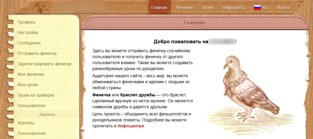
I really didn’t want the project we’re working to look like the vast majority of modern sites and were disgusted with both the first entry and the time it was used. Instead of abstract flat and unbounded blocks, I used the image of a real desktop of a person engaged in needlework. To make the site design look like a piece of the real world, I spent a lot of time searching for suitable images.
Also, much was photographed or scanned by us personally and then processed in Photoshop.
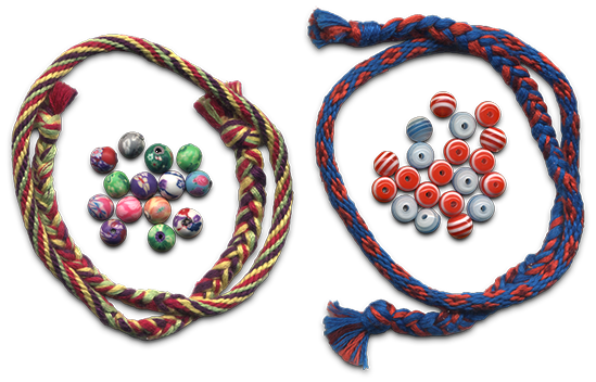
Kumihimo and beads
Here are some examples of real-world objects that were used in the design:
- my gift ribbon was a header;
- the menu is a sheet torn out of my notebook (which was originally in the box);
- Header in front of the content of the page is an element of the cover for the e-book reader;
- pop-up window and footer badge - an element of a denim backpack;
- Button to close the pop-up window - a button with a short;
- logo on the main page - freehand drawing;
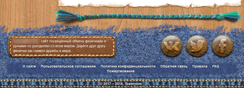
- All the baubles and many beads that can be seen in front of the footer and on the page on the right also came from the real world (some of the baubles were woven during the design of the project).
Home Footer
More screenshots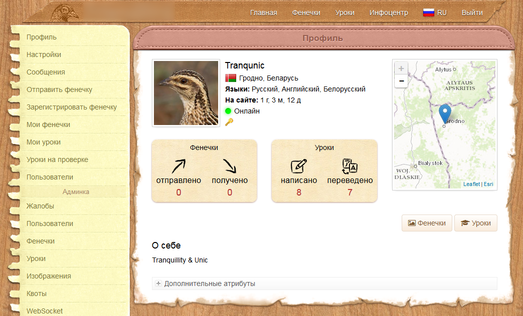
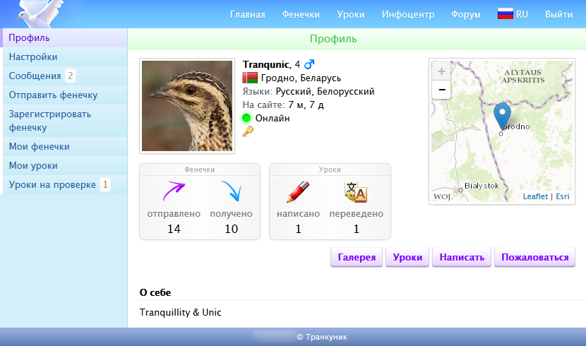
Страница профиля пользователя
Страница со списком уроков
Всплывающее окошко с выбором языка
Страница профиля пользователя
Страница со списком уроков
Всплывающее окошко с выбором языка
One of the most time consuming work was the preparation of images for use in conjunction with the CSS attribute border-image. The difficulty was that certain parts of the picture should look seamless when repeated. This is how to draw repetitive (seamless) textures, only harder. Most of the time was spent on the picture used in the design of pop-up windows (and the footer patch), since the size of the elements on which this picture “stretched” could change freely both vertically and horizontally.
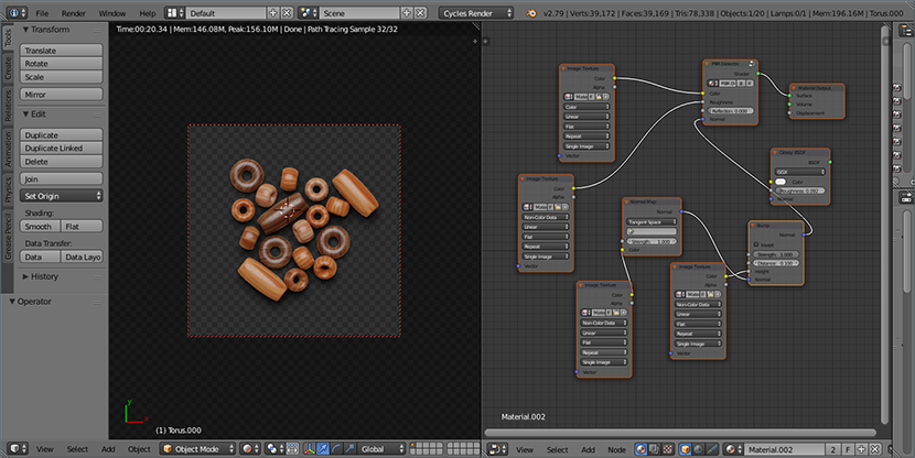
Probably, with the design, we were confused more than with anything else. Moreover, they got so confused that many elements of the environment (for example, beads and beads) and some icons were modeled and rendered in Blender (something was even textured in Substance Painter). Yes, for the sake of icons measuring about 32x32 pixels, we were confused so much.
Rendering results
How to create design elements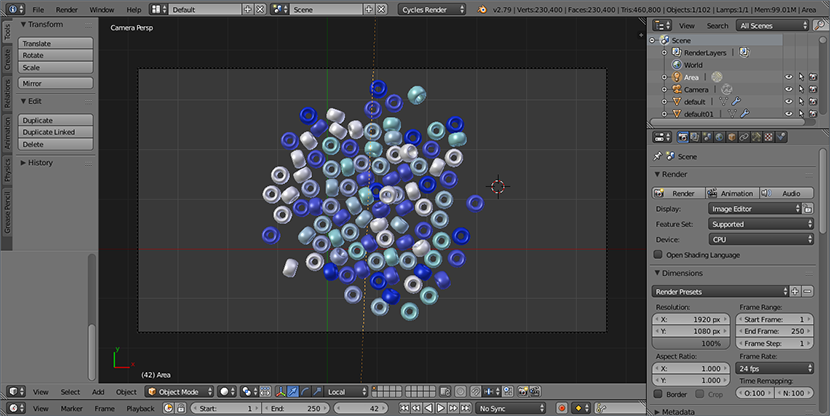
Моделирование бисера (использован в качестве элемента окружения)
Моделирование бусин (использованы в качестве элемента окружения)

Моделирование пуговицы (использована в качестве элемента окружения)
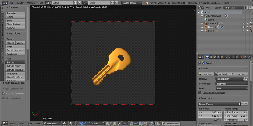
Моделирование ключа (использован в качестве иконки «Администратор»)
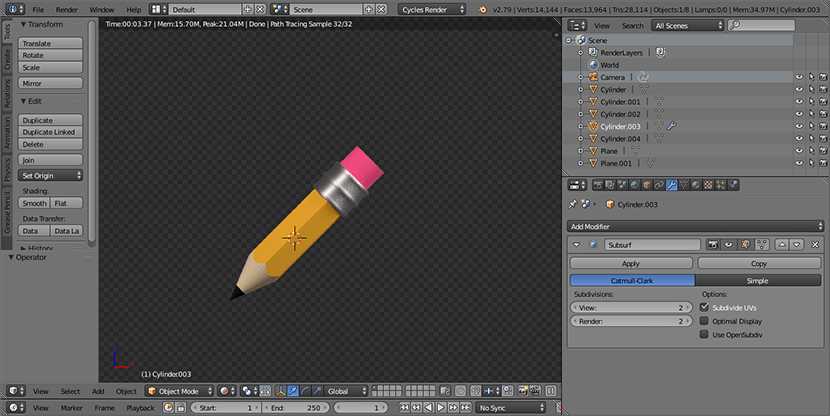
Моделирование карандаша (использован в качестве иконки «Редактировать урок» на кнопке)
Текстурирование бусин в Substance Painter
Моделирование бисера (использован в качестве элемента окружения)
Моделирование бусин (использованы в качестве элемента окружения)
Моделирование пуговицы (использована в качестве элемента окружения)
Моделирование ключа (использован в качестве иконки «Администратор»)
Моделирование карандаша (использован в качестве иконки «Редактировать урок» на кнопке)
Текстурирование бусин в Substance Painter
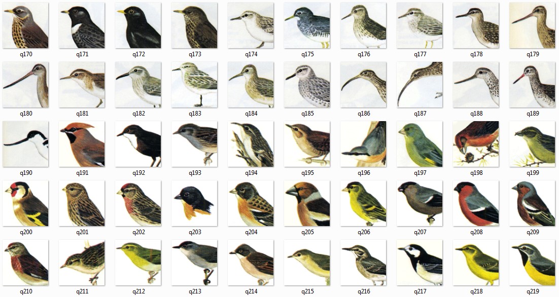
I liked the idea of automatically generated user avatars that I saw on various sites. But their problem was that often these were rather primitive and uniform patterns. People in JIRA looked more interesting, but still pretty simple and flat that did not fit into our design. Nothing good came to my mind until the moment when my co-author showed me a page from an old book on birds of Great Britain. And then I realized that before my eyes a great collection of ready-made avatorok. I asked to scan all the pages with birds, after which I sat in Photoshop for two days and cut these birds into avatars, removing artifacts from the book paper in the course. After registration, the user randomly received one of the 267 avatar-birds
After the work on the new (skeuomorphic) design was completed, and we completed its integration into the layout prepared by my coauthor on Bootstrap, I began to integrate the new design. I thought it would be the most embarrassing thing I do in this project. In fact, it was just a routine development work, and hell itself was still waiting for me to come.
Deployment
So, all the planned features were developed, all critical and major problems were eliminated, the new design was stretched, and the site was translated by the co-author into English, it was time to test the project on an external server. We decided to start the project right away, but close it with a password so that the random guest would somehow not be able to
During development, I used the name "fenker" ("Fenker"), which was essentially its codename. I suggested using it as a site name, but later this version was discarded, as it sounded too Russian. We have been sorting out names for a long time: Fenkexchange, Friendship Pigeon, Flossy Hearts, Silky Hearts,…. Yes, the names all turned out to be too long, then too Russian. Until the idea to combine the theme of the site (friendship bracelets) with one of its features (birds: pigeon on the logo and avatar birds) came to mind. And so it turned out a bird-friend - FriendBird.
While the co-author was involved in registering a domain name and searching for an acceptable VDS, I installed Debian Linux on VirtualBox in order to practice deploying our project. I used to work with Linux and used one period (about a year) only for this operating system, but later abandoned it because it didn’t grow together, and as a result I returned to Windows (mainly due to the lack of powerful software for working with 2D and 3D graphics); after that, I also had the experience of setting up an Apache web server under Linux as part of university classes. In general, when working with Linux, I didn’t have any serious problems, so I expected that the deployment of a freshly baked project would take place quickly and relaxedly. But in the end, this activity became the most unpleasant thing I did in the framework of this project.
The most unpleasant experience in my life with Linux
Такой уж я человек, который любит, когда установливаешь программу — и она работает. И ладно, если для конфигурации приложения надо почитать документацию, поправить конфиг, набрав несколько команд. Но когда приходится перебирать несколько мануалов, каждый их которых описывает процесс настройки по-своему, а в результате всё равно ничего не работает, то это уже начинает, мягко говоря, напрягать. Я — разработчик, а не сисадмин, и у меня не было когда-либо интереса к настройке веб-серверов под Linux. Мне не доставляет удовольствия красноглазить часами или даже днями ради того, что под Windows в большинстве случаев легко устанавливается, конфигурируется и работает. В Линуксе же настройка каждого приложения мне давалась так, словно я проходил очередной круг ада.
Проблемы начались уже с этапа настройки базы данных: моё приложение наотказ не хотело работать с установленной по умолчанию MariaDB. Обновление коннектора и перебор URL'ов для подключения к БД со всевозможными параметрами не помогал. Удалить MariaDB со всеми зависимостями так, чтобы на её место поставился MySQL от Oracle, мне не удалось. Поэтому пришлось познакомиться с докером, в который и была заселена версия MySQL от Oracle.
Объёмность мануала по настройке почтового сервера заставила меня нервно сглотнуть. Набрав десятки команд и отредактировав несколько конфигов, я в итоге не получил работоспособного почтового сервера. К этому моменту у меня уже не было какого-либо желания выполнять примерно то же самое, только по другому мануалу, поэтому настройку почты я просто забросил. К счастью, впоследствии соавтор проекта нашёл способ настройки почтового сервера через панель управления, предоставляемую хостинг-провайдером.
Но самой хардкорной частью была установка SSL-сертификата. Делал это я впервые, поэтому сначала пришлось много почитать, чтобы хотя бы примерно понимать, как это работает. Получение самого сертификата (мы использовали сертификат от Let's Encrypt) выполнялось в пару кликов в вышеупомянутой панели. Но у меня не было понятия, как правильно его импортировать так, чтобы он был заиспользован Tomcat'ом. С этим вопросом я провозился много дней, перебирая разнообразные способы импорта, следуя разным мануалам, а потом и комбинируя разные подходы. Результата всё не было, и я уже было чуть не опустил руки, как решение всё-таки нашлось (надо было сконвертировать полученный fullchain-сертификат (также используя полученный private key) в формат pkcs12, а затем импортировать получившийся сертификат в JKS (Java Key Store), указанный в конфиге Tomcat'а). После того, как я увидел в браузере заветный зелёный замочек, я почувствовал такое облегчение, словно я сдал самый важный в моей жизни экзамен.
Конечно, опытные сисадмины могут посмеяться с моих «проблем» — и я их прекрасно пойму, так как это их сфера деятельности и область их интересов. Очень жаль, что на этом проекте, который я так хотел выпустить «в люди», мне пришлось заниматься тем, чем заниматься мне совсем не нравится.
Production
On the night of January 25, 2018, I erased everything that was generated by us in the database during testing, and again launched the initialization process. When the process was completed, I removed the password to the site and restarted the web server. Now the site has been open to the public.
Since the co-author of the project himself was once engaged in needlework, kept his own website on this topic and administered his Vkontakte group, we didn’t have a question about where to get the original audience. The group was published news - and we saw the first registered users. In the first weeks, the number of page views was more than a thousand per day; a little, but even that we were happy. But most of all we were happy when the first results of exchanges of baubles began to appear on the site, which over time became more and more.
And users did not write lessons. Therefore, in order to somehow stir them up, the co-author first published a lesson, after which other users began to publish their own. Most of all, in this regard, the guys from Ukraine stood out, who willingly wrote lessons and translated them into Ukrainian, for which a special thanks to them.
The first month of the site looked like this:
- 131 registered user;
- 14 received baubles;
- 15 written lessons (including translations of lessons into other languages).
Of course, during the production there were problems that I tried to solve quickly, continually updating the site. But over time, the application became stable, after which I began to deal only with data backup. In total, during the site’s operation (from 2018.01.25 to 2018.07.03 and including the testing phase) 29 updates were made. There were a couple of critical updates when I fixed bugs at night, and applied an update in the morning.
Not all the users liked it right away, but something was not enough at all. Already during the production, a page with a list of users, a page with a feedback form and the ability to exchange baubles only inside their own country was added. After the site was released to the public, the co-author of the project was engaged in its promotion in social networks and collecting feedback and suggestions. We tried to listen to the community gathered on the site, thanks to which some errors were corrected and changes were made to the site’s functionality. Thank them very much for that.
Probably the biggest problem for users of the site was downloading photos. To avoid uploading images that are too large, of excessive quality and of unsuitable format for our markup, we set appropriate restrictions (minimum and maximum allowable file size, height, width and aspect ratio). But, judging by the logs, it is often very difficult for users to comply with these restrictions, even though every time they try to load a message is displayed on the screen indicating the problem. I expected it to become a problem, but I did not expect the problem to be so large (so that some users eventually downloaded distorted or low-quality photos, referring to the fact that the system does not allow them to upload photos in normal quality). Maybe,
The present
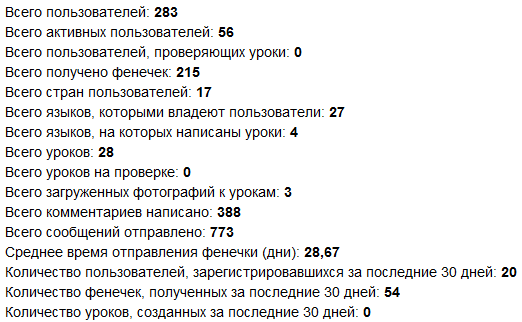
At the time of this writing, the site has been living for 5 months and 1.5 weeks, and the results of its work are as follows:
Statistics for 2018.07.05
For such a period, these are, of course, very modest numbers; the influx of users to this moment was greatly weakened, and the activity of writing lessons ended as sharply as it began. However, we are pleased that the exchange of baubles is going on actively, and non-Russian-speaking foreigners are taking part in this.
Statistics on the number of users
I well understand that the site could have been made more popular through advertising, but, as I said, one of our tasks was to keep to minimum financial expenses. When launching this project, we did not hope for any significant profit (due to its non-commercial nature and specificity of the target audience); At the moment, the profit from the project (advertising and donations) does not even cover the cost of its maintenance (domain name, VDS and a bit of our support time). But, as one of my Australian friends said, if the project made at least a couple of people happy, efforts to develop it were well spent.
Even despite the very small interest from the public and some imperfections of the site itself (for example, the absence of CDN and two-factor authentication), I like the way our project turned out. For about a year, I have been doing a great job, getting great pleasure from solving a variety of tasks and trying to do everything that was within my intellectual abilities. Also in the development process I was pleased that there are no customers above me, I am not driven by the deadlines for the project, and the style of writing the code is not constrained by agreements imposed from outside; the complete freedom of my decisions gave a special taste to the pleasure of working on this project.