Usability Torture at ITMO UX Labs
At the NRU ITMO, in which I study at the magistracy, as it turned out, a usability laboratory works . We with like-minded people create a service for communication and collaboration on documents - Rizzoma . I got the idea to test our project.
In this report, we want to share our experience in conducting such testing, talk about what we can expect from it, and also show what practical results we have achieved. I hope that this article will contribute to the emergence of new laboratories. For example, I will be very glad for the emergence of such a laboratory in our city of Tomsk.
It is known that in order to make a good interface, you need to visit the user's shoes. Total monitoring of the subjects, implemented in the laboratory, allows you to get as close to this as possible. The key difference between the laboratory and home conditions is the ability to track the direction of view using the Eye tracking technique. It is significant that the total cost of equipment installed in the laboratory is about 5 million rubles, of which 3 million is Eye tracker.
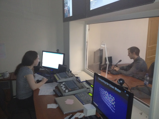
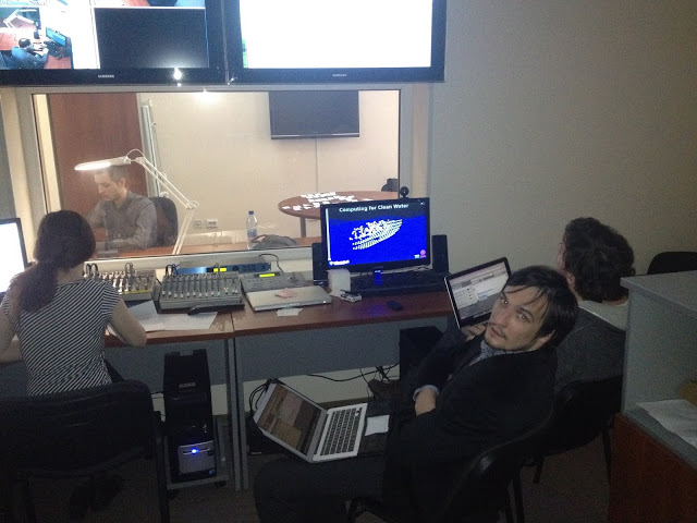
The subject can be watched through a one-way Gazell mirror, and you can monitor the broadcast from three viewing cameras. The video signal of the mouse position (mouse-tracking) is also recorded.
There is well-tuned equipment for voice conversations between rooms. But the sound recording was done very poorly, because of this problem, our video is very boring to watch. The laboratory received our feedback and reported that the problem has now been resolved. With the organization of testing, we were helped by Sofia Chebanova , head of the laboratory.
You need to prepare for testing, think through user scenarios in advance. Unfortunately, we did not work out this moment enough. I had to invent on the fly. In a few minutes, we threw up this:
1. Log in (register) in Rizzoma
2. Create a new document and a list of 3-4 items in it
3. Give a friend access to the document by email
4. Send a message to a friend using the "@ mention "
An experienced Rizzoma user takes 3 minutes to complete all of these steps. We figured it would take no more than 20 minutes for beginners.
We were told that participation in usability testing can be stressful for subjects. The cause of stress is fear, similar to the fear of public speaking. I personally grabbed the test subjects in the corridors. All of them are somehow connected with IT and startups, ITMO students, employees of the Quattour Dimensionis (QD) business incubator.
Sonya met the subjects, explained that nothing bad would happen, and reassured her in every way. Then they were placed in a conditionally relaxing environment: three cameras were directed at the subject, and in front of him was a huge mirror, which is known to be transparent. In my opinion, only the quiet and friendly voice of Sophia from the speakers really relaxed and calmed.
Setting up the Eye-tracker was done quickly, about 10 seconds. Checking the sound, another 10 seconds and then working with our site. During testing, we hid behind a mirror in a small room. The basic concept of interaction, which the testing moderator adheres to: the respondent is given the task to do something with the product, after which we leave the respondent alone to act impulsively, i.e. as it acts in real life, without rationalizing each of its actions. When the respondent copes with the task, we ask you to explain why he did just that.
They guessed with the test duration - on average, the experiment lasted 15 minutes. After the experiment, we went out and talked with the subjects. Each chocolate bar: girls - Bounty, boys - Mars, in strict accordance with the recommendations of marketers.
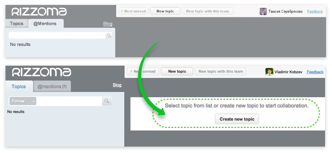
At the time of testing, our service already had active users and their number is growing steadily. Google Analytics data shows that the conversion is staying at a normal level. It was a discovery for us that the way from visiting the main page to working with a document had several very serious “holes”. Such that without prompting from other users, immersion in the service, strictly speaking, was simply impossible. Apparently, we did not see them in Google analytics, since a significant part of new users comes in search of an alternative to Google Wave, which they used before, so the Rizzoma interface for them was largely familiar.
From the test results, we took out a bunch of small details that need to be fixed. Here is an example of how we solved the problem of frustration when we first opened the interface. We quickly made a small patch, now the picture for the new user is no longer so frighteningly empty.
In addition, testing helped solve all the minor flaws in the concept of the new interface, which we plan to update in early June.

Album with other interface details (updated).
As we developed this version of the interface, we came across an interesting point. The development and rendering of the interface turned out to be comparable in complexity with the remaking of program code for this interface.
But since it is important for us now to launch this interface as quickly as possible, we have postponed many complex and controversial issues. Here is some of them:
Within a couple of months, we plan to solve all these issues and once again test the service in the usability-laboratory.
In this report, we want to share our experience in conducting such testing, talk about what we can expect from it, and also show what practical results we have achieved. I hope that this article will contribute to the emergence of new laboratories. For example, I will be very glad for the emergence of such a laboratory in our city of Tomsk.
UX Lab: How User Tracking Works
It is known that in order to make a good interface, you need to visit the user's shoes. Total monitoring of the subjects, implemented in the laboratory, allows you to get as close to this as possible. The key difference between the laboratory and home conditions is the ability to track the direction of view using the Eye tracking technique. It is significant that the total cost of equipment installed in the laboratory is about 5 million rubles, of which 3 million is Eye tracker.
The subject can be watched through a one-way Gazell mirror, and you can monitor the broadcast from three viewing cameras. The video signal of the mouse position (mouse-tracking) is also recorded.
There is well-tuned equipment for voice conversations between rooms. But the sound recording was done very poorly, because of this problem, our video is very boring to watch. The laboratory received our feedback and reported that the problem has now been resolved. With the organization of testing, we were helped by Sofia Chebanova , head of the laboratory.
Experimentation and user scripts
You need to prepare for testing, think through user scenarios in advance. Unfortunately, we did not work out this moment enough. I had to invent on the fly. In a few minutes, we threw up this:
1. Log in (register) in Rizzoma
2. Create a new document and a list of 3-4 items in it
3. Give a friend access to the document by email
4. Send a message to a friend using the "@ mention "
An experienced Rizzoma user takes 3 minutes to complete all of these steps. We figured it would take no more than 20 minutes for beginners.
We were told that participation in usability testing can be stressful for subjects. The cause of stress is fear, similar to the fear of public speaking. I personally grabbed the test subjects in the corridors. All of them are somehow connected with IT and startups, ITMO students, employees of the Quattour Dimensionis (QD) business incubator.
Sonya met the subjects, explained that nothing bad would happen, and reassured her in every way. Then they were placed in a conditionally relaxing environment: three cameras were directed at the subject, and in front of him was a huge mirror, which is known to be transparent. In my opinion, only the quiet and friendly voice of Sophia from the speakers really relaxed and calmed.
Setting up the Eye-tracker was done quickly, about 10 seconds. Checking the sound, another 10 seconds and then working with our site. During testing, we hid behind a mirror in a small room. The basic concept of interaction, which the testing moderator adheres to: the respondent is given the task to do something with the product, after which we leave the respondent alone to act impulsively, i.e. as it acts in real life, without rationalizing each of its actions. When the respondent copes with the task, we ask you to explain why he did just that.
They guessed with the test duration - on average, the experiment lasted 15 minutes. After the experiment, we went out and talked with the subjects. Each chocolate bar: girls - Bounty, boys - Mars, in strict accordance with the recommendations of marketers.
Conclusion: fix the jambs and conduct another test
At the time of testing, our service already had active users and their number is growing steadily. Google Analytics data shows that the conversion is staying at a normal level. It was a discovery for us that the way from visiting the main page to working with a document had several very serious “holes”. Such that without prompting from other users, immersion in the service, strictly speaking, was simply impossible. Apparently, we did not see them in Google analytics, since a significant part of new users comes in search of an alternative to Google Wave, which they used before, so the Rizzoma interface for them was largely familiar.
From the test results, we took out a bunch of small details that need to be fixed. Here is an example of how we solved the problem of frustration when we first opened the interface. We quickly made a small patch, now the picture for the new user is no longer so frighteningly empty.
In addition, testing helped solve all the minor flaws in the concept of the new interface, which we plan to update in early June.
Album with other interface details (updated).
As we developed this version of the interface, we came across an interesting point. The development and rendering of the interface turned out to be comparable in complexity with the remaking of program code for this interface.
But since it is important for us now to launch this interface as quickly as possible, we have postponed many complex and controversial issues. Here is some of them:
- Where to place the comment insertion button so that a new user can easily find it?
- Where is the message menu better: at the top or bottom of the message?
- How to make / make up / display a new message that appears when you click the Reply button. It must be done in such a way that it is convenient for users to communicate in a chat format and, if necessary, to structure useful information obtained in the process of communication.
Within a couple of months, we plan to solve all these issues and once again test the service in the usability-laboratory.