Commercial factors ranking online store and site services
- Tutorial
Attention, longrid!
This is a detailed analysis of commercial factors, based on an analysis through the web viewer of the behavior of visitors from Yandex.Toloki, information from official documents of search engines and speeches of their employees at conferences.
We analyze the commercial factors of online stores and sites on which they provide services.
Checklist for commercial factors at the end of the article.

- Коммерческие факторы для интернет-магазина
- Навигация
- Контактная информация
- Карточки товаров
- Ассортимент товаров
- Товарная перелинковка
- Возможность сравнивать товары
- Кнопка Купить
- Цена
- Корзина
- Доставка и оплата
- Отзывы
- Скидки и акции
- Гарантии, возврат
- Онлайн-консультант
- Служба поддержки
- Соцсети
- Оптимизированный контент
- Раздел новостей
- Страница благодарности
- Использование технологии HTTPS
- Глубина вложенности страниц
- Читабельность домена
- Адаптация под мобильные телефоны
- Репутация и возраст домена
- Ссылки на авторитетных ресурсах
- Узнаваемость интернет-магазина в глобальной сети
- Наличие организации в Яндекс.Справочнике и Google Мой Бизнес
- Упоминания бренда на форумах
- Дополнение для сайтов услуг
- Широкий ассортимент предлагаемых услуг
- Структурированный каталог
- Контакты и обратная связь
- Отзывы клиентов
- Свежие новости
- Корпоративный блог
- Цены
- Фото и видеоотчеты
- Кейсы-портфолио
- Лицензии и сертификаты
- Упоминание бренда или самого коммерческого сайта на сторонних ресурсах
- Возраст домена
Commercial factors - this is the most important direction in SEO commercial projects. Characteristics affecting the convenience of making a purchase or ordering a service, and customer confidence, are now the cornerstone of promoting IM and Yandex services sites. Commercial factors are taken into account by search engines when ranking and directly affect the conversion of visitors into buyers. Work on each of the factors improves the ranking of the resource. So, it helps you to become better and more noticeable competitors, causes the loyalty of your users.
Previously, assessors checked a lot by hand, then Matriksnet appeared, and now Cat Boost based algorithms check our sites. Algorithms are taught by people who perform tasks in Yandex.Talk . Task results help improve your search engine. About Toloka at the end of the article, ibid: checklists on factors for an online store and website services.
Commercial factors for an online store
Internal
Navigation
Navigation is extremely necessary to make it convenient and easy enough so that any person can understand.
It is always useful to compare an online store with an offline store. For example, you went to a new store in your area, and there is not a single signboard. Corridors, stairs ... where to go? No pointers to be found. In the online store the same, with an incomprehensible navigation, the visitor will simply go to a competitor.
Categorization . With categories and subcategories, it will be easier for the user to navigate the site, and searching for the right product group will take less time. Do not make them too branchy - no one will dig. It is best to analyze the most popular categories and put them higher in the lists.
Good category structure of a very large store, the image is clickable :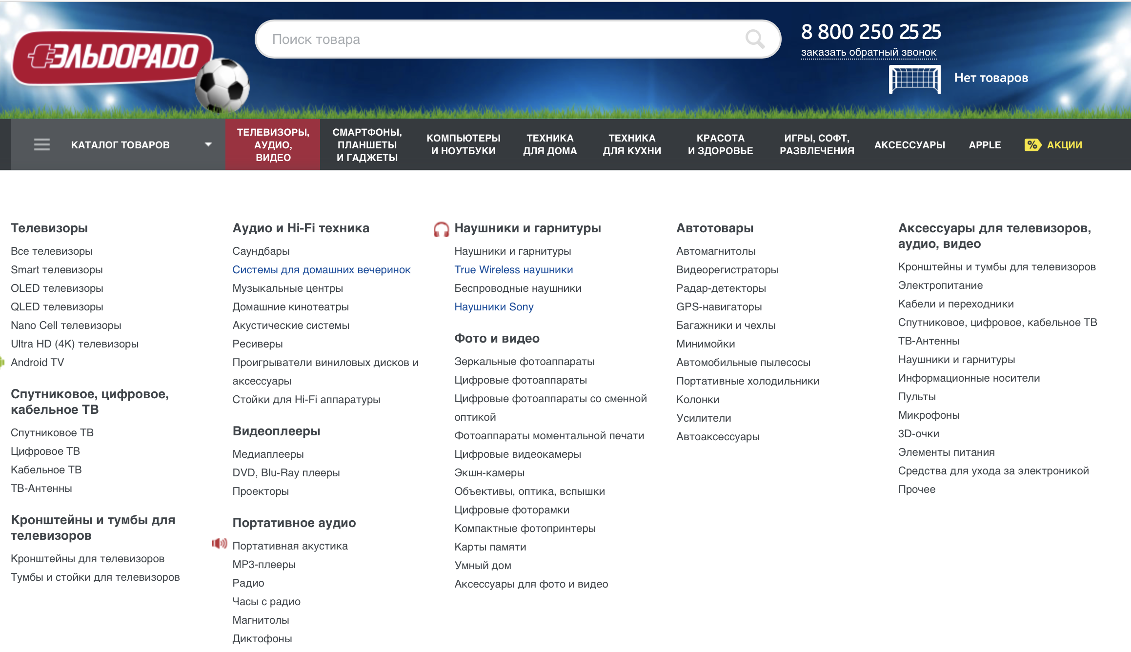
Filter goods. Do the same with filtering: do not complicate, but do not simplify to a minimum; do not duplicate items. The necessary filter pages must be opened for indexing, unnecessary - hidden. All pages that are planned to be displayed in the search must include Title, meta-Description and H1. SEO filter is a very powerful vacuum cleaner for collecting traffic, I highly recommend to disassemble the UI / UX filter in great detail and optimize it as much as possible for the PS.
Make links from the text (for example product descriptions) visible and beautiful. Sometimes in stores, links visually hardly differ from the rest of the text. And in vain. Any search engine does not like this and people can not see.
Here is what Yandex Help recommends :
Links must be visible and visually different from the rest of the text. Usually they are highlighted in blue and underlined. The most important links worth highlighting somehow especially. For example, a link, the click of which means the active action by the user, can be arranged in the form of a button.
Add that, ideally, links should be no longer than 60 characters, beautiful, short, reflecting the category, with the URL being rewritten.
No need for blank pages . The lack of information on any of the pages of the site is at least annoying, as a maximum - reduces trust: they don’t care about the buyer, they don’t tell him anything. This is especially true of the pages of the catalog. Of course, there are technical works on the page, but in this case, you need to politely, affordably and, if possible, creatively inform the users about this. And provide a link to the main page. And it is better not to add a blank page to the site and a link to it in the main menu.

Contact Information
Give detailed contact information to the user. The main contact information should be duplicated in the website header: phones, instant messengers, a link to detailed contacts. And this is indicated on the page with contacts:
- Phones . Well visible and written as text to be accessible for indexing. It is desirable with the indication of the names of departments and / or names of managers and the time of their work. Photo managers - a big plus. The advantage will be the availability of a toll-free number for calls from regions (8,800).
- Messengers . Buttons must be accompanied by the names of instant messengers and even numbers. Skype, Viber, WhatsApp, Telegram are most often placed, but this list can vary greatly depending on your target audience; conduct analytics with the help of which instant messengers are contacted. I recommend to modify the functionality that allows you to copy the login or phone number in one click, or go directly to the dialogue in the application.
- -mail an e . It is also good if there will be several e-mail addresses indicating the persons in charge and the ability to copy by clicking on the icon.
The address of the organization. With hours of work, a link to the map. Plus a map with an indication of points of sale and points of pickup (it is a moving map, not a screenshot), photos of the building, mode of operation. - Details . Must be legal information and the official name of the company. Moreover, the details do not sculpt into a string, and give a list.
- Feedback form . Here the real opportunity to communicate with the manager is important. Therefore, it is better if this is a real online consultant. But it is usually added to all pages anyway, and here you can duplicate it with a simple form for deferred communication, messages from which come to the store's mail.
- Regional offices or points of issue . With addresses, phone numbers, photos and maps.
It would be cool if you upload a photo of a store or delivery of goods, your employees, and so on to Instagram. You can place the Instagram widget on your site and give people the opportunity to look at the work of the store "from the inside" - for the user it will be a huge plus to trust. Of course, it is better to upload photos of beautiful, high-quality and regular.
Criteria, as you can see, a lot. What weight each of them has specifically in your subject is difficult to determine. Therefore, the optimization of the commercial factors of the site should be properly conducted along with the marketing analysis of the site and competitors. With this approach, you are more likely to hit the target. Otherwise, many useful features and services in your niche can be added to the site.
A good contact page, so to speak, is the minimum required set: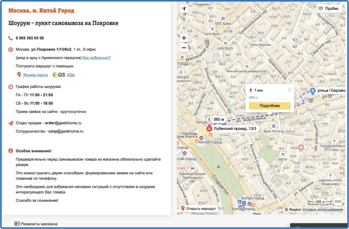
Cards of goods
The completeness and quality of the product card filling is one of the most significant commercial factors of an online store.
Good unique photos from different angles + 3D + video will make visitors poke a spell into pictures, fumble a link to a page and carry out a half-day improving on your site PF.
By the way, the video of the goods in the online store card is a very powerful thing. Video is generally the strongest anchor. Not only did Lenin think that cinema is the most important of all arts for us (he knew how to influence the masses); not only that "it is better to see once ..."; so more and Cisco predicts that by 2021, Internet video traffic will quadruple (albeit from 2016). Here Google at the conferences learns to do a lot of video.
Qualitative filling of cards of goods is:
- characteristics (color, weight, dimensions and other at least some significant parameters)
- detailed description
- ability to select options for configuration
- name and country of manufacturer (possibly a link to the manufacturer)
- photos from different angles
- the cost
- customer reviews (If you do not have your own then on the i.market for example)
- information about payment methods and delivery time
- references to related and related products
- availability of goods (the number of items in stock, not the online "in stock")
- button "Buy" and / or "Add to cart"
Sample can serve well-known large stores. Scroll through the page with a card of this product, and you will understand why this site is in TOP of the issue:

Assortment of goods
If the store is big . The wider the range, the more likely that the visitor will find suitable products for themselves. There is an opinion that more than 80% of products should be available. Actual, timely information about the product will increase confidence and the likelihood of purchase. It is dangerous to increase the quantity of goods at the expense of missing positions, as a minimum it should be possible to bring these goods “to order”.
If the store is small . No need to try to increase the number of cards of goods by multiplying the same position in different colors. It is better to give interesting detailed descriptions, case studies about use from real buyers, vivid reviews with photos or videos from the moment the goods are delivered to their first use and use within a month, that is, to improve the information content and usefulness of the page for the user in all possible ways. This is what distinguishes small shops with unique things.
Product linking
Users prefer sites with a wide range of products and services. But if the assortment is initially conceived of a small but aimed at narrow demand, then it makes sense to supplement the information content of the position with recommendations of related and / or similar products. You can specify cases of sharing the main and proposed goods, for example, when buying a bicycle, you can transport a child if you buy a bicycle seat like this, you will not get lost in the woods with a navigator attached to this holder and so on. About similar products you can also immediately show their main advantages and / or disadvantages compared to the main ones. With a wide range of this, of course, is also worth doing. It is very convenient when there is a block with “recently viewed goods” where the goods of the card the user has recently visited are displayed.
The ability to compare products
An optional item, but it will be a significant advantage. Such pages on my analytics often add to favorites that plays into our hands in all respects.

Buy button
Or the button "Order", or "Add to Cart" for convenience should be near each product and be visible.
The price of the product
The price must be competitive. It must be indicated near each position. If there is no price, then, firstly, it is alarming (too expensive? Not for sale? What is wrong?), And secondly, it forces you to perform extra actions in order to find out the cost. Leaving ...
I often encounter the impossibility of adding a price for a product card for various reasons (from competition to currency fluctuations) in such cases at least to write “price on request”, “Price from ***” and so on.
We recommend making information about the cost of a product or service as accessible as possible.
Basket
In your online store, the visitor should be able to go to the shopping basket from any page of the site. This can be a button on the side of the top of the pages indicating the quantity of goods in it (personally, I like it when a thin block with a basket is “pasted” on top of the page and scrolls along with all the content). And it is desirable that the button led to a separate page with a "basket", and did not give a drop-down window with the goods. Because in a small pop-up window there is little information, and if it is large, it will close the information on the page itself. From the "basket" page there should be a link "return to purchases".
Shipping and payment
- Payment. The section itself must be accessible, which means noticeable. At least three options for payment methods must be in it. In addition to the list of options you need to add an explanation of how to pay in this way, so that the buyer chooses.
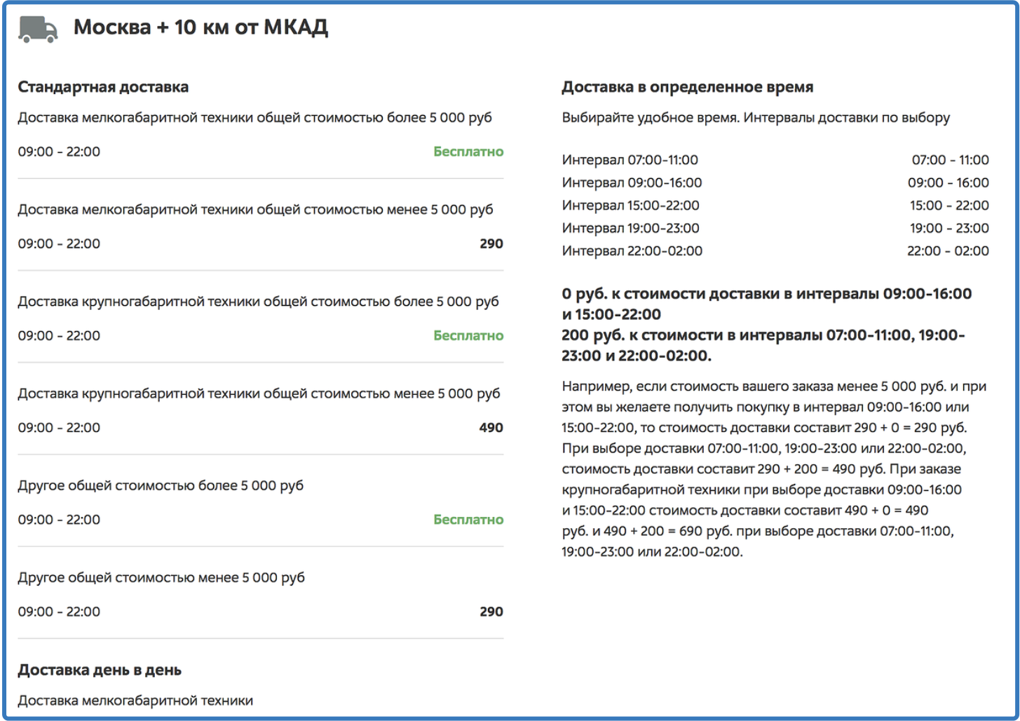
- Delivery. Specify the maximum number of ways. For each give a description with prices, terms, regions, nuances (if any). The more pickup points, the better. Information can be given in detail in the form of questions / answers.
Do not just give a link to the transport company - they say, go see for yourself. It is much better to copy information from the websites of transport companies, to describe the pros and cons of order delivery to specific regions by a specific organization. Connect the delivery calculator by API, if available. And (for perfectionists), above, show information on the regions to which they most often order delivery.
And immediately give links to mobile applications of delivery services (if available) and a mini-instruction on its use, so that the buyer can easily track the goods upon delivery to the regions. And remind about SMS informing so that the client is completely calm.
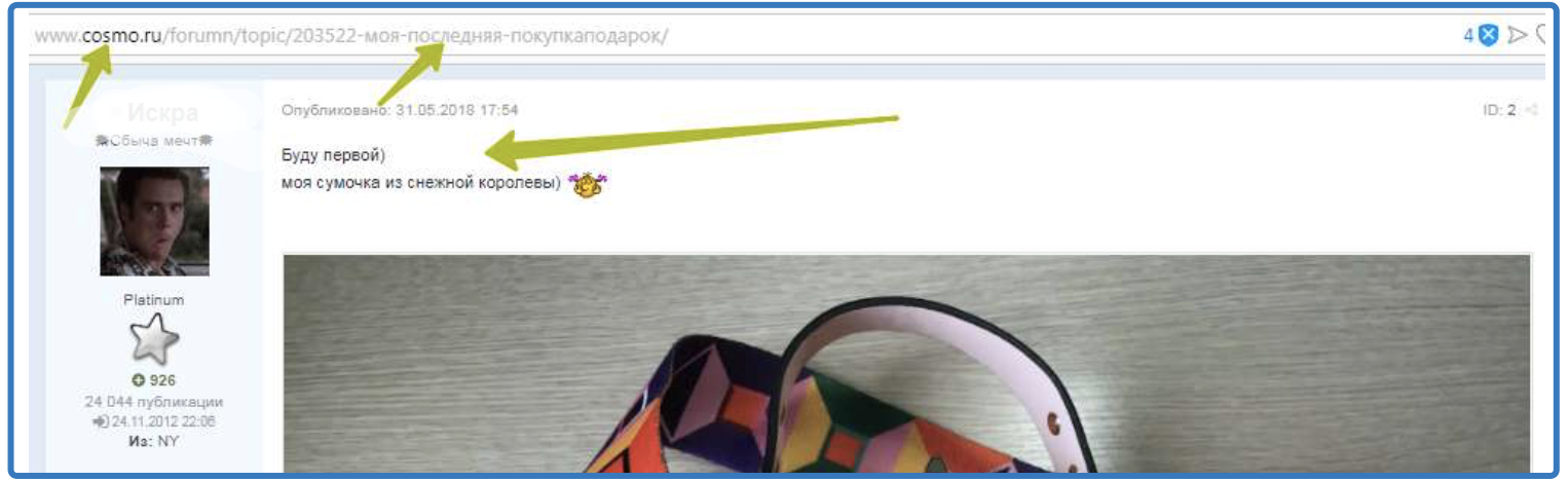
Reviews
Well, if they are on the page itself with the goods. But even better, when links to reviews lead to well-known otzoviki portals, because the buyer has hope that there they are real and unbiased:
- https://www.yell.ru
- https://zoon.ru
- https://ru.otzyv.com
- https://www.spr.ru
- http://www.apoi.ru
- http://irecommend.ru
- http://otzovik.com
- https://market.yandex.ru
- Flamp (each city has its own website)
And even better if next to the review will be a photo of the buyer with the goods in his hands and a link to his profile in any social network (this is, of course, an ideal and difficult option, but we should strive for this). For greater coolness and, if possible, during delivery it is good to offer some small change as a gift (wire holder, USB flash drive) in exchange for a video review or review with a photo and a link to a profile.
Discounts and promotions
- Shares . Well, if there is a separate page with information about current and future promotions. Past promotions delete or move to the archive so as not to mislead users.
- Discounts . By increasing the buyer's involvement, the number of sales will increase. Do not leave the page with discounts and promotions empty. If there are no fresh promotions, offer a discount for reviewing a product. In general: more discounts and bonuses! In the Russian store "freebie" should be inexhaustible. The bonus systems and loyalty programs describe in plain language, without complications. And let's give them information before registering the future buyer on the site.
Warranty, return
You may not have any guarantees and opportunities to return the goods at all, but you must write about it. And in order for the store to be good, it’s worthwhile to take care of the customer in a human way, without forgetting about the Consumer Protection Act . Briefly describe how to act the buyer, if the goods he did not fit.
Online consultant
It is worth making, but unobtrusive. Perhaps annoying pop-up chat windows with an online consultant, making it difficult to view the main content, will annoy your customers. The consultant must be truly online during the business hours of the store.
Support
These can be different services depending on the subject of the online store: site technical support, order status tracker, active forum or social network with admin answers, feedback form - that is, where the buyer can get a quick answer to his question. This refers to the ability to communicate after the purchase or ordered (received) services, and not just the presence of an online manager. It is also important, within an hour after placing the order, to confirm it with a letter to the post office or a call to the buyer, report the purchase and delivery cost with the date (pickup).
Social network
Support the site with social signals - on all pages you should have buttons to go to the page of your online store and buttons "Share" in social networks. Search algorithms index social networks and track whether you have representative offices in social networks, and active. Integration of the site with social networks should not be "for show": if the group has the most recent post two years ago - this is bad; If you are actively using the social network as a channel for working with clients, this is good. Pages of the online store will be indexed faster and ranked higher if they are links from social networks.
Optimized content
It is necessary that the text be structured: lists, subtitles, tables.
Keywords (search queries) of the semantic core are selected by analyzing the services or products of a company, analyzing query statistics, site statistics, the contents of competing sites, and the seasonality of using search queries. The composition of the semantic core should correspond as closely as possible to the ideas of the target visitors of the site about the information that, in their opinion, should be present on it.
- Wikipedia
At Yandex, we do this through the Yandex.Wordstat service , at Google through the Keyword Planner .
News section
Periodically update the information section to the site did not look abandoned, or completely abandon the news section. Pss! Remember we compared the online store with the offline store? Yandex also does this :

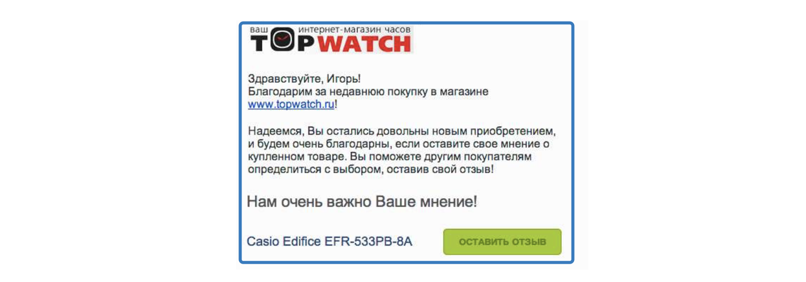
Thank You Page
Nothing prevents you from thanking the buyer for making a purchase in your online store. But how much benefit! Saying "thank you" on the website of the online store is very simple, literally to automatism: make the page "thank you page", which will automatically appear after the customer commits the transaction, or will be a separate page.
What gives "senkyu pidzh":
- builds trust with customers;
- increases conversion;
- is a tool for additional sales (especially if you add a block with recommended products to it);
- encourages the following transactions;
- helps to establish a dialogue if you add a question about the quality of services or wishes to the service
- Stimulates to leave feedback.
Using HTTPS technology
All commercial sites that pay for an order, buy a product or even have a feedback form need to use the secure HTTPS protocol and connect an SSL certificate. The technology ensures the security of data transmission between the user and you, and its use directly affects the ranking of the site.
The work of the site using the HTTPS protocol correlates with the position on the first page of Google issue. This is not surprising, since Google has confirmed HTTPS as a ranking signal.
Page Nesting Depth
It is recommended that the landing page be no more than two clicks away from the main one. The lower the level of nesting for the main pages, the better.
Domain readability
This is important for any sites, but in a professional environment it is considered that this is a separate item for commercial projects.
Adaptation for mobile phones
TASS reports : 15% of Russian users make purchases on the Internet from mobile phones. It is necessary to ensure the convenience of viewing your site on the screens of smartphones for such a rabid number of Russians. The presence of a comfortable in use mobile version of the online store today - mast. Take care of responsive design. Check optimization for mobile from google .
Separately, I note that since 2015, Google has been working to improve search results on mobile phones. To do this, launched the project AMP (Accelerated Mobile Pages) - Accelerated Mobile Pages. Recently published requirements for online stores on the AMP for E-Commerce Getting Started page . For example, eBay is already all on AMP. At Yandex, these are Turbo Pages, and the other day he published a similar specification for online stores.
All new features Yandex wrapped in Turbo page
External
Do not refer directly to the site itself, but affect its issuance in search engines.
Reputation and age of the domain
The older the domain and the higher its reputation, the more the search engines like it. For a highly specialized store, the average term for recruiting is one year. For commercial sites with high competitiveness - about two years.
Links to authoritative resources
Search engines take into account links to your store on large industry resources, in niche directories, directories (up to Wikipedia), on government websites and other reputable sites. If possible, you should ask your suppliers or buyers to put a link to your store. Also worth ordering reviews from reputable bloggers. Just remember that some types of articles on blogs Google considers to be spam. This guest blogging with an abundance of links, keywords, links in press releases, paid links in advertising articles. Read about it in the Link Exchange Schemes .
Links with text optimized for search engines, posted in articles or press releases that are published on third-party sites. For example:
Many different wedding rings are being sold. If you are preparing for the wedding, you need to choose the best ring. You also need to buy flowers and a wedding dress.
Recognition of the online store in the global network
The more often they talk about your store on the web, the more loyal search engines treat it. Just remember that the context of the review should be positive. Work politely with the negative. For example, the Children's World online store has a lot of negative reviews. However, see what a competent brand protection policy is:

The presence of the organization in Yandex.The Handbook and Google My Business
Be sure to add the official company data to Yandex and Google business directories . Specify the type of activity, address, contact details, links to pages in social networks in the relevant sections.
Not so long ago, Yandex published interesting information on its blog about how the organization’s rating is calculated in the directory.
Brand references in forums
Best of all the thematic forums and, of course, positive mention. Well, if one of your employees will have the task of finding someone else's brand references and responding to such messages (monitoring the brand on the Internet): remove objections, give thanks for positive feedback, explain controversial issues, work with negative. But this is marketing and brand protection.
Supplement for service sites
Internal
A wide range of services offered
You should maximize the list of customer problems that will help solve your services. If a niche involves only a few services, then supplement them with related services or goods.
Structured directory
Use the keyword selection service to understand exactly what interests your customers. About navigation preferences, re-read the first internal factors section for an online store.
Contact and Feedback
The site should be implemented convenient feedback and provide full contact details on each page. By the way, the online directories parse the contacts in automatic mode, so on the contact page it is recommended to use the special microformat hCard. And e-mail is better to start on your domain.
You also need an interactive map (how to create it using the Yandex.Maps API, see the article “How to make a delivery map on the website?”, Directions and recommendations, how to get to your office by public transport.
Customer reviews
They are the most effective addition to the main content. Feel free to ask customers to post pages on their sites with thanks or recommendation of you.

Latest news
Regularly update and update the news section with relevant information. Specify partners and suppliers: this will increase the level of trust and help to attract new customers.
Corporate blog
It will help to establish communication with existing and potential customers. It will be an educational program for customers who do not know your "kitchen" and are studying you to make a choice of service provider. This is a tool for "long sales."
Prices
Specify them if you have them. Do not expect that a potential client will try to find out the cost of services - he will rather go away than spend time. Also indicate the cost of tariff packages and subscription services. Set up an online calculator to help you calculate the final cost.
Photo and video reports
Not that the more, the better, but in our media age we should post photos and videos about our services, it’s necessary. Add text descriptions to them (consider the semantic core!). All material must be realistic, and drench reputation. You can set up relaying from social networks.

Portfolio cases
The portal should have examples of successfully rendered services with a complete description of the process. At the beginning of the case, let's get an introduction: who is the customer, what the task was, what results were achieved. In the title it is better to focus on what benefits you have achieved for the customer, than simply to give the name of the project.

Very cool, if under each case sign your client to whom you have provided a service. For example, "I completely agree with the information on the page, I thank LLC Korovka" for the work. Director Vasily Ivanov, LLC About whom Case.
Licenses and certificates
If they are, they should also be posted on the site. Just make out, please, so that blood does not flow from the eyes of visitors to the site.

External
Mention of a brand or the most commercial site on third-party resources
The more the better. Mention should be in a positive way. Negative third-party connotations should be neutralized whenever possible. For the convenience of centralized analysis (monitoring of brand references in the network) and search engine reputation management (SERM), there are many agency services and services.
Domain Age and Reputation
The older the site, the faster its new pages will be in the TOP of the issue. Reputation also plays a role. The hardest thing is if you bought a domain from your hands, and before that it belonged to scammers. Reputation “whitening” will take longer than creating it from scratch. It is recommended to even register a domain name on a legal entity so that everything in WHOIS is decent.
Features of work with commercial factors for small online stores
Problem 1
The main problem is the lack of assortment.
Solution:
This can be compensated by useful information about the product, detailed characteristics, additional useful articles and customer reviews. Also, customers will appreciate professional advice and additional services.
Problem 2
The company is unknown to a wide range of users.
Solution:
It is recommended to invest in dense work with clients. Spilling up every client as much as possible, asking for feedback on “cookies”, offering conditionally free additional services, delivery to the other end of the world at an adequate price and different kinds of “buns”, conducting “feedback” draws among your 10 customers :) and giving each a gift .
Yandex.Toloka
Yandex uses people to train artificial intelligence. With the help of the Yandex.Toloka service, the company distributes tasks to volunteers (for a penny) and collects analytics. In the description of the page itself, Yandex writes:
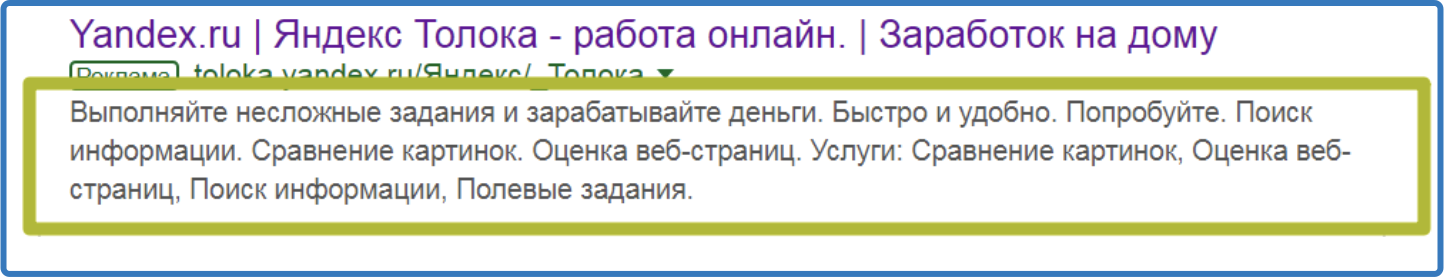
That is, in fact, Toloka "recruits" people's inspectors, who check our sites for correct content. Many of the above commercial factors can be analyzed and not only. On the basis of a complex grid of tasks and their checks, an analyst is formed, on the basis of which the AI forms an idea of quality and then uses it to evaluate your site. The tasks are completely varied: from checking whether the series of the series is correct is uploaded in the video to assessing the naturalness of the dialogue in the comments.
Now you can say with 100% certainty what to do for a robot is a waste of time, it is necessary to work with visitors and there will be happiness and TOP.
The difference of commercial factors in Google and Yandex
Google, in contrast to Yandex, does not single out commercial ranking factors as a separate group. Although when issuing sites in the search takes into account all these characteristics. In Google, more emphasis should be placed on the quality of the content, the exact occurrences of key requests, the volume of the texts themselves. Also on the ranking is greatly influenced by the amount of links to third-party resources. For more information, go to Google Webmaster . Use official services and consider Google's recommendations, for example: "Analytical tools for your business" in Google Analytics and " Google Solutions for business ". And on the official Youtube channel of Google Russia there is a useful rubric " Video Hangouts with Webmasters ."
Yandex also ranks sites for commercial information: contacts, company information, range, competitive prices. Of great importance is the age of the domain. Of the links, only those that go to the portal are taken into account. Read " How to make a website more efficiently " in Yandex.Metrica and " Shopping requirements ".
Conclusion
After writing this material, I still have the feeling that I missed a lot, you can continue about the design of goods in the basket, about pop-up windows like “this product has been viewed 108 times today” or “Vasya Pupkin just bought 3 such curtains with delivery to Moscow”. However, about such things it is better to write separate materials in the topics about UI / UX.
What is crucial to do, and what can be neglected depends solely on your capabilities, as well as the specifics of the business.
I would like to pay special attention to Yandex.Toloku. This tool Yandex actively uses in very many areas, for example, the appointment and removal of sanctions for advertising occurs through manual moderation by the Tolokers. If we develop the topic of Toloki and get deep into the tasks that give performers, we can conclude that for Yandex, User Experience SEO is in the first place in SEO commercial projects.
Check list for all factors
The table below can be copied and put in the empty cells on the left notes and comments.
| Commercial factors for an online store | |
| Internal | |
| Navigation | |
| Designed directory structure | |
| There is a product filter | |
| A product filter is used to form landing pages. | |
| Contact Information | |
| Contacts are available from any part of the page. | |
| The cap shows the regional phone numbers. | |
| The cap shows the messengers | |
| Hours are indicated | |
| The contact page has a feedback form. | |
| On the contact page there is a Yandex or Google map. | |
| On the contact page there are photos of the building showroom, office | |
| The contact page has a detailed location map by public transport or by car. | |
| All possible ways of communication with each department that may be useful to the user are indicated. | |
| Contact page is beautifully decorated and with the maximum possible information. | |
| The contact page lists regional representatives. | |
| Cards of goods | |
| characteristics (color, weight, dimensions and other at least some significant parameters) | |
| detailed description | |
| ability to select options for configuration | |
| name and country of manufacturer (possibly a link to the manufacturer) | |
| photos from different angles | |
| the cost | |
| customer reviews (If you do not have your own then on the i.market for example) | |
| information about payment methods and delivery time | |
| references to related and related products | |
| availability of goods (the number of items in stock, not the online "in stock") | |
| button “Buy” and / or “Add to cart” | |
| Assortment of goods | |
| The range of products is as wide as possible. | |
| In the catalog there is no product that can not be ordered at least "on order" | |
| Product linking | |
| On the cards of goods there is a block with related products | |
| On the cards of goods there is a block with similar goods | |
| On the item cards there is a block with “recently viewed items” | |
| The ability to compare products | |
| If possible, then there is a functional comparison of goods on the characteristics | |
| Buy button | |
| The button "buy" and / or "Add to cart" is in each product | |
| Buttons do not have to look, they are very well visible | |
| The price of the product | |
| Price is for each product | |
| If it is not possible to show the price, then write at least "price by request" or "price from ***" | |
| Basket | |
| Ordering a product using the basket is easy and convenient. | |
| The cart is available from any screen on any page. | |
| Shipping and payment | |
| There is a separate page for delivery and opata. | |
| Provides detailed information about the dotavka | |
| Specified information about payment methods | |
| Reviews | |
| You are working on reviews on third-party resources. | |
| Discounts and promotions | |
| There is a separate page for discounts and promotions. | |
| All offers on the page are relevant and honest. | |
| Warranty, return | |
| There is a separate page about the warranty and the charge | |
| The page describes in detail all that you can guarantee and return methods. | |
| Online consultant | |
| Not intrusive | |
| Only shown if the operator is online, unless the UX dictates otherwise | |
| Support | |
| The site has someone to answer customer questions by phone, in the comments or through a special form | |
| Social network | |
| The company has corporate accounts in social networks | |
| Live accounts | |
| Optimized content | |
| The information on all pages is structured with the help of headings and subheadings. | |
| For the formation of tables of lists and other elements use the tags intended for this purpose. | |
| News section | |
| News section | |
| Thank You Page | |
| There is a page with gratitude to the buyer after sending them an order, making a purchase or other actions | |
| Using HTTPS technology | |
| SSL certificate is configured | |
| Page Nesting Depth | |
| The depth of nesting of important pages of the site, if possible, not beyond the third level | |
| Domain readability | |
| Domain name is readable and easily dictated by phone. | |
| Adaptation for mobile phones | |
| The site has an adaptive or mobile version. | |
| The site uses AMP technology. | |
| The site uses Yandex.Turbo technology. | |
| External | |
| Reputation and age of the domain | |
| You follow the reputation on third-party reviews of the company | |
| Links to authoritative resources | |
| Work is underway on affixing links to reputable resources. | |
| The presence of the organization in Yandex.The Handbook and Google My Business | |
| The site is registered in Yandex. Directory and Yandex maps | |
| Site is registered in Google Business | |
| Brand references in forums | |
| You are working on the mention of your brand on the Internet | |
| Supplement for site services | |
| Internal | |
| A wide range of services offered | |
| All services that you provide are listed on the site. | |
| Services that provide your partners are also listed on the site. | |
| Structured directory | |
| Service catalog is conveniently structured. | |
| In the catalog it is easy to find any of the services. | |
| Contact and Feedback | |
| Contacts are available from any page of the site. | |
| On each page of the service there is a handicap ordering services. | |
| Customer Reviews, Case-portfolio | |
| You have a review page. | |
| Do you have a portfolio page | |
| Latest news | |
| The site has a news page. | |
| The page contains current news and is regularly updated. | |
| Corporate blog | |
| Do you have a corporate blog | |
| The blog is current, regularly updated information. | |
| Prices | |
| On each page of the service prices are indicated. | |
| Photo and video reports | |
| If there is a possibility, then for each provided service you have photo and / or video reports. | |
| Licenses and certificates | |
| If your activity requires licenses and certificates, then you have a page with them. | |
| All certificates are in good quality. | |
| External | |
| Mention of a brand or the most commercial site on third-party resources | |
| You are working on the mention of your brand on the Internet | |
| Qualitative reference profile | |
| Work is underway on affixing links to reputable resources. | |
Only registered users can participate in the survey. Sign in , please.