How JS Works: Shadow DOM Technology and Web Components
- Transfer
[We advise you to read] Other 19 parts of the cycle
Часть 1: Обзор движка, механизмов времени выполнения, стека вызовов
Часть 2: О внутреннем устройстве V8 и оптимизации кода
Часть 3: Управление памятью, четыре вида утечек памяти и борьба с ними
Часть 4: Цикл событий, асинхронность и пять способов улучшения кода с помощью async / await
Часть 5: WebSocket и HTTP/2+SSE. Что выбрать?
Часть 6: Особенности и сфера применения WebAssembly
Часть 7: Веб-воркеры и пять сценариев их использования
Часть 8: Сервис-воркеры
Часть 9: Веб push-уведомления
Часть 10: Отслеживание изменений в DOM с помощью MutationObserver
Часть 11: Движки рендеринга веб-страниц и советы по оптимизации их производительности
Часть 12: Сетевая подсистема браузеров, оптимизация её производительности и безопасности
Часть 12: Сетевая подсистема браузеров, оптимизация её производительности и безопасности
Часть 13: Анимация средствами CSS и JavaScript
Часть 14: Как работает JS: абстрактные синтаксические деревья, парсинг и его оптимизация
Часть 15: Как работает JS: классы и наследование, транспиляция в Babel и TypeScript
Часть 16: Как работает JS: системы хранения данных
Часть 17: Как работает JS: технология Shadow DOM и веб-компоненты
Часть 18: Как работает JS: WebRTC и механизмы P2P-коммуникаций
Часть 19: Как работает JS: пользовательские элементы
Today, in the translation of the 17 parts of the materials on the features of everything that is somehow connected with JavaScript, we will focus on web components and on various standards that are aimed at working with them. Particular attention will be paid to Shadow DOM technology.
Overview
Web components are a family of APIs designed to describe new, reusable DOM elements. The functionality of such elements is separated from the rest of the code; they can be used in our own web applications.
There are four technologies related to web components:
- Shadow DOM
- HTML Templates (HTML Templates)
- Custom Elements
- HTML Imports (HTML Import)
In this article we will talk about the Shadow DOM technology, which is designed to create component-based applications. It offers solutions to common web development problems that you may have already encountered:
- DOM Isolation: the component has an isolated DOM tree (this means that the command
document.querySelector()will not allow access to the node in the shadow DOM component). In addition, it simplifies the system of CSS selectors in web applications, since the DOM components are isolated, which allows the developer to use the same universal identifiers and class names in different components, without worrying about possible name conflicts. - CSS Isolation: The CSS rules described inside the shadow DOM are limited to them. These styles do not leave the limits of the element; they do not mix with other page styles.
- Composition: developing a declarative API for components based on markup.
Shadow DOM technology
It assumes that you are already familiar with the concept of the DOM and the corresponding APIs. If not, you can read this material.
Shadow DOM is, in general, the same as a regular DOM, but with two differences:
- The first is how the Shadow DOM is created and used, in particular, this is about the relation of the Shadow DOM to the rest of the page.
- The second is the behavior of the Shadow DOM in relation to the page.
When working with DOM, DOM nodes are created that are attached as child elements to other elements of the page. In the case of Shadow technology, DOMs create an isolated DOM tree that joins an element, but it is separated from its normal child elements.
This isolated subtree is called the shadow tree. The element to which such a tree is attached is called the shadow host (shadow host element). Everything added to a shadow subtree of a DOM turns out to be local to the element to which it is attached, including the styles described with tags
<style>. This is exactly how Shadow DOM provides CSS isolation.Creating Shadow DOM
Shadow root is a fragment of a document that is attached to the host element. An element acquires a shadow DOM when a shadow root element is attached to it. In order to create a shadow DOM for some element, you need to use a command like this
element.attachShadow():var header = document.createElement('header');
var shadowRoot = header.attachShadow({mode: 'open'});
shadowRoot.appendChild(document.createElement('<p> Shadow DOM </p>');It should be noted that the Shadow DOM specification has a list of elements to which the shadow subtrees of the DOM cannot be connected.
Shadow DOM composition
Composition is one of the most important features of the Shadow DOM, it is a way to create web applications that is used in the process of writing HTML code. During this process, the programmer combines the various building blocks (elements) that make up the page, nesting them, if necessary, into each other. For example, it is elements such as
<div>, <header>, <form>, and others used to create the interface of web applications, including acting as containers for other elements. The composition determines the capabilities of the elements, such as
<select>, <form>, <video>, to include in their composition other HTML-elements as children, and the possibility of organizing a special behavior of these structures consisting of different elements. For example, the element
<select>It has means for rendering elements <option>in the form of a drop-down list with a predetermined content of the elements of such a list. Consider some of the features of the Shadow DOM used when composing elements.
Light dom
Light DOM is a markup created by the user of your component. This DOM is outside the shadow DOM component and is a child element of the component. Imagine that you have created a custom component called
<better-button>, which extends the capabilities of a standard HTML element <button>, and the user needs to add an image and some text to this new element. Here's what it looks like:<extended-button>
<!-- теги img и span - это Light DOM элемента extended-button -->
<imgalign="center"src="boot.png"slot="image">
<span>Launch</span></extended-button>An element
<extended-button>is a custom component described by the programmer on its own, and the HTML code inside this component is its Light DOM — what the user of this component added to it. The shadow DOM in this example is a component
<extended-button>. This is a local object model of a component that describes its internal structure, isolated from the outside world of CSS, and encapsulates the implementation details of the component.Flattened dom
The Flattened DOM tree represents how the browser displays a component on the screen, combining Light DOM and Shadow DOM. It is this DOM tree that can be seen in the developer’s tools, and that is what is displayed on the page. It might look something like this:
<extended-button>
  #shadow-root
  <style>…</style>
  <slotname="image">
    <imgalign="center"src="boot.png"slot="image">
  </slot>
  <spanid="container">
    <slot>
      <span>Launch</span>
    </slot>
  </span></extended-button>
Templates
If you have to constantly apply the same structures in the HTML markup of web pages, it will be useful to use a certain template instead of writing the same code over and over again. This was possible before, but now everything has become much simpler due to the appearance of an HTML tag
<template>, which enjoys excellent support from modern browsers. This element and its contents are not displayed in the DOM, but you can work with it from JavaScript. Consider a simple example:<templateid="my-paragraph">
<p> Paragraph content. </p></template>If you include such a construction in the HTML markup of the page, the contents of the tag described by it
<p>will not appear on the screen until it is explicitly attached to the DOM document. For example, it might look like this:var template = document.getElementById('my-paragraph');
var templateContent = template.content;
document.body.appendChild(templateContent);There are other tools that allow to achieve the same effect, but, as already mentioned, templates are a very convenient standard tool that enjoys good browser support.
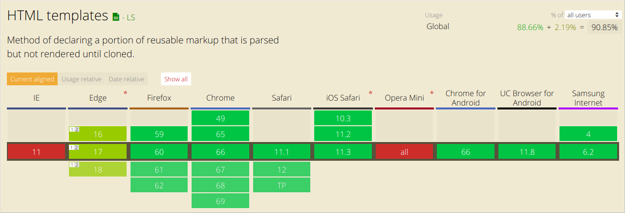
HTML templates are supported by modern browsers.
Templates are useful in and of themselves, but their capabilities are fully revealed when used with custom elements. Custom elements are a topic for a separate material, and now, to understand what is happening, it’s enough to take into account the fact that the browser API
customElementallows the programmer to describe his own HTML tags and specify how the elements created using these tags look on the screen. Define a web component that uses our template as content for its shadow DOM. Let's call this new item
<my-paragraph>:customElements.define('my-paragraph',
classextendsHTMLElement{
constructor() {
super();
let template = document.getElementById('my-paragraph');
let templateContent = template.content;
const shadowRoot = this.attachShadow({mode: 'open'}).appendChild(templateContent.cloneNode(true));
}
});The most important thing to notice here is that we have attached a clone of the template contents, made using the Node.cloneNode () method , to the shadow root.
Since we attach the contents of the template to the shadow DOM, we can include some styling information in the template in the <style> element , which will then be encapsulated into a custom element. This whole scheme will not work as expected, if instead of Shadow DOM to work with a regular DOM.
For example, the template can be further developed as follows to include information about the styles:
<templateid="my-paragraph">
  <style>
    p {
      color: white;
      background-color: #666;
      padding: 5px;
    }
  </style>
  <p>Paragraph content. </p></template>
Now the custom element we described can be used on ordinary web pages as follows:
<my-paragraph></my-paragraph>Slots
HTML templates have several drawbacks, the main one is that templates contain static markup, which, for example, does not allow displaying the contents of certain variables with their help in order to work with them the same way they work with standard HTML- patterns. This is where the tag comes in
<slot>. Slots can be perceived as placeholders, which allow you to include your own HTML-code in the template. This allows you to create generic HTML templates and then make them customizable by adding slots to them.
Let's take a look at how the above template will look using the tag
<slot>:<templateid="my-paragraph">
<p>
<slotname="my-text">Default text</slot>
</p></template>If the contents of the slot are not specified when the element is included in the markup, or if the browser does not support working with slots, the element
<my-paragraph>will include only standard content Default text. In order to specify the contents of the slot, you need to include in the element
<my-paragraph>HTML-code with an attribute slotwhose value is equivalent to the name of the slot in which you want to place this code. As before, there can be anything. For example:
<my-paragraph><spanslot="my-text">Let's have some different text!</span></my-paragraph>The elements that can be placed in slots are called Slotable elements.
Notice that in the previous example we added an element to the slot
<span>, it is the so-called slotted-element. It has an attribute slotthat is assigned a value my-text, that is, the same value that is used in the nameslot attribute described in the template. After processing the above markup by the browser, the following Flattened DOM tree will be created:
<my-paragraph>
  #shadow-root
  <p>
    <slotname="my-text">
      <spanslot="my-text">Let's have some different text!</span>
    </slot>
  </p></my-paragraph>
Pay attention to the item
#shadow-root. It is just an indicator of the existence of the Shadow DOM.Stylization
Components that use the Shadow DOM technology can be styled on a generic basis, they can define their own styles, or provide hooks in the form of custom CSS properties that allow component users to override the default styles.
▍ Styles described in components
CSS isolation is one of the most remarkable features of Shadow DOM technology. Namely, we are talking about the following:
- CSS selectors of the page on which the corresponding component is placed do not affect what it has inside.
- The styles described inside the component do not affect the page. They are isolated in the host element.
CSS selectors used inside the shadow DOM are applied locally to the contents of the component. In practice, this means the possibility of repeated use of the same identifiers and class names in different components and the absence of the need to worry about name conflicts. Simple CSS selectors also mean better performance of the solutions in which they are used.
Take a look at the element
#shadow-rootthat defines some styles:#shadow-root
<style>
#container {
background: white;
}
#container-items {
display: inline-flex;
}
</style><divid="container"></div><divid="container-items"></div>All the above styles are local to
#shadow-root. In addition, a
#shadow-roottag can be used to include external style sheets <link>. Such styles will also be local.С Pseudo-class: host
The pseudo-class
:hostallows you to access an element containing a shadow DOM tree and style this element:<style>
:host {
display: block; /* по умолчанию у пользовательских элементов это display: inline */
}
</style>Using the pseudo-class, you
:hostshould remember that the rules of the parent page have a higher priority than those set in the element using this pseudo-class. This allows users to override the styles of the host component defined in it from the outside. In addition, the pseudo-class :hostonly works in the context of the shadow root element; it cannot be used outside the shadow DOM tree. The functional form of the pseudo-class,,
:host(<selector>)allows you to access the host element if it corresponds to a given element <selector>. This is a great way to allow components to encapsulate behavior that reacts to user actions or to a change in the state of a component, and allows you to stylize internal nodes based on the host component:<style>
:host {
opacity: 0.4;
}
:host(:hover) {
opacity: 1;
}
:host([disabled]) { /* стилизация при условии наличия у хост-элемента атрибута disabled. */
background: grey;
pointer-events: none;
opacity: 0.4;
}
:host(.pink) > #tabs {
color: pink; /* задаёт цвет внутреннего узла #tabs если у хост-элемента есть class="pink". */
}
</style>▍Themes and elements with pseudo-class: host-context (<selector>)
A pseudo-class
:host-context(<selector>)corresponds to a host element if it or any of its ancestors corresponds to a given element <selector>. The usual use of this feature is to style items with themes. For example, themes are often used by assigning the appropriate class to tags
<html>or <body>:<body class="lightheme">
<custom-container>
…
</custom-container></body>A pseudo-class
:host-context(.lightheme)will apply to <fancy-tabs>in the event that this element is a descendant of .lightteme::host-context(.lightheme) {
color: black;
background: white;
}The design
:host-context()may be useful for applying themes, but for this purpose it is better to use hooks using custom CSS properties .▍Stabilize the component host element from the outside
The host element of a component can be styled externally using its tag name as a selector:
custom-container {
  color: red;
}
Outer styles have higher priority than styles defined in the shadow DOM.
Suppose a user has created the following selector:
custom-container {
  width: 500px;
}
It will override the rule specified in the component itself:
:host {
  width: 300px;
}
Using this approach, only the component itself can be styled. How to stylize the internal structure of the component? Custom CSS properties are used for this purpose.
▍Create hook styles using custom CSS properties
Users can customize the styles of the internal structures of components if the author of the component provides them with style hooks, using custom CSS properties .
The basis of this approach is a mechanism similar to the one used when working with tags
<slot>, but it is, in this case, applied to styles. Consider an example:
<!-- main page --><style>
  custom-container {
    margin-bottom: 60px;
     - custom-container-bg: black;
  }
</style><custom-containerbackground>…</custom-container>
Here is what's inside the shadow DOM tree:
:host([background]) {
  background: var( - custom-container-bg, #CECECE);
  border-radius: 10px;
  padding: 10px;
}
In this case, the component uses black as the background color, since the user specified it. Otherwise the background color will be
#CECECE. In the role of the author of the component, you are responsible for informing its users about exactly which custom CSS properties they can use. Consider this part of the open interface of your component.
JavaScript API for working with slots
The Shadow DOM API provides the ability to work with slots.
SlotSlotchange event
The event
slotchangeis triggered when nodes placed in the slot are changed. For example, if a user adds or removes child nodes to the Light DOM:var slot = this.shadowRoot.querySelector('#some_slot');
slot.addEventListener('slotchange', function(e) {
console.log('Light DOM change');
});To track other types of changes in Light DOM, you can, in the element's constructor, use
MutationObserver. Read more about it here .Assigned Method assignedNodes ()
The method
assignedNodes()can be useful if you need to know which elements are associated with the slot. Calling the method slot.assignedNodes()allows you to find out exactly which elements are displayed by the slot. Using the option {flatten: true}allows you to get the standard contents of the slot (displayed in the event that no nodes were attached to it). Consider an example:
<slotname=’slot1’><p>Default content</p></slot>Imagine that this slot is located in a component
<my-container>. Let's look at the various uses of this component, and what will be issued when the method is called
assignedNodes(). In the first case, we add our own content to the slot:
<my-container>
  <spanslot="slot1"> container text </span></my-container>
In this case, the call
assignedNodes()will return [ container text ]. Note that this value is an array of nodes. In the second case, we do not fill the slot with our own contents:
<my-container></my-container>The call
assignedNodes()will return an empty array []. If, however, pass to the method parameter
{flatten: true}, its call for the same element will give its contents, the displayed default .
In addition, in order to gain access to an element inside a slot, you can call to let you know which component slot is assigned to your element.[Default content
]assignedNodes()Event model
Talk about what happens when an event that occurs in a shadow DOM tree emerges. The purpose of the event is given by the encapsulation supported by the Shadow DOM technology. When an event is redirected, it looks as if it originates from the component itself, and not from its internal element, which is in the shadow tree of the DOM and is part of this component.
Here is a list of events that are sent from the shadow DOM tree (for some events, this behavior is not typical):
- Events focus (the Focus Events Read):
blur,focus,focusin,focusout. - Mouse events (the Event Mouse) s:
click,dblclick,mousedown,mouseenter,mousemoveand others. - Mouse wheel events (Wheel Events Read):
wheel. - Input Events:
beforeinput,input. - Keyboard Events:
keydown,keyup. - Events composition (a Composition Events Read):
compositionstart,compositionupdate,compositionend. - Drag and drop events (the Drag Events Read):
dragstart,drag,dragend,drop, and so on.
Custom events
User events by default do not leave the limits of the shadow DOM tree. If you want to trigger an event, and you want it to leave the limits of the Shadow DOM, you need to supply it with parameters
bubbles: trueand composed: true. Here is what a call to this event looks like:var container = this.shadowRoot.querySelector('#container');
container.dispatchEvent(new Event('containerchanged', {bubbles: true, composed: true}));Shadow DOM browser support
To find out if a browser supports Shadow DOM technology, you can check for availability
attachShadow:const supportsShadowDOMV1 = !!HTMLElement.prototype.attachShadow;Here is information about the support of this technology by various browsers.
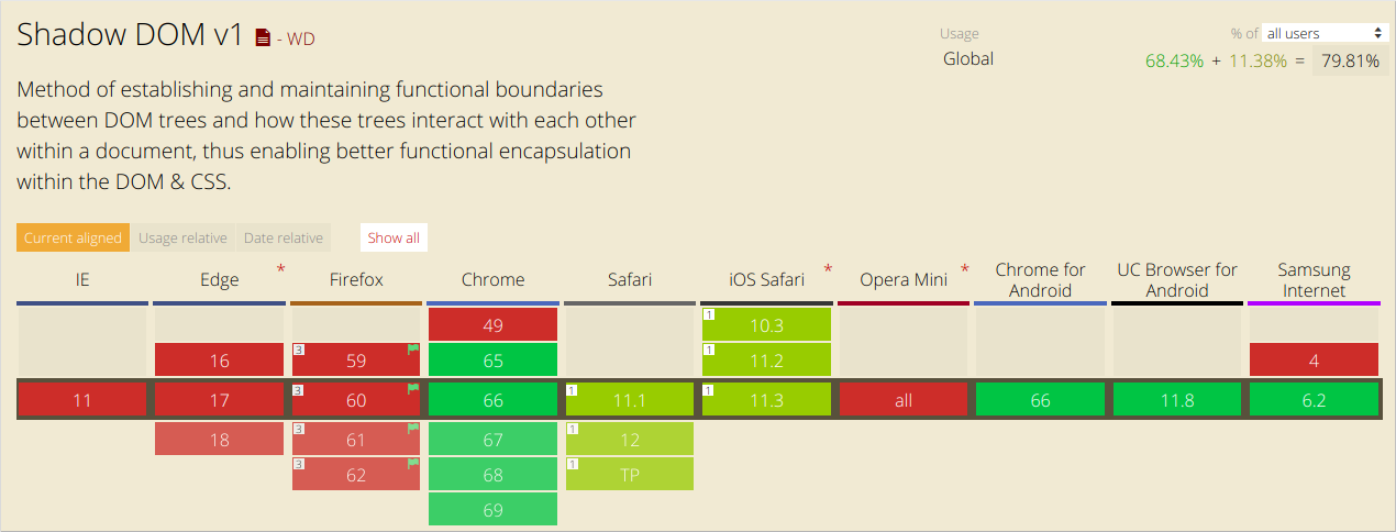
Shadow DOM technology support in browsers
Results
A shady DOM tree does not behave like a regular DOM tree. In particular, according to the author of this material, in the SessionStack library , this is reflected in the complication of the DOM change tracking procedure, the details of which are needed to reproduce what was happening with the page. Namely, for tracking changes used
MutationObserver. At the same time, the DOM shadow tree does not trigger events MutationObserverin the global scope, which necessitates the use of special approaches for working with components that use the Shadow DOM. Practice shows that more and more modern web applications use the Shadow DOM, which suggests that this technology is likely to be further developed and distributed.
Dear readers! Do you use web components based on Shadow DOM technology?
