Improving interaction with small controls via touch-interface
Reading a regular site from a phone or tablet computer with a touch-interface, I constantly miss the right links and small controls.
Touch is imperfect, and the fingertip has an area. What is happening under it is not visible. The result of the action is unpredictable until it is completed. Constantly reducing or enlarging a page is inconvenient, and styluses are what we left 5 years ago.
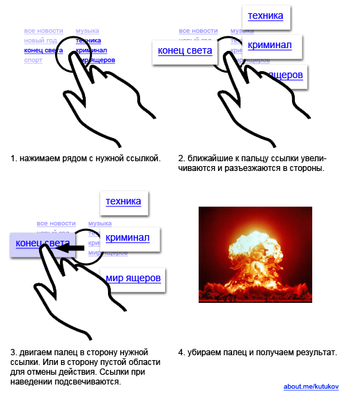
In place of the developers of mobile interfaces, I would do as follows.

The solution is based on some implementations of on-screen keyboards and quad-menus, which are present in many 3D editors.
All with the coming!
Touch is imperfect, and the fingertip has an area. What is happening under it is not visible. The result of the action is unpredictable until it is completed. Constantly reducing or enlarging a page is inconvenient, and styluses are what we left 5 years ago.
In place of the developers of mobile interfaces, I would do as follows.

The solution is based on some implementations of on-screen keyboards and quad-menus, which are present in many 3D editors.
All with the coming!
