 December 26, 2011 at 22:01
Create a lightbox effect with CSS3
- Transfer
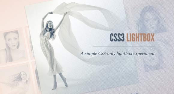
Today we want to show you how to create a lightbox effect using only CSS. The idea is to create several thumbnails, when clicked, the corresponding large image is displayed. Using CSS transitions and animations, we can make the appearance of a large image in various cute ways.
Using the: target pseudo-class, we can display images and navigate through them.
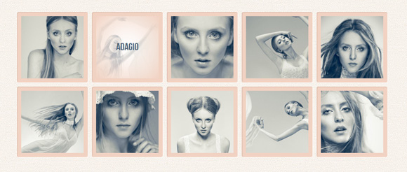
Beautiful images used in demos by Joanna Kustra , they are used under the Attribution-NonCommercial 3.0 Unported Creative Commons License .
Please note that these examples will only work in browsers that support the pseudo class : target .
So let's do it!
HTML markup
First, create a set of thumbnails, each of which has a name that will be displayed when you hover over. When you click on the thumbnail, we will show a large version of the image in a block with the lb-overlay class , which will be hidden initially. So, we will use an unordered list, where each element of the list will contain a thumbnail and a block with a corresponding large image:


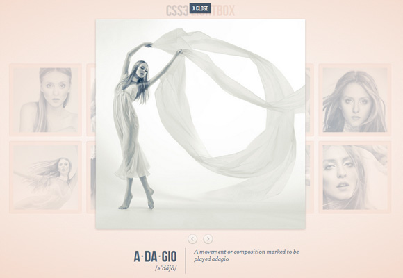
An anchor in thumbnails, for example, href = "# image-1" will point to an element with id image-1 , which is a div of the lb-overlay class . In order to navigate through the images, we will add two links that point to the previous and next (large) image.
In order to “close” the lightbox, we will simply click on the link with the lb-close class , which points to the element with the ID page , which is, in our example, the body tag.
Please note that we use navigation only in the last demo.
Now let's turn to the styles.
CSS
I will omit the prefixes of various browsers for some new properties so as not to overload the article. But they can, of course, be found in the source files.
Below are the styles of our main layer, unordered list and thumbnails:
.lb-album{
 width: 900px;
 margin: 0 auto;
 font-family: 'BebasNeueRegular', 'Arial Narrow', Arial, sans-serif;
}
.lb-album li{
 float: left;
 margin: 5px;
 position: relative;
}
.lb-album li > a,
.lb-album li > a img{
 display: block;
}
.lb-album li > a{
 width: 150px;
 height: 150px;
 position: relative;
 padding: 10px;
 background: #f1d2c2;
 box-shadow: 1px 1px 2px #fff, 1px 1px 2px rgba(158,111,86,0.3) inset;
 border-radius: 4px;
}
The name of each thumbnail will be invisible and we will add a transition for the opacity, which will become equal to 1, when we hover over the anchor of the thumbnail. We will use a smooth radial gradient as the background:
.lb-album li > a span{
 position: absolute;
 width: 150px;
 height: 150px;
 top: 10px;
 left: 10px;
 text-align: center;
 line-height: 150px;
 color: rgba(27,54,81,0.8);
 text-shadow: 0px 1px 1px rgba(255,255,255,0.6);
 font-size: 24px;
 opacity: 0;
 background:
 radial-gradient(
 center,
 ellipse cover,
 rgba(255,255,255,0.56) 0%,
 rgba(241,210,194,1) 100%
 );
 transition: opacity 0.3s linear;
}
.lb-album li > a:hover span{
 opacity: 1;
}
The overlay layer will have the same radial gradient, we will also set the position property to fixed, with zero height and width:
.lb-overlay{
 width: 0px;
 height: 0px;
 position: fixed;
 overflow: hidden;
 left: 0px;
 top: 0px;
 padding: 0px;
 z-index: 99;
 text-align: center;
 background:
 radial-gradient(
 center,
 ellipse cover,
 rgba(255,255,255,0.56) 0%,
 rgba(241,210,194,1) 100%
 );
}
As soon as we click on the thumbnail, we will open this block in full screen on top of the rest, but first, let's look at the children.
Let's define styles for the main title and description:
.lb-overlay > div{
 position: relative;
 color: rgba(27,54,81,0.8);
 width: 550px;
 height: 80px;
 margin: 40px auto 0px auto;
 text-shadow: 0px 1px 1px rgba(255,255,255,0.6);
}
.lb-overlay div h3,
.lb-overlay div p{
 padding: 0px 20px;
 width: 200px;
 height: 60px;
}
.lb-overlay div h3{
 font-size: 36px;
 float: left;
 text-align: right;
 border-right: 1px solid rgba(27,54,81,0.4);
}
.lb-overlay div h3 span,
.lb-overlay div p{
 font-size: 16px;
 font-family: Constantia, Palatino, serif;
 font-style: italic;
}
.lb-overlay div h3 span{
 display: block;
 line-height: 6px;
}
.lb-overlay div p{
 font-size: 14px;
 text-align: left;
 float: left;
 width: 260px;
}
Let's place a link to close lightbox-a just above the picture:
.lb-overlay a.lb-close{
 background: rgba(27,54,81,0.8);
 z-index: 1001;
 color: #fff;
 position: absolute;
 top: 43px;
 left: 50%;
 font-size: 15px;
 line-height: 26px;
 text-align: center;
 width: 50px;
 height: 23px;
 overflow: hidden;
 margin-left: -25px;
 opacity: 0;
 box-shadow: 0px 1px 2px rgba(0,0,0,0.3);
}
The image will have a maximum height of 100%. We will also add a transition to create translucency. As soon as we “open” the large image, transparency will be animated. Later we will see how we can use animation for the image.
.lb-overlay img{
 max-height: 100%;
 position: relative;
 opacity: 0;
 box-shadow: 0px 2px 7px rgba(0,0,0,0.2);
 transition: opacity 0.5s linear;
}
Now let's set the styles for the navigation items:
.lb-prev, .lb-next{
 text-indent: -9000px;
 position: absolute;
 top: -32px;
 width: 24px;
 height: 25px;
 left: 50%;
 opacity: 0.8;
}
.lb-prev:hover, .lb-next:hover{
 opacity: 1;
}
.lb-prev{
 margin-left: -30px;
 background: transparent url(../images/arrows.png) no-repeat top left;
}
.lb-next{
 margin-left: 6px;
 background: transparent url(../images/arrows.png) no-repeat top right;
} 
When we click on the thumbnail anchor, it will point to the corresponding large image, which is in the block with the lb-overlay class. Thus, in order to find this element, we can use the pseudo-class: target. We will add padding for lb-overlay and “stretch” it by setting the width and height of auto (this is not really necessary) and set right and bottom to 0px. Remember that we already set top and left before.
.lb-overlay:target {
 width: auto;
 height: auto;
 bottom: 0px;
 right: 0px;
 padding: 80px 100px 120px 100px;
}
Now we set the transparency for the image and the closing link to 1:
.lb-overlay:target img,
.lb-overlay:target a.lb-close{
 opacity: 1;
}
And these are all styles!
Let's also look at the other two options that we use in example 1 and example 2.
In the first example, we made the image appear using animation, changing its scale and increasing its opacity value:
.lb-overlay:target img {
 animation: fadeInScale 1.2s ease-in-out;
}
@keyframes fadeInScale {
 0% { transform: scale(0.6); opacity: 0; }
 100% { transform: scale(1); opacity: 1; }
}
In the second example, we created the opposite effect, that is, the image scale decreases:
.lb-overlay:target img {
 animation: scaleDown 1.2s ease-in-out;
}
@-webkit-keyframes scaleDown {
 0% { transform: scale(10,10); opacity: 0; }
 100% { transform: scale(1,1); opacity: 1; }
}
Demo examples
Example 1: Scale-up / fade-in animation
Example 2: Scale-down / fade-in animation
Example 3: Fade-in & navigation
As you will see, each browser works very differently when it comes to transitions / animations. By adjusting the duration, time functions and delays, you can make the effects smoother, i.e. You can change the animation time for Firefox only by changing the -moz properties.
It's all! I hope you enjoyed these examples! Mary Lou
Download Sources