 August 31, 2010 at pm
We train box-shadow
 W3C developers have made box-shadow a very flexible feature. Thanks to this, very interesting results can be obtained if this property is used in a non-trivial way. In this article I will write about some of the effects that I managed to get with the help of "shadow technology".
 While I was compiling the examples, I unexpectedly discovered that browsers display them quite differently. As a result, in addition to a simple demonstration of the box-shadow capabilities, we also got a small browser test for CSS 3 support. All examples are equipped with CSS code and a picture (the total volume of all PNGs is 161 KB). In the article, I did not prescribe properties with vendor prefixes -moz- and -webkit-, so as not to impair readability. In the summary page with all examples there are these prefixes (I warn you that Opera has a bug with drawing external box-shadow when scrolling).
Cloning (loop)
The box-shadow property allows you to create many shadows, which can be used in a very peculiar way. Below is a div element with a kind of loop (in some games, shells describe such “tails” approximately).
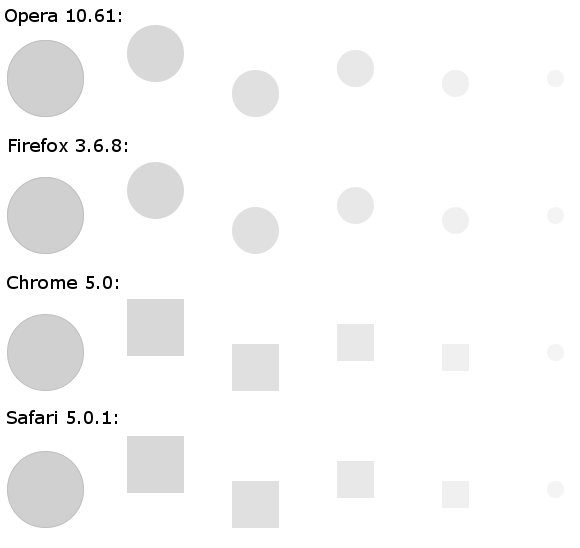
How did I get it? It just took to create a few “shadows” with different positioning and color. I remind you of the linear dimensions of the box-shadow property: indentation along the X axis (positive value to the right, negative value to the left), indentation along the Y axis, blur radius and the last - scale.
How does browser work?Opera and Firefox did not have any problems. As for webkit browsers, they seem to love playing whistleblowers. They painted “Shadows” square, exposing the true essence of the circle: a square with the maximum rounding of corners. This, of course, is interesting, but FAIL. By the way, it’s very remarkable that they nevertheless drew the very last “shadow” round (if you don’t see it at all, then it's time to deal with the gamut of your monitor).
#trail {
	background: #d0d0d0;
	border: 1px solid #c0c0c0;
	border-radius: 40px;
	box-shadow: #d8d8d8 110px -25px 0 -10px,
	            #e0e0e0 210px  15px 0 -15px,
	            #e8e8e8 310px -10px 0 -20px,
	            #f0f0f0 410px   5px 0 -25px,
	            #f4f4f4 510px   0px 0 -30px;
	height: 75px;
	margin: 20px;
	width: 75px;
	}
Glow
Any shadow that can be painted in a bright color and greatly blurred can be used for the glow effect. Since CSS box-shadow allows, why not use it?
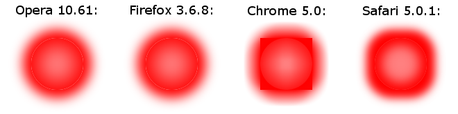
How did I get it? I filled the circle (square) with light red color and let out 2 red blurry “shadows”: one inside, the other outside. Thus, I got a glow effect, in which the central part seems brighter. In any case, stars usually draw like that.
How does browser work? No browser has done this perfectly. Opera and Firefox (as well as Safari, but not so pronounced) for some reason came out with a thin light stroke around the element. The higher the gamma of the monitor, the more noticeable it is.
#glow {
	background: #ff8080;
	border-radius: 40px;
	box-shadow: inset #ff0000 0 0 40px 10px,
	                  #ff0000 0 0 24px 12px;
	height: 75px;
	margin: 45px;
	width: 75px;
	}
Multiple border
You may sometimes need to use two or more lines around an element. Outline will give only one additional, and not all browsers will round it. Border-style has limited fantasy. In this case, box-shadow will help. This example depicts a treadmill.
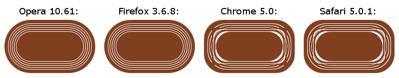
How did I get it? It is necessary to apply a few "shadows" in a row with different scales (sizes). For brown tracks, I zoomed in by 3 pixels compared to the previous shadow (well, or frame). For the white line - one pixel. It must be remembered that the deeper layers should be the last in the list, since the order matters).
How does browser work?Opera and Firefox rendered almost identically. But Chrome and Safari showed something hypnotic. Here, by the way, you can find the reason for the insufficiently rounded “shadow” in the previous example (glow). Turns Webkit-s does not increase and does not reduce the border-radius for shade proportion to the increase / decrease of the shade itself. Annoying jamb.
#multi-border {
	background: #804020;
	border: 1px solid #ffffff;
	border-radius: 40px;
	box-shadow:
	/* линии внутри */
	inset #804020 0 0 0  3px,
	inset #ffffff 0 0 0  4px,
	inset #804020 0 0 0  7px,
	inset #ffffff 0 0 0  8px,
	/* линии снаружи */
	      #804020 0 0 0  3px,
	      #ffffff 0 0 0  4px,
	      #804020 0 0 0  7px,
	      #ffffff 0 0 0  8px,
	      #804020 0 0 0 15px;
	height: 75px;
	margin: 35px;
	width: 150px;
	}
Volume effect (bulge)
With the help of box-shadow, you can make a good volume element. Many people are abusing pseudo-volume graphics today, but in this article we are not talking about the design rules of good form.
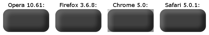
How did I get it? It was required to create two internal “shadows”: one light, the other dark. Light - with a shift to the right down, dark - to the left up. In this case, light and dark "shadows" should be created using translucency of white and black colors. Due to the translucency (if the alpha channels are correctly adjusted), the confluence points of the dark and light “shadows” acquire a color close to the color of the background. Otherwise, one of the “shadows” will prevail, which will reduce realism. If in the example, the blurring of “shadows” is canceled, then it will be easier to understand how the code works.
How does browser work?Let's assume that Opera, Firefox, and Safari draw the same volume rectangle the same way. As for Chrome, here we find the reason for some shoals in the previous examples: internal “shadows” always creep out of the border-radius.
#embossment {
	background: #404040;
	border-radius: 20px;
	box-shadow: inset rgba(255,255,255,0.2) 8px  8px 18px 5px,
	            inset rgba(0,0,0,0.5)      -8px -8px 18px 5px;
	height: 75px;
	margin: 20px;
	width: 150px;
	}
Gradient
Insanity grows stronger. Now draw a rainbow gradient using box-shadow. In general, gradients are provided in the W3C draft , but Opera does not yet support them. So the practical benefit in this, oddly enough, is.
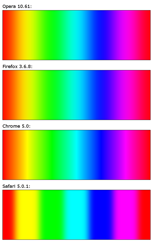
How did I get it?First, the rectangle filled with a red background. Then, in turn, I applied “shadows” of the necessary colors (for convenience, first without blurring): yellow, green, blue, blue, purple, red again. Each subsequent color had to be higher in depth and shifted to the right so that the previous color was visible. Then I applied blur: the radius should match the length of the color in the gradient. As soon as I saw the result, I remembered that the blurring goes in all directions, and not just on the sides, because of which the upper and lower parts of the entire gradient let a red background through. To get rid of this effect, I had to increase all the “shadows” and then shift them to the right by the same amount to compensate for the change in size. For control, checked without blur. Done.
How does browser work?Opera and Firefox again showed an identical result to the eye. Chrome showed richer color in places of minimal blurring of shadows. I will not venture to say who did the right thing. It seems that the truth lies in the middle. Safari blunted the “shadows” very weakly, so the gradient came out clearly wrong. All browsers, except Chrome, slowed down while scrolling to the right block with a gradient. Safari slowed down incomparably enchanting.
#gradient {
	background: #ff0000;
	border: 1px solid #000000;
	box-shadow: inset #FF0000 -150px 0 100px -100px,
	            inset #FF00FF -250px 0 100px -100px,
	            inset #0000FF -350px 0 100px -100px,
	            inset #00FFFF -450px 0 100px -100px,
	            inset #00FF00 -550px 0 100px -100px,
	            inset #FFFF00 -650px 0 100px -100px;
	height: 200px;
	margin: 20px;
	width: 600px;
	}
Flame!
Well, now the apotheosis of free-coding: fire with box-shadow! I probably killed him about 2 hours, because I constantly had to redo it. In this example, a burning match is shown, which is parallel to the ground and turned its head towards the viewer. It turned out, of course, not too believable. But this is a flame in CSS!
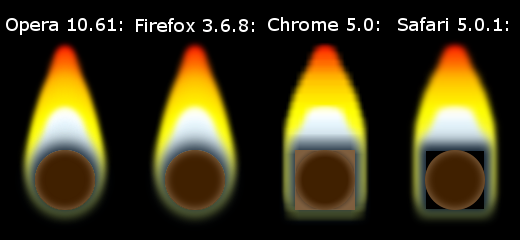
How did I get it? No comment, see the code immediately :)
How does the browser work? Opera and Firefox have minimal differences. Safari's "shadows" are again too square, so the flame came out wider. Behind the head of the match is some strange black square. Chrome also made the fire too wide, but in addition, the blur was also very rough.
#black-background {background: #000000;}
#burning {
	background: #402000;
	border-radius: 40px;
	box-shadow:
	/* головка */
	inset #806040 0 0 10px 2px,
	/* прозрачно-голубо-белая часть */
	#102030 0px    0px 20px   6px,
	#c8d8e0 0px  -10px 17px   4px,
	#d8e8f0 0px  -20px 15px  -2px,
	#e0f0f8 0px  -30px 14px  -6px,
	#e8f8ff 0px  -40px 12px  -9px,
	#ffffff 0px  -50px 10px -12px,
	#ffffe0 0px  -55px 10px -14px,
	#ffffc0 0px  -60px 10px -20px,
	#ffffa0 0px  -62px 10px -22px,
	#ffff80 0px  -64px 10px -24px,
	/* желто-красная часть */
	#ffff40 0px    0px 15px   4px,
	#ffff30 0px  -10px 13px   6px,
	#ffff20 0px  -20px 12px   8px,
	#ffff10 0px  -30px 11px   6px,
	#ffff00 0px  -40px 10px   4px,
	#fff000 0px  -50px 10px   2px,
	#ffe000 0px  -60px 10px   0px,
	#ffd000 0px  -70px 10px  -4px,
	#ffc000 0px  -80px 10px  -6px,
	#ffa000 0px  -90px 10px -10px,
	#ff8000 0px -100px 10px -14px,
	#ff6000 0px -110px 10px -16px,
	#ff4000 0px -120px 10px -20px,
	#ff2000 0px -124px 10px -22px,
	#ff0000 0px -127px 10px -24px;
	height: 60px;
	margin: 125px 35px 30px 35px;
	width: 60px;
	}
UPD: From the kindly provided screenshot from IE9 PP4 , we can say that the new IE is pretty good.