Design PI: Learning from the mistakes of others
Briefly about the series of articles
With this article, I begin the series of articles “Design PI”. They will be useful to those who care about what their applications look like, how they behave in relation to the user - thinking designers, programmers, designers and those who want to make this world a little better :)
Foreword to the cycle
Have you ever thought about why some software products with good (if not more) functionality and quality are not successful, while others, on the contrary, are snapped up? The reason for this paradox is often a simple fact - most often this happens because the first software products lose to the second as a user interface and usability. The most striking example is the Google Chrome browser and all other browsers. Not so much time has passed since his birth - this is the “youngest” of all browsers - but this does not prevent him from firmly holding the third line of the “browser parade” and confidently pushing off the Mozilla Foundation brainchild from the “honorable” second place. This success is very easy to explain - from the moment the browser was released, it aimed at maximum ease of use, a minimum of settings (although now their number is growing steadily) and maximum user friendliness. And of course, Google’s engineers studied the browser market for a long time in order to understand what exactly the users of other browsers lack in terms of usability and user interface - and the browser “shot”. He continues to confidently lure users,
Zhuzhu answered with a mockery, - I will show you an advertisement!
Let's move from spherical horses to square blocks and look at an example of poor design in practice. Today we will be preparing a form for creating a new entry in LiveJournal ( I hope everyone understands what I mean ). Of course, the example is synthetic, because there are many other ways to create a post in LiveJournal, but still I would like to parse this example, since it contains a lot of design errors and violations of usability rules. Here is the original form that we have to work on: The
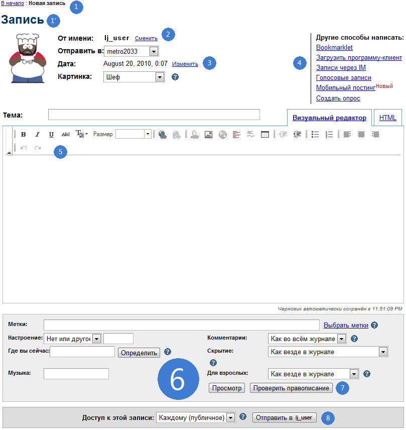
numbers indicate problem areas. Let's analyze them and write them in a list. So, in order:
1) A control that behaves like a navigation chain ( "Breadcrumbs" ), in fact, it is not, because in almost any mode it appends to the beginning of the chain only one link, which always leads to the main page. Moreover, the presence of this degenerate case of the navigation chain is not clear if the main menu is available in the new record creation mode ( the “New record” item is in the “Log” menu ):

1 ') Duplication of information. The meaning of using this design element is generally unclear.
2) Violation of the integrity of perception, violation of scenarios for using the site, duplication of actions. The appearance of such controls in similar places ( creating a new record) is generally unacceptable. They disorient the user and, in general, pose a risk of changing the current working context of the user. Want to write a post under another user? Follow a typical scenario - Logout -> Log in as a different user -> New entry. It is possible that there was a slight denormalization of the user interface by LJ developers who wanted to make life easier for users with multiple accounts. Even if creating a new record under another user from under the current one does not change the global working context ( does not lead to an actual user change) Is still the wrong decision. Since having solved this denormalization problem, the developers got a “sprawling" user interface with duplicate actions and scripts.
3) Bicycle with square wheels. To date, there is an uncountable set of implementations of the Select Date and Time for Web controls . By the way, when you click on the link to change this element changes its appearance:
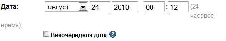
And if the user needs to select a different date and at the same time look at what day of the week it falls out? In general - no comment.
4) The block of links falling out of context. The situation is aggravated by the fact that almost all actions in the link block, except Create a pollchange the current context of the user. The last action is worth discussing in more detail. In fact, this is generally a different editing mode . And this mode is available from the mode of creating a new record and nowhere else ( correct me if this is not so ). This is just a powerful blow to usability - in order to create a survey, you must first create a new record.
5) Incomprehensible indents for the built-in editor. The editor is built into the workspace with incomprehensible indents that violate the integrity of perception and spoil the appearance. In addition, they are the reason that the Undo and Redo actions in the toolbar of the message editor “left” on the following line:

It also raises questionsexpander to the left of the toolbar. Why is he? A minimized toolbar will not save much space and this element introduces only visual noise.
6) Just a disgusting layout of the additional information block. No comment - I think this is obvious.
7) Buttons that are out of context of this panel. It would be logical to group these buttons with the Send button , since they are included in the group of actions on the record (post).
8) Duplication of information, redundancy, loss of the element. Access to this entry from the context of the panel. Control Access this entrycontains redundant information in the label - and so it is clear that we are currently editing only one ( this ) record. There is no need to duplicate this information ( maybe this is a translation difficulty? ).
Roll up your sleeves ...
Can this form be fixed? Of course, you can - because what one broke can fix the other. So, we will help LJ guys to make this world a little better. Here's what the form for creating a new record might look like:
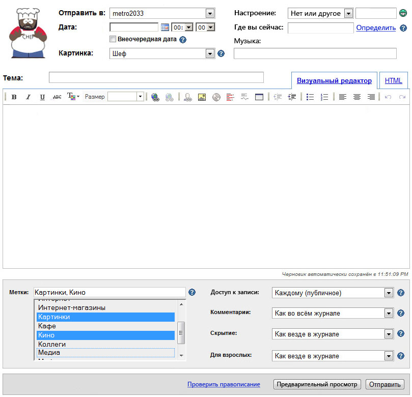
Advantages of this solution:
1) Fixed date / time selection control . It has been replaced by a more convenient and familiar user control.
2) The Extraordinary date control has become available not only in the date editing mode. It’s very bad to hide controls from users. They should always be visible but may not be available . Moreover, it is desirable to somehow explain to the user why he does not have access to the locked control.
3) Controls Mood , Where are you now , Music is grouped more logically - in the heading, next to other main parameters of the post.
4) Removed from the heading an unnecessary item On behalf , since it poses a threat of changing the user context.
5) More convenient label editing editor. It should be noted that I did not come up with anything - I just took this editor from another form - the label editing form .
6) Recording controls Check spelling , Preview and Send are grouped in one panel, which looks more logical than in the original version. Action Check spellingdesigned in the form of a link so as not to burden a too visual series of actions, and also because it is rather an auxiliary and optional action, having a weight much less than the other two actions.
7) The built-in editor looks more attractive due to the fact that all the buttons of the tools fit on one panel and removed the expander, which served only as a source of visual noise.
8) The shape has become a little smaller in height and due to this it now fits perfectly on the monitor screen with a resolution of 1280x1024. If desired, it can be reduced so that it fits entirely on the monitor with a resolution of 1440x900 - by reducing the height of the editor and the panel in which the tag editor is located.
9) The user interface is slightly improved.
The disadvantages of this solution:
1) The controversial alignment of the Music control. It is very welcome if someone can offer a more beautiful solution. I did this only because I tried to avoid voids in the title. I believe that this heading is just the case when the rule “do not be afraid of empty spaces” does not work
2) It was not possible to lower the density of information flow - the form still looks like a mess. It just looks like a little orderly porridge now :)
Afterword
Do not be afraid to experiment with design, color and content. If you feel that you have done something that does not meet your expectations - do not be lazy to remake, improve. Move iteratively - never try to be one step ahead of yourself. Anyway, the understanding of how to do better ( or that it is worth stopping there, because the deadlines are already running out ) comes from the realization of the imperfection of the current step.