Interface: analog versus numbers
Judging by the comments on the topic about the organization of the Moscow United Energy Center, there are many doubts whether it is possible to fully replace conventional devices with their virtual counterparts. I will try to consider this issue.
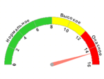
Here is an example of an analog device:

What are its advantages:
It is very convenient to monitor the dynamics of a parameter change. And in this form it is very convenient to monitor whether the parameter has gone beyond the permissible zone:

There is one drawback - it is inconvenient to take accurate readings. To do this, the device in the first image has digital indicators.
Everything is fine, while there are not many such devices, but try to monitor a dozen readings at the same time?
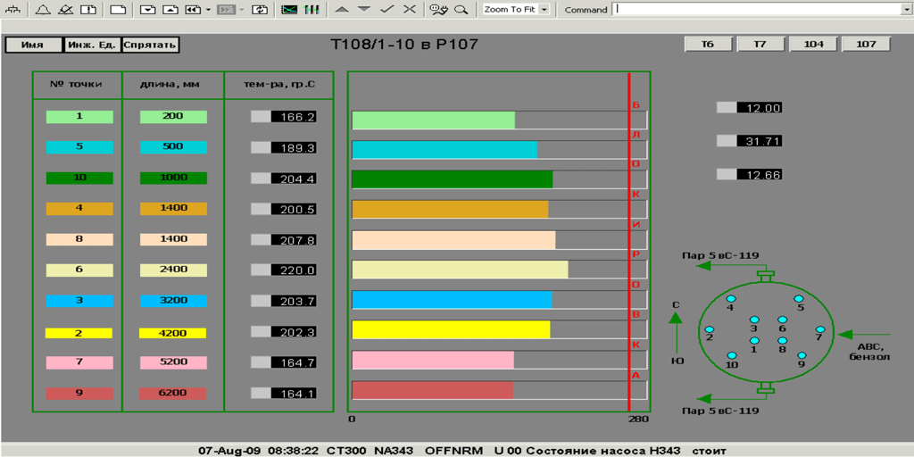
I will give an example of how this problem is solved: The

temperature reading is visible, and with the help of horizontal stripes it is possible to monitor whether the parameter has exceeded the permissible limits. they can also be used to judge the degree of heating at different elevations.
what happens when the parameter reaches critical values:
Now compare yourself what is more convenient: ten instruments with scales, or one such circuit.
UPD a few clarifications:
Such color coding was undertaken according to the urgent requirements of technologists and operators. It’s more convenient for them. Initially, all the stripes were the same, and changed their color depending on the temperature. I use this option everywhere. If there are suggestions, I’m discussing with people who will work with this.
The point changes color to red when it reaches a critical temperature.
For example, for 3 parameters:
You can place a trend on the diagram (a graph where it will be shown how the parameters behave over time, but this is more suitable for expenses). Perhaps I would limit myself to three gifts. it all depends on what these parameters are and how they are interconnected.
I won’t be boring for a long time, just compare what is more convenient:
Analogue:

Number:

 VS
VS 
Until now, no one can give a definite answer. Usually, buttons and toggle switches are used at key positions, or in cases where you need to click a few switches very quickly, and it is not known in advance in which order to press them. An example is an airplane. In modern aircraft, the display is almost completely digital, and the controls are buttons and toggle switches.
UPD What is this post for? By type of activity, I have to create a convenient interface so that the operator can focus on work, and not on searching for “this damned button”. I wanted to show an example of competent visualization of the process technology. But how to do it right and how it's not worth it, the topic is not an article, but for a separate book.
The form for submitting information should correspond to the tasks of reading readings, and also eliminate the need for complex quantitative and logical transformations.
Indicator devices
Here is an example of an analog device:

What are its advantages:
It is very convenient to monitor the dynamics of a parameter change. And in this form it is very convenient to monitor whether the parameter has gone beyond the permissible zone:

There is one drawback - it is inconvenient to take accurate readings. To do this, the device in the first image has digital indicators.
Everything is fine, while there are not many such devices, but try to monitor a dozen readings at the same time?
I will give an example of how this problem is solved: The

temperature reading is visible, and with the help of horizontal stripes it is possible to monitor whether the parameter has exceeded the permissible limits. they can also be used to judge the degree of heating at different elevations.
what happens when the parameter reaches critical values:
- The color of the strip changes;
- An alarm goes off (in the figure, the operator is informed that the pump H343 has stopped);
- One of the buttons lights up in red, when clicked, the operator will be taken to another mimic, where he can take actions to prevent an accident.
Now compare yourself what is more convenient: ten instruments with scales, or one such circuit.
UPD a few clarifications:
Where did this color coding come from?
Such color coding was undertaken according to the urgent requirements of technologists and operators. It’s more convenient for them. Initially, all the stripes were the same, and changed their color depending on the temperature. I use this option everywhere. If there are suggestions, I’m discussing with people who will work with this.
Why is this encoding not duplicated in the diagram in the right corner? There are dots all the same color ...
The point changes color to red when it reaches a critical temperature.
And what would happen if the number of points was less?
For example, for 3 parameters:
You can place a trend on the diagram (a graph where it will be shown how the parameters behave over time, but this is more suitable for expenses). Perhaps I would limit myself to three gifts. it all depends on what these parameters are and how they are interconnected.
Registrars
I won’t be boring for a long time, just compare what is more convenient:
Analogue:

Number:

Big red button
 VS
VS 
Until now, no one can give a definite answer. Usually, buttons and toggle switches are used at key positions, or in cases where you need to click a few switches very quickly, and it is not known in advance in which order to press them. An example is an airplane. In modern aircraft, the display is almost completely digital, and the controls are buttons and toggle switches.
UPD What is this post for? By type of activity, I have to create a convenient interface so that the operator can focus on work, and not on searching for “this damned button”. I wanted to show an example of competent visualization of the process technology. But how to do it right and how it's not worth it, the topic is not an article, but for a separate book.
