Modality Outside Dialog Boxes
- Transfer
Article written by jagoterr . If this article gets +50, then the author will receive an invite to Habrahabr.
Aza recently published a note on modal overlays (Here and hereinafter, we use just such a translation of the word overlay, least “Russian”, but without distorting the essence of this concept) . About those same dialog boxes that suddenly pop up and block what is behind them. You are completely free in your actions within the framework of a modal window, but you cannot use a single element “blocked” by it until this window disappears.
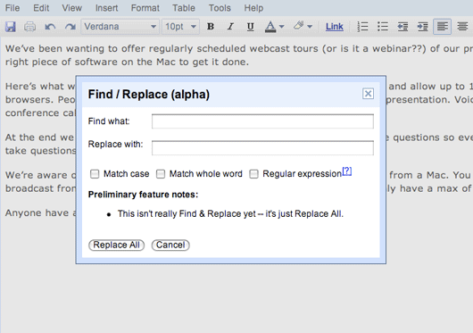
Usually, when we talk about modal windows, we are talking specifically about dialogs, such as in the following snippet of the Google Documents application. The criticism of Aza refers precisely to modal windows of this kind. After you have opened the search / replace dialog, you cannot click anywhere except inside this dialog. This means that you cannot scroll through the document under the dialog, or copy a word from the document and paste it into the search bar without closing the dialog.
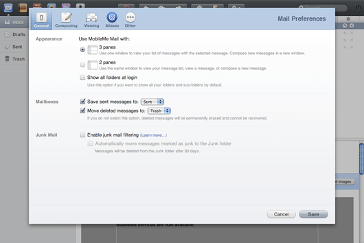
But this is not the only type of modal windows. Take a look at this settings panel from Apple’s me.com. There is nothing here that could require working with the main content that it overlaps. It might as well have been a completely separate screen.
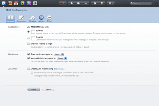
Generally speaking, it was the fact that it could be a separate screen that interested me. In 37 (the short name of the company 37signals , - approx. Per.) We never use modal windows. The settings panel is always an absolutely independent application screen. To study the difference between the two approaches, I mocked up an alternative version of Apple’s settings panel, which uses the entire screen space, as it would in any typical web application. It is interesting to compare these two versions. I must admit, I like the modal option much more. On the one hand, its significance is more tangible visually. On the other hand, it leads to interesting thoughts about navigation.
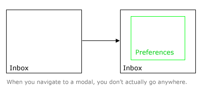
There are two questions that most often revolve in our minds when working with software - “where am I?” And “how do I get back?”. There are many tricks to simplify the care of this: tabs, “Cancel” buttons, etc. Why do not we think of modal windows as a means of solving the same problems? This mechanism extremely smooths out these annoying questions. The question “where am I?” Simply does not arise, because you are not leaving the main screen. And the answer to the question “how to return back?” Is simply obvious, since the main screen always remains visible in the background.
Another aspect of the modal settings panel, which I frankly like, is that this panel does not look equivalent to other screens. You feel that she did not deserve her own browser window due to her lesser importance.
When we develop the interface of a specific application screen, we always try to highlight the most important and frequently used elements and make them larger, compared to elements that are rarely used. It is a good rule to perceive elements of the same size in the same context as equivalent. Apple's settings panel uses the same principle at the screen level as a whole. The settings panel screen itself is smaller than the browser window, which contains more important application screens filled with real data.
While Aza's criticism is still valid for modal windows such as the above example from Google docs, me.com clearly demonstrates that modal overlays have a right to exist as an alternative to the principle of navigation between independent screens. It is also very interesting to speculate on which screens actually deserve a full separate browser window, and which of them should be displayed as sublevels of other screens. I can assume that when people praise applications for their “desktop”, this lack of navigation between individual screens gives rise to many criticisms. Apple has shown the ability to incorporate “desktop” principles into web applications without turning into the full equivalent of “desktop” systems. It would be very funny to find out where other designers draw their inspiration from.
I’ll add from myself that the author still has interesting translations, and another good article is being prepared that I would gladly see on the pages of Habr.
Aza recently published a note on modal overlays (Here and hereinafter, we use just such a translation of the word overlay, least “Russian”, but without distorting the essence of this concept) . About those same dialog boxes that suddenly pop up and block what is behind them. You are completely free in your actions within the framework of a modal window, but you cannot use a single element “blocked” by it until this window disappears.
Usually, when we talk about modal windows, we are talking specifically about dialogs, such as in the following snippet of the Google Documents application. The criticism of Aza refers precisely to modal windows of this kind. After you have opened the search / replace dialog, you cannot click anywhere except inside this dialog. This means that you cannot scroll through the document under the dialog, or copy a word from the document and paste it into the search bar without closing the dialog.

But this is not the only type of modal windows. Take a look at this settings panel from Apple’s me.com. There is nothing here that could require working with the main content that it overlaps. It might as well have been a completely separate screen.

Generally speaking, it was the fact that it could be a separate screen that interested me. In 37 (the short name of the company 37signals , - approx. Per.) We never use modal windows. The settings panel is always an absolutely independent application screen. To study the difference between the two approaches, I mocked up an alternative version of Apple’s settings panel, which uses the entire screen space, as it would in any typical web application. It is interesting to compare these two versions. I must admit, I like the modal option much more. On the one hand, its significance is more tangible visually. On the other hand, it leads to interesting thoughts about navigation.

Modal windows as an alternative to navigation
There are two questions that most often revolve in our minds when working with software - “where am I?” And “how do I get back?”. There are many tricks to simplify the care of this: tabs, “Cancel” buttons, etc. Why do not we think of modal windows as a means of solving the same problems? This mechanism extremely smooths out these annoying questions. The question “where am I?” Simply does not arise, because you are not leaving the main screen. And the answer to the question “how to return back?” Is simply obvious, since the main screen always remains visible in the background.

Screen size as a reflection of importance
Another aspect of the modal settings panel, which I frankly like, is that this panel does not look equivalent to other screens. You feel that she did not deserve her own browser window due to her lesser importance.
When we develop the interface of a specific application screen, we always try to highlight the most important and frequently used elements and make them larger, compared to elements that are rarely used. It is a good rule to perceive elements of the same size in the same context as equivalent. Apple's settings panel uses the same principle at the screen level as a whole. The settings panel screen itself is smaller than the browser window, which contains more important application screens filled with real data.
Not all modal windows are bad
While Aza's criticism is still valid for modal windows such as the above example from Google docs, me.com clearly demonstrates that modal overlays have a right to exist as an alternative to the principle of navigation between independent screens. It is also very interesting to speculate on which screens actually deserve a full separate browser window, and which of them should be displayed as sublevels of other screens. I can assume that when people praise applications for their “desktop”, this lack of navigation between individual screens gives rise to many criticisms. Apple has shown the ability to incorporate “desktop” principles into web applications without turning into the full equivalent of “desktop” systems. It would be very funny to find out where other designers draw their inspiration from.
I’ll add from myself that the author still has interesting translations, and another good article is being prepared that I would gladly see on the pages of Habr.
