Web typography today. Part I
Part I - Part II - Part III - Part IV - Part V - Part VI
Once, a familiar designer turned to me with a request to understand a strange situation in his opinion. The client asked "to do the same as Apple", but using their own methods for arranging blocks, images, colors and text. In general, the design in the end turned out to be completely different from apple.com, but this, in fact, was achieved by the client. And it seems that the designer succeeded, but ... The client still did not like it, he still required to redo the layout. In his opinion, “something was not at all right.” And what exactly - he could not explain. So a question arose from my colleague about how to please the whims of the client and understand his aspirations. It turned out to be not so simple, but understandable. I have encountered this problem before. Therefore, I decided to try to express my thoughts on this matter.
So, what is the situation in the field of modern web typography and in what ways should you solve the problems that arise?
And they, these problems, lie in the use of standard fonts for typesetting text on the site. Which, by the way, as a rule, practically no one even thinks about.
But let's look at this whole situation from the very beginning.
So, at the very dawn of the web, the HTML language did not imply a change in the type of headset, and the size could be set relative to a certain average value in just a few gradations (more or less).
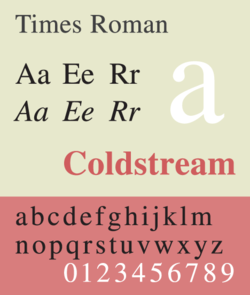 As a standard font, as a rule, a serif font was used ( Times), and a large enough size so that the text on the monitors of that time was easy to read with very low resolution and strong distortion due to the convexity of the screen surface. In different operating systems, this font was implemented in different ways.
Personally, it seems to me that the version of Microsoft called Times New Roman , which was included in the Windows operating systems (and still is), turned out to be the worst, since the small text (in the HTML tag and even more so) turned out to be almost unreadable.
 In the absence of anti-aliasing (screen anti-aliasing algorithm) serif serifs in letters stuck together in some unimaginable mess, and it was almost impossible to make out anything. And in large sizes (and above) the font looked very ugly. Italic and bold faces in the headset did not differ in special grace. Things were a little better on Unix and MacOS systems. The best option seemed to be the implementation in the now abandoned BeOS system, but here, most likely, the presence of font smoothing affected. And today, where Times New Roman is used , it often turns out something completely unimaginable.
 However, the browsers of that time made it possible to forcibly select any headset installed in the system as the default font. In Windows it was possible to use besides antiquanThe Times grotesque font Arial (to a certain extent - not the most successful alteration of the legendary Helvetica ), the monospaced Courier and the semi- scripted mocking ComicSans .
  And if Courier turned out to be a very good option for displaying program code (this font is still a favorite in the programming environment and is used by default in most modern programming environments), then Arial only slightly improved the situation compared to Times New Roman . Unix systems used the Helvetica font(more or less close to the original font from Linotype). And users of Apple products in use was a Geneva headset .
With the development of the HTML language in the mid-90s, it became possible to set not only the size, but also a specific headset using a parameter. This entailed, well, not just a revolution, but certainly a universal enthusiasm for the violent use of a particular font. However, designers who began to write something like quickly discovered that all the alleged prettiness is realized only on their own computers, while the vast majority of website visitors see everything completely differently. In the absence of the specified font, the default headset is used, and the site carefully drawn in the table layout crumbles in the form of some ridiculous heap of scattered blocks.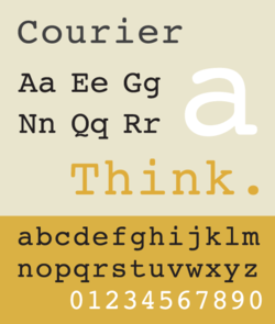 Corrections were made to the HTML specification, thanks to which it became possible to specify several fonts and a unifying family in case there was no particular font in the system. For example, you could write this: and be sure that on different computers the text block you need will look more or less the same, since all of these fonts are included in the standard configurations of the most popular operating systems, and if for some reason there isn’t such a font , the browser should use any default font from the grotesque family (sans-serif). In total, seven such families were supposed: monospaced (monospace fonts for displaying program code, for example: Courier ), serif(serif fonts, for example: Times ), sans-serif ( sans serif grotesque fonts, for example: Arial, Geneva ), cursive (handwritten fonts, for example: ZapfChancery ), fantasy (decorative fonts, for example: ComicSans ), symbol (fonts for certain characters, for example: ZapfDingbats ) and the special class other (all other fonts, for example: technogenic, grunge, gothic, etc.). All families could be customized for specific cases. For example, instead of Courier, assign MonoCondensed, and then everything that is supposed to be displayed in a monospaced font will be done using MonoCondensed .
To top it off, already in HTML 4.0 with the development of style sheets, it became possible to indicate font size not only in relative but also in absolute values using various units. And if, to a certain extent, the pt (points), em (uh) and % values, depending on the screen resolution and other factors , nevertheless assumed some relative manipulations with the size of the texts, then the toughest px (pixel) unit left no alternatives: how prescribed designer, and have to read.

At the turn of the century, pixel graphics and minimal font sizes bordering on illegibility came into fashion. Therefore, it was quite possible to meet a design like. And no matter how an ordinary visitor to a site with an average type of vision tried to increase the font in the browser, he still had to read through the small size typed in a tiny size of 9 pixels. On older monitors with a resolution of 800x600, this looked even more or less tolerable, but on more modern displays with resolutions of 1024x768 and higher, it was extremely difficult to read such things. By the way, this is probably why many sites popular in those years with minimized graphics and tiny fonts are now mostly dead or live the last days:

 In 1996, new system fonts Verdana, Tahoma and Georgia were developed and included with Windows.
Over time, these fonts are included in all modern operating systems. Not the last role in this was played by the sharply increased popularity of these fonts among web developers.
Almost all the "fashionable" sites of the late 90s and early 2000s were created exclusively with the help of Tahoma or Verdana . The use of the "obsolete" Arial was perceived as amateurism and old-fashioned. Indeed, in small pins (even up to 10 pins or even 9 pins), these headsets were read much better, although in large sizes Arial still looked better. Over time, Verdana and Tahoma have been criticized more than once by designers. It turned out thatVerdana doesn’t display some characters correctly, the font has too heavy bold typeface and not very pleasant italics. But Tahoma did not have italics at all, often the letters stuck together, which made it difficult to read the text, and in large pins the bold style did not look quite bold. In addition, both fonts looked far from ideal on print. However, these have not in the least reduced the popularity of these two fonts in the camp of web designers so far.
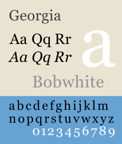
The Georgia headset (developed by Mattew Carter in 1993) turned out to be much more successful and served as an excellent replacement for the unpretentious Times New Roman .
The font looked more organically, rounded and better perceived on the screen. The font has a very successful implementation of italics and bold style. Today, if it is planned to create a site in the canons of classical typography, in the spirit of layout of strict business publications, just the Georgia headset is used, which looks equally good both in small and large pins, on monitors with any resolution, as well as with smoothing, and without it. However, this font also has its drawbacks. For example, a rather archaic “jumping” manner of performing numbers (minuscule numbers - some are displayed in size with letters, others protrude strongly down or up from the baseline) may seem unusual and stylish to some, but for the most part they cause some difficulties for the ordinary site reader. Georgia , being a serial font, is not well perceived when writing "inversion" (ie, light in dark). And due to its roundness, the font is much less compact than the notorious Times : on one screen page withGeorgia contains much less information than with other fonts, which is not very beneficial for various portals and online stores. Georgia has gained the most popularity today on blogs and social networks , where compactness and maximum informativeness are not so important, as well as convenience for unhurried reading, accuracy and unobtrusiveness - the design should in no way dominate the content.
With the further development of the HTML language and CSS specifications, more and more possibilities appeared for organizing content without involving bulky structures and rigid definitions of font size. At the same time, it was still possible to flexibly control the typography on the page. What professional designers immediately began to use, more and more rarely resorting to the implementation of images to display text headings and headings. Over time, the stereotypes that only sans-serif fonts are suitable for reading from the screen have collapsed, while in print, as antiturn fonts in magazines and newspapers, only antiqued headsets like Times are used . In many ways, two important factors play a decisive role.
But we will talk about these factors, trends and problems (as well as much more, including methods for resolving some issues, the subtleties and tricks of web typography) in the next part of this story.
To be continued...
Part I
Once, a familiar designer turned to me with a request to understand a strange situation in his opinion. The client asked "to do the same as Apple", but using their own methods for arranging blocks, images, colors and text. In general, the design in the end turned out to be completely different from apple.com, but this, in fact, was achieved by the client. And it seems that the designer succeeded, but ... The client still did not like it, he still required to redo the layout. In his opinion, “something was not at all right.” And what exactly - he could not explain. So a question arose from my colleague about how to please the whims of the client and understand his aspirations. It turned out to be not so simple, but understandable. I have encountered this problem before. Therefore, I decided to try to express my thoughts on this matter.
So, what is the situation in the field of modern web typography and in what ways should you solve the problems that arise?
And they, these problems, lie in the use of standard fonts for typesetting text on the site. Which, by the way, as a rule, practically no one even thinks about.
But let's look at this whole situation from the very beginning.
So, at the very dawn of the web, the HTML language did not imply a change in the type of headset, and the size could be set relative to a certain average value in just a few gradations (more or less).
As a standard font, as a rule, a serif font was used ( Times), and a large enough size so that the text on the monitors of that time was easy to read with very low resolution and strong distortion due to the convexity of the screen surface. In different operating systems, this font was implemented in different ways. Personally, it seems to me that the version of Microsoft called Times New Roman , which was included in the Windows operating systems (and still is), turned out to be the worst, since the small text (in the HTML tag and even more so) turned out to be almost unreadable.
In the absence of anti-aliasing (screen anti-aliasing algorithm) serif serifs in letters stuck together in some unimaginable mess, and it was almost impossible to make out anything. And in large sizes (and above) the font looked very ugly. Italic and bold faces in the headset did not differ in special grace. Things were a little better on Unix and MacOS systems. The best option seemed to be the implementation in the now abandoned BeOS system, but here, most likely, the presence of font smoothing affected. And today, where Times New Roman is used , it often turns out something completely unimaginable. However, the browsers of that time made it possible to forcibly select any headset installed in the system as the default font. In Windows it was possible to use besides antiquanThe Times grotesque font Arial (to a certain extent - not the most successful alteration of the legendary Helvetica ), the monospaced Courier and the semi- scripted mocking ComicSans . And if Courier turned out to be a very good option for displaying program code (this font is still a favorite in the programming environment and is used by default in most modern programming environments), then Arial only slightly improved the situation compared to Times New Roman . Unix systems used the Helvetica font(more or less close to the original font from Linotype). And users of Apple products in use was a Geneva headset .With the development of the HTML language in the mid-90s, it became possible to set not only the size, but also a specific headset using a parameter. This entailed, well, not just a revolution, but certainly a universal enthusiasm for the violent use of a particular font. However, designers who began to write something like quickly discovered that all the alleged prettiness is realized only on their own computers, while the vast majority of website visitors see everything completely differently. In the absence of the specified font, the default headset is used, and the site carefully drawn in the table layout crumbles in the form of some ridiculous heap of scattered blocks.
Corrections were made to the HTML specification, thanks to which it became possible to specify several fonts and a unifying family in case there was no particular font in the system. For example, you could write this: and be sure that on different computers the text block you need will look more or less the same, since all of these fonts are included in the standard configurations of the most popular operating systems, and if for some reason there isn’t such a font , the browser should use any default font from the grotesque family (sans-serif). In total, seven such families were supposed: monospaced (monospace fonts for displaying program code, for example: Courier ), serif(serif fonts, for example: Times ), sans-serif ( sans serif grotesque fonts, for example: Arial, Geneva ), cursive (handwritten fonts, for example: ZapfChancery ), fantasy (decorative fonts, for example: ComicSans ), symbol (fonts for certain characters, for example: ZapfDingbats ) and the special class other (all other fonts, for example: technogenic, grunge, gothic, etc.). All families could be customized for specific cases. For example, instead of Courier, assign MonoCondensed, and then everything that is supposed to be displayed in a monospaced font will be done using MonoCondensed . To top it off, already in HTML 4.0 with the development of style sheets, it became possible to indicate font size not only in relative but also in absolute values using various units. And if, to a certain extent, the pt (points), em (uh) and % values, depending on the screen resolution and other factors , nevertheless assumed some relative manipulations with the size of the texts, then the toughest px (pixel) unit left no alternatives: how prescribed designer, and have to read.
At the turn of the century, pixel graphics and minimal font sizes bordering on illegibility came into fashion. Therefore, it was quite possible to meet a design like. And no matter how an ordinary visitor to a site with an average type of vision tried to increase the font in the browser, he still had to read through the small size typed in a tiny size of 9 pixels. On older monitors with a resolution of 800x600, this looked even more or less tolerable, but on more modern displays with resolutions of 1024x768 and higher, it was extremely difficult to read such things. By the way, this is probably why many sites popular in those years with minimized graphics and tiny fonts are now mostly dead or live the last days:
In 1996, new system fonts Verdana, Tahoma and Georgia were developed and included with Windows. Over time, these fonts are included in all modern operating systems. Not the last role in this was played by the sharply increased popularity of these fonts among web developers.
Almost all the "fashionable" sites of the late 90s and early 2000s were created exclusively with the help of Tahoma or Verdana . The use of the "obsolete" Arial was perceived as amateurism and old-fashioned.
Indeed, in small pins (even up to 10 pins or even 9 pins), these headsets were read much better, although in large sizes Arial still looked better. Over time, Verdana and Tahoma have been criticized more than once by designers. It turned out thatVerdana doesn’t display some characters correctly, the font has too heavy bold typeface and not very pleasant italics. But Tahoma did not have italics at all, often the letters stuck together, which made it difficult to read the text, and in large pins the bold style did not look quite bold. In addition, both fonts looked far from ideal on print. However, these have not in the least reduced the popularity of these two fonts in the camp of web designers so far. The Georgia headset (developed by Mattew Carter in 1993) turned out to be much more successful and served as an excellent replacement for the unpretentious Times New Roman .
The font looked more organically, rounded and better perceived on the screen. The font has a very successful implementation of italics and bold style. Today, if it is planned to create a site in the canons of classical typography, in the spirit of layout of strict business publications, just the Georgia headset is used, which looks equally good both in small and large pins, on monitors with any resolution, as well as with smoothing, and without it. However, this font also has its drawbacks. For example, a rather archaic “jumping” manner of performing numbers (minuscule numbers - some are displayed in size with letters, others protrude strongly down or up from the baseline) may seem unusual and stylish to some, but for the most part they cause some difficulties for the ordinary site reader. Georgia , being a serial font, is not well perceived when writing "inversion" (ie, light in dark). And due to its roundness, the font is much less compact than the notorious Times : on one screen page withGeorgia contains much less information than with other fonts, which is not very beneficial for various portals and online stores. Georgia has gained the most popularity today on blogs and social networks , where compactness and maximum informativeness are not so important, as well as convenience for unhurried reading, accuracy and unobtrusiveness - the design should in no way dominate the content.
With the further development of the HTML language and CSS specifications, more and more possibilities appeared for organizing content without involving bulky structures and rigid definitions of font size. At the same time, it was still possible to flexibly control the typography on the page. What professional designers immediately began to use, more and more rarely resorting to the implementation of images to display text headings and headings. Over time, the stereotypes that only sans-serif fonts are suitable for reading from the screen have collapsed, while in print, as antiturn fonts in magazines and newspapers, only antiqued headsets like Times are used . In many ways, two important factors play a decisive role.
But we will talk about these factors, trends and problems (as well as much more, including methods for resolving some issues, the subtleties and tricks of web typography) in the next part of this story.
To be continued...