The invasion of "glamor." Fashion trends in GUI design.
 In the mid-nineties, with the development of desktop publishing systems and in connection with the penetration of the graphical interface into the masses (together with Windows), non-standard graphical interfaces began to be widely used. One of the apologists for this trend was the now almost forgotten GUI design guru Kai Krause, who worked for the small company HSC, which later merged with Fractal Design (the manufacturer of the first versions of Painter), was renamed Metatools, then Metacreations, and then completely torn apart Corel, Procreate, and other companies. The first experience in designing custom interfaces was really boldly implemented in Photoshop plugins, the most famous of which is Kai's Power Tools ...
Then came the equally legendary Kai's PowerGoo, Soap, Convolver and the truly monstrous Bryce, Poser and Carrara. The success of bright, unusual, but professionally executed solutions by Krause gave rise to a galaxy of good and not-so-very attempts to go beyond the boring set of interface elements that Windows, MacOS and Unix offered. Basically, plugins for Photoshop, AfterEffects, and Painter differed in an unusual interface. Although none of the well-known programs could get closer to the level that Kai Krause set in his applications. Its unexpected forms of non-rectangular windows, metal buttons and translucent panels a dozen years ago caused wild delight of any uninitiated. Many people put KPT or Bryce on themselves just for the aesthetic pleasure of moving some translucent lens with sliders on top of the picture. However, over time, MetaCreations products became more and more ergonomic, all these graphic refinements were smoothed and simplified, although OS elements were also not used. As a result, when the company ceased to exist, and the programs were sold out, Kai Krause himself disappeared somewhere, by the beginning of the new millennium, interest in non-standard GUIs had faded.
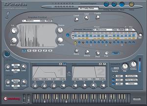
Interesting solutions could only be seen in two software sectors: music editors and three-dimensional modeling programs. The industry of VST plugins for music software has developed especially rapidly.
Here to this day, you can find amusing instances of the graphical interface. To some, such decisions will seem redundant, but someone is used to living without them. As a rule, controls everywhere are similar (buttons, sliders, checkboxes, lists, etc.), but their design and relationship are often different.
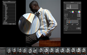
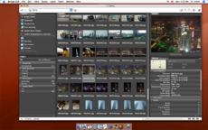
Recently, programs with a non-standard interface that differs from the GUI of operating systems have begun to appear more and more often. Especially a lot of "glamorous" dark interfaces. Moreover, such software is by no means released by small companies that stamp Photoshop plug-ins, but quite serious giants of the software industry. Adobe introduced the "dark" Lightroom and Bridge. Apple marked Aperture and Logic. Even Microsoft could not resist and presented the latest version of Windows Media Player in the now fashionable "gothic" shade. What is a new trend in GUI design? And should we expect the emergence of a new large-scale wave of non-standard interfaces? Especially in the dark range ... Is it good or bad? How convenient or inconvenient to work with such applications? Does it affect fatigue, labor productivity and creativity? Or does the color and shape of the interface elements in no way affect the workflow, and the GUI of the program can be anything?

It would be interesting to know the opinion of Habr-people regarding all these fashion trends, as well as see links to examples of the most interesting and unusual GUI ideas.