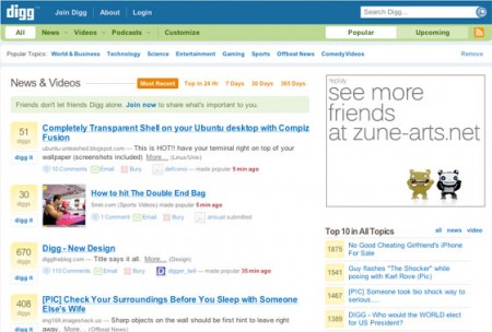
Digg.com has changed its design today
As expected earlier, this morning Digg.com got a new look.
The biggest change is the appearance of the Video menu on the main page. Other changes include some changes on the main and individual pages, navigation with a drop-down menu, advanced personal settings ...
The usability has been improved in the new design: now links can be “buried” with one click, instead of the previous two clicks. The activity of friends became visible right on the main page - also nice and convenient. Links to popular and new news have become more visible. The pop-up menu, on the contrary, caused a controversial response from users - some people like this solution more than the old, tree-like version, and some less. In general, opinions were divided in a ratio of 50/50.
 Of the minuses, one can note only the increase in the size of banners, and the lack of the expected section with pictures - people still put (pic) at the end of the topic name :( In general, I personally am pleased with the redesign. And what do you think?
The biggest change is the appearance of the Video menu on the main page. Other changes include some changes on the main and individual pages, navigation with a drop-down menu, advanced personal settings ...
The usability has been improved in the new design: now links can be “buried” with one click, instead of the previous two clicks. The activity of friends became visible right on the main page - also nice and convenient. Links to popular and new news have become more visible. The pop-up menu, on the contrary, caused a controversial response from users - some people like this solution more than the old, tree-like version, and some less. In general, opinions were divided in a ratio of 50/50.
 Of the minuses, one can note only the increase in the size of banners, and the lack of the expected section with pictures - people still put (pic) at the end of the topic name :( In general, I personally am pleased with the redesign. And what do you think?