 July 14, 2019 at 19:32
8 simple UI tricks to make a prototype design dynamic without resorting to animation
The material in this article is a consequence of my design experiments and conclusions over the past year and a half continuous grind design. I tirelessly collected ui kits, experimented with content in placeholders, styles, shadows, texts and states to understand if this affects the conversion. In other words, can I increase sales of design products for Figma if I add some visual dynamics to static design layouts to make the templates more interesting and more functional.
Below I will demonstrate some simple tricks to add some useful effects to ordinary static prototypes. Quality will not be affected by this; visual diversity will appear in repeating elements. Maybe this will help make your best shot on Dribbble.or win a few points in the eyes of a client or team lead, as using these tricks demonstrates you as a performer of UI details.
If I introduce some kind of feature in the design, and see how the metrics grow on my Setproduct resource , it’s hard for me to be sure what action caused these changes. However, as my site developed, I began to notice an increase in the number of regular visitors who for some reason returned. If people didn’t buy food, then they appeared again and again to stare at something. But what for?
Alas, I have not yet found a way to determine the metrics of certain visual techniques with which I regularly experiment. I tried to analyze all my UI developments and systematize from a subconscious into a convenient and understandable list of simple tricks to make the design a little more fun. Maybe it's just fun and catches the eye, maybe subscribers are growing from it, maybe it's something from the near future, and maybe it makes no sense. As I said above, I can’t be sure that the traffic and pageview rates of my site are growing precisely thanks to these techniques of adding “visual dynamics” to static layouts. But I like to think that the UI effects that I will describe below directly or indirectly affected my overall progress.
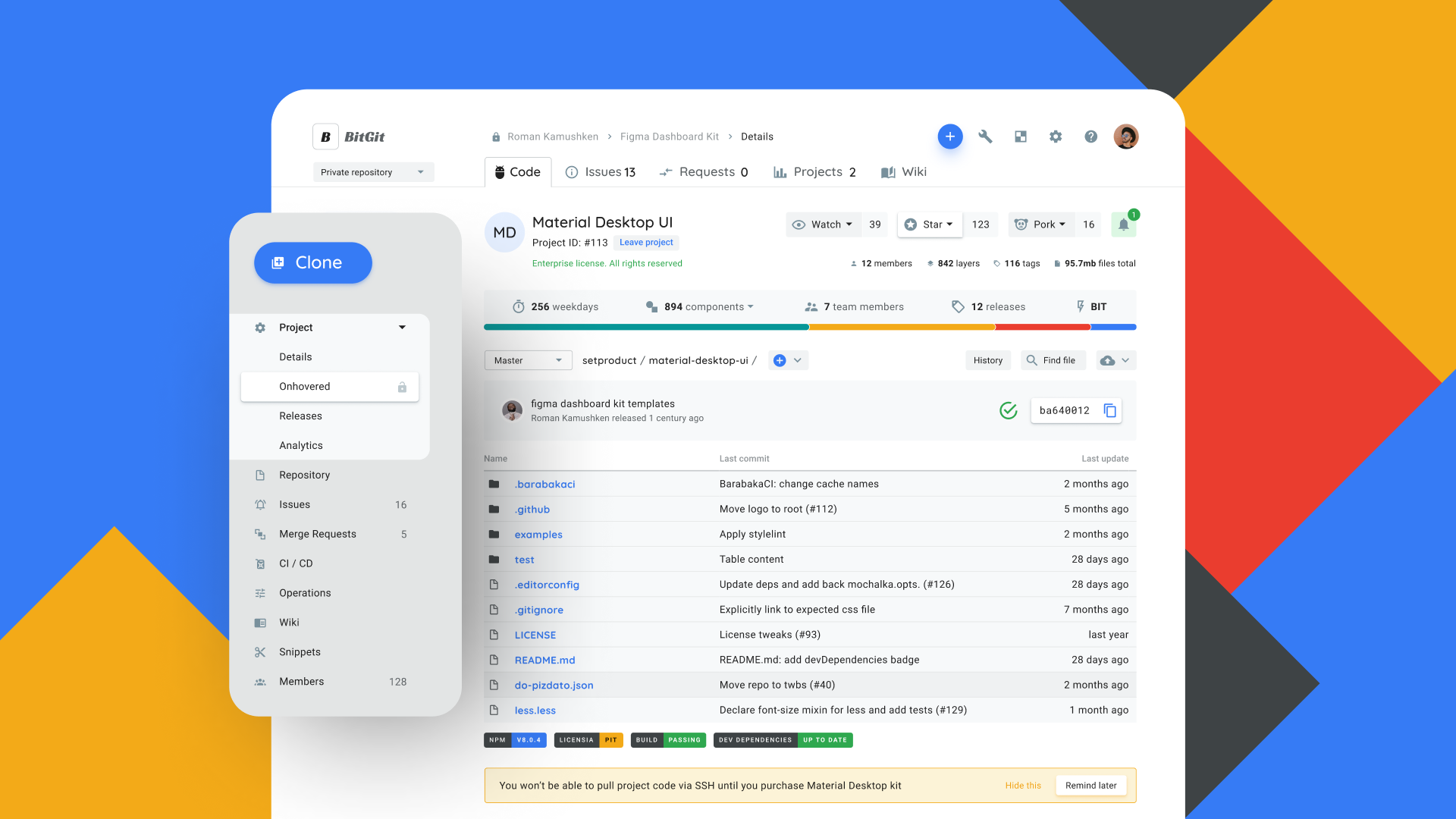
By the way, if you use Figma , I recommend paying attention to our ready-made design systems . They help freelancers complete more orders per month, programmers are allowed to create beautiful applications on their own, and team leads “sprint” sprints faster using ready-made design systems for team work.
And if you have a serious project, our team is ready to deploy a design system within the organization based on our best practices and tailor it to specific tasks using Figma. Web / desktop, and any mobile. We are also familiar with React / React Native. Write to T: @kamushken
So, I’ll talk about how adding states to a static prototype adds some dynamics to it, showing some event. Go!
A little raised
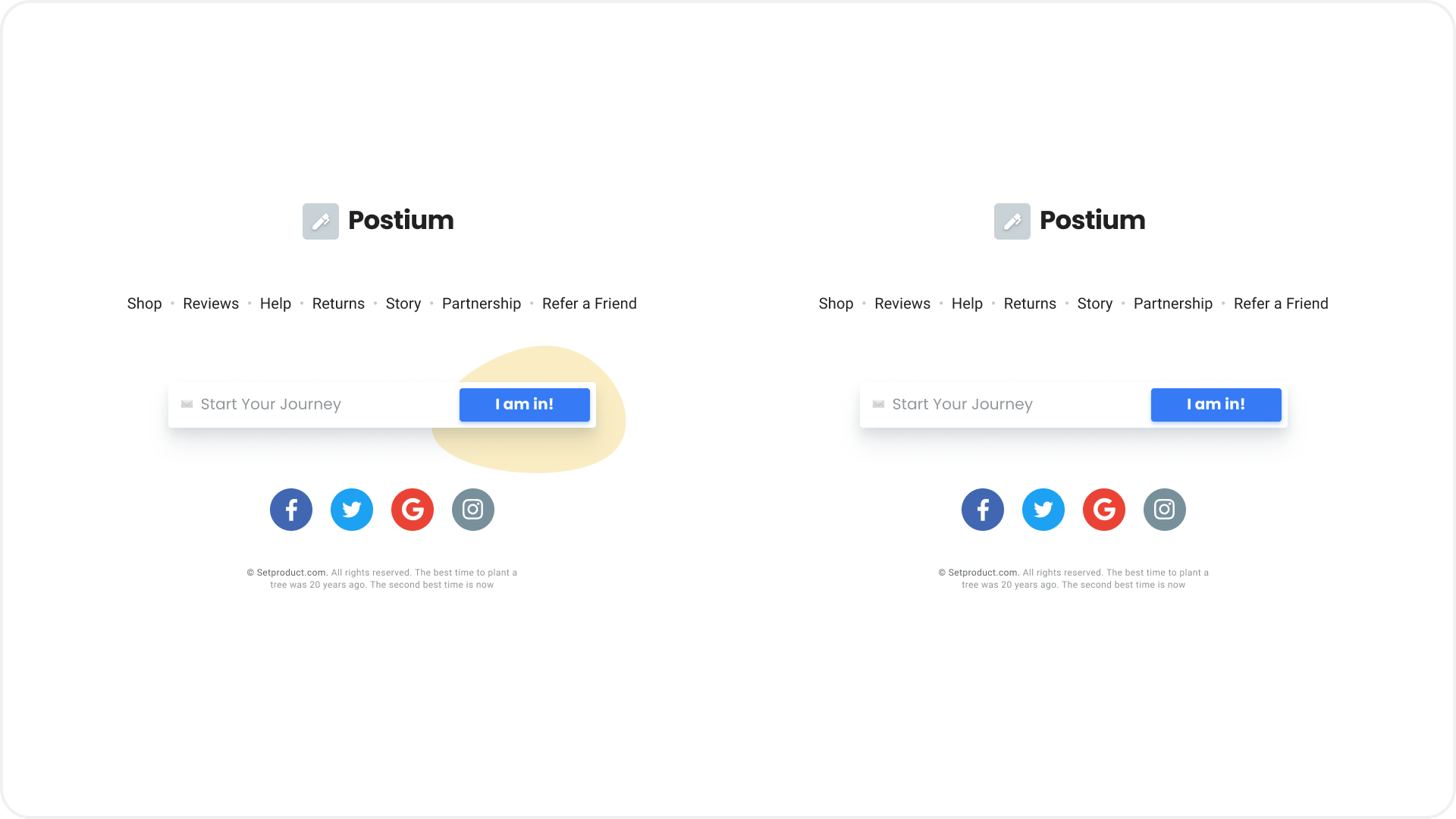
If your artboard uses a lot of cards, blocks and other elements of the same type, then one of the selection can be “raised” by shadow. This technique is appropriate for large elements, such as cards, and for small UI components, for example, menu sections in side navigation. It seems that we hovered over the card and you can click:

In this example, perhaps clicking on the review does not make any sense, but the reception with raising the card is applicable here. Who knows, if you work for a client and show him this block, he will probably say “Wow, this is a cool effect with a shadow, let's multiply it EVERYWHERE and I accept this work.” You have given the customer a choice. This is a profit!
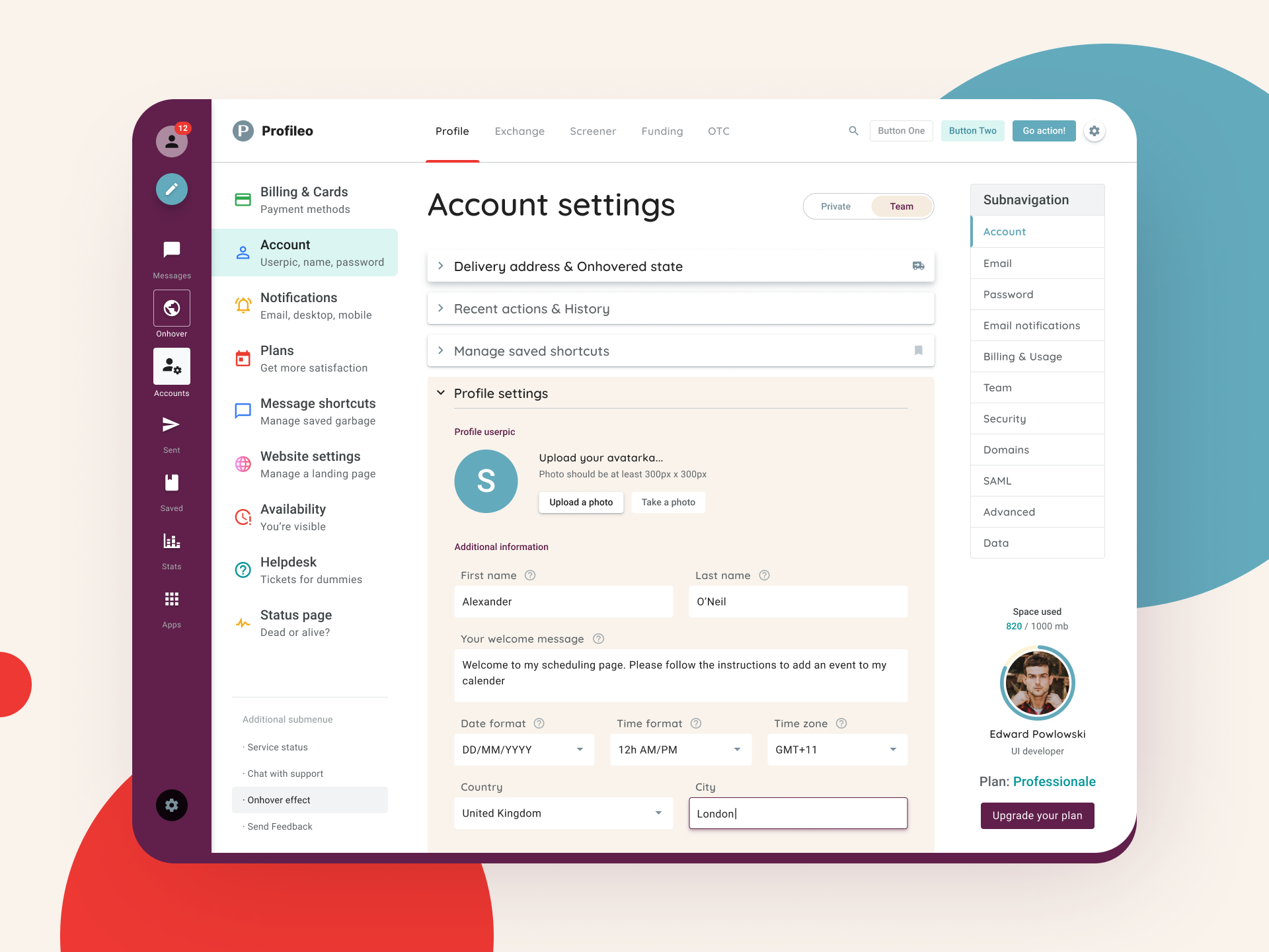
Induced or active
For example, when prototyping dashboards, navigation at several depth levels is often used. To give dynamics, I made the first level of Getting Started activated, and on one of the expanded submenu items I added the onHover style. In addition, it will help developers to get all the necessary menu states and observe how it looks holistically and in the context of navigation:
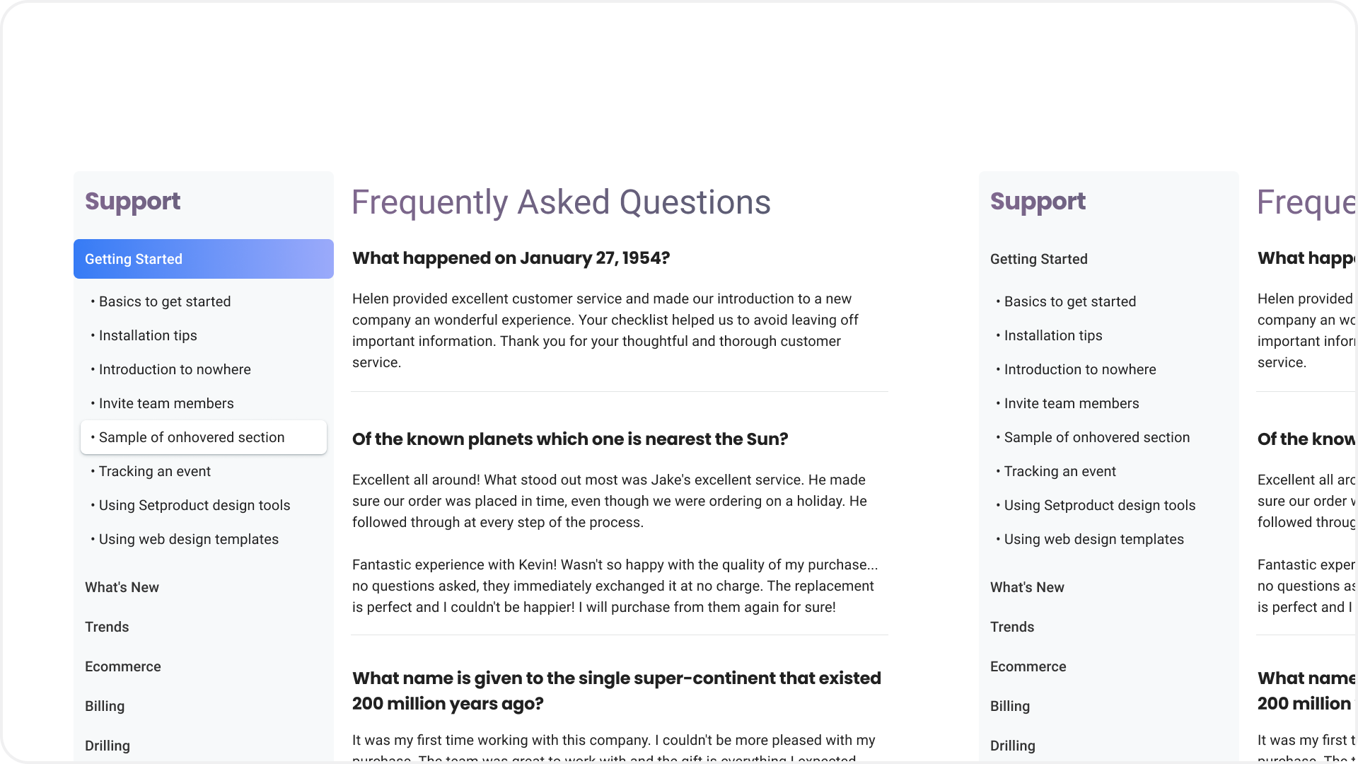
I deliberately left the “empty” option on the right so you can compare and decide which one is the most attractive. A
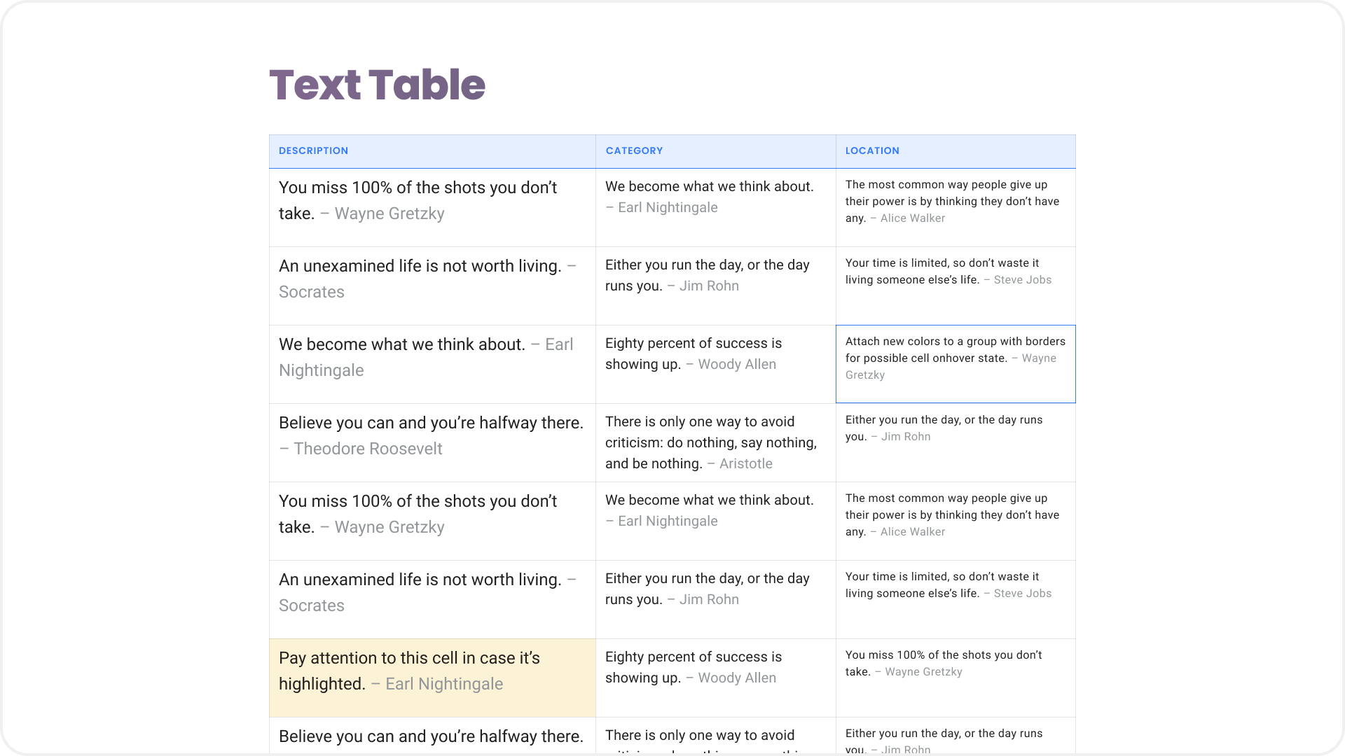
simple table can be made more dynamic if one of the cells simulate the state of the hover cursor, and another, for example, tint with light yellow, showing something conditionally important in it. Eye hooked - goal achieved
Useful trash
Mugs, squares, crosses, blobs and other other visual trash flying in the background are an integral part of the design craft, especially if you want to promote your profile on Dribbble. Only the geometry and shape of this tinsel changes cyclically. I began to think how to give it more meaning and use it for the benefit of the user experience:
Does the blob under the blue button seem to make it visually larger and more attractive in the literal sense of the word?
And sometimes to start some useless element in the background becomes useful if it helps to distinguish between objects:
As can be seen in the option on the left, the green spot adds shape and dynamics to the card, although it’s also appropriate to use a stroke or shadow as options here
Selected or marked
Imitating the ability to make a selection or highlight an element active is a great way to add variety to a prototype. Even if in the end there is no logic in this choice, then such a technique will at least show you competent in understanding the states of UI elements after a fictitious interaction with them:

Nothing happens on the left screen, while in the right and center screens the choice and item changed state
Emoji Strength
From time to time, emoji is found in applications as a way to amplify a message to a user or as part of a design language. When prototyping, you can quickly assemble the logo, taking any icon as a basis or strengthen the message Empty state of the screen. By the way, sometimes sticking an emoji symbol is faster than picking up an icon from the library separately. The figure renders them perfectly, but if you overdo it with the height of the text, pixels appear. In any case, emoji will help to add some personalization and positive, or even sense, to your layout:

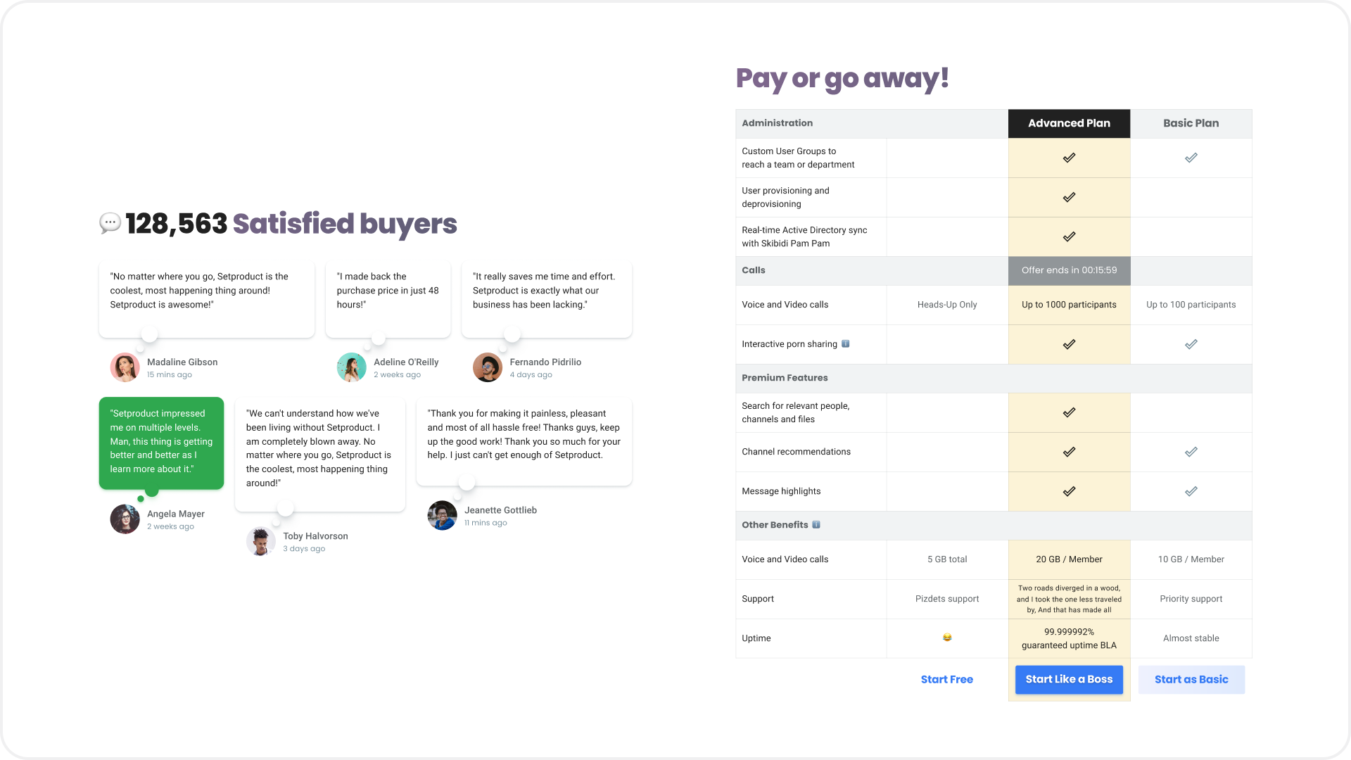
Emphasis of importance
Every day we are faced with situations where design encourages us to make a choice that is beneficial for the business. This is mainly done by highlighting or prioritizing the desired area, block, button, or any other detail. According to these principles, one can somehow especially highlight or contrastly highlight one of the repeating objects in the group. A column in the table, or a speech bubble with a product review, specifically drawing attention to it:
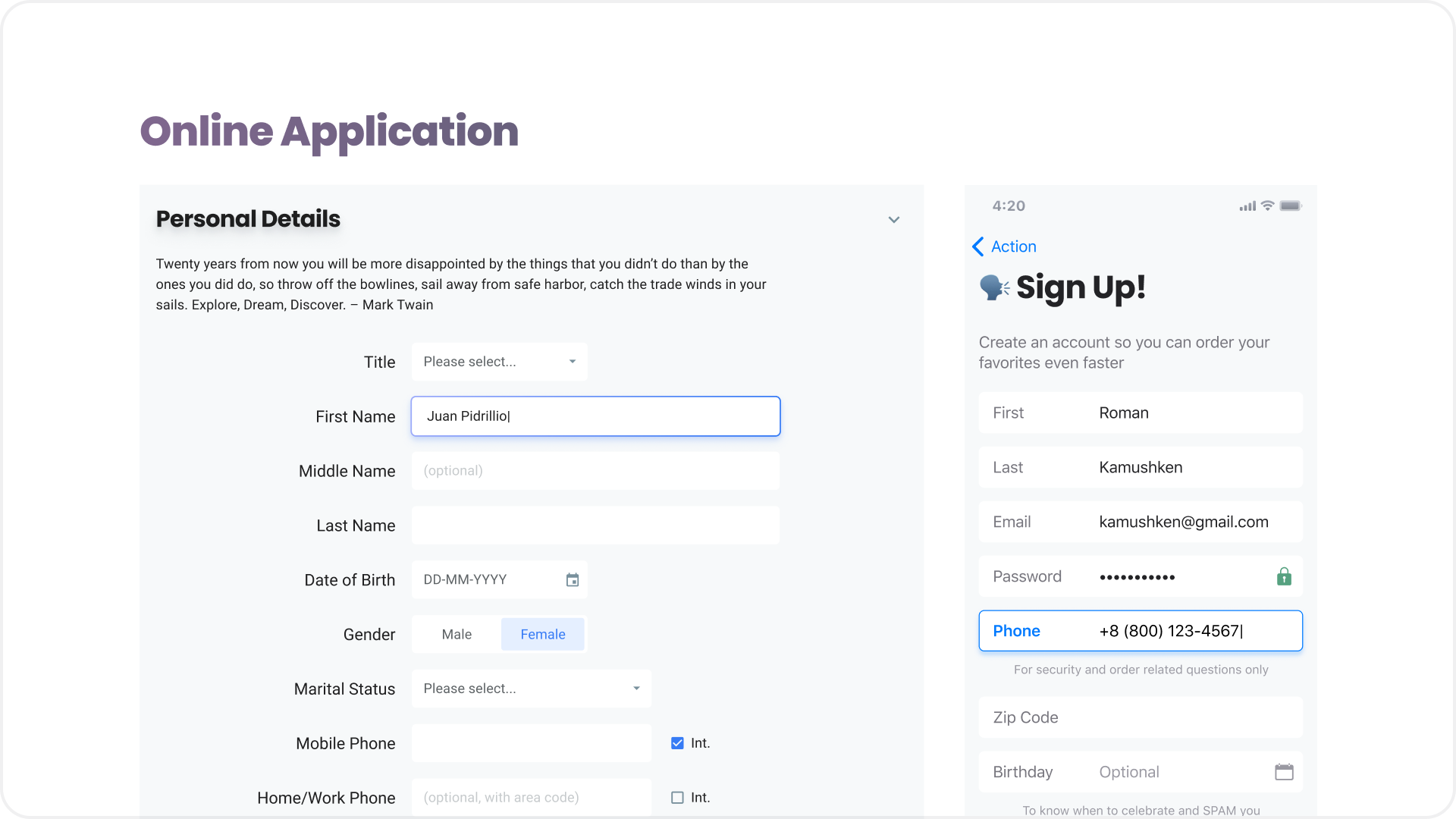
Active Input
When you design a prototype that uses a lot of text fields, it looks great if one of the inputs is highlighted active. It can be a trick, a mistake or a validation state when you have already entered something. Use your imagination, reproducing real situations that are possible when filling in inputs, and this will help to produce the most realistic picture:
Game of Thrones of Shadows
The physics of space must be understood by every designer. Now the shadows from UI objects have returned to our armament again, but they have returned rethought after several years of oblivion, being supplanted by the flat trend. Now they are more realistic and more organically used in design to create the desired effect. Therefore, you should well represent the objects on the canvas in space and subordinate to the logic the blur and transparency of each shadow, depending on the effect you want to get:
I had to “dribble” a little the most ordinary git dashboard prototype to collect a few likes and subscribers
Everything is simple: the “higher” the object is from the zero plane (background), the greater the transparency, blur and offset at the shadow. By the way, in Figma it is often more convenient to create realistic shadows with the usual Rectangle, to which in this example I rounded the corners and applied a blur> 200. Further, with a simple Resize, I brought it into the most realistic form, creating the effect of “floating” navigation over the dashboard. Fortunately, in production you will not find such nonsense. You have to resort to such tricks to understand which Dribbble posts the audience responds to better. But this is a separate topic of promoting a design product, about it some other time.
Conclusion
Today's design is damn interesting. Over the last year of constant UI experiments, it seemed to me that design is like an open source product: everyone in the community can bring something of their own, and if these ideas turn out to be promising, the rest will pick up your wave and carry it along distant shores. That is why it is important to tell the world what you are doing.
Now, looking back, I can honestly confess to myself: all my previous many years of design experience was not worth a penny. Switching to my own products and creating one ui kit after another, I managed to make a tremendous leap in practice, at the same time polishing the organization’s experience and improving the architecture of design systems in Figma. But now a giant repository of components and their possible states has appeared in my head. And if you wake me up at night, and ask, for example, about Tabs, I will instantly drop you literally everything about them .
If you are considering whether to build your ui kitand try selling, then I will answer that it is certainly worth it. It turned out to be much more interesting to invent design tasks for yourself than to get bogged down in a lot of stupid edits from the next client. In the worst case, you will gain more experience. With a successful set of circumstances, you will receive the first sales, which will certainly spur and motivate you even more.
Go for it! Have fun prototyping
You can also subscribe to my channel Useful for Designers , where I say that I think about the design and products around the design scene.
By the way, if you understand Western design trends, are attentive to the grid, typography, horizontal rhythm and generally to each pixel, then you have a great opportunity to join the small Setproduct team to jointly fill the digital market with high-quality design templates that save other teams whole months of development. Email me on Telegram .