Concept: logo for Yekaterinburg from Logomashiny

Introduction
The logomachine volunteered to make a logo on one of the Russian cities from a random list.
To determine which city will get the logo, we held a popular vote. From 18 cities, Yekaterinburg and Kaliningrad reached the final, where the capital of the Urals won with a minimum margin.

Poll in the Logomachine group
Like in Yekaterinburg with design
Coat of arms
The history of the ECB logo resembles a dramatic detective story. Until 2015, the city was content with a coat of arms, which combined as many as 10 (!) Images. Try to find them all: The

beautiful and self-sufficient coat of arms of Yekaterinburg
Competition
However, in May 2015, the "contest for the development of the logo and identity of Yekaterinburg" began, which received as many as 330 works of different levels of sophistication.
In the summer of the same year, the winner was chosen by voting - EKAT ERIN BURG:

Voting results from the official site
The winning concept is based on the font face inscribed in a square shape. The authors of the concept associate the style with “strength, power, stability and confidence”:

The concept is the winner of the competition.

Logo in life
It will be fair to note that not all citizens came to terms with the new logo: people have called it “Yekaterinburger”, either because of its shape, visually similar to a burger (two buns and a cutlet in the middle), either because of the association with the font version of the Burger King logo, or because of the hanging part of the word “BURG”, after which “-ER” begs. Polls on the city portal and in the official group of the contest did not give the best results:

Voting on the city portal and in the official group of the contest on VK.
Of course, any concept has strengths and weaknesses. This option is good because it is easy to use, thanks to its square shape - the authors solved the problem of placing a long city name in the logo. However, this gives rise to a problem: the logo is poorly read due to the unnatural transfer of the name not by syllables - EKAT ERIN BURG.
Lebedev logo
Oh yes, at the end of 2014, Lebedev Studio proposed its own version of the Ekaterinburg logo, basing the concept on the initials of Catherine I, but the administration rejected this option :

Yekaterinburg Style from Lebedev Studio
Concept search
We carefully studied the history of Yekaterinburg and what it is famous for. This is the capital of the Urals, founded near the Iset River and named after Catherine I. The city is famous for its developed industry, wealth of minerals and precious metals, as well as Bazhov's tales and constructivism:

An approximate mudboard for the first drafts
Based on these associations, we began to make the first sketches:

The first logo sketches using simple images
It was clear that you need to think more. At this stage, we came to the shortened writing of Yekaterinburg - EKAT,because they learned that many locals already use this reduction. Also, we liked that the name is read in Russian and English in the same writing (and still we could not beat the recent situation with the demolition of the highest towers of the city):

Can in humor

T-shirt with malachite pattern we like
Searching through options, we realized that reflecting the traditions of the city in the logo is not the technique that we want to use in the new concept.
In the following sketches, we tested the trend, youth, modern direction in design, played with gradients and perspective:

Sketches in a trend style
Something interesting and stylish could turn out, but these options lacked the soul, and we wanted the residents of Yekaterinburg to be proud and use the new concept.
We took the time to search for a concept that will be relevant for many years.
Residents of Yekaterinburg will not let you lie - there is a tendency towards modernization in the city : a huge glass Yeltsin center has been built, a modern tram R1 has been developed (which, although it will not see the light, is still cool), the tall Iset tower was erected.
We began to be inspired by the present - what is happening in the city and with the city at the moment, and tried to look into its future:

Moodboard for the concept of the future
Having made the first sketches, we realized that we were moving in the right direction:

The first sketches of the final version
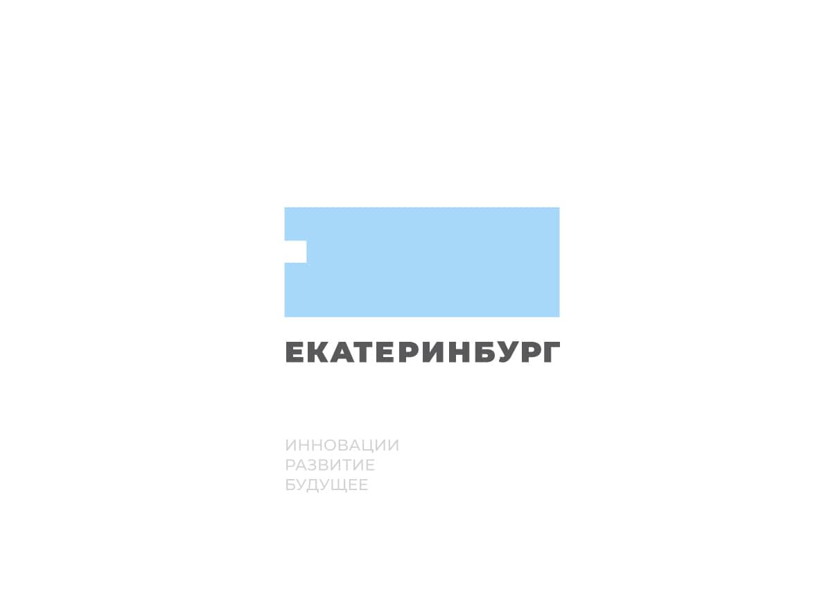
The final brand concept of Yekaterinburg
Based on the work done, we came to a concept with a simple slogan “A city where there is a place for new”:

Sounds!
As a basis for the sign, we took an adaptive shape with right angles, which has a missing element.
In our opinion, the logo of the future is a form that adapts to the environment. Such a sign can be stretched, leaving the recognizable element unchanged, so it is very easy to use:
Logo with a corporate mark
Without a corporate mark, the sign is even easier to use:

A square version of the mark
Such a flexible corporate style opens up many possibilities for branding media:

Style in action

Example of designing labels on buildings

An example of urban navigation

Example of designing a bus

Making photos
Conclusion
In our opinion, we managed to solve the current branding problems of Yekaterinburg, and we hope you liked our concept. Share your opinion in the comments, we will be happy to receive feedback!