Analysis of the report of Nikita Makarov on the revolver, mnemonics, warehouse manager and other useful things
There is a new analysis on the JUG.ru blog, this time Nikita Makarov from Odnoklassniki, a multiple participant in the program committees of our conferences, came under a magnifying glass. Today we will review a report on microservices for test automation. The performance took place in 2015 at the devclub.eu meeting in Tallinn:
The report slides can be found here .
The link to the word micro in Nikita's story seems to me too strong. Purists may say that the report is not related to micro services. The speaker most likely suspected something like this, and so a section appeared about how large the micro should be. It is needed in order to refer to the definition if necessary.
In my opinion, all this is unnecessary. It was not worth building a performance "from the buzzword", that is, from microservices. Testing a social network is a difficult task, and the approaches Nikita talks about are interesting and valuable no matter how small the services created for this are. In the report, an interesting speech - about the specifics of the subject area - begins from about the seventeenth minute. I would have pulled this to the very beginning, and dosed explanations about microservices as they become necessary for understanding what is happening. So you can make room for interesting things that are now only indirectly affected in the story.
Testing in production is very interesting, and it's good that Nikita and the team managed to never drop the Odnoklassniki portal. I’m able to drop Yandex from the inside, once I was able to assess the quality of the search with some involvement from me once. If you have been added to all white lists and anti-vandal systems therefore do not respond, and you shoot a lot of requests at a service without delays or other politeness, then anything can happen.
But people usually remember about the load this way, but in my experience, they begin to exclude their own bots from statistics only after incidents. How many bots are there, they think. For Odnoklassniki Nikita gives the answer: there are ~ 20,000 of them. We, he says, know our bots by sight and by name and know how to ignore them. But from the further course of the story it is clear that “we” are a rather narrow circle of people. Admins in their statistics considered bots to be normal people. Who do they consider, for example, people who predict advertising revenue or analytics who consider some kind of user engagement, retention or churn rate? Bots perform repeating scenarios without interruptions in sleep and food, and if they are not excluded from the calculations, they can produce a lot of statistics. At 24:20Nikita gives an example of a testing team that was able to light up even on a YouTube scale, and this is not an exceptional case.
Removing a class of scripts or users from statistics is a difficult task when you solve it for the first time. Usually there are many places where users are taken into account (not all of them design the statistics collection system right away with the expectation that it is convenient to exclude something from it), and no one knows all these places. If you really managed to differentiate everything, then this is a valuable experience that was worth sharing.
In general, the topic of testing in production is quite broad and phaco-consuming, and I would add some bloody details related to it in the story.
Conclusions (entitled "Lessons learned") begin at around 44:00 . Everything that Nikita says at the end of the report is related to the problems of microservices in general and, in my opinion, does not apply directly to testing. “If you have 800 fronts, then how to get some of them out of production and then turn it on again so that users don’t notice anything?” - this is not about the services used specifically for testing. This, as well as the other points of the conclusions, are the lessons learned by Odnoklassniki as a whole during the implementation of microservices.
Thus, the story breaks up: the introduction and conclusion are devoted to microservices in general, and the central part illuminates, in fact, their application in testing.
I’m sure you already know everything about the laser pointer and what harm it does, but I’ll note that it appears at 3:37 a.m. and 7:40 a.m. in the parsed speech , and it’s not clear where it’s located both times ”Referred to by the speaker. From the context, this can be restored, but at the cost of extra mental effort.
On many slides we will see an orange die in the upper left corner. What is written on it marks the place (chapter, if you like) in the script of the whole speech, while the title of the slide refers to what is on the screen right now. This is an attempt to implement the sound idea of maintaining context (so that the viewer at every moment understands where we are now globally), but it, in my opinion, does not work.
In reality, on many slides the title is simply duplicated (sometimes literally, sometimes only in meaning):

In addition to the fourth slide shown here, which we will look further below, this situation arises on slides 3, 5, 6, 7, 8, 9, 10, 16, 17, 18, 19, 21, 22, 24, 25, 28, 29, 31, 32, 37, 50 and 51. All the attention the viewer spends on comparing these headings and subheadings is a net loss, albeit a small one.
How to reduce this loss? The revised report plan, in which the topics are highlighted in larger sizes, will greatly help us, then the orange title will not change so often. But it will help us even more if we can show this plan at the beginning of the speech and periodically return to it, marking the points as we go through them. This can be either a text list or a diagram. For our purposes, the diagram depicted on slide 48 would be quite suitable, but more on that below.
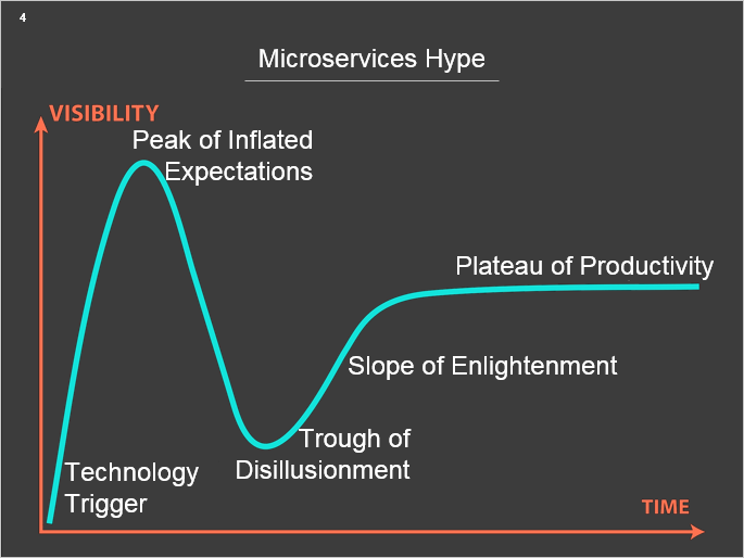
Until we have gone far from slide 4, note that it has:
I believe that it’s worth getting rid of all this, at least somehow (the option is not ideal, but very simple):
On many other slides, the gray background adds a frame around the content, it works as an additional (extra) element. In my opinion, if the picture takes up all the available space without borders, it looks better, for example, here:
or here:
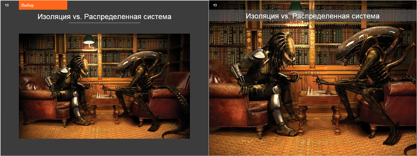
The fact that the Alien and the Predator board is wrong and the first ones go black, we discard them as petty nitpicking: in the end, they are aliens and are not required to play according to earthly rules. But for the future, we note that any person with a chess past, seeing a board in an artwork, immediately begins to check whether the color is the lower right corner and how the pieces are arranged. And he is especially distracted if he notices inconsistencies.
Let's go back to the diagram that appears on slides 38-48 (I will give here the first and last of them):
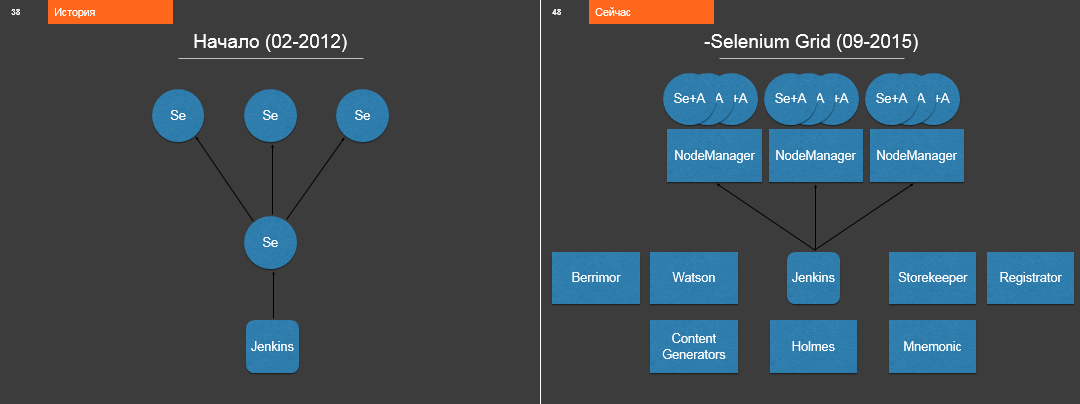
These two pictures show the initial and final type of Odnoklassniki testing architecture at the time of the story. Intermediate states are located on slides 39-47.
Relatively complex architectural schemes are correctly shown exactly as Nikita does. Elements of the scheme should appear sequentially, then at every moment the audience understands what exactly the speaker is commenting on and where to look. Moreover, the architectural scheme, as a rule, is interesting not in the static form of the current description, but along with its history, in dynamics. The history of the emergence of architecture explains why the scheme is exactly what problems the developers solved by introducing each new element. So the viewer is much easier to understand which of this applies in his case and what is not.
Descriptions of only the current architecture, in isolation from its history, so often found at technical conferences, in my opinion, almost completely fly past the ears and brains of the audience. So in this place I urge to take an example from the speaker.
Nevertheless, I think that could be done even better. If we take slide 48 as the basis, and from the 38th start the performance, then this consistently growing scheme could serve as an excellent skeleton of the whole story. Then detailed stories about Revolver, Mnemonic and Storekeeper could appear at those moments when the corresponding block opens on the diagram.
The next edition of the Heisenbag conference will be held in Moscow on December 8-9, and Nikita will speak there . He will tell interesting things, for sure I say.
If you want to receive feedback on your presentation, then I will gladly provide it to you.
The report slides can be found here .
Plot
Starting point
The link to the word micro in Nikita's story seems to me too strong. Purists may say that the report is not related to micro services. The speaker most likely suspected something like this, and so a section appeared about how large the micro should be. It is needed in order to refer to the definition if necessary.
In my opinion, all this is unnecessary. It was not worth building a performance "from the buzzword", that is, from microservices. Testing a social network is a difficult task, and the approaches Nikita talks about are interesting and valuable no matter how small the services created for this are. In the report, an interesting speech - about the specifics of the subject area - begins from about the seventeenth minute. I would have pulled this to the very beginning, and dosed explanations about microservices as they become necessary for understanding what is happening. So you can make room for interesting things that are now only indirectly affected in the story.
For example, for such
Testing in production is very interesting, and it's good that Nikita and the team managed to never drop the Odnoklassniki portal. I’m able to drop Yandex from the inside, once I was able to assess the quality of the search with some involvement from me once. If you have been added to all white lists and anti-vandal systems therefore do not respond, and you shoot a lot of requests at a service without delays or other politeness, then anything can happen.
But people usually remember about the load this way, but in my experience, they begin to exclude their own bots from statistics only after incidents. How many bots are there, they think. For Odnoklassniki Nikita gives the answer: there are ~ 20,000 of them. We, he says, know our bots by sight and by name and know how to ignore them. But from the further course of the story it is clear that “we” are a rather narrow circle of people. Admins in their statistics considered bots to be normal people. Who do they consider, for example, people who predict advertising revenue or analytics who consider some kind of user engagement, retention or churn rate? Bots perform repeating scenarios without interruptions in sleep and food, and if they are not excluded from the calculations, they can produce a lot of statistics. At 24:20Nikita gives an example of a testing team that was able to light up even on a YouTube scale, and this is not an exceptional case.
Removing a class of scripts or users from statistics is a difficult task when you solve it for the first time. Usually there are many places where users are taken into account (not all of them design the statistics collection system right away with the expectation that it is convenient to exclude something from it), and no one knows all these places. If you really managed to differentiate everything, then this is a valuable experience that was worth sharing.
In general, the topic of testing in production is quite broad and phaco-consuming, and I would add some bloody details related to it in the story.
conclusions
Conclusions (entitled "Lessons learned") begin at around 44:00 . Everything that Nikita says at the end of the report is related to the problems of microservices in general and, in my opinion, does not apply directly to testing. “If you have 800 fronts, then how to get some of them out of production and then turn it on again so that users don’t notice anything?” - this is not about the services used specifically for testing. This, as well as the other points of the conclusions, are the lessons learned by Odnoklassniki as a whole during the implementation of microservices.
Thus, the story breaks up: the introduction and conclusion are devoted to microservices in general, and the central part illuminates, in fact, their application in testing.
Slides
Laser pointer
I’m sure you already know everything about the laser pointer and what harm it does, but I’ll note that it appears at 3:37 a.m. and 7:40 a.m. in the parsed speech , and it’s not clear where it’s located both times ”Referred to by the speaker. From the context, this can be restored, but at the cost of extra mental effort.
Duplicate Items
On many slides we will see an orange die in the upper left corner. What is written on it marks the place (chapter, if you like) in the script of the whole speech, while the title of the slide refers to what is on the screen right now. This is an attempt to implement the sound idea of maintaining context (so that the viewer at every moment understands where we are now globally), but it, in my opinion, does not work.
In reality, on many slides the title is simply duplicated (sometimes literally, sometimes only in meaning):

In addition to the fourth slide shown here, which we will look further below, this situation arises on slides 3, 5, 6, 7, 8, 9, 10, 16, 17, 18, 19, 21, 22, 24, 25, 28, 29, 31, 32, 37, 50 and 51. All the attention the viewer spends on comparing these headings and subheadings is a net loss, albeit a small one.
How to reduce this loss? The revised report plan, in which the topics are highlighted in larger sizes, will greatly help us, then the orange title will not change so often. But it will help us even more if we can show this plan at the beginning of the speech and periodically return to it, marking the points as we go through them. This can be either a text list or a diagram. For our purposes, the diagram depicted on slide 48 would be quite suitable, but more on that below.
Drawings
Until we have gone far from slide 4, note that it has:
- white graph-picture on a dark gray background;
- the word "VISIBILITY", written vertically;
- trimming the word "MATURITY" along the horizontal axis
I believe that it’s worth getting rid of all this, at least somehow (the option is not ideal, but very simple):

On many other slides, the gray background adds a frame around the content, it works as an additional (extra) element. In my opinion, if the picture takes up all the available space without borders, it looks better, for example, here:

or here:

The fact that the Alien and the Predator board is wrong and the first ones go black, we discard them as petty nitpicking: in the end, they are aliens and are not required to play according to earthly rules. But for the future, we note that any person with a chess past, seeing a board in an artwork, immediately begins to check whether the color is the lower right corner and how the pieces are arranged. And he is especially distracted if he notices inconsistencies.
Schemas and context preservation
Let's go back to the diagram that appears on slides 38-48 (I will give here the first and last of them):

These two pictures show the initial and final type of Odnoklassniki testing architecture at the time of the story. Intermediate states are located on slides 39-47.
Relatively complex architectural schemes are correctly shown exactly as Nikita does. Elements of the scheme should appear sequentially, then at every moment the audience understands what exactly the speaker is commenting on and where to look. Moreover, the architectural scheme, as a rule, is interesting not in the static form of the current description, but along with its history, in dynamics. The history of the emergence of architecture explains why the scheme is exactly what problems the developers solved by introducing each new element. So the viewer is much easier to understand which of this applies in his case and what is not.
Descriptions of only the current architecture, in isolation from its history, so often found at technical conferences, in my opinion, almost completely fly past the ears and brains of the audience. So in this place I urge to take an example from the speaker.
Nevertheless, I think that could be done even better. If we take slide 48 as the basis, and from the 38th start the performance, then this consistently growing scheme could serve as an excellent skeleton of the whole story. Then detailed stories about Revolver, Mnemonic and Storekeeper could appear at those moments when the corresponding block opens on the diagram.
Minute advertising
The next edition of the Heisenbag conference will be held in Moscow on December 8-9, and Nikita will speak there . He will tell interesting things, for sure I say.
Regular reviews
If you want to receive feedback on your presentation, then I will gladly provide it to you.
What is needed for this?
All this needs to be sent to the p0b0rchy habrayuzer , that is, to me. I promise that the review will be constructive and polite, as well as highlight positive aspects, and not just what needs to be improved.
- Link to the video of the speech.
- Link to slides.
- Application from the author. Without the consent of the speaker himself, we will not analyze anything.
All this needs to be sent to the p0b0rchy habrayuzer , that is, to me. I promise that the review will be constructive and polite, as well as highlight positive aspects, and not just what needs to be improved.
