 December 22, 2016 at 13:27
How I translated a project on BEM ... and translated
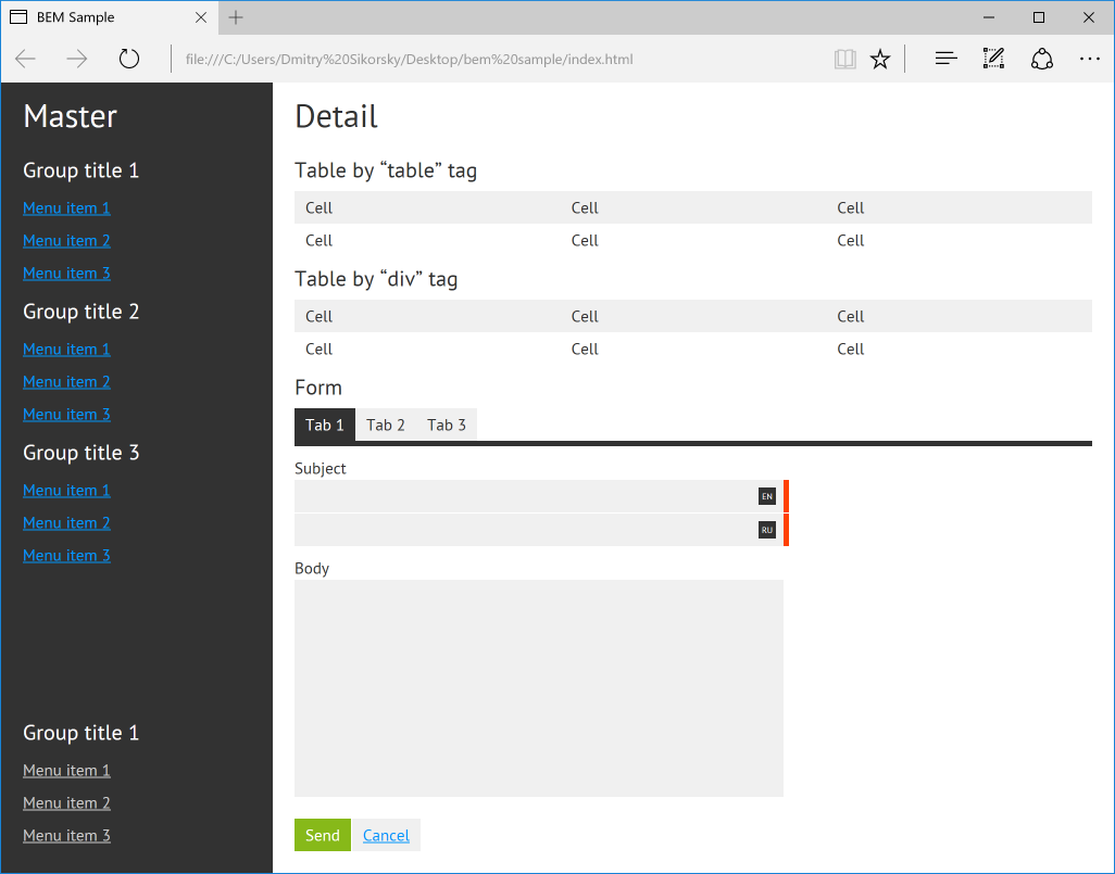
The combination of HTML and CSS (CSS to a greater extent) always seemed to me somewhat “foggy,” the worst amenable to control and testing. I came up with various rules for myself and tried to standardize my approach in one way or another, but there was no feeling that "here, this is it." Several times I briefly got acquainted with BEM (and not only), read articles on this topic, but it didn’t go beyond reading. But the farther, the stronger the feeling of the need for a certain rigorous methodology. In the end, I decided to try to introduce BEM at one of my projects, where, in my opinion, this could not be done. This is a CMS, a simplified backend page of which I will give as an example of layout:
I want to note right away that BEM is far from a methodology for all occasions, and the question of the need for its application in a particular project should be considered in private (including on the basis of whether you like it or not). Also, due to the fact that I did not use the proposed specific file structure or HTML generation, we won’t talk about them (later I nevertheless divided the CSS file into separate parts corresponding to the blocks, but decided to limit myself to this for now). Also, quite a lot has already been written (for example, here and there ) about the advantages and disadvantages of this approach as a whole, so we won’t talk about this either, I’ll just share my experience and thoughts on this subject, assuming that you are already familiar with the essence.
So, in my case, CMS is a large and modular open source project in which each module can have its own backend pieces, using common ones and adding specific interface elements to them. Ideally, modules should be developed by other developers. I think this is just such a project where the application of BEM (or another serious methodology) is not just appropriate, but necessary. This is especially important, because many of the web developers consider CSS to be collateral, unworthy of attention and deep study of technology, trying to achieve the desired result by copying ready-made pieces of markup and styles, concentrating on what they like best, resulting in unsupported tables terrifying quality styles.
At first, the easiest way was not to touch the source code of my project, because it is quite large. Instead, I created a simple HTML document (/index.html) and a stylesheet (/css/style.css) for it, put it all on the desktop for convenience and decided to start composing a few fragments from the image above, using for this Notepad ++ and browser. (As a result, I wanted to get a page containing all the components I needed, and then, if successful, transfer it to my project. The simplified result is available for study by the link at the end of the article; a link to how everything turned out in reality , you can also look there.)
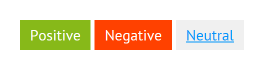
I decided not to start with a structure, but with a small button block - button . Buttons I have 3 types: positive action, negative action and neutral action. They differ only in color, so I described these differences as Boolean modifiers , respectively, button - positive , button - negative and button - neutral (I chose an alternative syntax for modifiers and use two hyphens instead of a single underscore - for me it looks much clearer).
As a result, in HTML the button is described as follows:
We also allow such an option (one of the features of BEM is, ideally, the independence of the appearance of the tag used, although I consider it sufficient to proceed from what tags the class can be applied to and not try to provide for everything by inflating the stylesheet with unnecessary rules):
It looks quite readable and understandable. Let's look at CSS now:
The button is described very simply. Although I have met recommendations to reset the values of all the rules inside my classes (so that they are not affected by the environment), but, as for me, this is already too much, and is required only when there is a real chance that you will reuse your block in which is another project where the layout style is different from yours (for example, you are developing some kind of widget that cannot be inserted as an iframe in the landing page). The button block class , as BEM requires, does not in any way specify its dimensions or outer margins.
We go further:
These classes define modifiers for various types of buttons (depending on the action) and their state when the mouse cursor hovers over them.
Let's look at our buttons live:
In my opinion, good.
В моем проекте я практически нигде не использую кнопки сами по себе, они почти всегда сгруппированы в группы (например, «Сохранить» и «Отмена» в форме). В каждой группе кнопки должны быть расположены горизонтально, на расстоянии ровно в 1 пиксель друг от друга. Чтобы не испытывать затруднений с выдерживанием этого расстояния (в случае с inline- или inline-block-элементами оно зависело бы от форматирования HTML, а именно, от наличия пробела между тегами), проще всего добавить кнопкам правило float: left, но только тогда, когда кнопка является элементом группы кнопок (т. е. само собой было бы неверно добавлять это правило непосредственно блоку button).
Итак, опишем блок группы кнопок buttonswith a single buttons__button element representing a button in a group. Then the HTML of the button group will look like this:
Consider CSS:
The buttons block class is empty.
Since the buttons within the group will apply the rule float: left (the reason I described above), I cancel the wrap in this way. By the way, I like this way of closing the flow around the float most of all, although it will not work in outdated browsers (most often it is not necessary to focus on them). In any case, that is not the point.
Here we directly describe the button element that is part of the group, indented to one point on the right.
The last button in the group should not be indented on the right, use the : last-child pseudo -class for this. I used the pseudo-class, and not the modifier, because all buttons in groups, if they are the last, should not have this indent on the right. I consider the use of modifiers in this case excessive.
In my opinion, it turns out pretty cool. Blocks themselves do not position themselves in any way, do not describe external indents. But when we put a block in another block, it becomes as if at the same time an element of our block and it is the element class that allows us to additionally specify all the necessary rules for its location, if necessary. By the way, I always place the element classes first, then the element modifier classes follow, and only then the block classes and its modifiers. This greatly simplifies the reading of HTML, because if there are many classes, then it’s immediately clear what is included. Another moment (just in case). The order in which CSS classes are applied is determined by the order in which they appear in the CSS file (and not in the class attribute, as it might seem), so declare classes should start with the simplest blocks, and place the blocks at the very end,
Here's what our button group looks like in a browser:

We are almost done with buttons, we move on.
Next, I decided to deal with other controls. Similarly described the blocks of the text field text-box and text area text-area (we will not consider the text area, since the blocks are almost identical - you can see the source code for the example). The following is the HTML text box block. Additionally, the text-box - required modifier is added , which means that the field is required (it adds a red bar to the right of the field):
The relevant CSS classes look like this:
There is nothing special here, except, I repeat, the last text-box modifier - required . The text area also has one, but it is called text-area - required .
Our text box looks like this:
As with buttons, text fields and areas are rarely applied on their own in my project. Most often they are used as part of forms in the form of form fields (a combination of a header and a text field, for example). That is, forms are assembled from small finished pieces, and not from individual controls. So I decided to add a field block , and describe how the headers and text fields and areas inside the form field behave using the field__label , field__text-box and field__text-area elements . As a result, the HTML form field with a text area looks like this:
Everything is simple. Once again, pay attention to the order of the classes. First, for example, should be field__label , and label -.. After that, that is to tag label is the first element field__label his unit field , and then later an independent unit label . This uniformity helps a lot. Consider CSS:
This class is empty. When displaying form fields directly in forms, we need vertical indentation between them, but we will describe this in the corresponding form__field element of the form block below.
The headers inside the field block will be displayed on a new line and indented one pixel from the bottom.
With these two classes, we specify the sizes for the text fields and areas when they are elements of the form field. The result of all this is as follows:
Also, part of the form fields in me are localized (multilingual). They need an additional visual marker to indicate the language to which their text fields or areas belong. In HTML, a form field with a set of localized text fields looks like this:
Pay attention to the set of classes of the text field, there are four of them. Let's go over them again. The field__text-box class defines the size of the text field inside the form field, field__text-box - multilingual adds a small additional indent on the right so that the characters during typing do not fit under the language marker that appears over the text field. The text-box class defines the basic parameters of the text field, and the text-box - required adds a red bar to the right of the field.
New CSS classes:
There is nothing to dwell on here. The first two classes are needed to display a language marker above a text field or text area, and the last one to add an indentation of one pixel in height between controls for different languages.
Now, consider the form block form . Forms consist of form fields and button groups, which we have already described, but add vertical indentation to them using the element classes form__field and form__buttons . This is what the simplified HTML of the form block looks like :
And here is his CSS:
As you can see, everything is quite obvious. If necessary, we can insert, for example, a group of buttons into some control panel on our website, but if we are talking about form, then providing the group of buttons with an additional class form__buttons , we will get the necessary indentation from above.
In the browser, the whole form looks like this:
Now let's take a look at a slightly more complex element - a table. I think everyone knows that tables should be made up of tables (since this is semantically true and has good browser support), but, in the case of adaptive layout, it is sometimes more convenient to do this using general-purpose div tags with styles, like display: table . In this case, on mobile devices it is easy to turn a horizontal table into a vertical list, manipulating the displayed data in every way (you can hide something, and combine something). Be that as it may, for the implementation of tables in my project, I decided to use table , but, partly as an experiment, before doing this I made it up using div. The beauty of BEM independence from tags is that, then replacing the div tags with table , tr and td , I did not have to change anything in my CSS file, the table looked identical. I gave both options for comparison.
The standard table in HTML looks like this:
As you can see, each tag is given a class. It may seem unusual, but it makes it possible to painlessly change table , tr and td to a div and not visually notice the difference.
CSS tables:
As you can see, for the block itself, as well as for its elements, the rules display: table , display: table-row and display: table-cell are set . Thanks to this, the block becomes relatively independent of tags. In fact, I repeat, I do not think that there is any sense in these rules if you are sure that the table will always be composed with standard table tags.
And finally, let's look at the result live:
We pass to the final stage. Menus are represented by a menu block. Each menu can contain several groups of menu elements ( menu__group element ), each of which, in turn, can contain one title of a group of menu elements ( menu__group-title element ) and several menu elements ( menu__item element ). Here is the relevant HTML:
I thought about making the menu__group and menu__item elements separate blocks, but I did not find arguments in favor of such a solution: they are not used anywhere else, this would only lead to an increase in the number of classes.
Everything seems to be obvious, but for clarity, I’ll also give CSS:
In this case, some classes are empty for me. As you can see, for example, the appearance of the headers of groups of menu items is determined by the general sub-title block (I did not stop there - look, please, in the source). There is no need for empty classes (rather, there is a need to remove them). I decided to leave them for clarity of our example.
The menu itself looks like this:
Finally, consider the general structure of the page. But before that, I would like to touch on one more point. The fact is that mainly in articles on BEM it is recommended not to have rules that are not related to blocks in the CSS file. That is, the general rules applicable to the entire document (for example, with a selector by tag, not by class). I decided not to go this way, because in this case the number of rules that need to be duplicated in each block or element increases. I see no particular reason to do this in my case. If you think about it, then all the blocks in my project are described in the framework of a single context, and it is immutable, so it’s quite acceptable, for example, to set a common style for the text, and in all blocks to build on it, because they should have a generalized all the same style.
In addition, it seems to me superfluous to assign a class for each heading, paragraph in the text, each link. In this case, when using, for example, the WYSIWYG editor, we would need to add these classes manually (or do this automatically when saving). One way or another, this is an extra inconvenience.
Back to the general structure. I decided to present it in one master-detail block with two main elements: master-detail__master and master-detail__detail , which are responsible for the left-dark and right-light parts of the page, respectively.
In master-detail__master, I added two menus. One menu does not contain any additional classes of the master-detail__master element, because there is no need to supplement it with some CSS-rules. The second menu is also a master-detail__secondary-menu element, which positions it at the bottom of the master-detail__master element . Additionally, the elements of this second menu are “mixed” with the master-detail__secondary-menu-item element , which gives them a gray color.
I will not cite the HTML / CSS of this block, because it is too cumbersome, and it must be considered in the context of the rest of the page content. Therefore, I suggest taking a look at the source code of the test case, a link to which can be found below.
Also on the page there was one more block - tabs. I decided that describing them no longer makes sense, because the block is very simple.
Well, in the end we get the same result as in the first picture.
Why did I decide to write this? When I began to deal with BEM, I had a lot of questions for which I could not find unambiguous answers. It was a kind of semi-finished idea. It was interesting to rebuild and take a fresh look at the HTML layout process, refuse to use cascades, and so on. As a result, I somehow found solutions for myself, and I wanted to share this experience in order to try to simplify for someone this process of “getting used to and rebuilding,” showing another point of view.
I liked the methodology as a whole. The most important thing, in my opinion, is that it pushes the developer into a fairly tight framework in terms of structuring, naming style, and so on. As a result, in most cases there is only one answer to the question “how?”, Which is very cool (especially in large and team projects).
Will I use BEM on small and simple projects? I don’t know yet. Although I did not experience any unnecessary difficulties at all and did not notice unnecessary “stress” due to the increased number of classes, still following the methodology requires a bit more effort than with the “traditional” approach. Although, quite possibly, this is due to a lack of experience and dexterity.
I hope it was interesting. You can watch and touch live here , but here lies the real demo of the project, a piece of the simplified admin panel of which I gave as an example. There you can see in real scale what it looks like, and also, if desired, compare with what it was before.
I want to note right away that BEM is far from a methodology for all occasions, and the question of the need for its application in a particular project should be considered in private (including on the basis of whether you like it or not). Also, due to the fact that I did not use the proposed specific file structure or HTML generation, we won’t talk about them (later I nevertheless divided the CSS file into separate parts corresponding to the blocks, but decided to limit myself to this for now). Also, quite a lot has already been written (for example, here and there ) about the advantages and disadvantages of this approach as a whole, so we won’t talk about this either, I’ll just share my experience and thoughts on this subject, assuming that you are already familiar with the essence.
Getting down
So, in my case, CMS is a large and modular open source project in which each module can have its own backend pieces, using common ones and adding specific interface elements to them. Ideally, modules should be developed by other developers. I think this is just such a project where the application of BEM (or another serious methodology) is not just appropriate, but necessary. This is especially important, because many of the web developers consider CSS to be collateral, unworthy of attention and deep study of technology, trying to achieve the desired result by copying ready-made pieces of markup and styles, concentrating on what they like best, resulting in unsupported tables terrifying quality styles.
At first, the easiest way was not to touch the source code of my project, because it is quite large. Instead, I created a simple HTML document (/index.html) and a stylesheet (/css/style.css) for it, put it all on the desktop for convenience and decided to start composing a few fragments from the image above, using for this Notepad ++ and browser. (As a result, I wanted to get a page containing all the components I needed, and then, if successful, transfer it to my project. The simplified result is available for study by the link at the end of the article; a link to how everything turned out in reality , you can also look there.)
Buttons
I decided not to start with a structure, but with a small button block - button . Buttons I have 3 types: positive action, negative action and neutral action. They differ only in color, so I described these differences as Boolean modifiers , respectively, button - positive , button - negative and button - neutral (I chose an alternative syntax for modifiers and use two hyphens instead of a single underscore - for me it looks much clearer).
As a result, in HTML the button is described as follows:
We also allow such an option (one of the features of BEM is, ideally, the independence of the appearance of the tag used, although I consider it sufficient to proceed from what tags the class can be applied to and not try to provide for everything by inflating the stylesheet with unnecessary rules):
CancelIt looks quite readable and understandable. Let's look at CSS now:
.button {
  border: none;
  cursor: pointer;
  font: normal 15px 'PT Sans', sans-serif;
  line-height: 20px;
  display: inline-block;
  padding: 5px 10px;
}
The button is described very simply. Although I have met recommendations to reset the values of all the rules inside my classes (so that they are not affected by the environment), but, as for me, this is already too much, and is required only when there is a real chance that you will reuse your block in which is another project where the layout style is different from yours (for example, you are developing some kind of widget that cannot be inserted as an iframe in the landing page). The button block class , as BEM requires, does not in any way specify its dimensions or outer margins.
We go further:
.button--positive {
  background-color: #87b919;
  color: #fff;
}
.button--positive:hover {
  background-color: #a0d71e;
  color: #fff;
}
.button--negative {
  background-color: #ff4100;
  color: #fff;
}
.button--negative:hover {
  background-color: #ff7346;
  color: #fff;
}
.button--neutral {
  background-color: #f0f0f0;
}
.button--neutral:hover {
  background-color: #f5f5f5;
}
These classes define modifiers for various types of buttons (depending on the action) and their state when the mouse cursor hovers over them.
Let's look at our buttons live:
In my opinion, good.
Button Groups
В моем проекте я практически нигде не использую кнопки сами по себе, они почти всегда сгруппированы в группы (например, «Сохранить» и «Отмена» в форме). В каждой группе кнопки должны быть расположены горизонтально, на расстоянии ровно в 1 пиксель друг от друга. Чтобы не испытывать затруднений с выдерживанием этого расстояния (в случае с inline- или inline-block-элементами оно зависело бы от форматирования HTML, а именно, от наличия пробела между тегами), проще всего добавить кнопкам правило float: left, но только тогда, когда кнопка является элементом группы кнопок (т. е. само собой было бы неверно добавлять это правило непосредственно блоку button).
Итак, опишем блок группы кнопок buttonswith a single buttons__button element representing a button in a group. Then the HTML of the button group will look like this:
Consider CSS:
.buttons {
}
The buttons block class is empty.
.buttons::after {
  content: '';
  display: block;
  clear: both;
}
Since the buttons within the group will apply the rule float: left (the reason I described above), I cancel the wrap in this way. By the way, I like this way of closing the flow around the float most of all, although it will not work in outdated browsers (most often it is not necessary to focus on them). In any case, that is not the point.
.buttons__button {
  float: left;
  margin-right: 1px;
}
Here we directly describe the button element that is part of the group, indented to one point on the right.
.buttons__button:last-child {
  margin: 0;
}
The last button in the group should not be indented on the right, use the : last-child pseudo -class for this. I used the pseudo-class, and not the modifier, because all buttons in groups, if they are the last, should not have this indent on the right. I consider the use of modifiers in this case excessive.
In my opinion, it turns out pretty cool. Blocks themselves do not position themselves in any way, do not describe external indents. But when we put a block in another block, it becomes as if at the same time an element of our block and it is the element class that allows us to additionally specify all the necessary rules for its location, if necessary. By the way, I always place the element classes first, then the element modifier classes follow, and only then the block classes and its modifiers. This greatly simplifies the reading of HTML, because if there are many classes, then it’s immediately clear what is included. Another moment (just in case). The order in which CSS classes are applied is determined by the order in which they appear in the CSS file (and not in the class attribute, as it might seem), so declare classes should start with the simplest blocks, and place the blocks at the very end,
Here's what our button group looks like in a browser:
We are almost done with buttons, we move on.
Text fields and text areas
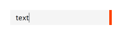
Next, I decided to deal with other controls. Similarly described the blocks of the text field text-box and text area text-area (we will not consider the text area, since the blocks are almost identical - you can see the source code for the example). The following is the HTML text box block. Additionally, the text-box - required modifier is added , which means that the field is required (it adds a red bar to the right of the field):
The relevant CSS classes look like this:
.text-box {
  background-color: #f0f0f0;
  border: none;
  font: normal 15px 'PT Sans', sans-serif;
  line-height: 20px;
  outline: none;
  padding: 5px 10px;
  resize: none;
}
.text-box:hover {
  background-color: #f5f5f5;
}
.text-box:focus {
  background-color: #f5f5f5;
}
.text-box--required {
  border-right: 5px solid #ff4100;
}
There is nothing special here, except, I repeat, the last text-box modifier - required . The text area also has one, but it is called text-area - required .
Our text box looks like this:
Form Fields
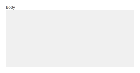
As with buttons, text fields and areas are rarely applied on their own in my project. Most often they are used as part of forms in the form of form fields (a combination of a header and a text field, for example). That is, forms are assembled from small finished pieces, and not from individual controls. So I decided to add a field block , and describe how the headers and text fields and areas inside the form field behave using the field__label , field__text-box and field__text-area elements . As a result, the HTML form field with a text area looks like this:
Everything is simple. Once again, pay attention to the order of the classes. First, for example, should be field__label , and label -.. After that, that is to tag label is the first element field__label his unit field , and then later an independent unit label . This uniformity helps a lot. Consider CSS:
.field {
}
This class is empty. When displaying form fields directly in forms, we need vertical indentation between them, but we will describe this in the corresponding form__field element of the form block below.
.field__label {
  display: block;
  margin-bottom: 1px;
}
The headers inside the field block will be displayed on a new line and indented one pixel from the bottom.
.field__text-box {
  width: 430px;
}
.field__text-area {
  width: 430px;
  height: 190px;
}
With these two classes, we specify the sizes for the text fields and areas when they are elements of the form field. The result of all this is as follows:
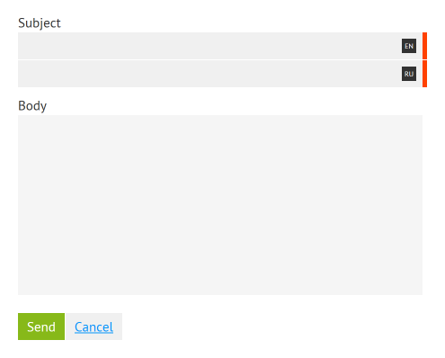
Also, part of the form fields in me are localized (multilingual). They need an additional visual marker to indicate the language to which their text fields or areas belong. In HTML, a form field with a set of localized text fields looks like this:
enruPay attention to the set of classes of the text field, there are four of them. Let's go over them again. The field__text-box class defines the size of the text field inside the form field, field__text-box - multilingual adds a small additional indent on the right so that the characters during typing do not fit under the language marker that appears over the text field. The text-box class defines the basic parameters of the text field, and the text-box - required adds a red bar to the right of the field.
New CSS classes:
.field__culture {
  position: relative;
  left: 450px;
  width: 0;
  z-index: 10;
}
.field__culture-flag {
  background-color: #323232;
  color: #fff;
  cursor: default;
  font-size: 8px;
  line-height: 16px;
  text-align: center;
  text-transform: uppercase;
  position: absolute;
  left: -23px;
  top: 7px;
  width: 16px;
  height: 16px;
}
.field__multilingual-separator {
  height: 1px;
}
There is nothing to dwell on here. The first two classes are needed to display a language marker above a text field or text area, and the last one to add an indentation of one pixel in height between controls for different languages.
Forms
Now, consider the form block form . Forms consist of form fields and button groups, which we have already described, but add vertical indentation to them using the element classes form__field and form__buttons . This is what the simplified HTML of the form block looks like :
And here is his CSS:
.form {
}
.form__field {
  margin-top: 10px;
}
.form__buttons {
  margin-top: 20px;
}
As you can see, everything is quite obvious. If necessary, we can insert, for example, a group of buttons into some control panel on our website, but if we are talking about form, then providing the group of buttons with an additional class form__buttons , we will get the necessary indentation from above.
In the browser, the whole form looks like this:
Tables
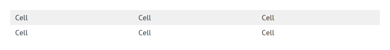
Now let's take a look at a slightly more complex element - a table. I think everyone knows that tables should be made up of tables (since this is semantically true and has good browser support), but, in the case of adaptive layout, it is sometimes more convenient to do this using general-purpose div tags with styles, like display: table . In this case, on mobile devices it is easy to turn a horizontal table into a vertical list, manipulating the displayed data in every way (you can hide something, and combine something). Be that as it may, for the implementation of tables in my project, I decided to use table , but, partly as an experiment, before doing this I made it up using div. The beauty of BEM independence from tags is that, then replacing the div tags with table , tr and td , I did not have to change anything in my CSS file, the table looked identical. I gave both options for comparison.
The standard table in HTML looks like this:
Cell Cell Cell Cell Cell Cell
As you can see, each tag is given a class. It may seem unusual, but it makes it possible to painlessly change table , tr and td to a div and not visually notice the difference.
CSS tables:
.table {
  border-collapse: collapse;
  display: table;
  width: 100%;
}
.table__row {
  display: table-row;
}
.table__cell {
  font-weight: normal;
  text-align: left;
  vertical-align: top;
  display: table-cell;
  padding: 5px 10px;
}
.table__row:hover .table__cell {
  background: #ffff96;
}
.table__cell--header {
  background: #f0f0f0;
}
.table__row:hover .table__cell--header {
  background: #f0f0f0;
}
As you can see, for the block itself, as well as for its elements, the rules display: table , display: table-row and display: table-cell are set . Thanks to this, the block becomes relatively independent of tags. In fact, I repeat, I do not think that there is any sense in these rules if you are sure that the table will always be composed with standard table tags.
And finally, let's look at the result live:
Menu
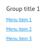
We pass to the final stage. Menus are represented by a menu block. Each menu can contain several groups of menu elements ( menu__group element ), each of which, in turn, can contain one title of a group of menu elements ( menu__group-title element ) and several menu elements ( menu__item element ). Here is the relevant HTML:
I thought about making the menu__group and menu__item elements separate blocks, but I did not find arguments in favor of such a solution: they are not used anywhere else, this would only lead to an increase in the number of classes.
Everything seems to be obvious, but for clarity, I’ll also give CSS:
.menu {
}
.menu__group {
}
.menu__group-title{
}
.menu__item {
  display: block;
  padding: 5px 0;
}
In this case, some classes are empty for me. As you can see, for example, the appearance of the headers of groups of menu items is determined by the general sub-title block (I did not stop there - look, please, in the source). There is no need for empty classes (rather, there is a need to remove them). I decided to leave them for clarity of our example.
The menu itself looks like this:
General structure
Finally, consider the general structure of the page. But before that, I would like to touch on one more point. The fact is that mainly in articles on BEM it is recommended not to have rules that are not related to blocks in the CSS file. That is, the general rules applicable to the entire document (for example, with a selector by tag, not by class). I decided not to go this way, because in this case the number of rules that need to be duplicated in each block or element increases. I see no particular reason to do this in my case. If you think about it, then all the blocks in my project are described in the framework of a single context, and it is immutable, so it’s quite acceptable, for example, to set a common style for the text, and in all blocks to build on it, because they should have a generalized all the same style.
In addition, it seems to me superfluous to assign a class for each heading, paragraph in the text, each link. In this case, when using, for example, the WYSIWYG editor, we would need to add these classes manually (or do this automatically when saving). One way or another, this is an extra inconvenience.
Back to the general structure. I decided to present it in one master-detail block with two main elements: master-detail__master and master-detail__detail , which are responsible for the left-dark and right-light parts of the page, respectively.
In master-detail__master, I added two menus. One menu does not contain any additional classes of the master-detail__master element, because there is no need to supplement it with some CSS-rules. The second menu is also a master-detail__secondary-menu element, which positions it at the bottom of the master-detail__master element . Additionally, the elements of this second menu are “mixed” with the master-detail__secondary-menu-item element , which gives them a gray color.
I will not cite the HTML / CSS of this block, because it is too cumbersome, and it must be considered in the context of the rest of the page content. Therefore, I suggest taking a look at the source code of the test case, a link to which can be found below.
Also on the page there was one more block - tabs. I decided that describing them no longer makes sense, because the block is very simple.
Well, in the end we get the same result as in the first picture.
conclusions
Why did I decide to write this? When I began to deal with BEM, I had a lot of questions for which I could not find unambiguous answers. It was a kind of semi-finished idea. It was interesting to rebuild and take a fresh look at the HTML layout process, refuse to use cascades, and so on. As a result, I somehow found solutions for myself, and I wanted to share this experience in order to try to simplify for someone this process of “getting used to and rebuilding,” showing another point of view.
I liked the methodology as a whole. The most important thing, in my opinion, is that it pushes the developer into a fairly tight framework in terms of structuring, naming style, and so on. As a result, in most cases there is only one answer to the question “how?”, Which is very cool (especially in large and team projects).
Will I use BEM on small and simple projects? I don’t know yet. Although I did not experience any unnecessary difficulties at all and did not notice unnecessary “stress” due to the increased number of classes, still following the methodology requires a bit more effort than with the “traditional” approach. Although, quite possibly, this is due to a lack of experience and dexterity.
I hope it was interesting. You can watch and touch live here , but here lies the real demo of the project, a piece of the simplified admin panel of which I gave as an example. There you can see in real scale what it looks like, and also, if desired, compare with what it was before.