Visualization of integration applications
- Transfer

Since I started to perform the duties of a system architect, I often have to draw rectangles and arrows than write program code. This could be fought, for example, to participate in open source projects on sleepless nights, to create evidence of the feasibility of the concept and a demo code, but there too, you need to draw rectangles to demonstrate the architecture. This article focuses on the visualization of messaging in distributed systems, service-oriented architecture (SOA) and microservice applications using the agile development methodology (this term has lost its meaning, but there is no more suitable one in this case).
What I like about the software industry in recent years is that most of the organizations I have worked with appreciate the principles of a lean and flexible software development methodology. Everyone strives to create ready-made software (rather than documentation), quickly give out the result (rather than engage in long planning), eliminate losses and respond to changes. To implement these principles, such control methods as Scrum, Kanban and technical methods borrowed from the extreme programming methodology (for example, unit testing and pair programming), as well as CI / CD and DevOps methods are used. In general, I decided to collect in one place the schemes and design tools that I use in my daily work with distributed systems.
Problems of the 4 + 1 and UML Death View Models
Each project is accompanied by great ambitions at the start, but each time there is not enough time to bring everything to perfection, and in the end we have to give out something that more or less works. And this is good - in this way the world around us helps us avoid embellishment and abide by principles such as YAGNI and KISS. As a result, we fulfill the necessary minimum and adapt to changes.
Most of the schemes I met were based on Philippe Crachten ’s 4 + 1 representation model , which has a development, process, and logical and physical representation.

Representation model "4 + 1". Image taken from A Practical Guide to Enterprise Architecture by James McGovern, Scott W. Ambler, Michael E. Stevens, James Lynn, Vikas Sharan, Elias C. Joe, 2003.
I really like the ideas and goals that underlie this model: the use of individual ideas and points of view to consider certain limitations and positioning for different participants. This model is great for describing complex software architectures, but when I use it for integration applications, I run into two problems.
Chart Applicability
Typically, these views are described using a unified modeling language (UML), and for each view one or more UML diagrams are required. If I need to create 15 types of UML diagrams to describe and explain the system architecture in an accessible way, this contradicts the purpose of UML.

Death by UML. Fragments of the Paulo Merson diagram from Wikipedia .
Most likely, there will be only one or two people in the organization who have the tools to create such a complex set of diagrams and are able to understand and update them. Diagrams that are inconvenient for perception and no longer relevant are no more useful than outdated documentation. Complex diagrams that do not carry a lot of value quickly become a burden, not valuable documents describing the current state of an ever-changing system.
Another drawback of existing UML diagrams is that they describe primarily object-oriented architectures, rather than channel-based and filter-based architectures. In messaging applications, the main role is played not by structure, but by methods of interaction between elements, routing and data flows. Class diagrams of objects, components, packages, etc. are far from an effective form for describing processing processes based on channels and filters. UML behavior diagrams (for example, activity and sequence diagrams) are more meaningful, but also do not make it easy to describe basic concepts of integration applications, such as filtering and routing based on content.
Applicability of Views
Representations reflecting various aspects of the system are an excellent form for describing its concept, however, existing representations of the 4 + 1 model do not correspond to the practice of developing and deploying modern software. The idea of a directed flow is when a logical representation is first created, then the representations of development and processes arising from it, and at the end the corresponding physical representation is not always consistent with reality. The life cycle of systems development differs from the traditional (waterfall) sequence of requirements collection, design, implementation and maintenance.

Software Development Life Cycle. A fragment of a Web Serv drawing .
In practice, alternative development approaches are used, including a flexible methodology, prototyping, “synchronization and stabilization” and “ejection and stabilization”. Over time, not only the development process changes, but also its participants. When using techniques such as DevOps, developers need to know the final physical deployment model, and operations specialists need to know application processing routes.
Modern architectures (such as microservices) also influence perceptions. On the one hand, the number of microservices is so great that knowing one of them is of little use; on the other hand, general knowledge of microservices is difficult to put into practice. It is extremely important to choose a suitable level of abstraction, at which general ideas about the system are combined with sufficiently detailed information about it.
Visualization Tools for Integration Applications
The most useful model, in my opinion, is described by Simon Brown and is called the C4 model (I advise you to download a free copy of Simon’s excellent book, The Art of Visualising Software Architecture ). Describing his model, Simon notes the importance of having a single set of abstractions, rather than a common notation (for example, UML), and using a small set of diagrams to create abstractions of various levels: the context of the system, containers, components, and classes. I like this approach because it involves a movement from the general to the particular, starting with the most general idea and its subsequent refinement at each new level.
The C4 model is not always ideal for creating middleware and application integration, but it is more effective than the previous ones. If we used it, the system context diagram would be a single rectangle with the words “enterprise service bus”, “middleware”, “communication middleware” or “microservices” with dozens of arrows diverging in all directions. Not too useful, is it? The container diagram is more convenient, but the term “container” is so overloaded with various meanings (“virtual machine container”, “application container”, “docker container”) that the value of its use for communicative purposes is low. Component and class diagrams are also not a good choice, since channels and filters are based on enterprise integration patterns and not on classes and packages.
The question arises: what kind of diagrams to use? I use three types of diagrams, which are denoted by the abbreviation SSD (although it doesn’t sound as cool as C4): the system context, the service design, and the deployment.
System context diagram
This model displays all services (both SOA and microservices) with inputs and outputs. Typically, external systems are located at the top of the model, services are in the middle, and internal services are at the bottom. Sometimes internal and external services are located partially above the intermediate level, and partially below it, as shown in the figure below. Next to the arrows, it is also useful (although not necessary) to specify protocols (for example, HTTP, JMS, file) and data formats (XML, JSON, CSV). If the number of services is large, then protocols and data formats can be indicated on service level diagrams. Using the arrows, I show the services that initiate the requests, not the data flow directions.
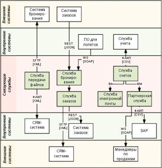
System context diagram
This diagram gives a good general idea of the structure of a distributed system: its services, internal and external communications, types of interactions (with protocols and data formats) and their initiators.
Service Structure Diagram
This diagram shows what happens in each of the rectangles corresponding to the linking services in the system context diagram. To create this diagram, it is recommended to use EIP-icons and connect them together by message flows. A service can have multiple data streams, support various protocols, and implement real-time and batch processing mechanisms.

Service Structure Diagram
Deployment Chart
The two previous diagrams are logical representations of the system as a whole and each of its services separately. Deployment charts show the deployment locations for each service. Instances of the same service can run on different nodes; services can be in an active state on some nodes and in a passive state on other nodes. Sometimes services are run by a load balancer.
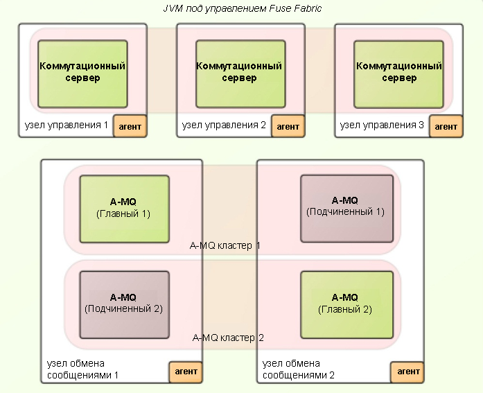

Deployment
Diagram The deployment diagram shows how the individual services and the system as a whole relate to nodes (physical and virtual).
Tool Tips
System and deployment context diagrams consist only of rectangles and arrows; no special tools are needed to create them. To create a service structure diagram, you will need a tool with the function of integrating EIP icons. Currently I know the following tools with support for EIP-icons:
- Mac OS: OmniGraffle with graffletopia icons . With this tool, I created all the diagrams for the book Camel Design Patterns ;
- Windows: Sparx Systems' Enterprise Architect with Harald Westphal's EIP Badges . In addition, MS Visio templates are located here ;
- • Internet: LucidCharts , which by default includes EIP icons. This tool is the easiest to use and available anywhere.
In addition, there are a number of other development tools with which you can create EIP diagrams:
- Red Hat JBoss Developer Studio ;
- EIP Designer of the Sirius ;
- Talend Open Studio for ESB ;
- Hawtio , a plug-in for Camel that can display Camel's running routes as EIP diagrams.
The system context diagram illustrates the overall structure of the system and the coverage of its services; the service structure diagram describes the operation of the service well, and the deployment diagram is useful in designing the physical implementation of the contents of the two previous diagrams.
IT professionals can find tasks that take up all their working time. I’m sure that if we had more time, then we would come up with a dozen more useful ideas, but without these three we could not describe an application for integration. As Antoine de Saint-Exupery once said: "Perfection is achieved not when there is nothing to add, but when there is nothing to remove."