A bit about the movie or how to do interactive visualizations in python
Introduction
In this article I want to talk about how you can easily build interactive graphics in Jupyter Notebook'e using the library plotly. Moreover, to build them, you do not need to raise your server and write javascript code. Another big plus of the proposed approach - visualizations will work in NBViewer as well , i.e. You can easily share your results with colleagues. Here, for example, is my code for this post.
For examples, I took the movie data downloaded in April (year of release, ratings on KinoPoisk and IMDb, genres, etc.). I uploaded data for all films that had at least 100 ratings - a total of 36,417 films. About how to download and parse KinoPoisk data, I talked about in a previous post .
Visualization in python and plotly
The python has many libraries for visualization: matplotlib, seabornported from R ggplotand others (for details about the tools you can read here or here ). Among them are those that allow you to build interactive graphics, for example bokeh, pygaland plotly, which in fact will be discussed.
PlotlyIt is positioned as an online platform where you can create and publish your own charts. However, this library can be used just as well Jupyter Notebook'e. In addition, the library has offline-mode, which allows you to use it without registering and publishing data and graphs to the server plotly( documentation ).
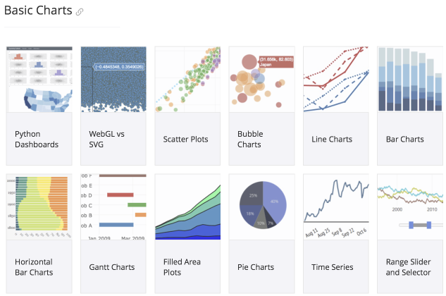
In general, I really liked the library: there is detailed documentation with examples , various types of graphs are supported (scatter plots, box plots, 3D graphs, bar charts, heatmaps, dendrograms, etc.) and the graphs are pretty nice.
Examples
Now is the time to go directly to the examples. As I said above, all code and interactive graphics are available in NBViewer .
Library is easy to install using the command c: pip install plotly.
First of all, you need to do the import, call the command init_notebook_modeto initialize plot.lyand load into the pandas.DataFramedata with which we will work.
from plotly.offline import download_plotlyjs, init_notebook_mode, plot, iplot
import plotly.graph_objs as go
init_notebook_mode(connected=True)
df = pd.read_csv('kp_all_movies.csv') #скачиваем подготовленные данные
df.head()
How many films came out in different years?
To begin with, let's build a simple bar chart showing the distribution of films by year of release.
count_year_df = df.groupby('movie_year', as_index = False).movie_id.count()
trace = go.Bar(
    x = count_year_df.movie_year,
    y = count_year_df.movie_id
)
layout = go.Layout(
    title='Фильмы на Кинопоиске',
)
fig = go.Figure(data = [trace], layout = layout)
iplot(fig)
As a result, we get an interactive graph that shows the value when hovering for a year and the expected conclusion that there are more films over the years.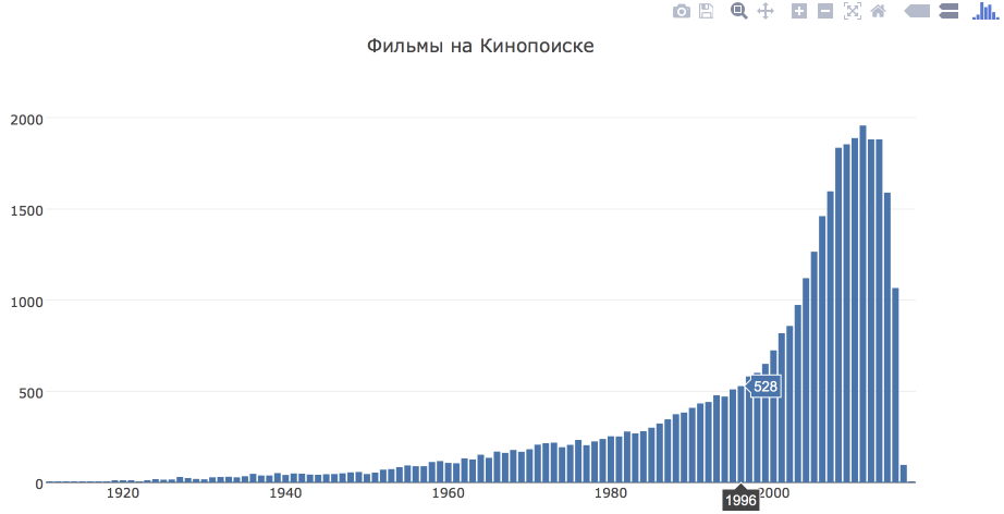
Have you started making better movies over the years?
To answer this question, we construct a graph of the dependence of the average score on KinoPoisk and IMDb on the year of release.
rating_year_df = df.groupby('movie_year', as_index = False)[['kp_rating', 'imdb_rating']].mean()
trace_kp = go.Scatter(
    x = rating_year_df.movie_year,
    y = rating_year_df.kp_rating,
    mode = 'lines',
    name = u'КиноПоиск'
)
trace_imdb = go.Scatter(
    x = rating_year_df.movie_year,
    y = rating_year_df.imdb_rating,
    mode = 'lines',
    name = 'IMDb'
)
layout = go.Layout(
    title='Оценки фильмов',
)
fig = go.Figure(data = [trace_kp, trace_imdb], layout = layout)
iplot(fig)
The estimates by KinoPoisk and IMDb show a trend towards a decrease in the average rating depending on the year of issue. But, in fact, from this it is impossible to make an unambiguous conclusion that earlier they shot better films. The fact is that if people already watch old films and evaluate them at KinoPoisk, then they choose a cult movie with obviously higher ratings (I think few people watch passing films released in 1940, at least I don’t watch).
Are there any differences in ratings depending on the genre of the film?
To compare grades depending on the genre, we construct a box plot. It is worth remembering that each film can belong to several genres, so films will be counted in several groups.
# прежде всего распарсим поле genres и data frame с размноженными строками для каждого жанра
def parse_list(lst_str):
    return filter(lambda y: y != '',
                  map(lambda x: x.strip(),
                      re.sub(r'[\[\]]', '', lst_str).split(',')))
df['genres'] = df['genres'].fillna('[]')
genres_data = []
for record in df.to_dict(orient = 'records'):
    genres_lst = parse_list(record['genres'])
    for genre in genres_lst:
        copy = record.copy()
        copy['genre'] = genre
        copy['weight'] = 1./len(genres_lst)
        genres_data.append(copy)
genres_df = pd.DataFrame.from_dict(genres_data)
# сформируем топ-10 жанров
top_genres = genres_df.groupby('genre')[['movie_id']].count()\
    .sort_values('movie_id', ascending = False)\
    .head(10).index.values.tolist()
N = float(len(top_genres))
# cгенерируем цвета для визуализации
c = ['hsl('+str(h)+',50%'+',50%)' for h in np.linspace(0, 360, N)]
data = [{
    'y': genres_df[genres_df.genre == top_genres[i]].kp_rating,
    'type':'box',
    'marker':{'color': c[i]},
    'name': top_genres[i]
    } for i in range(len(top_genres))]
layout = go.Layout(
    title='Оценки фильмов',
    yaxis = {'title': 'Оценка КиноПоиска'}
)
fig = go.Figure(data = data, layout = layout)
iplot(fig)
The graph shows that horror movies stand out most of all for low ratings
What genres most often coexist?
As I said above, one film most often refers to several genres at once. In order to look at which genres are more often found together, we will build a heatmap.
genres_coincidents = {}
for item in df.genres:
    parsed_genres = parse_list(item)
    for genre1 in parsed_genres:
        if genre1 not in genres_coincidents:
            genres_coincidents[genre1] = defaultdict(int)
        for genre2 in parsed_genres:
            genres_coincidents[genre1][genre2] += 1
genres_coincidents_df = pd.DataFrame.from_dict(genres_coincidents).fillna(0)
# отнормируем таблицу на количество фильмов каждого жанра
genres_coincidents_df_norm = genres_coincidents_df\
    .apply(lambda x: x/genres_df.groupby('genre').movie_id.count(), axis = 1)
heatmap = go.Heatmap(
    z = genres_coincidents_df_norm.values,
    x = genres_coincidents_df_norm.index.values,
    y = genres_coincidents_df_norm.columns
)
layout = go.Layout(
    title = 'Связанные жанры'
)
fig = go.Figure(data = [heatmap], layout = layout)
iplot(fig)
You need to read the schedule as follows: 74.7% of historical films also have a drama tag .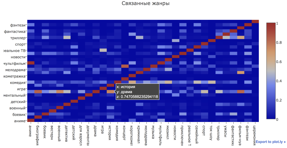
How did movie ratings vary by genre?
Let us return once again to the example in which we looked at the dependence of the average score on the year of release and construct such graphs for various genres. In parallel, we will introduce another feature plotly: you can configure the drop-down menu and change the schedule depending on the selected option.
genre_rating_year_df = genres_df.groupby(['movie_year', 'genre'], as_index = False)[['kp_rating', 'imdb_rating']].mean()
N = len(top_genres)
data = []
drop_menus = []
# конструируем все интересующие нас линии
for i in range(N):
    genre = top_genres[i]
    genre_df = genre_rating_year_df[genre_rating_year_df.genre == genre]
    trace_kp = go.Scatter(
        x = genre_df.movie_year,
        y = genre_df.kp_rating,
        mode = 'lines',
        name = genre + ' КиноПоиск',
        visible = (i == 0)
    )
    trace_imdb = go.Scatter(
        x = genre_df.movie_year,
        y = genre_df.imdb_rating,
        mode = 'lines',
        name = genre + ' IMDb',
        visible = (i == 0)
    )
    data.append(trace_kp)
    data.append(trace_imdb)
# создаем выпадающие меню
for i in range(N):
    drop_menus.append(
        dict(
            args=['visible', [False]*2*i + [True]*2 + [False]*2*(N-1-i)],
            label= top_genres[i],
            method='restyle'
        )
    )
layout = go.Layout(
    title='Фильмы по жанрам',
    updatemenus=list([
        dict(
            x = -0.1,
            y = 1,
            yanchor = 'top',
            buttons = drop_menus
        )
    ]),
)
fig = go.Figure(data = data, layout = layout)
iplot(fig)
In conclusion
In this article, we learned how to use the library plotlyto build various interactive graphs in python. It seems to me that this is a very useful tool for analytical work, because it allows you to make interactive visualizations and easily share them with colleagues.
I advise to look interested and other plot.ly usage examples .
All code and data live on github