How to create eye-catching images if you are not a designer
- Transfer
Having read this article, you will no longer be able to post an article with a dull picture on Habré.
The basic laws of design and simple tools for him, under the cut.
Respectfully, the team of fulfillment operator Yambox
( Yambox - turn your online store into a computer game)
A professional social media marketer and advertiser of the 60s have a lot in common. David Ogilvy, the founder of advertising as such, was known for spending a huge amount of time and energy on headlines. Why? And because the headline is the line most read by people, this is the importance. Ogilvy was a master at such things - to prioritize in the right direction. If he lived in the era of social networks, I am absolutely sure that he said something like:
“On average, a huge number of people are immersed in images on social networks as if they had read an entire article. After you created the picture for the social network, you spent 80 cents from one dollar. "
As for the social sphere, for her images have always been very significant. They are like a key, leading to a greater immersion in the topic, just like the headline in the advertisement.
The only problem is that if you, like me, are not some super-advanced pro in graphic design, creating attractive and creative images can be difficult. So how can non-professionals like me create incredible pictures for social networks? One way is to learn simple, repetitive design principles.
Here are 3 key design principles that will always help you create attractive pictures for the public!

Principle # 1: Come up with a simple and balanced scheme
Here's what my table looked like in the morning:

And here is how it began to look 30 seconds later. Feel the difference?
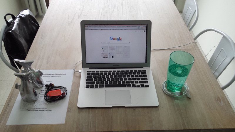
Both pictures depict the same objects. On the table, not one subject has been moved to another place, on the second go-kart the layout has only slightly changed - and now the feeling from the picture has become completely different! It's nicer to look at her.
Therefore, the lesson is very simple: the location of objects in your images play a big role.
Take a look at these two simple examples:


Definitely, the second picture looks much better! This is a consequence of two design principles associated with the layout of images - proximity and alignment.
Proximity is a grouping of elements with each other in such a way that thereby you will direct the viewer's attention to the various parts of the message.
In the above examples, in the first image, the icon and the text itself are located in close proximity to each other. This leads to the fact that the icon and the text play their own role separately from each other.
- The icon visually indicates surfing.
- The text conveys details about surfing.
The application of the principle of proximity means that the viewer's attention should initially be directed to the icon, and only then go to the text. This allows the viewer to better understand what exactly they want to convey to him.
In the second example, we see that the text is located after the icon.
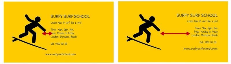
By applying the principle of intimacy, you add unity and integrity to your images.
Alignment
Correct alignment of image elements helps maintain balance.
Consider the same example about the surf school.
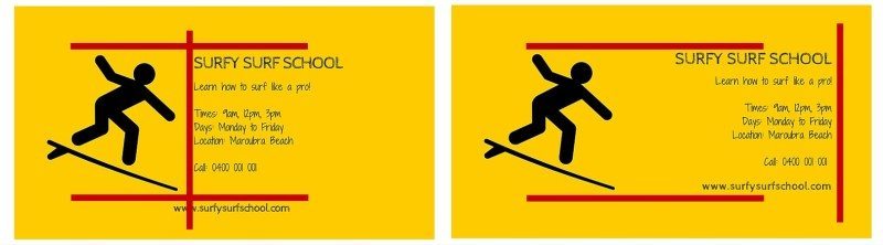
- The top of the icon is aligned with the text in both images.
- All text is aligned only in the second image.
- The lower part of the icon and the text are aligned only in the second picture
These small differences make the second image more balanced and interesting.
How to create a simple and balanced image
- When a picture contains several different elements (for example, text, icons, illustrations), think about what role they play in this image.
- Keep a balance between these different elements, whether they are vertical, horizontal or diagonal.
Principle # 2: All color difference.
Leslie Kabarga, the author of the Color Combination Designer's Guide, writes:
“An unpretentious choice of colors affects us on a subconscious level, a fact that has been discovered by many real estate agents. Potential buyers, looking at houses with ugly wallpapers, abandoned this house, although the house itself was very good. "I remember myself as a child, as I couldn’t eat anything while sitting in a restaurant whose walls were painted a pale green color of the 50s."
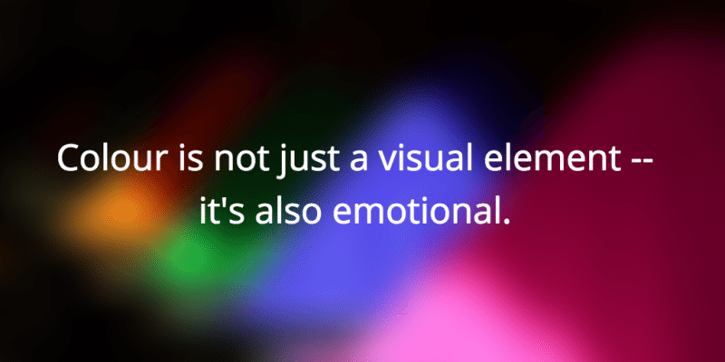
Color is not just a visual element, but also an emotional one.And precisely because color can cause a variety of emotions, you can determine whether people like your images. This does not mean that it is so easy to determine which shades to refrain from. It is important to think about the role that color plays in your pictures.
The role of color is simple: to create contrast in your images
Kalli Kavorgiya describes the functions of color and contrast:
“Contrast creates a conflict between elements to draw the viewer's attention to a certain point in the image, and is the most effective way to add visual interest .... this allows you to highlight key design elements.
Here are some simple examples.
Each pair of circles has the same color in the center, but each of them is seen differently. You can see for yourself the depth of the changes in different color variations. ”
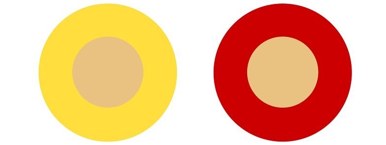
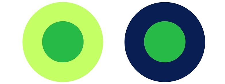
This contrast shows us that the perception of colors used in images can vary significantly depending on how you combine these colors.
It is very important to choose the right color combinations, but how do you know which colors to choose?
How to choose contrasting colors.
One of the useful tools in this business is Paletton . It automatically selects contrasting colors, which saves you a lot of time.
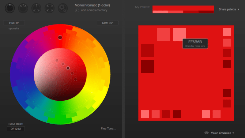
In this example, we selected red as the primary color (the top dot on the color wheel) and requested a monochromatic color scheme (color scheme based on different shades of the same color).
When you hover over the various fields on the right, in this diagram, you see various six-digit codes, depending on the color that you hover over. You can use these codes for your work.
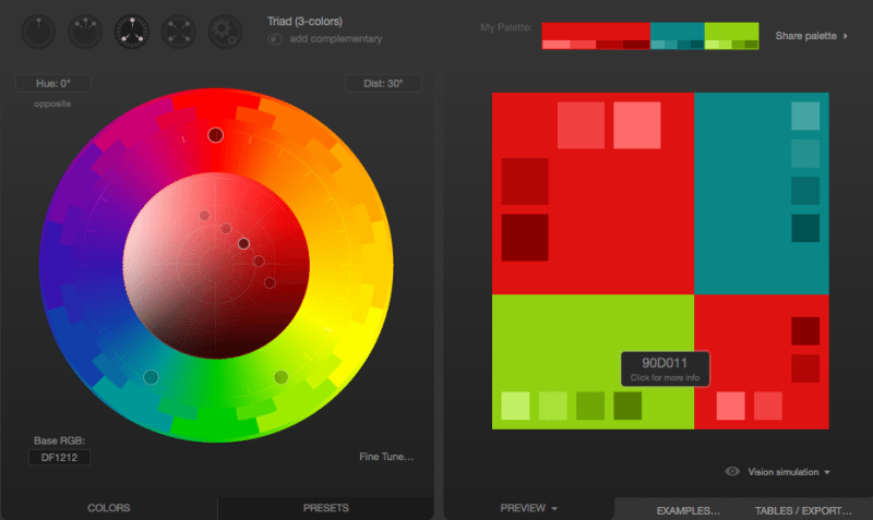
In the second example, we use red as the main color, but instead we ask you to show a triadic color scheme (three colors that are evenly placed in the lines around the color wheel). Again, this way we can choose contrasting colors that blend well with each other.
Another tool that I use quite often is Brand Colors , a collection of official color codes from world famous brands.
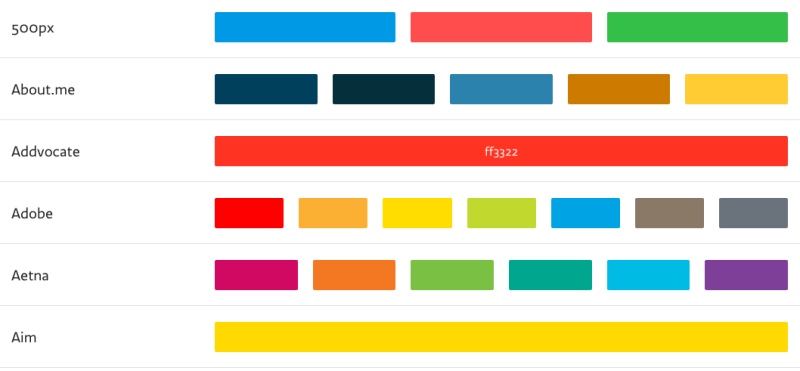
Hovering over any color (for example, as I did here with the Addvocate brand) you see a six-digit code.
When the inspiration is over, and I can no longer come up with and choose color combinations, for inspiration I often open Brand Colors.
Such tools are just a lifesaver for non-professional designers.
Principle # 3: Choose fonts that are easy to read and consistent with each other.
The above analogy is probably excessive, but for me the choice of font is the same as the choice of clothes.
Your choice of clothing expresses your personality and style. You will leave a completely different impression when you come to a meeting in a suit or in a T-shirt and shorts.
In addition, the use of fonts in social networks is the key message about you and your brand.
Let's look at the following example. Two options are possible here:

I like the image on the left more because:
- Its easier to read.
- Two selected fonts seem more appropriate to me
This does not mean that another image is disgusting and disastrous, but it does illustrate the importance of focusing on the role of the text.
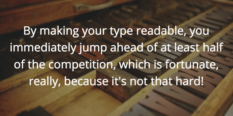
Max Luzuryaga, web designer and developer correctly sums up:
“What are you doing with the text? You read it! So why do so many people do everything to complicate this task, using either a tiny font size, an ugly and poorly readable font, or an incorrect line height or width. All this does not allow to enjoy the content of the text.
By making your text accessible and readable, you immediately jump one level higher and, consider, you have already won half of the competition. Well, what could be easier? ”
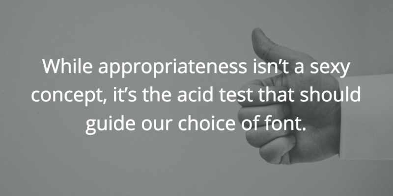
The million dollar question begs: how to choose the right font? Here we can rely on Dan Mayer's wise advice:
“Just like with clothes, there is a difference between stylish and eye-catching fonts compared to those that are comfortable and suitable for any occasion, and our job is to try to find the right balance of style and convenience.”
The best part about choosing fonts is that you don’t have to do a lot of work, because:
- A site like Font Pair, for example, selects well-compatible fonts
- A simple Google search (for example, “the best fonts for business quotes”) will provide you with great examples
How to choose a font for your images.
- Simple is better than fantasy
- Be consistent - try to use the same font everywhere
- When adding a second type of font, pick up something different, but equally simple
Well, now questions for you:
- How do you make images attractive to social networks?
- What sites / tools helped you find interesting designs?
- What else could you recommend from yourself?
Subscribe to our blog, then there will be a lot of interesting things.
By the way, here we are engaged in logistics for online stores, if that, maybe someone needs?
Respectfully, the team of fulfillment operator “Yambox”
( Yambox - turn your online store into a computer game)