X-shaped marks, as a way to identify the radar using the analysis of open data from two scientific satellites SENTINEL-1
- Transfer
The GIS analyst, Harel Dan, noticed that when he accidentally adjusted noise levels while working with a database of images received from the SENTINEL-1 satellites, suddenly many colored X-shaped markings appeared around the world.
Under the radar in the article refers to a tracking radar with a phased antenna array.
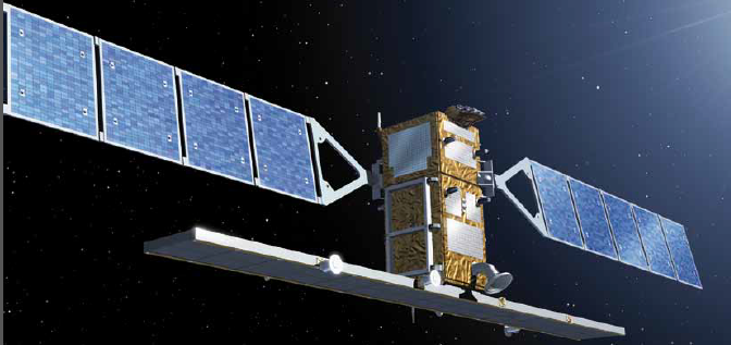
The satellite constellation SENTINEL-1 includes: the satellite Sentinel-1A (launched April 3, 2014) and the satellite Sentinel-1B (April 25, 2016). The mass of each satellite is 2300 kilograms, put into a sun-synchronous orbit with an altitude of 690 kilometers.
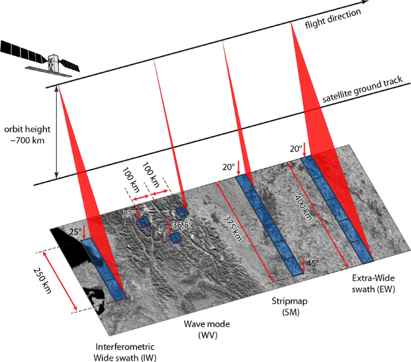
There are two main types of satellites for remote sensing: optical and radar. Each type can be further divided into subcategories based on aperture, orbit and ranges. At the moment, one of the most used such complexes is the implementation of the stages of the European Space Agency (ESA) program called Copernicususing a pair of satellites from the Sentinel-1, S1A and S1B constellation, which will provide data with a combined average waiting time of 1.5 days at best.
This method of obtaining high-resolution data and short update times, as well as providing open access to data from these satellites, now plays an important role in many areas of scientific research, including data for emergency response, monitoring the marine and aquatic environment ( even floods ) , vegetation cover analysis and agricultural assistance , forest fire assessments and urban planning.
Satellite data can be freely downloaded and analyzed on many platforms, including: Copernicus Open Data Hub ,Sentinel EO Browser and Google Earth Engine .
The mission of Sentinel-1 is based on the complex of two identical satellites Sentinel-1A and Sentinel-1B, rotating in orbits 180 degrees apart from each other around the Earth. Using these satellites allows you to create global ground coverage and the ability to deliver optimized data to Copernicus users.
Taking into account that there can be distortions in the data from optical images caused by interference from clouds and dust, using data from radar images you can mostly “see” through water vapor and other solid particles. On the other hand, data from radar images may be distorted due to interference from other sources on the ground and transmitting at the same wavelength.
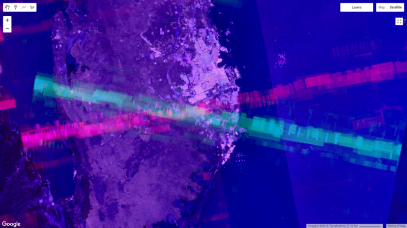
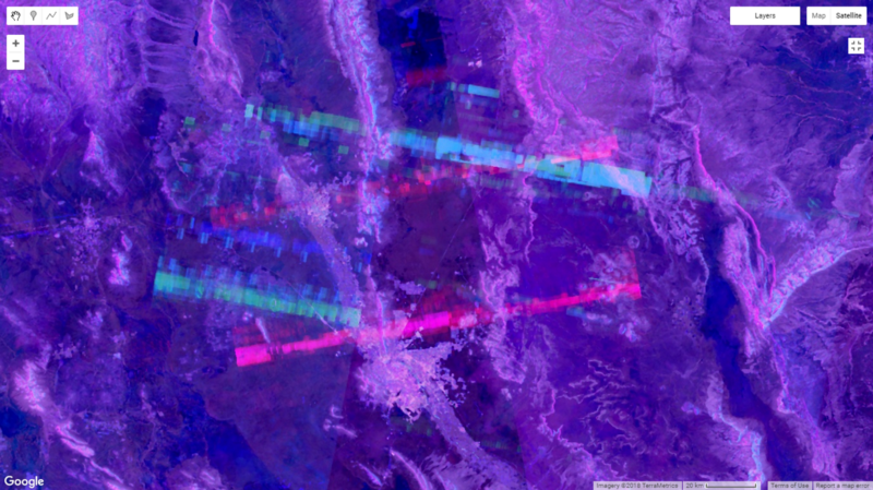
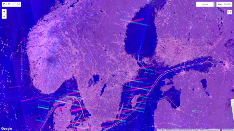
Analyzing data from Sentinel-1, you encounter many types of noise, flares, twists, snaps, and waves in images, so you need to combine and filter data from several images so that you can create a clearer image and compensate for some, if not all, noise.
Flashes, twists, specks and waves, screenshots from the Sentinel-Hub EO Browser:
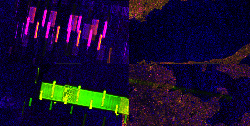
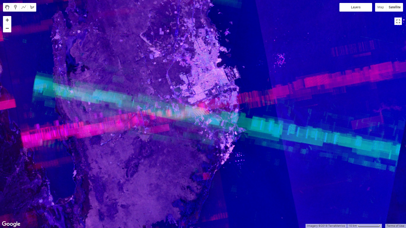
These artifacts in images are the result of interference from more powerful reverse impulses. They have different polarizations, sizes and locations, but will always have a primary angle perpendicular to the direction of the satellite’s flight, thus, in the data from the satellites, the images will have two different inclinations based on the orbit types.
Two paragraphs above, I mentioned that most of the noise can be filtered by some image processing or multi-time analysis, where the lowest value is chosen for each image pixel. When I tried to accomplish such a feat in Google Earth Engine, I accidentally chose the maximum value, and the results were stunning.
Displaying a combination of the polarizations VH and VV, these lines, the result of the overlapping of the ascending and descending orbital interference, converge one by one.
What is it?
The SENTINEL-1 equipment includes the C-SAR instrument (used for PCA - radar synthesizing aperture), operating at a frequency of 5.405 GHz, which conveniently “sits” within the military frequency used on Earth (Airborne Forces and naval radar systems - 5.250 -5.850 GHz, including phased-array radar). Consequently, my working hypothesis is that there is a kind of ground intervention in the data from SENTINEL-1.
Therefore, anywhere in the world on a map where these artifacts appear, they can indicate the location of special radar equipment or another early warning system, as I will show.
Confirmation of the correctness of my analysis comes from other GEOINT analysts.
Here are some examples.
Link to the script in GEE .
If you do not have a GEE account, the results are available through GEE Apps .
The script matches a specific time interval of images, performs the necessary filters and displays the result. The longer the time interval, the more “noise” is added to the result, and the convergence of the lines becomes clearer.
Theoretically, if you limit the time interval and additionally perform image analysis, it is possible to catch more accurate line intersections based on the time of appearance and disappearance of convergences in the images, but this may take several days.
Conclusion: Earth Observation data (EO - Earth Observation data) is becoming increasingly democratized and accessible, just as Google Earth democratized the GIS in some way and made aerial photographs publicly available about 15 years ago. Nevertheless, it is extremely important that companies, organizations and countries adapt to this new reality, especially in those areas and areas that are associated with certain sensitive information that cannot be simply disclosed to analysts at the level of the chair.