Quite a bit about travel interfaces
In this article, we will remember everyone's favorite solitaire, honestly speak about the emotions that we experience when searching for keys and a phone in the morning and also prepare a unique interface concept that Aviasales should tear off with hands.

The UX Club community of Russian-speaking usability experts threw me the idea for this article . This is by far the best group for usability and user experience analysis professionals today. Of course, many of you, looking at those projects that exist today in Runet, will not believe in the existence of any professionals in this industry, but this is normal. The fact is that usability in Russia is still in its infancy and is going through step by step all the usual childhood diseases:
- lack of understanding that design is a mathematically measurable quantity, not a picture at an exhibition;
- it’s still in fashion to evaluate any prototype in terms of future “by eye” conversion;
- And also everyone’s favorite habit of speaking for millions of users in one person.

Nothing, over the years this will pass, you just have to grit your teeth to wait another 10-15 years, and random people will subside like foam from this profession, freeing up space for real experts with a clear understanding of what they are doing, for what and what they are all evaluating it for. It takes time until the evaluation characteristics of “good-bad” are replaced by teenagers “better than that because ...”, “more effective than that, since ...”. So, just yesterday, 5,000 top experts failed to come to a single conclusion about the five metrics that can help you evaluate the quality of the interface of any travel site. However, despite the lack of measurable indicators, I was still tearfully asked to come up with a “good” interface. Good in the sense that he will give ice-cream and sweets to the tickets, do not make him sleep after 23 hours and don’t make mom mumble ??? Well, let's try.
Empathy
Does it not surprise you that so many information systems in the world rely on search? Search there, search, here, search everywhere. One gets the impression that a person has little experience in the world of the same buzz as from entering his request in the input field. But is it? Not.
In fact, ordinary people rarely get wild as much as finding things in real life. Remember yourself: the keys that were on the refrigerator yesterday; somewhere stocked up discharged phone; a sock without a pair after washing - yes you just hate looking for something. Each of us is so mentally healthy that he believes that all the most important things should be right before our eyes, at arm's length. And even if they are removed somewhere far away, then clearly in their place, in accordance with certain own rules and personal understandable sorting of things in the house (in the closet or on the desktop).
That is why my first decision: to show in the foreground for users the most convenient and obvious offers on the site looks quite reasonable. It is clear that this is not beneficial to bigwigs, magnates and other greedy capitalists, since when they show the best offers at once, everyone else will automatically lose in demand. Well, it would be naive to believe that so far at least something is being done in the domestic design and usability for the end user. Here for the customer, using analytics to find the best of 400 relatively honest ways of taking money from the population - yes; or for showing off to competitors - as much as you like; You can also save the budget by hiring the cheapest freelancer - every second does. But for the end user with his needs? Alas and ah:
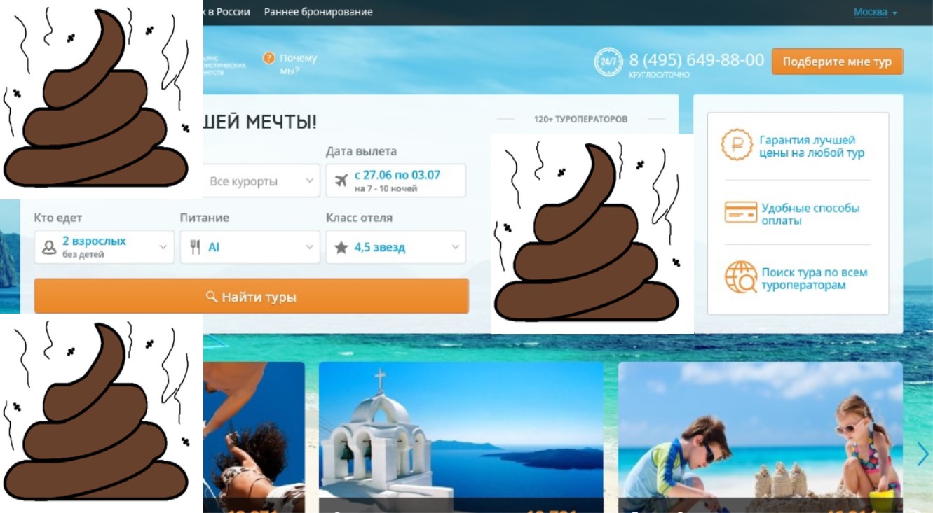
But there are still such cases as the selection of the date (and even month) of the start of the vacation for the most successful discounts, and the choice of the direction "to the sea" again, taking into account the time of flight, the number of transfers - and not out of love for a particular country. How to deal with all this? What a dull set of fields in the style of shovel questionnaire will help us here “was not, was not involved. Did not consist, number and signature? Nothing.
Habit
Probably, there is no such user in the world who would not know what ordinary solitaire on the computer is. So, such an interface, well, if at least one guru of the domestic UX had the courage to implement such a concept, it would look as familiar as possible, absolutely obvious and would not cause questions. Each user of the solitaire-style interface would instantly enter that very “stream of consciousness”, seeing the usual elements of interaction and, without being distracted by the details, would immediately go to their ultimate goal. It is also important to note that having successfully achieved the goal of selecting tickets, the conditioned reflex of each person would produce the necessary amount of endorphins, recalling the very familiar feeling of a winner who has successfully developed a solitaire with a vacation by the sea.

Decision
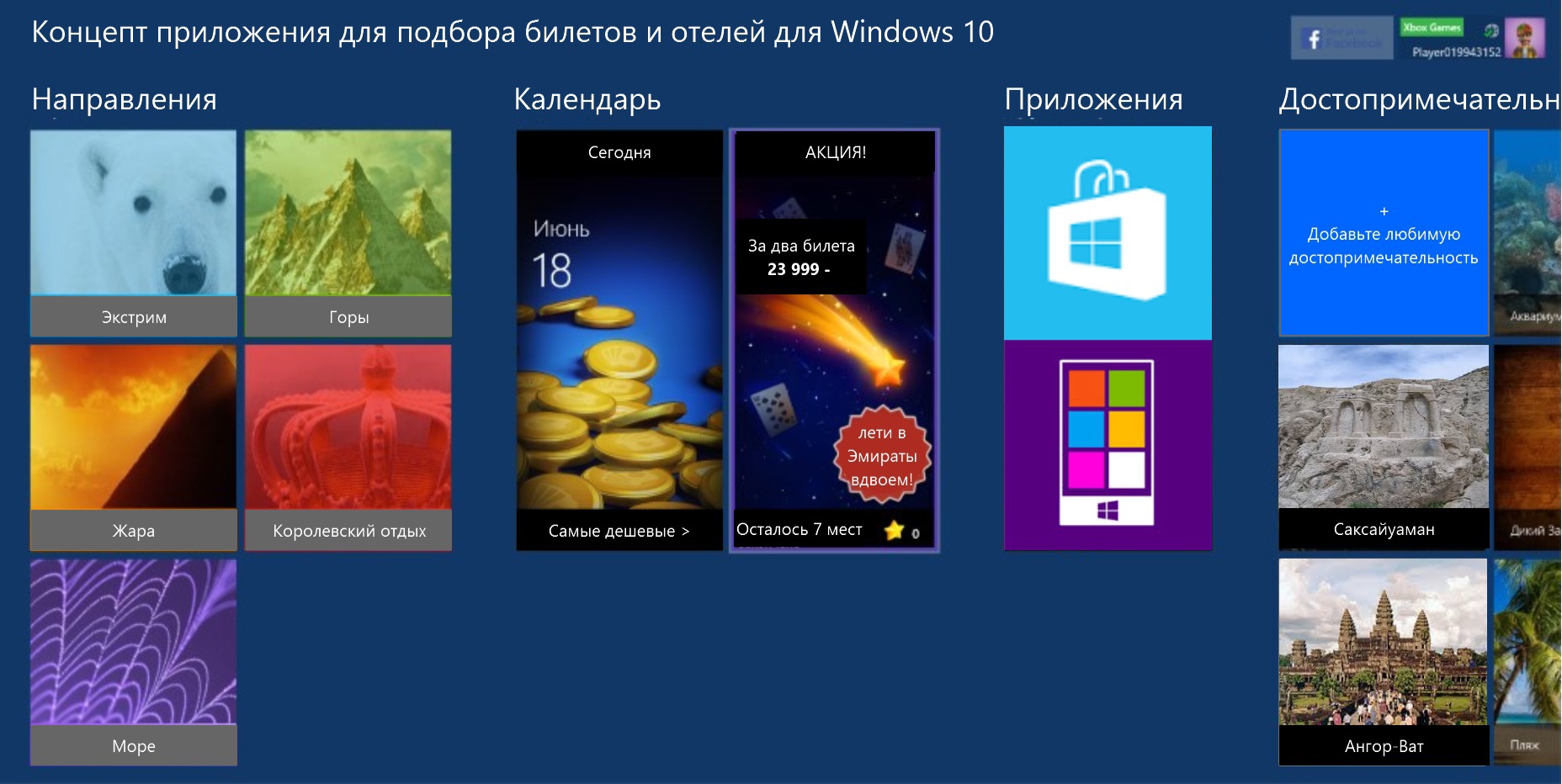
So we come to the conclusion that the card interface should come to our aid, about which so many articles and slides are written, but so little is done. Onion on the screen, pliz:
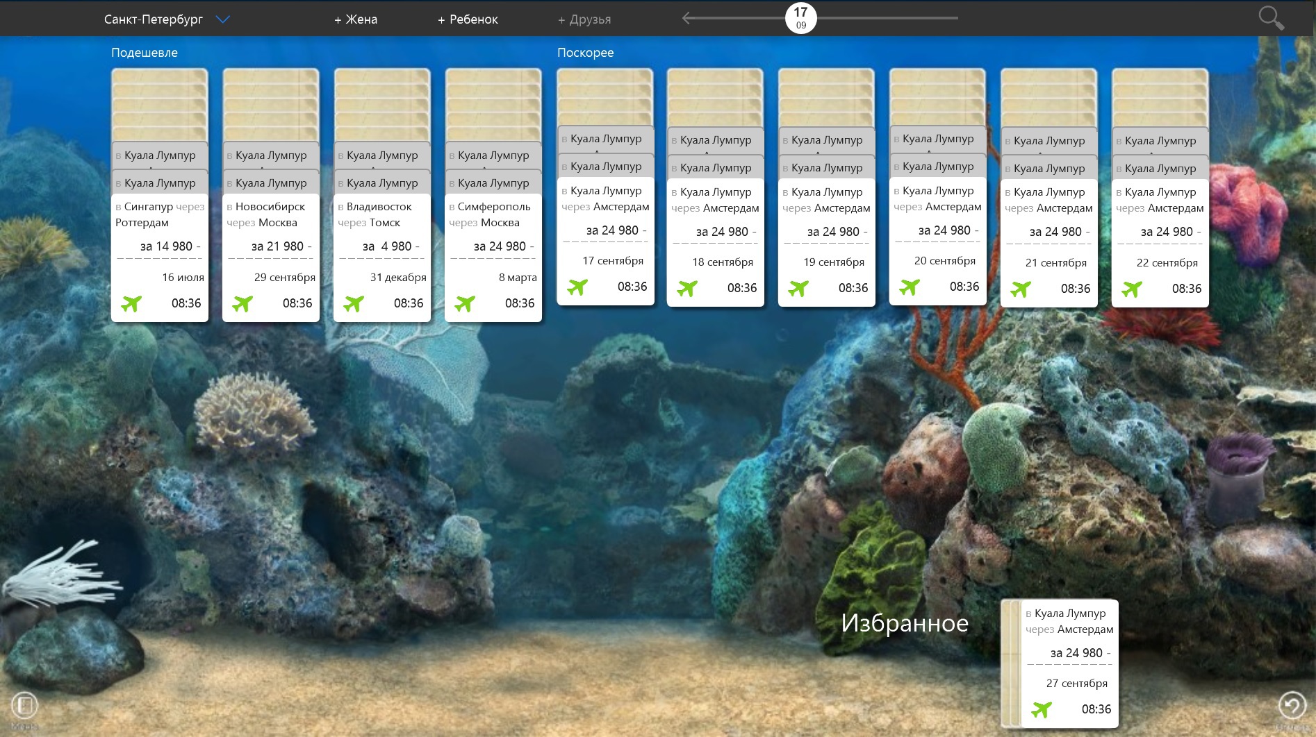
Here, each specific offer is framed as a separate card, with which it is easy to interact, sort through, generally delete from the "desktop" or sort it in your own way. A ready-made calculation of several proposals can be easily shared with your spouse to agree on a vacation schedule or used in sending to colleagues in the mail to clarify the final date of arrival. If the initial screen with the selection of optimal cards did not suit you, you can go to another page and change the selection parameters, but the essence remains the same: the first screen of the application contains ready-made offers, not filters.
How do you like this decision? It seems perfect to a few of my interrogated acquaintances by chance. But yes, all this can be subjectivity, or ordinary politeness, so in the comments, let's constructively criticize the idea before selling my concept to Kosta Kalinov. Reflections in the style are especially welcome: “I myself would never have tried it, but I condemn it”, or “no more than 3, 567% conversion is visible by eye”. In general, prove yourself to the fullest!
The UX Club community of Russian-speaking usability experts threw me the idea for this article . This is by far the best group for usability and user experience analysis professionals today. Of course, many of you, looking at those projects that exist today in Runet, will not believe in the existence of any professionals in this industry, but this is normal. The fact is that usability in Russia is still in its infancy and is going through step by step all the usual childhood diseases:
- lack of understanding that design is a mathematically measurable quantity, not a picture at an exhibition;
- it’s still in fashion to evaluate any prototype in terms of future “by eye” conversion;
- And also everyone’s favorite habit of speaking for millions of users in one person.
Nothing, over the years this will pass, you just have to grit your teeth to wait another 10-15 years, and random people will subside like foam from this profession, freeing up space for real experts with a clear understanding of what they are doing, for what and what they are all evaluating it for. It takes time until the evaluation characteristics of “good-bad” are replaced by teenagers “better than that because ...”, “more effective than that, since ...”. So, just yesterday, 5,000 top experts failed to come to a single conclusion about the five metrics that can help you evaluate the quality of the interface of any travel site. However, despite the lack of measurable indicators, I was still tearfully asked to come up with a “good” interface. Good in the sense that he will give ice-cream and sweets to the tickets, do not make him sleep after 23 hours and don’t make mom mumble ??? Well, let's try.
Empathy
Does it not surprise you that so many information systems in the world rely on search? Search there, search, here, search everywhere. One gets the impression that a person has little experience in the world of the same buzz as from entering his request in the input field. But is it? Not.
In fact, ordinary people rarely get wild as much as finding things in real life. Remember yourself: the keys that were on the refrigerator yesterday; somewhere stocked up discharged phone; a sock without a pair after washing - yes you just hate looking for something. Each of us is so mentally healthy that he believes that all the most important things should be right before our eyes, at arm's length. And even if they are removed somewhere far away, then clearly in their place, in accordance with certain own rules and personal understandable sorting of things in the house (in the closet or on the desktop).
That is why my first decision: to show in the foreground for users the most convenient and obvious offers on the site looks quite reasonable. It is clear that this is not beneficial to bigwigs, magnates and other greedy capitalists, since when they show the best offers at once, everyone else will automatically lose in demand. Well, it would be naive to believe that so far at least something is being done in the domestic design and usability for the end user. Here for the customer, using analytics to find the best of 400 relatively honest ways of taking money from the population - yes; or for showing off to competitors - as much as you like; You can also save the budget by hiring the cheapest freelancer - every second does. But for the end user with his needs? Alas and ah:
But there are still such cases as the selection of the date (and even month) of the start of the vacation for the most successful discounts, and the choice of the direction "to the sea" again, taking into account the time of flight, the number of transfers - and not out of love for a particular country. How to deal with all this? What a dull set of fields in the style of shovel questionnaire will help us here “was not, was not involved. Did not consist, number and signature? Nothing.
Habit
Probably, there is no such user in the world who would not know what ordinary solitaire on the computer is. So, such an interface, well, if at least one guru of the domestic UX had the courage to implement such a concept, it would look as familiar as possible, absolutely obvious and would not cause questions. Each user of the solitaire-style interface would instantly enter that very “stream of consciousness”, seeing the usual elements of interaction and, without being distracted by the details, would immediately go to their ultimate goal. It is also important to note that having successfully achieved the goal of selecting tickets, the conditioned reflex of each person would produce the necessary amount of endorphins, recalling the very familiar feeling of a winner who has successfully developed a solitaire with a vacation by the sea.
Decision
So we come to the conclusion that the card interface should come to our aid, about which so many articles and slides are written, but so little is done. Onion on the screen, pliz:
Here, each specific offer is framed as a separate card, with which it is easy to interact, sort through, generally delete from the "desktop" or sort it in your own way. A ready-made calculation of several proposals can be easily shared with your spouse to agree on a vacation schedule or used in sending to colleagues in the mail to clarify the final date of arrival. If the initial screen with the selection of optimal cards did not suit you, you can go to another page and change the selection parameters, but the essence remains the same: the first screen of the application contains ready-made offers, not filters.
How do you like this decision? It seems perfect to a few of my interrogated acquaintances by chance. But yes, all this can be subjectivity, or ordinary politeness, so in the comments, let's constructively criticize the idea before selling my concept to Kosta Kalinov. Reflections in the style are especially welcome: “I myself would never have tried it, but I condemn it”, or “no more than 3, 567% conversion is visible by eye”. In general, prove yourself to the fullest!